Golden Apple. Store as Instagram
«Golden Apple» is a perfume supermarket with outlets in Moscow, Saint Petersburg, Yekaterinburg, Kazan and many other cities in Russia. In 2018, the company decided to break into the e-commerce market, which meant developing an online store and setting up all of the associated business processes. In close collaboration with the client, the ONY team worked on the former task (and partially on the latter).
The bulk of cosmetics sales today are driven by bloggers. Therefore, the main idea behind designing customer interactions was the integration of popular social media mechanics in the store’s interface. On the site’s homepage you can find a preview of the brand’s Stories, where popular beauty bloggers test products and talk about their various features.
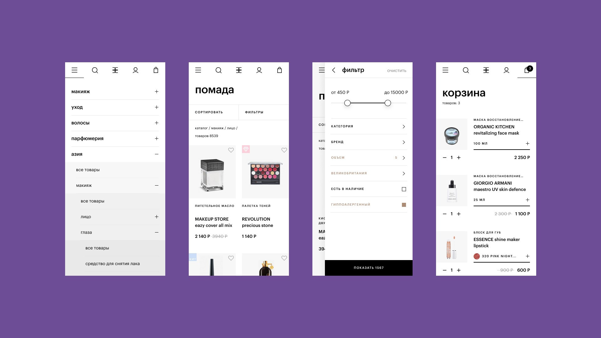
We conducted a series of experiments and interviews with the target audience in order to account for their requirements for the brand’s future UX solutions. This why one click takes users from a Story to the corresponding product page, where customers can find out as much as possible about the item without having the ability to test it in person. Photographs help solve this problem: decorative cosmetics are shot on a model’s hand in order to assess a product’s thickness and texture just like they would do in-store. We recreated the experience of working with a consultant in the case of a product running out or being discontinued in online form. Usually, a salesperson would suggest choosing something similar—and the Golden Apple site now does the same, connecting various user micro-scenarios into a single seamless shopping experience.
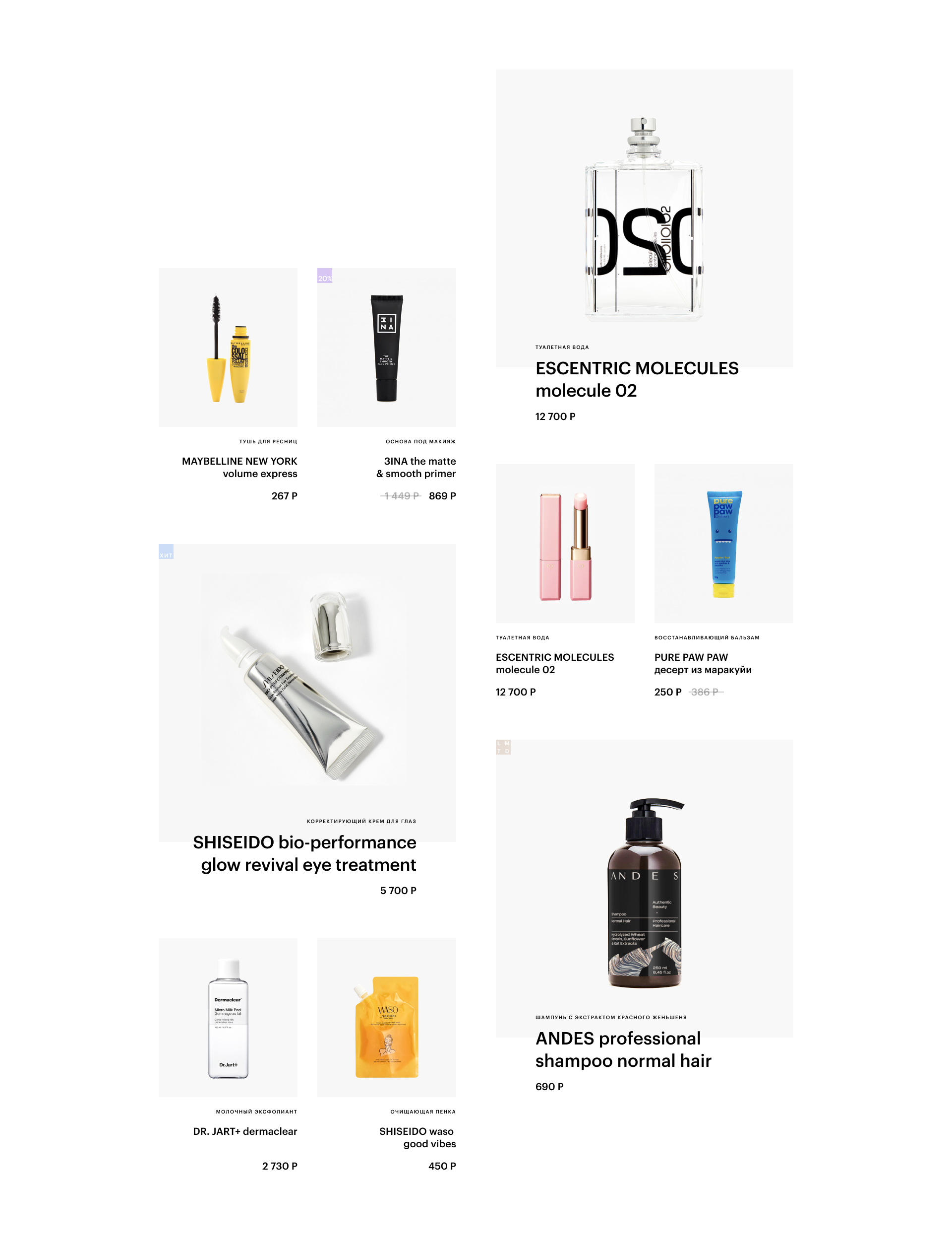
We made a principled choice not to overload the store’s main «window» with the largest possible number of products, like almost all of Golden Apple’s competitors. Quite the opposite: we only put a few items on the store’s homepage, leaving a comfortable visual distance between them. Users don’t get lost in an overwhelming quantity of options and content—they can comfortably choose what they’re interested in or need.
We used the symmetry of the store’s logo as our starting point and expanded it to the entire layout. In contrast with the bright colors and decorative aesthetics of many online cosmetics stores, we chose a clean, European visual style, where colored accents come through in the vivid display of the products themselves: perfumes, lipsticks and creams. The Golden Apple team creates lively, stylish photo content–hence the use of contrasting calm, light design elements in contrast.
Microanimations fill in the experience of interacting with the site in both desktop and mobile versions. They don’t overwhelm users; instead, they make the purchase process more pleasant. For example, when a person moves their mouse over a product page, the photographs change; when they hover over a lipstick’s color, a convenient menu opens up to reveal the entire variety of shades. If there are hundreds of shades in the palette, the first ten include both basic and extreme colors, showing the wide selection available for the product at hand. For color palettes, we also thought to indicate the name and number of a shade in addition to the color itself: this makes it easier for customers to match the product with what they have used before or seen in a look on Instagram.
Ultimately, we ended up with a site that differs sharply (and beneficially) from the majority of online cosmetics stores. It interacts with customers at the level of blogger content, which now serves as a popular form of researching assortments of the best beauty products available. It is relaxed and clean, but still bright and lively, making it easier to learn something about a given product and make the right choice.