The evolution of cyber immunity. Kaspersky
Kaspersky is a leader in cybersecurity offering solutions for individual users and businesses. The brand is developing, evolving, and updating its values and identity.
They have approached us to refine and develop the branding tools. As well as to make the company's visual identity more mature, calm and professional. First and foremost, it had to be associated with expert cybersecurity products designed for individual users and companies.
We have conducted a comprehensive design audit of the Kaspersky brand. We have analysed the existing brand identity, design system, and hundreds of digital and print layouts. Together with the client's team, we have identified the growth points for the style and those where we can simplify the designers' work.
We have structured and complemented the rules of working with composition, font, colour and signature elements. We have defined the primary colours and their proportion in the identity of the palette. Besides, we have created a colour wheel with complementary shades for gradients.
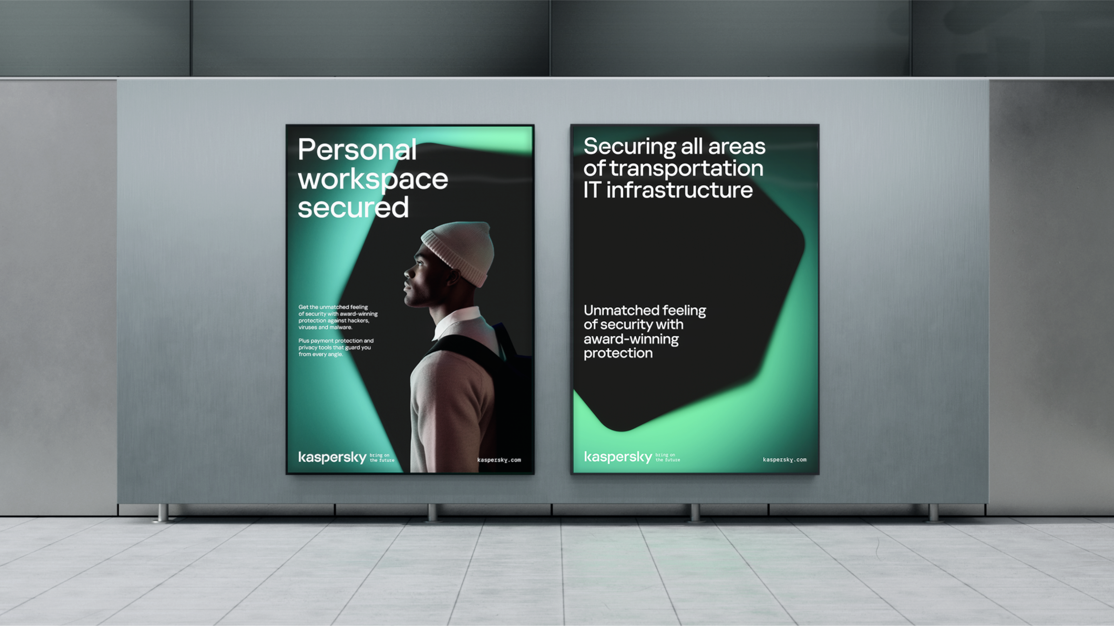
We have limited the variations for using the corporate hexagon and have formulated the usage principles in b2b and b2c: both communication types have a recognisable colour code.
We have chosen Kaspersky Display Medium as the principal font for headings, replacing ExtraBold lettering. Thus, the headlines are now more delicate, technologically advanced and readable. We have established rules for the breaks' use in the characters of the Kaspersky corporate font. This way, the number in the set can be managed easily, which helps to avoid excessive decorativeness. The "Bring on the future" slogan in the Kaspersky logo is now monospaced – to give the logotype an engineering feel.
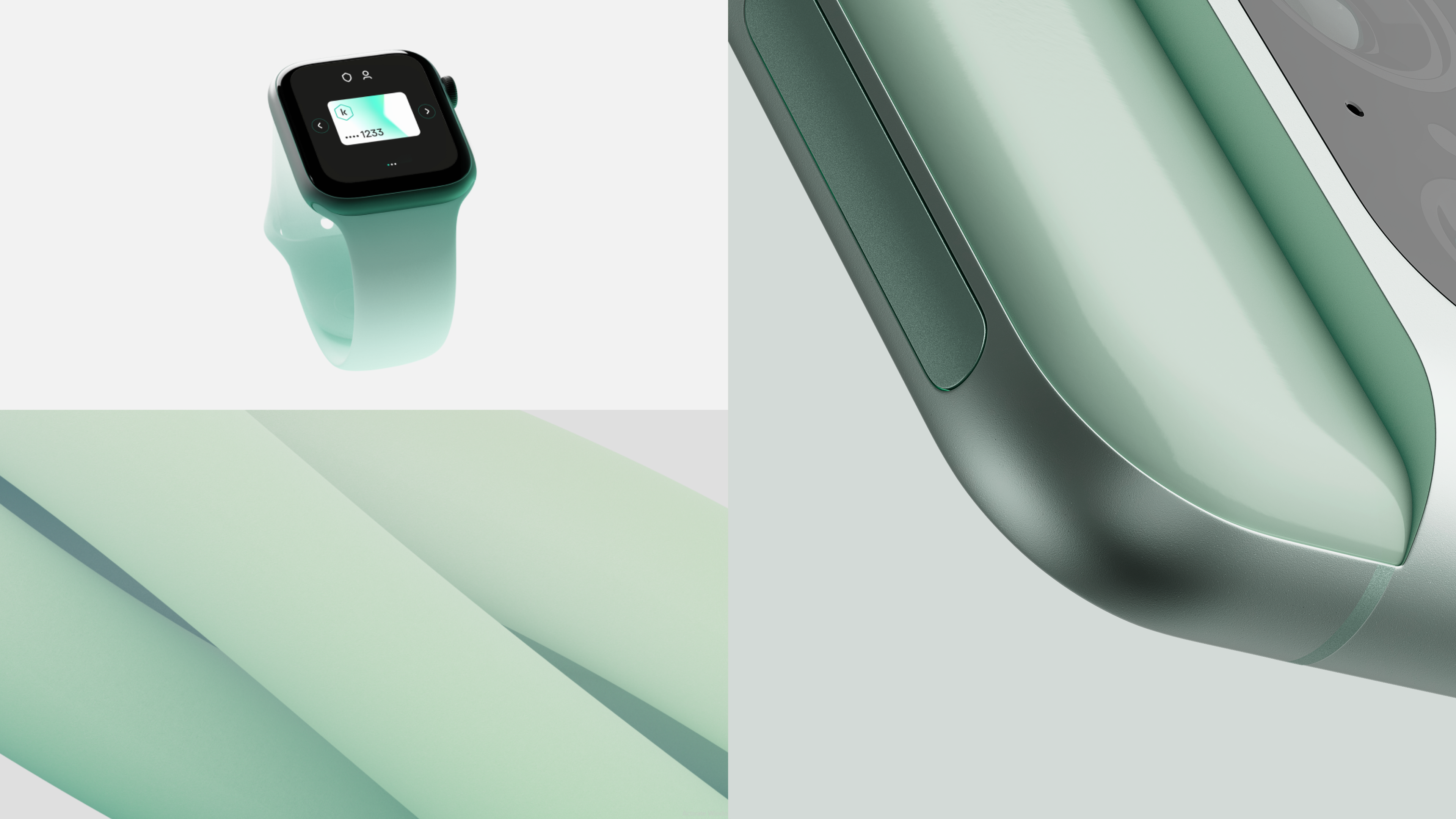
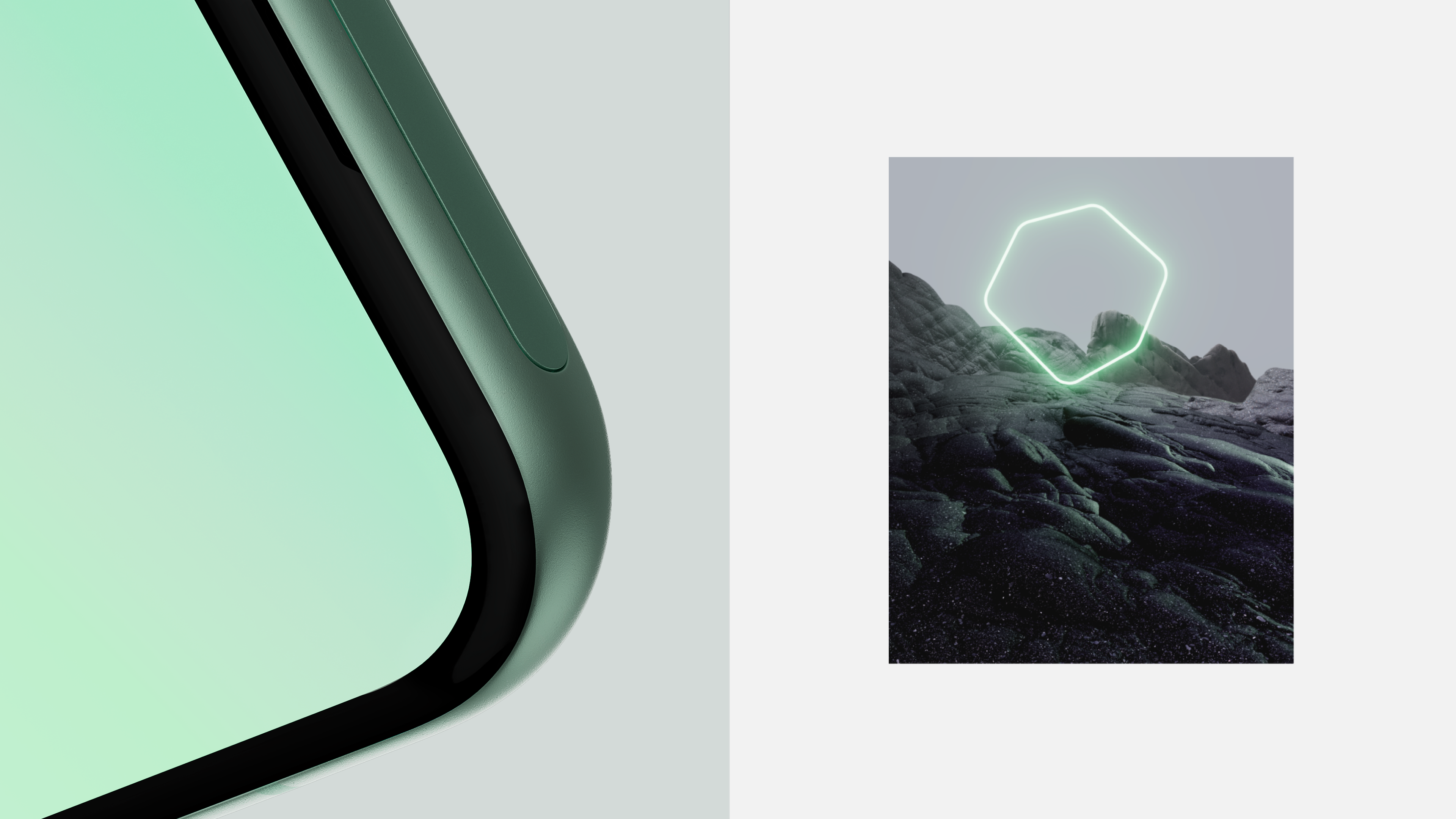
To illustrate the idea of innate cyber immunity in devices, we have come up with a recognisable solution for 3D graphics. All devices on the layout are now illuminated from the inside or placed in an illuminated safe space.
The rules of grid construction are explained in detail – to make different volumes of text, graphics and photos on the layouts look compositionally accurate. We have used the brand logo as a basis for grid construction: the letter "k" defines the margins, and the logo determines the width of the column.
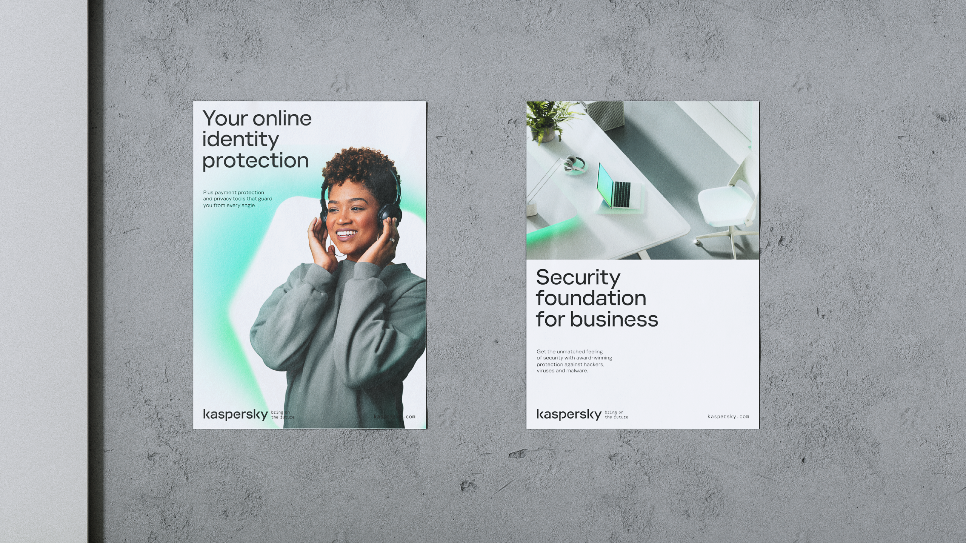
Complementary cool colours for b2b communications help to differentiate the two types of communications easily while making business-oriented layouts visually more serious and grown up.
UI explainers have been created for product communications: the sets of blocks that illustrate cases of product application in different life situations using fragments of the product.
We have developed a plugin for Figma – Kaspersky Figma AutoLayout – to simplify designers' work. It automates layout creation by selecting optimal logo and typography sizes for different formats: no more time-consuming reading of guidebooks and no more designing from scratch.
Clear rules for layout design create a more consistent brand image and make designers' work precise and easy. Kaspersky continues to evolve and now leans on more flexible and reliable branding tools.
