Russian Brand Consultancies Association. Paradigm shift
The Russian Association of Branding Companies (ABKR) represents the interests of Russian agencies domestically and abroad, helping create successful national brands. We stepped in as design partners in the development of ABKR’s new official style.
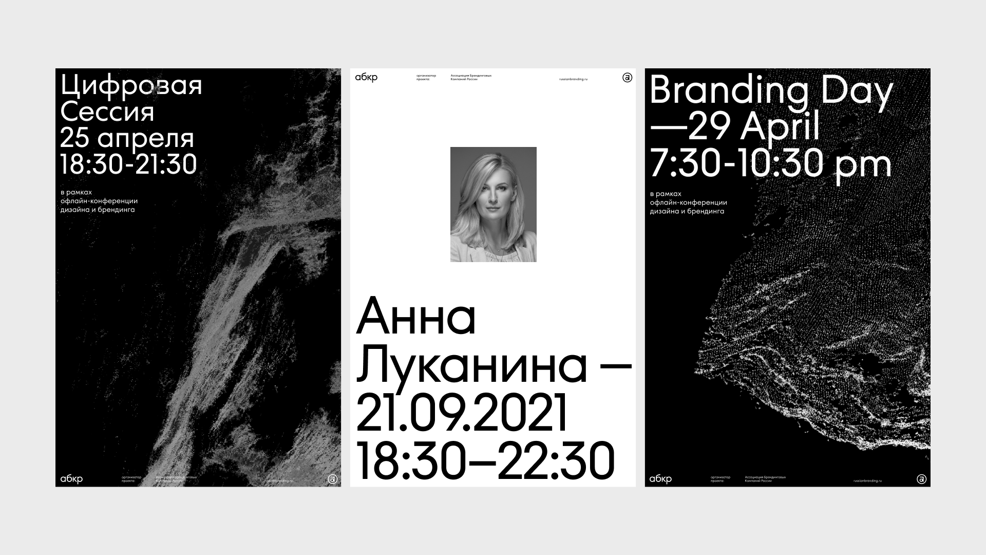
The Association’s old style was developed at the moment of its founding 12 years ago and referenced the simplest notions of “branding”: the key branding role of the logo in print and on various physical media. But brands today are flexible structures that exist in digital and offer a selection of units for creating new meanings and forms. We decided that the main challenge of rebranding the Association should be a shift of the old paradigm toward a contemporary understanding of brands. This is where we found the metaphor of digital inks that can combine to form any structure imaginable. They reflect the dynamism and interactivity of the digital space, full of constant movement and changing content.
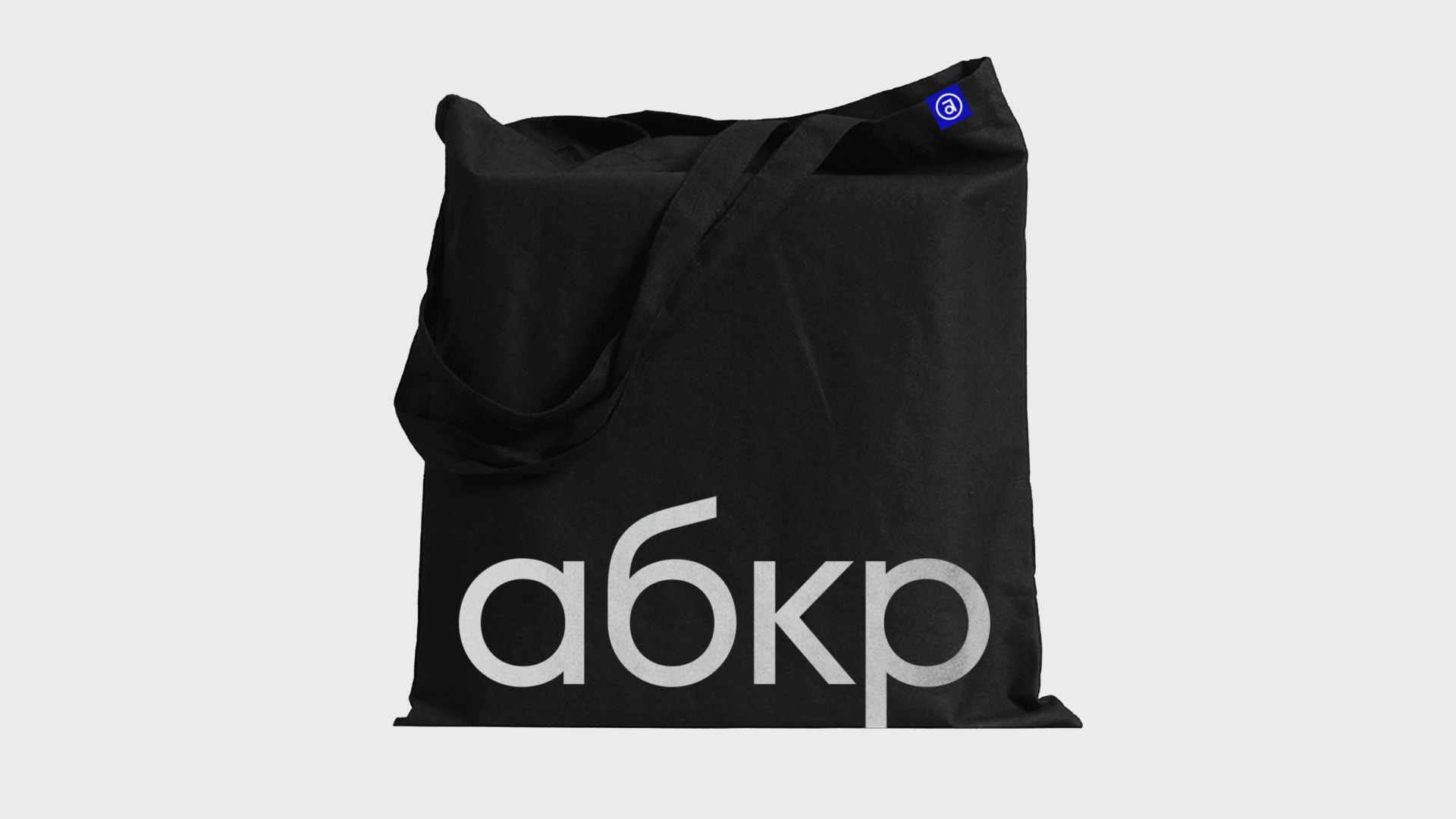
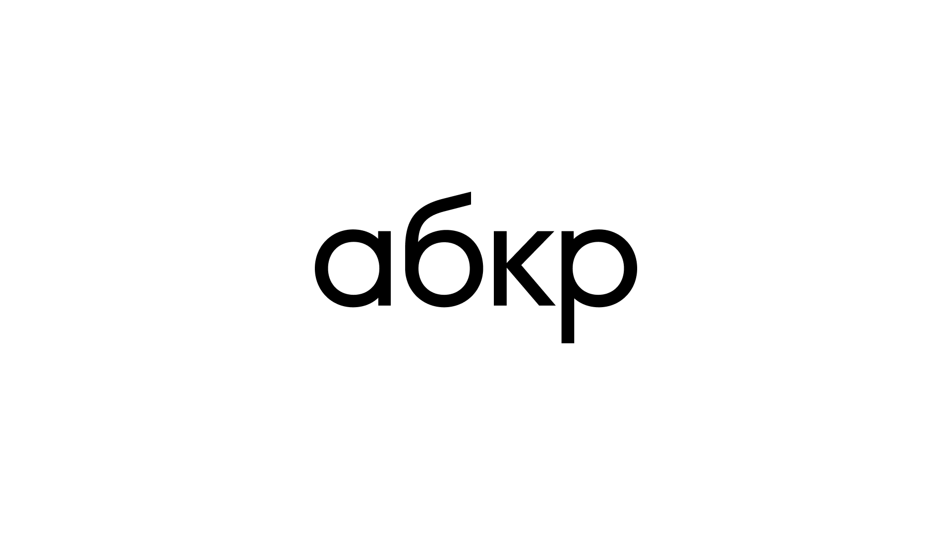
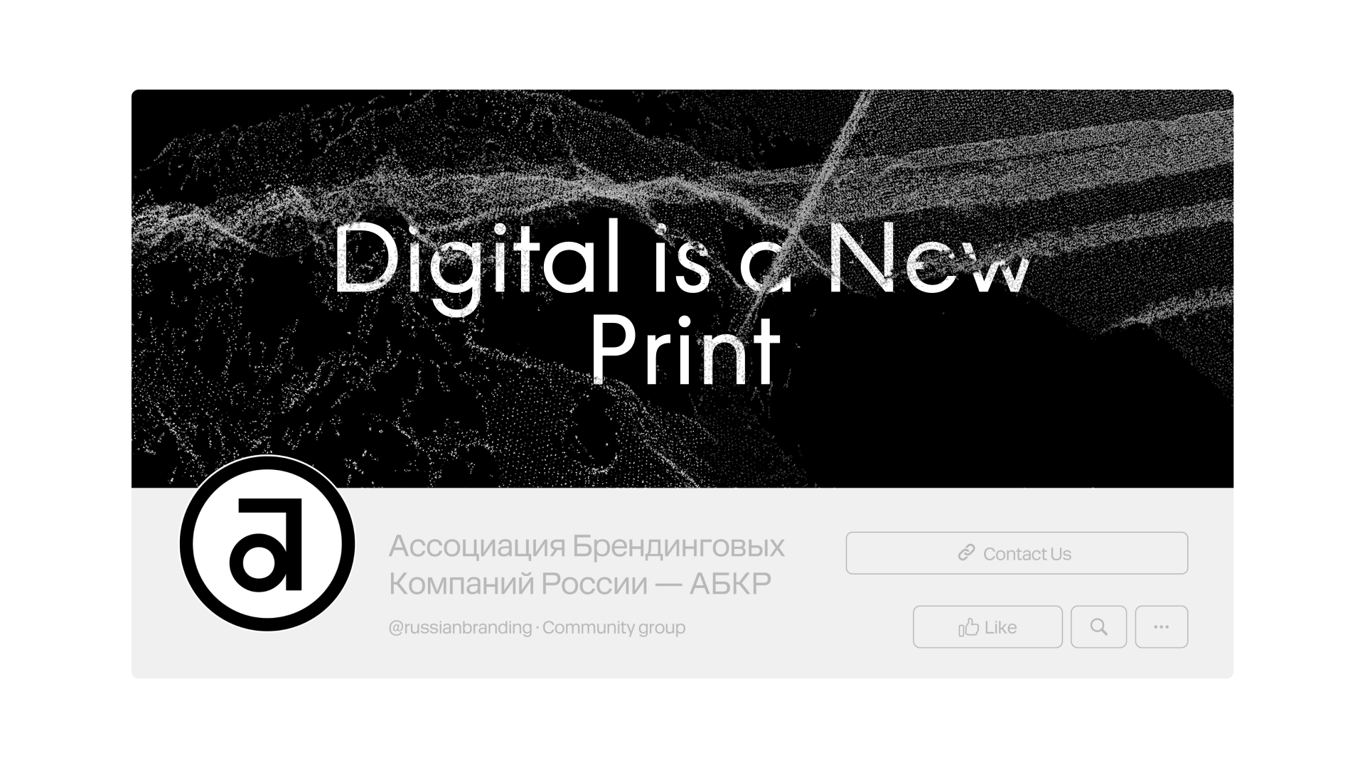
ABKR’s previous logo was like a stamp: the Cyrillic letters A and B within a circle. Its composition reminded us of the first sketches by German designer Paul Renner with experimental geometric shapes as a symbol of pure design and aesthetics. Since ABKR exists in the context of branding and advanced visual culture, we took Renner’s symbol as a launchpad and added some nuances of our own while maintaining its recognizability.

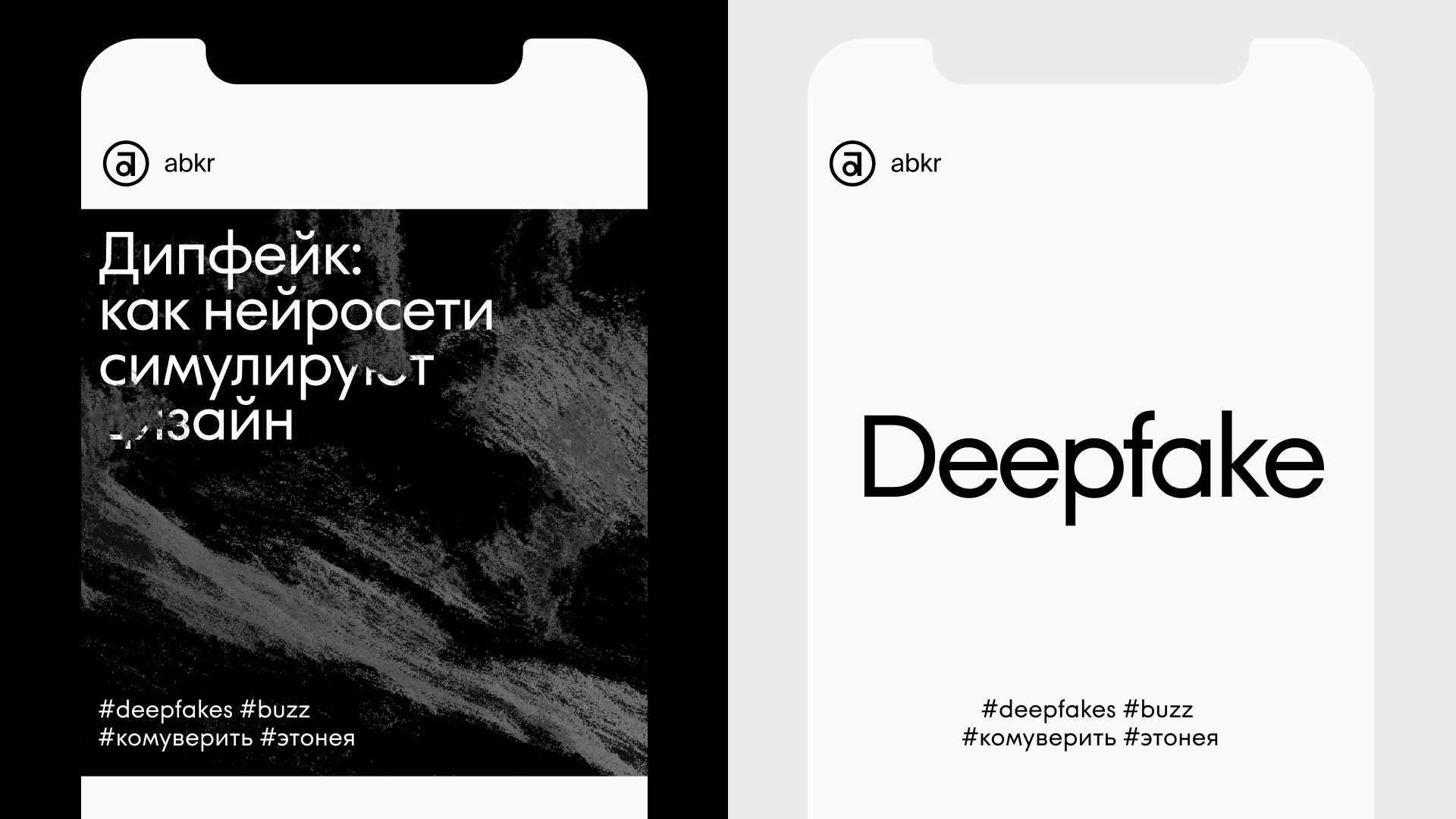
At the root of the dynamics for the official font, developed especially for the project, we also retained the simple shapes and ovals of the letters featured in the original monogram. The vertical typesetting and movable loops set a good rhythm that creates a unique, living format that works well with the Cyrillic alphabet. The font added decorative details that offered a fresh reading of time-tested outlines.
We created a detailed guide for ABKR that detailed the frequency with which alternative letter shapes can be used, in order to maintain some restraint in the text. Now the font can change how expressive it is based on its context: from safe and clear for the government officials with whom the Association frequently works to a more aesthetic and attractive form for the creative industry.
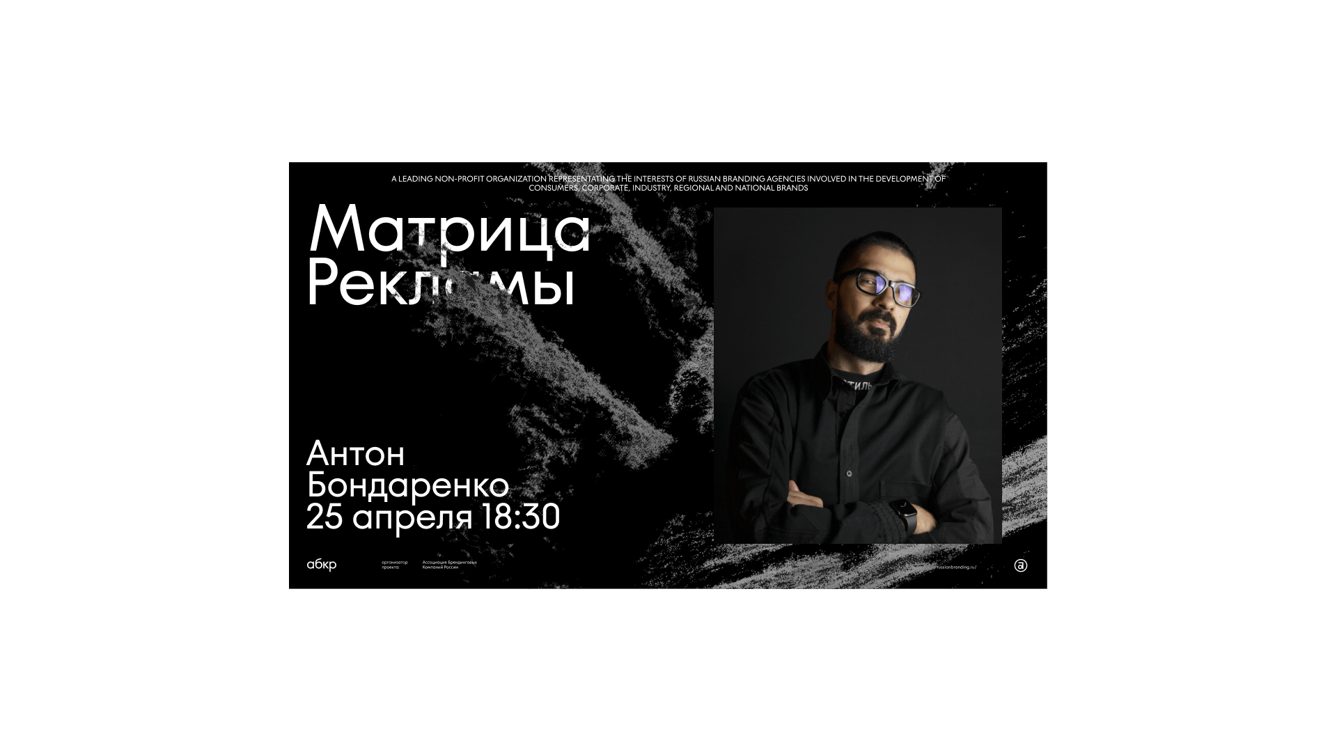
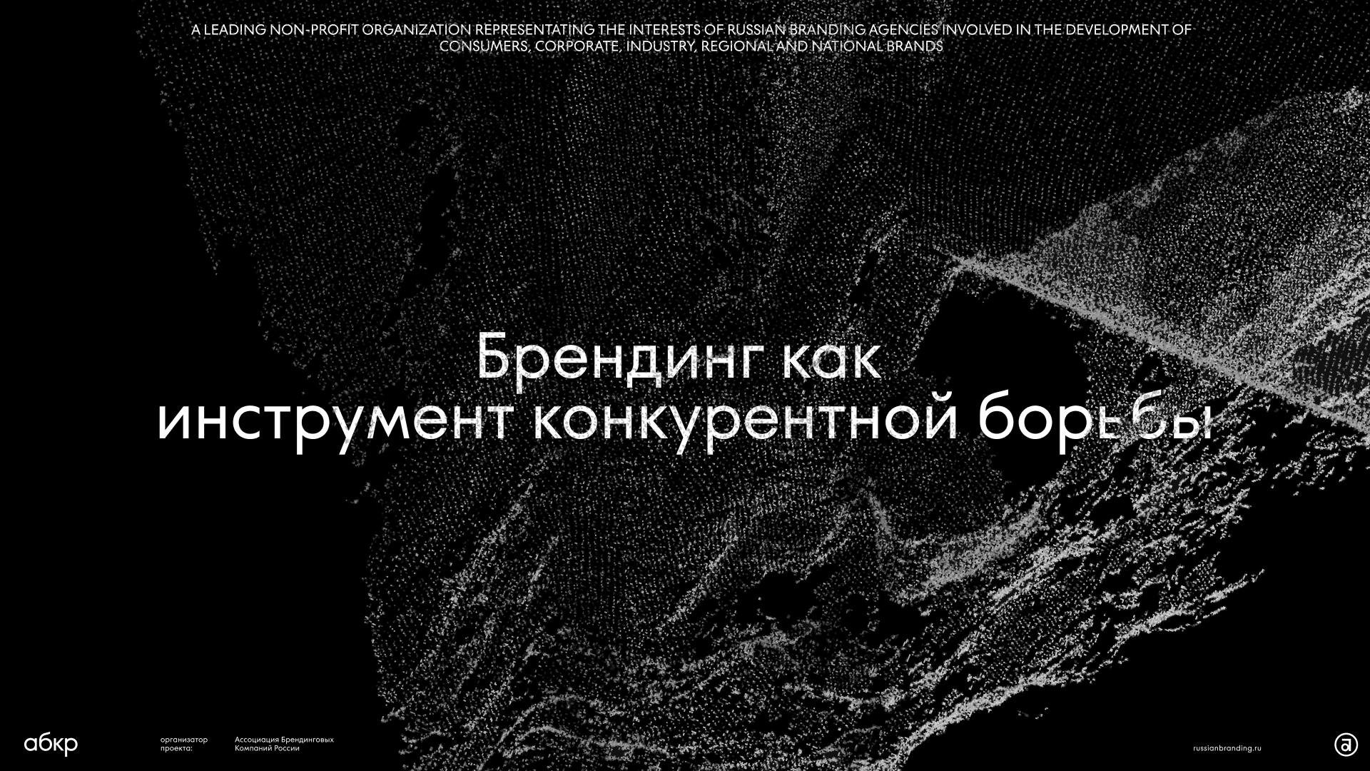
The graphics of the digital space, established using dots, can shift to fit any visual context, giving the style endless possibilities to coexist in collaboration with other brands while maintaining its visual language. The graphics can serve as a background with abstract imagery or the foundation for specific objects like logos, signatures and recognizable symbols. This looks like a reflection of the brand’s opinion on the company with which it interacts in communication materials.
On the one hand, ABKR is an institution that works with the government and major corporations, but on the other, it is also an important representative of the design industry. ONY created an official style that communicates its creative codes while maintaining the necessary restraint and precision.