ATTACK. The power of words
ATTACK Communication Agency (previously known as А-ТАК) was founded in 2008 to realize PR projects for venture funds, tech companies and IT startups. Over 10 years, the agency has earned the trust of major clients both in Russia and abroad, and won a series of professional awards. In early 2017, the founders of A-TAK were some of the first to launch a blockchain project division. As it turned 10, the agency decided to make a bold move by changing its name and undergoing a rebranding. Its original name contained a creative concept that in part answered the question, “How about this?” The new name, ATTACK, preserved the phonetic form but made it more understandable for the international market.
The craft of PR lies in the virtuosic use of information and the creation of new values and meaning through words. Professional know-how, knowledge of the tech market and the boldness to break into new fields are all things coded into the company’s DNA, all of which need to be passed on to future clients and partners using visual communication.
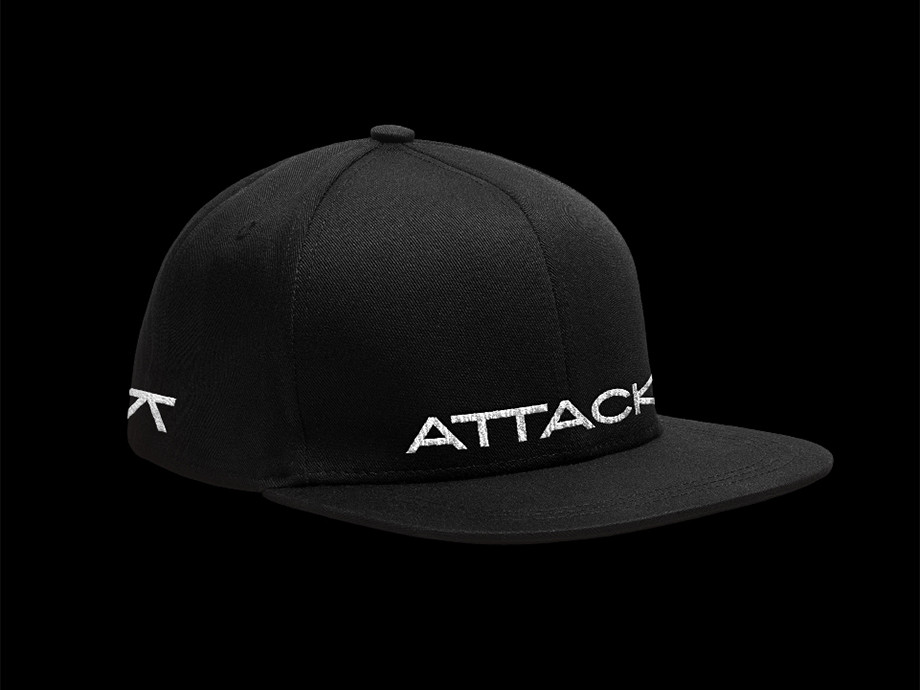
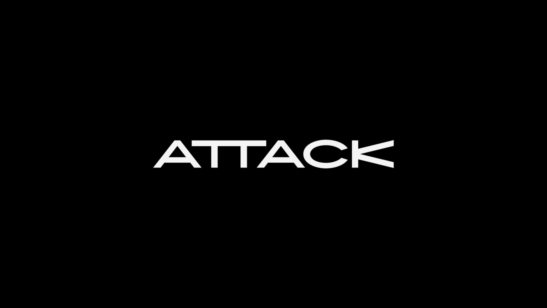
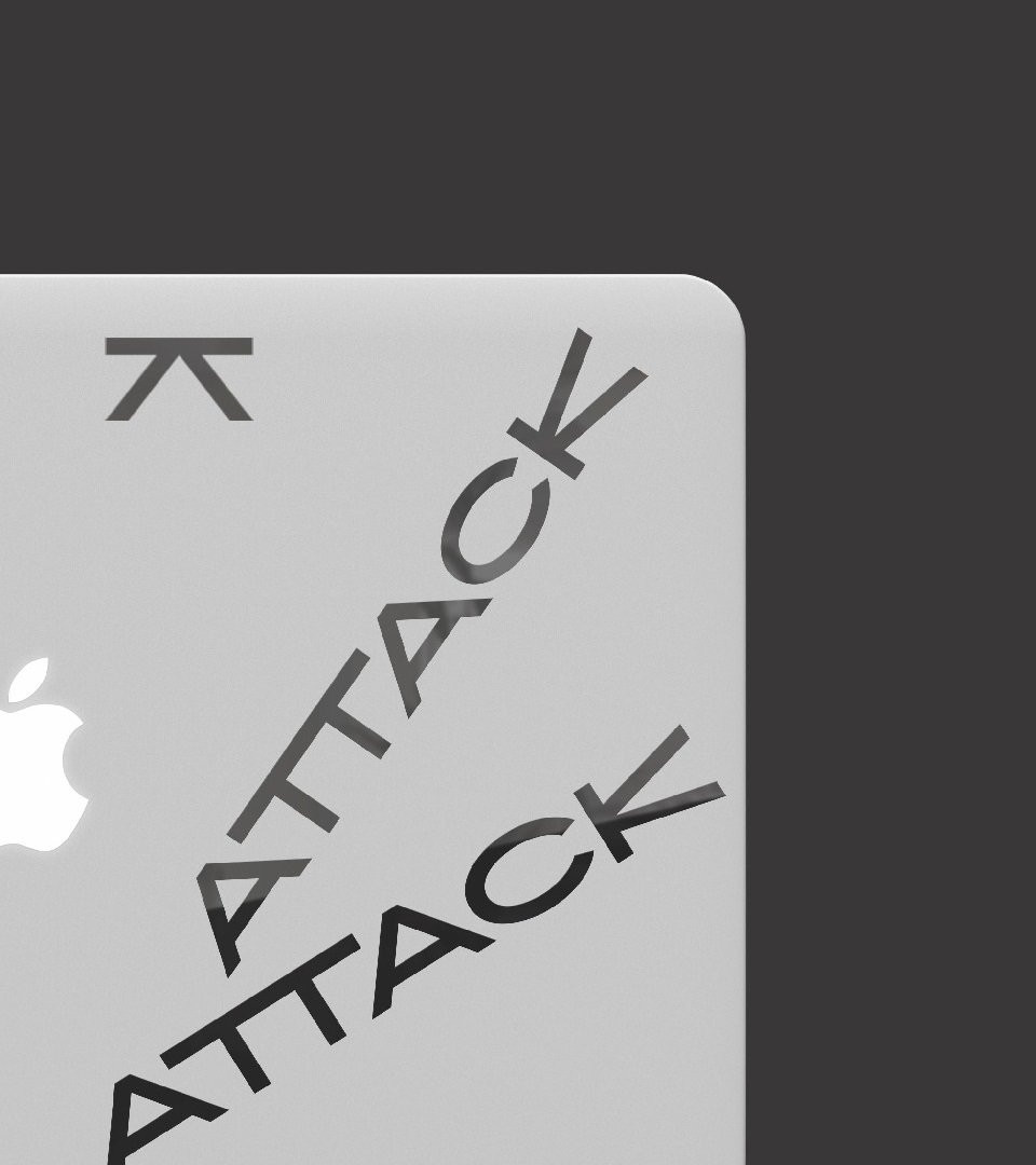
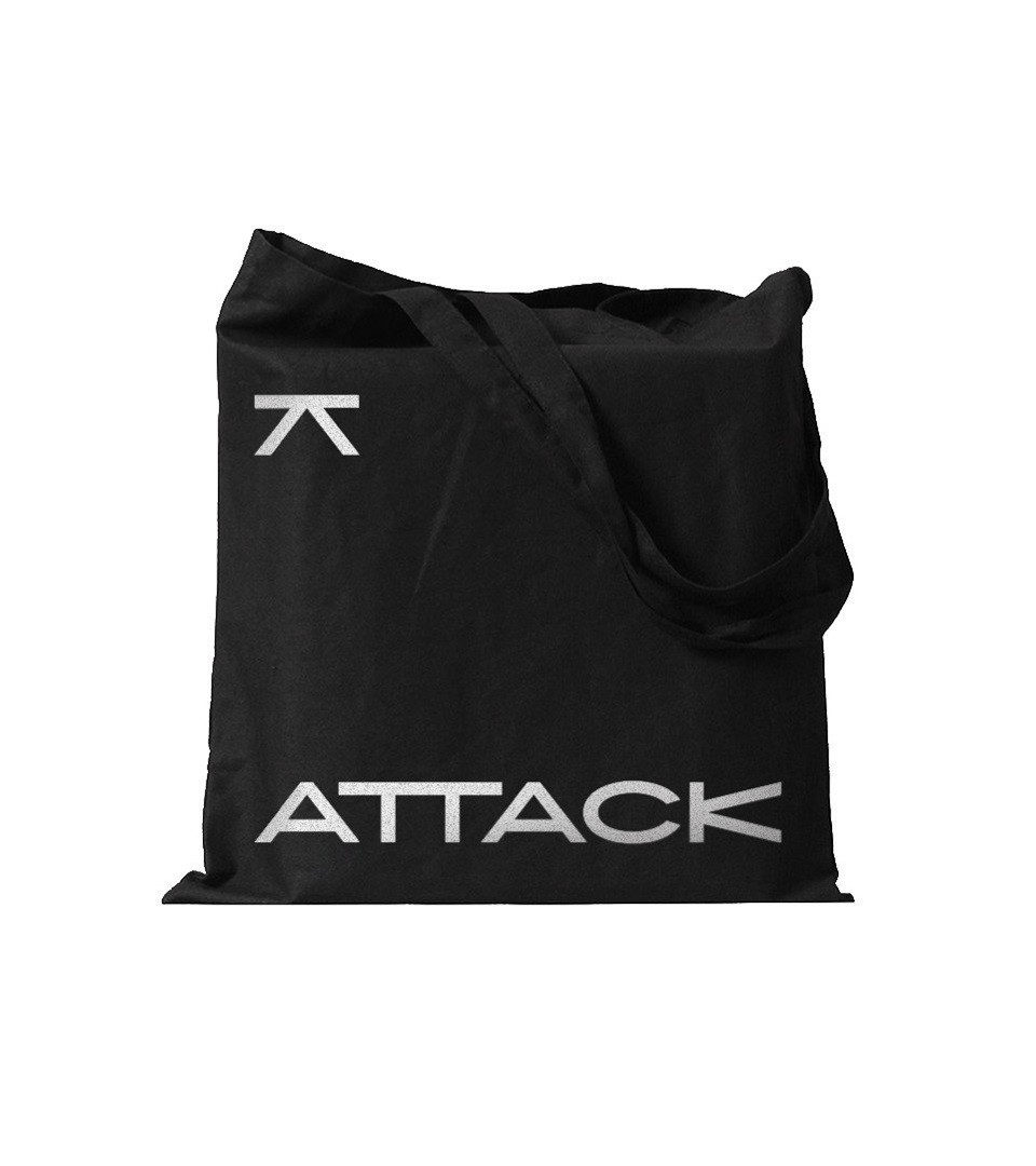
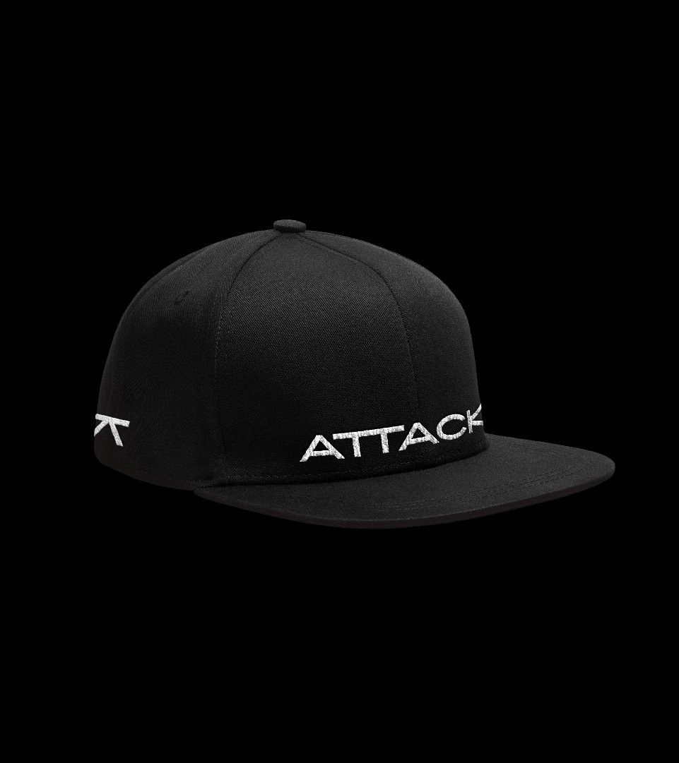
In creating a symbol for ATTACK, we tried to come up with a memorable and meaningful form. The АТТАСК logo is an original drawing with characteristic details. The radically wide proportions and minimal reverse contract create a special visual rhythm. The lettering looks unusual, bold and contemporary. The combination of hard forms and atypical proportions makes the company’s visual image tough and expressive. The reverse contrast accents the brand’s character, while non-standard characters attract attention by standing out from anything that you might have seen before.
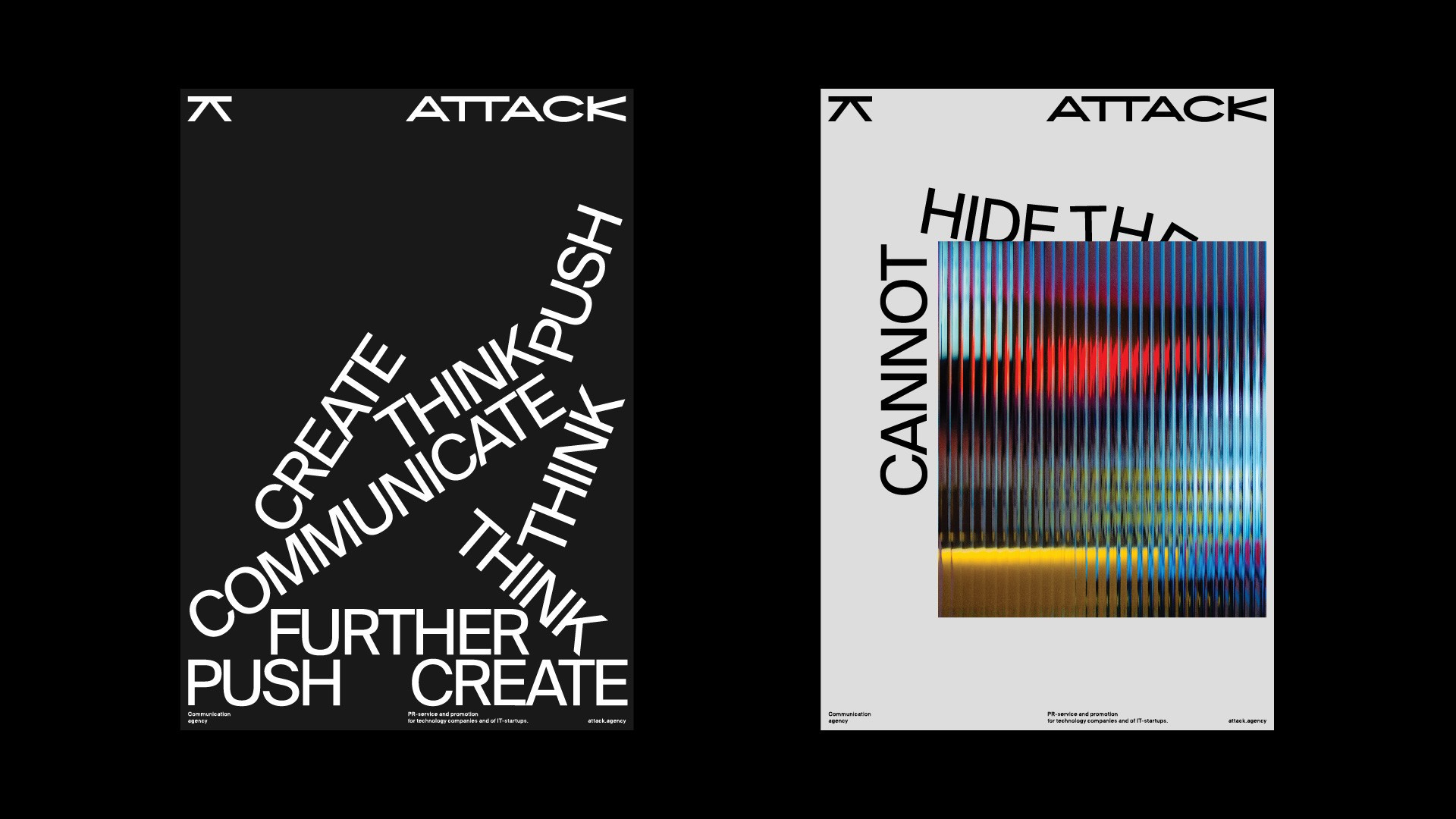
The main font is kept in a neutral and informative style. A contemporary reincarnation of the popular Helvetica is intended to draw attention not to form, but to content: specifically, to the brand’s typographical solutions and the situations where they’re used.
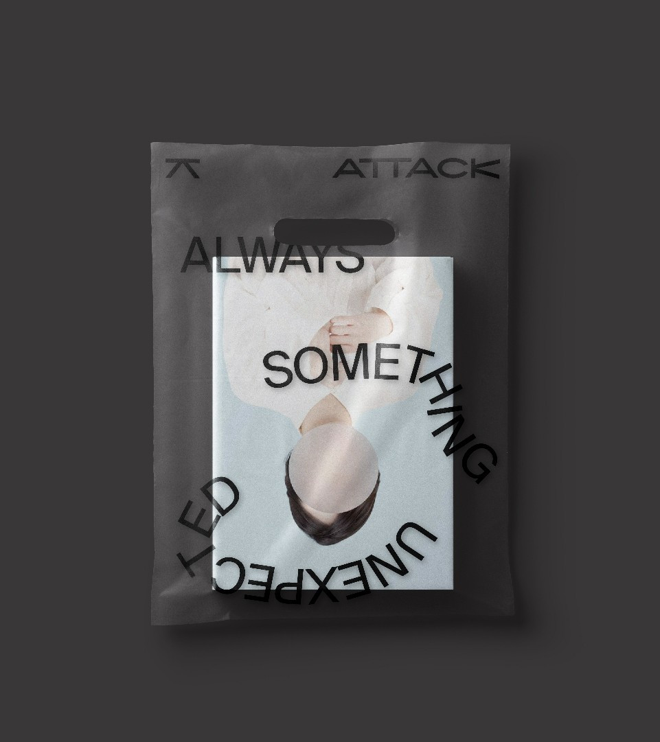
We gave all the components of this style the opportunity to show their stuff, letting them demonstrate flexibility and ability to interact. Words come alive: they can fly, fall or even play ping-pong, reflecting the boldness and willingness to break out of the box characteristic of ATTACK. The use of narrative typography enhances the company’s impression, and everything taken together literally illustrates their work in the communications field.
On the one hand, this identity turned out to be hip and relevant, while still demonstrating the agency’s experience and inspiring confidence by playing to the contract between modernity and tradition, and between style and technology.
