Avito. Here, people decide
Avito is the largest private classifieds service in Russia, helping people get good deals from buying a used printer to renting apartments or finding work. It is simultaneously a powerful tech product and a large community of frequent users. The Avito team liked their existing branding and its recognizability, but they still got the feeling that all of their existing tools had been exhausted. Our task was to develop the style and find new tricks to freshen it while keeping the logo and signature colors the same.
Before we began the brunt of the work, we conducted a major design audit, analyzing all of the visual materials of the brand over several years alongside about a dozen interviews with the company’s marketing, product and design teams. It was important for us to find the strong and weak points of the existing system, figure out which difficulties arise in the course of working with the current guides and understand what was missing from the current product. As a result of this research, we made an exhaustive presentation in which we analyzed the existing tools and laid out criteria for the subsequent changes.
First of all, the style had to remain recognizable: the service has an enormous user base that had to be preserved. Secondly, the system had to work equally well in all channels: static banners, video clips and corporate materials. In addition, we strove to increase the speed at which new layouts could be created: the style shouldn’t complicate workflow for the company’s designers as they create dozens of advertisements a day for different formats. Finally, we wanted to create an image that would be recognizable without the Avito logo.
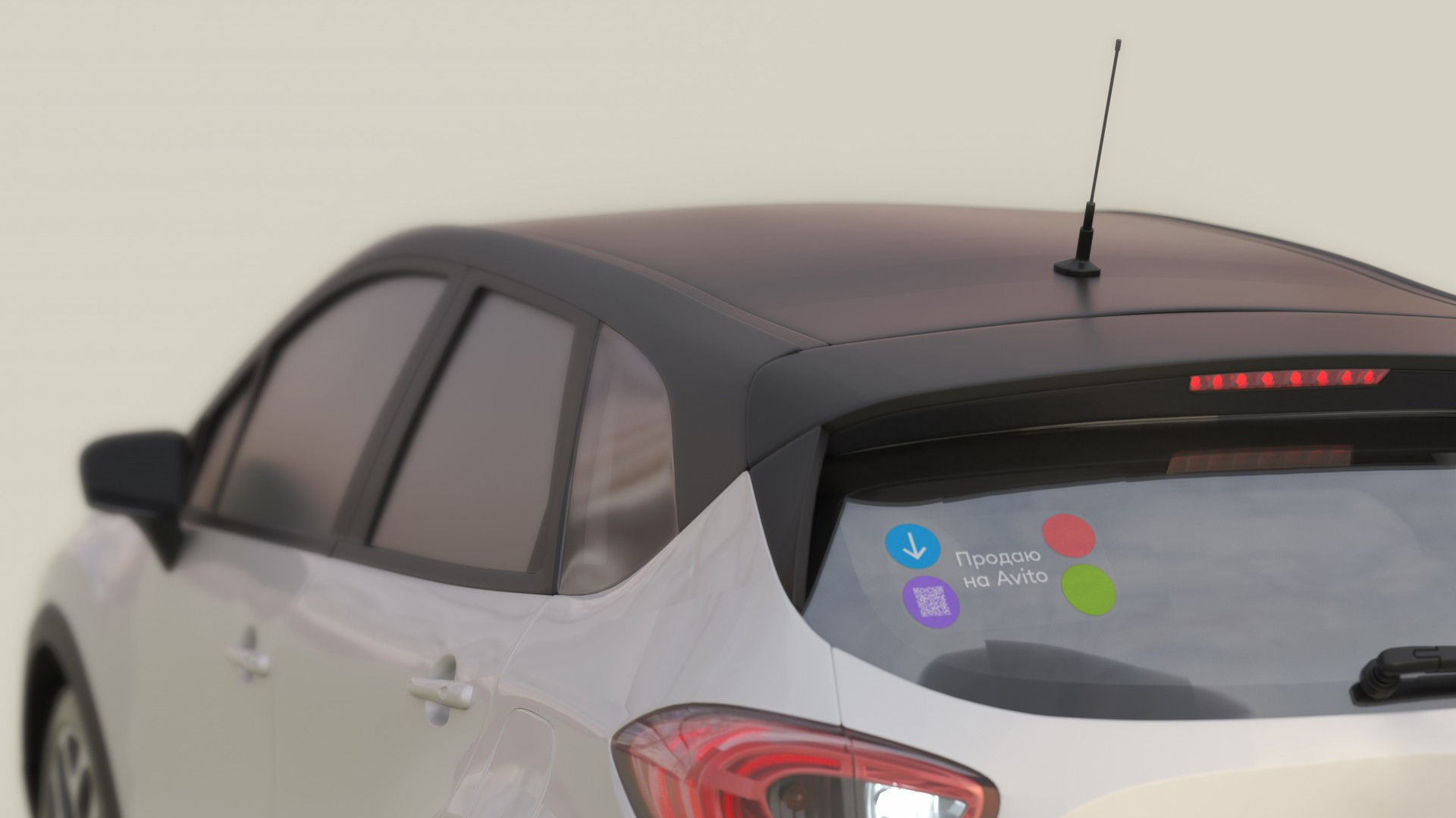
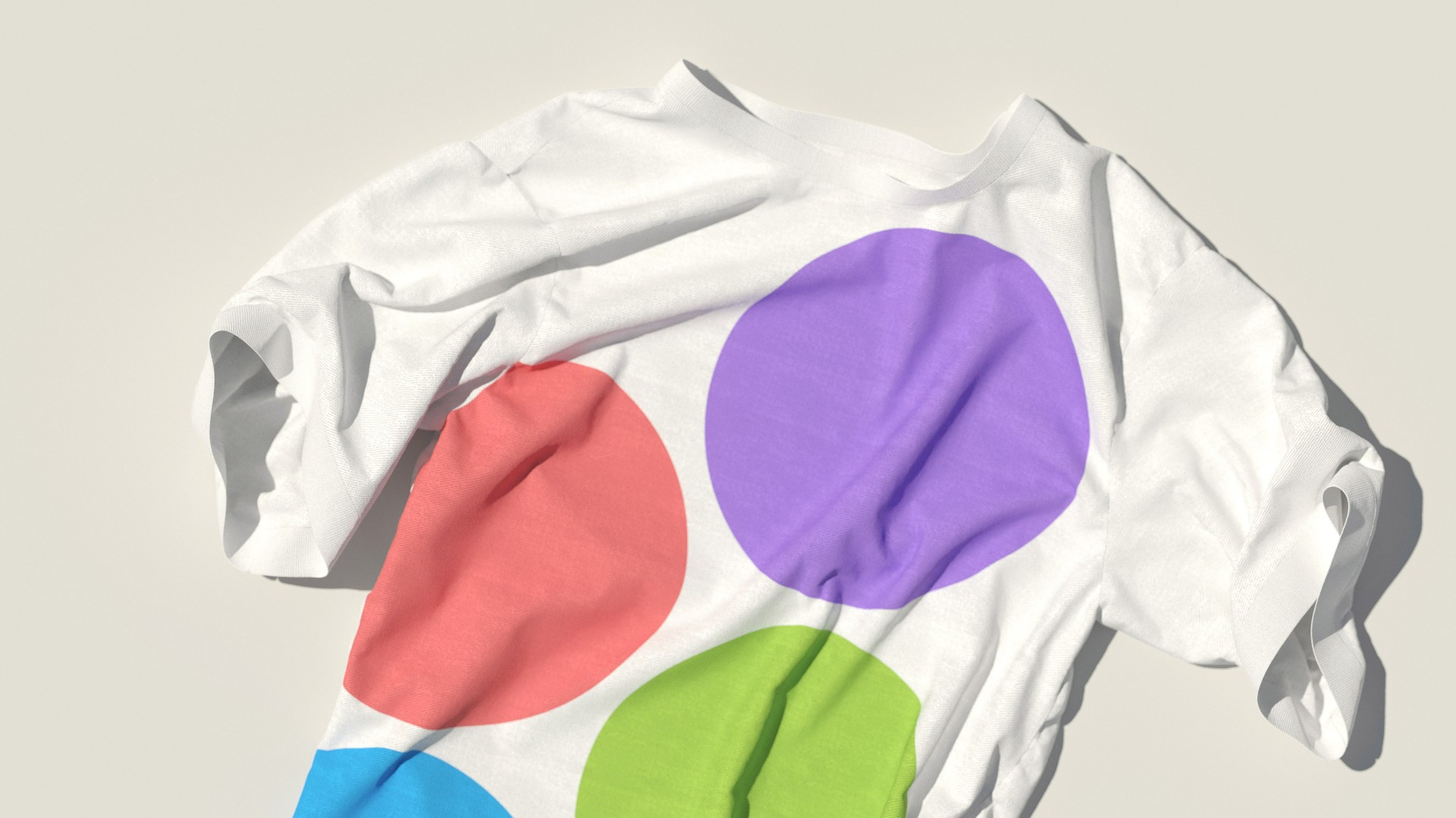
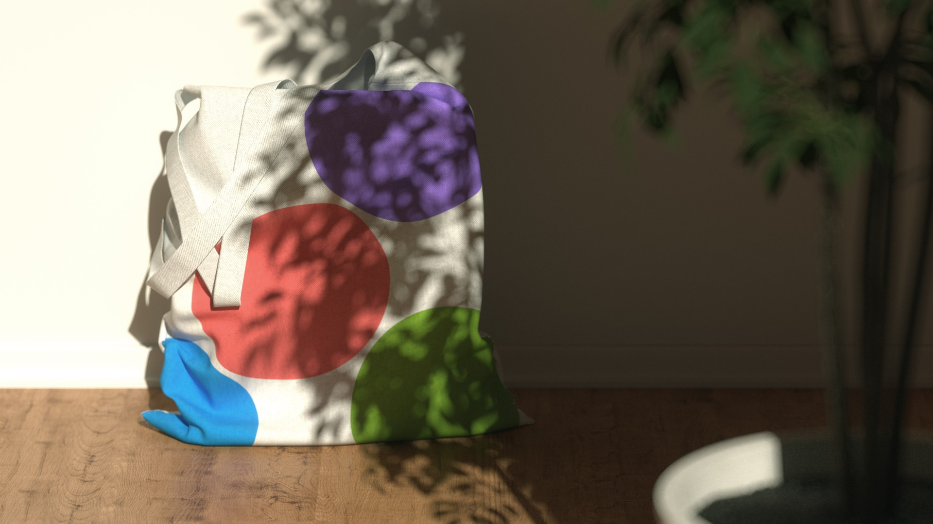
The concept for the updated style was built on the classic form of a notification board: the signature circles turn into pits and attach pictures to different formats. Avito is all about the people, without whom the service’s work is meaningless. That’s why we looked for a way to demonstrate its humanity. We added a faint beige to Avito’s four main colors, giving layouts a sense of intimacy and personality while making the signature colors look fresh and cozy all at once.
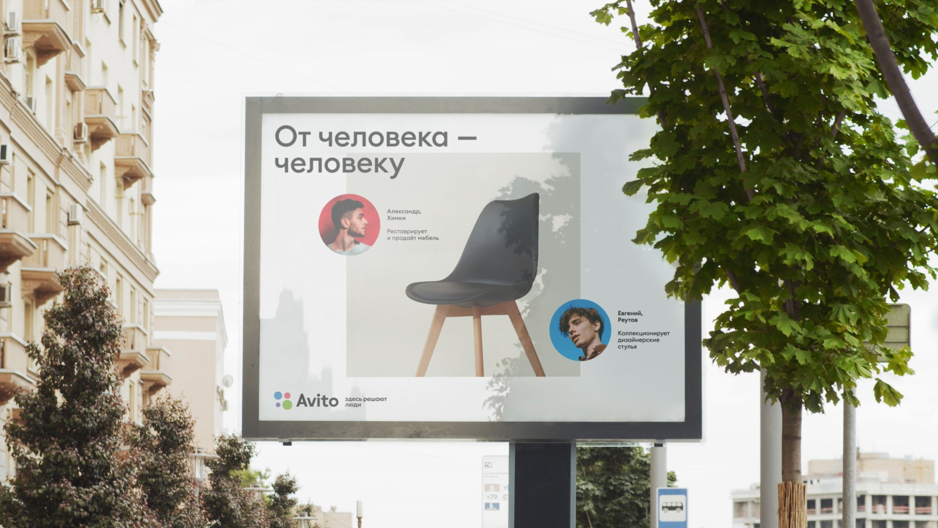
When there’s already a minimum of four colors in a design, it becomes fairly noisy by default and all of the compositional solutions should work to organize and relax the composition. That’s why in the new concept, the circles always form a rectangle, and only one of them can move to the side. This gives rise to numerous variations for their behavior, which is important for creating animated banners.
Another task ahead of us was creating guidelines for the company’s photo style. Avito often films real buyers and sellers from its community. It’s a very strong decision, and we wanted to underline the realness of these photos to make sure that they wouldn’t look like stock photos. We accomplished this using warm colors, complementary lighting and natural poses, haircuts and makeup. We also recommended avoiding white studio backgrounds in favor of settings that are more organic for these people, all while maintaining the right amount of negative space in the design.
Thanks to its technological prowess, Avito was able to test our solutions immediately. We were able to relaunch Avito’s style together with their marketing team without introducing significant changes. Now the company’s designers have new tools that help put people in the center of all their communications, giving a nod to all those people without whom the service couldn’t possibly exist.
