AZ Museum Shop. A love for art in every single object
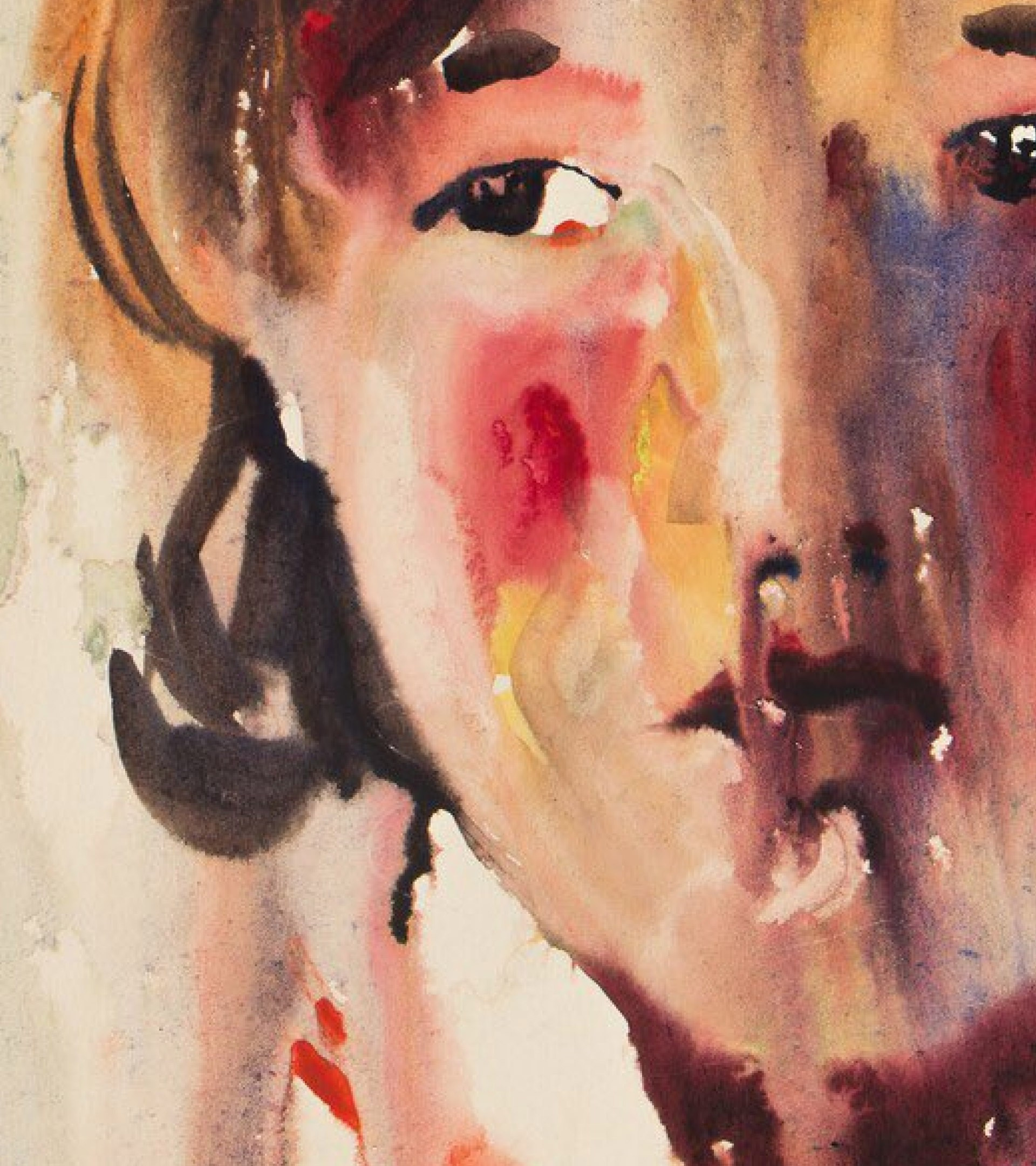
AZ Museum is a private museum in the center of Moscow, named after the initials of legendary Soviet avant-garde artist Anatoly Zverev. «Our best sketcher» — or the «Russian Van Gogh», as he was alternately called—went against the system, painting and drawing with anything that came to hand and wherever inspiration struck, turning his entire life into a creative act. Zverev’s style, openness to everything new, conceptual strength and ultra-contemporary perspective all factored into our design for the museum’s new style guide and website, and we didn’t forget them as we set to work on their new online store.
During the pandemic, the museum began to develop their online sales platform, but the small storefront on the site wasn’t enough to support this. We had to create a clear, concise catalog of all their products and make the store attractive, subtle and functional while preserving the brand’s visual style and links to the main site.

The client told us that the average visitor to their site is very loyal to the museum but rarely knows in advance what they want when they wind up in the web shop. We built a navigation system and page structure that would help users choose. Thanks to a convenient navigation system, they can quickly flip through the catalog, while a recommendation system based on a series of parameters holds their interest for an extended period of time.
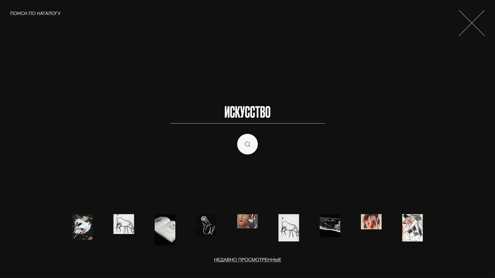
With our design, we tried to accent the style of the products on sale, rather than overshadowing them. All of the museum’s products had already been photographed, so we proposed a universal product card solution that can highlight photos of any format and quality. For online stores, functionality is the most important quality of all, so we eliminated the decorative details on the museum’s main site. They were replaced by small functional elements that make the user experience simpler and more streamlined. We focused in particular on font, shape and color contrast.
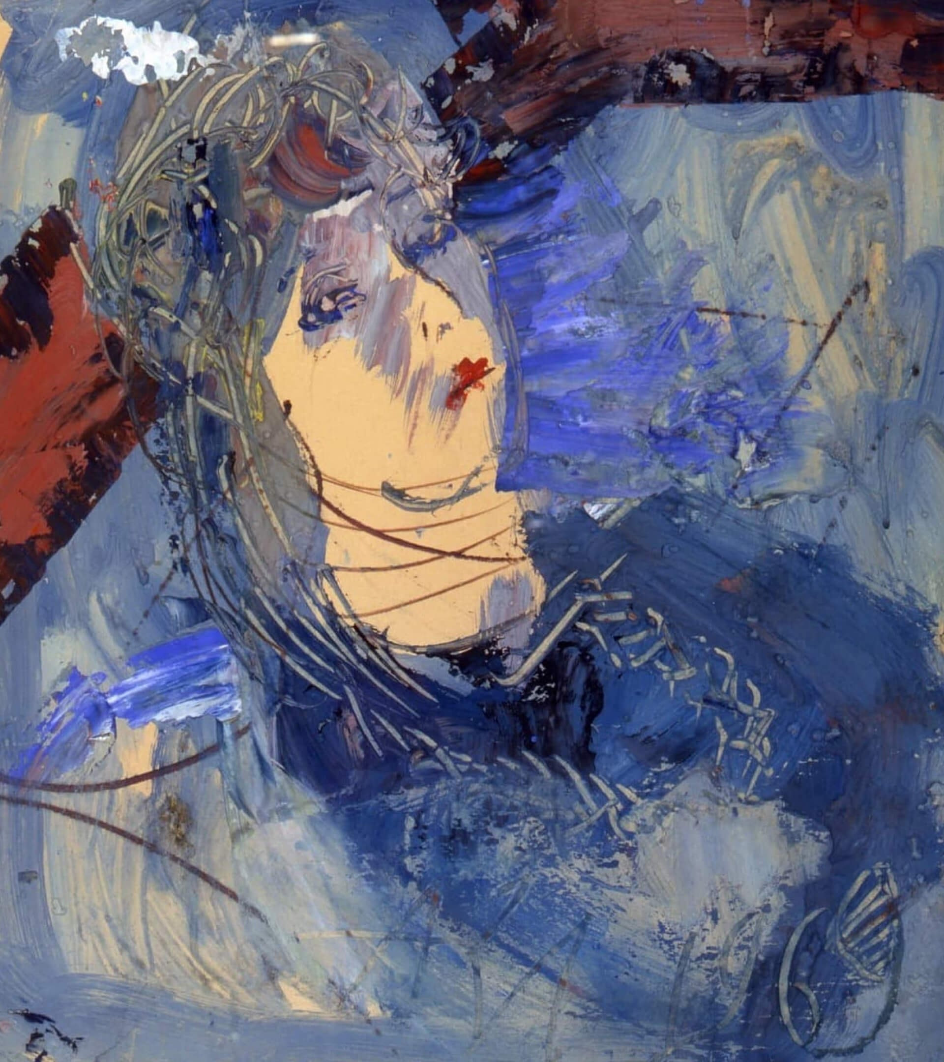
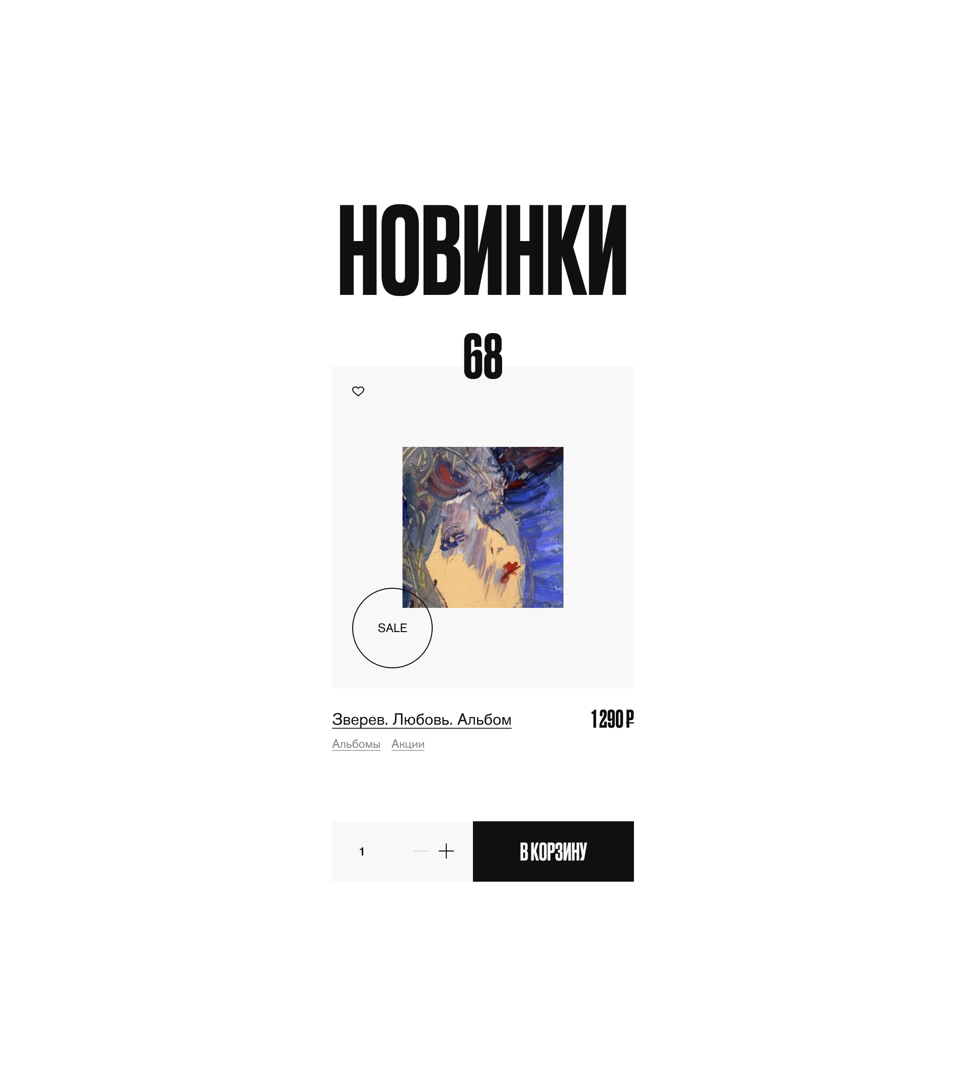
In creating this site, we wanted to achieve the maximum possible comfort level for both users and the museum’s team. We developed a custom admin page and internal interface. Due to the nuances of working with a museum store that sells products of different shapes, colors and sizes—books in various languages, postcards and other kinds of souvenirs—we developed separate modules that simplifying the process of adding content and the system’s functionality in general. For convenience’s sake, we combined the cart, user profiles and favorites, putting everything into a single user control panel. This transition from the general to the personal is accented through contrast: the site uses a light theme for all users, then transitions to a darker theme during the purchase process.
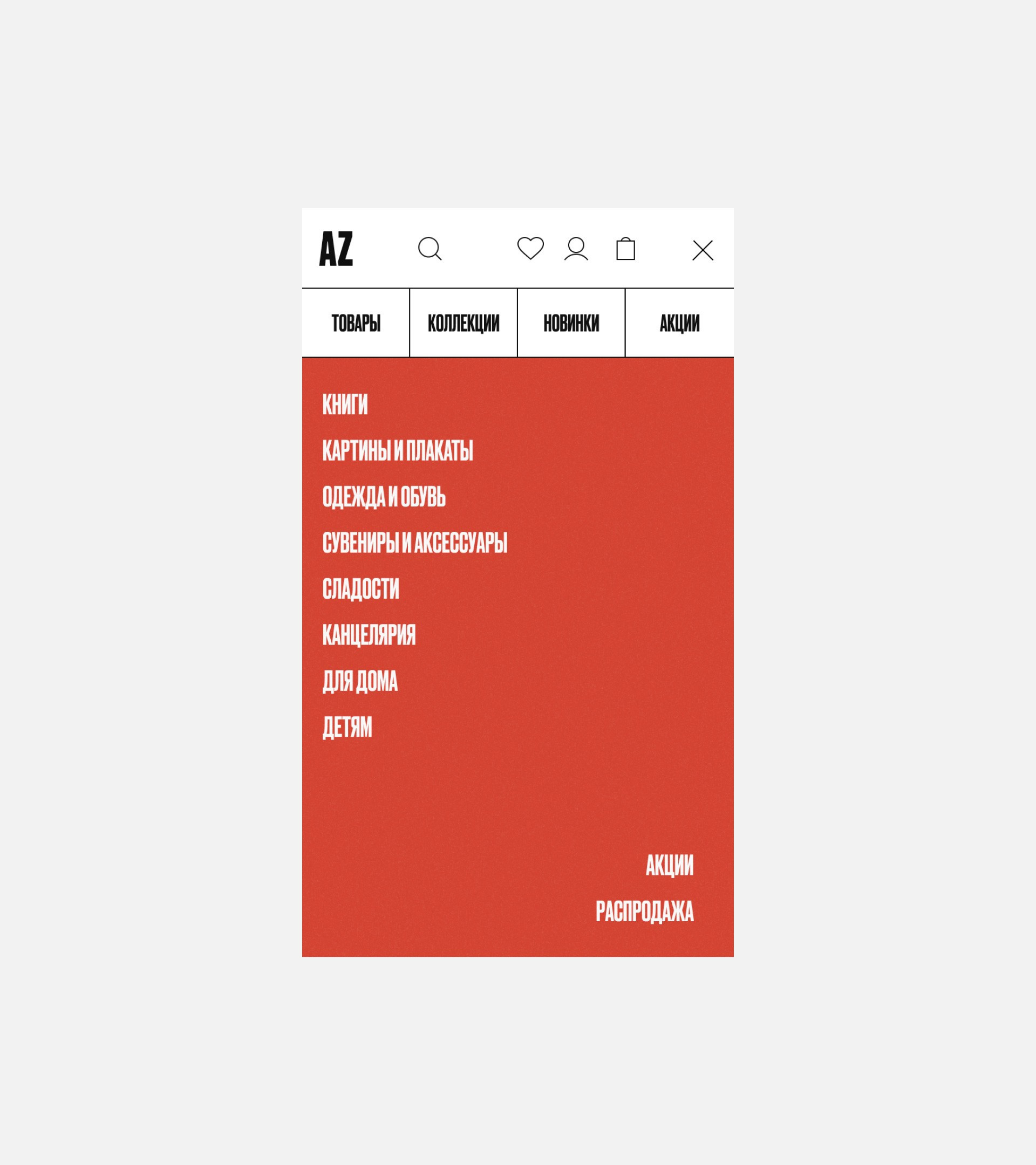
The AZ Museum staff is made up of open-minded, friendly people who live by the philosophy that every visitor deserves their attention and respect. We made an online store that embodies these values, all while being convenient, subtle and informative.