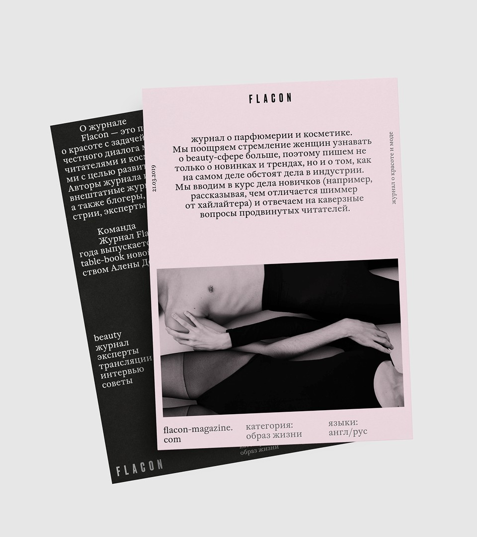
Flacon Magazine. All about beauty
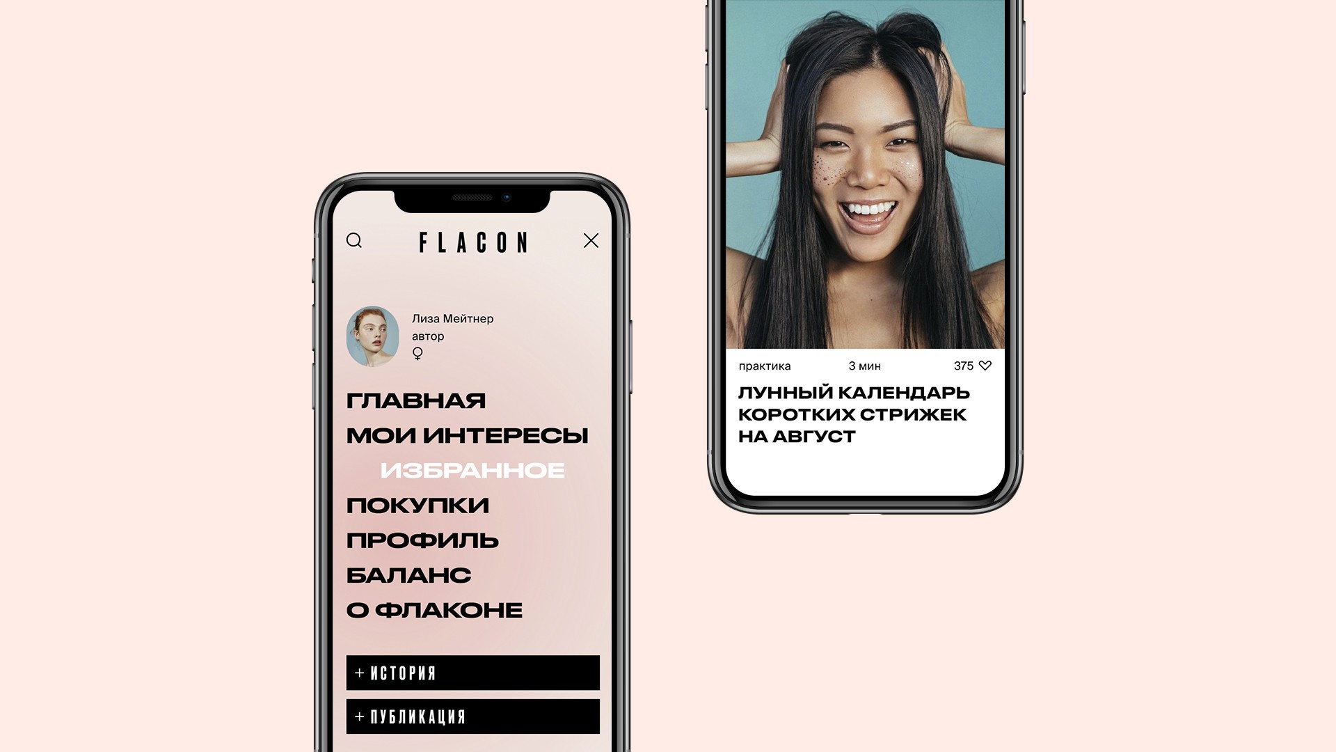
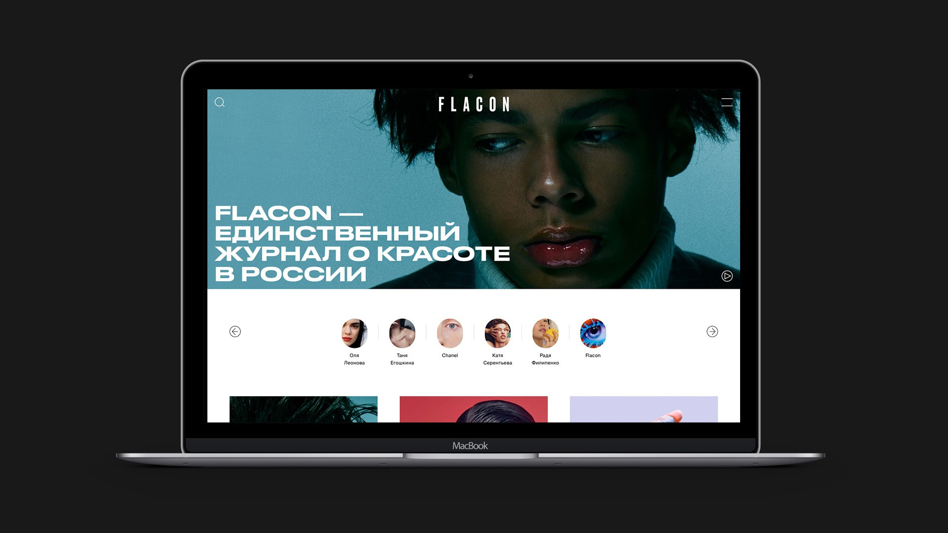
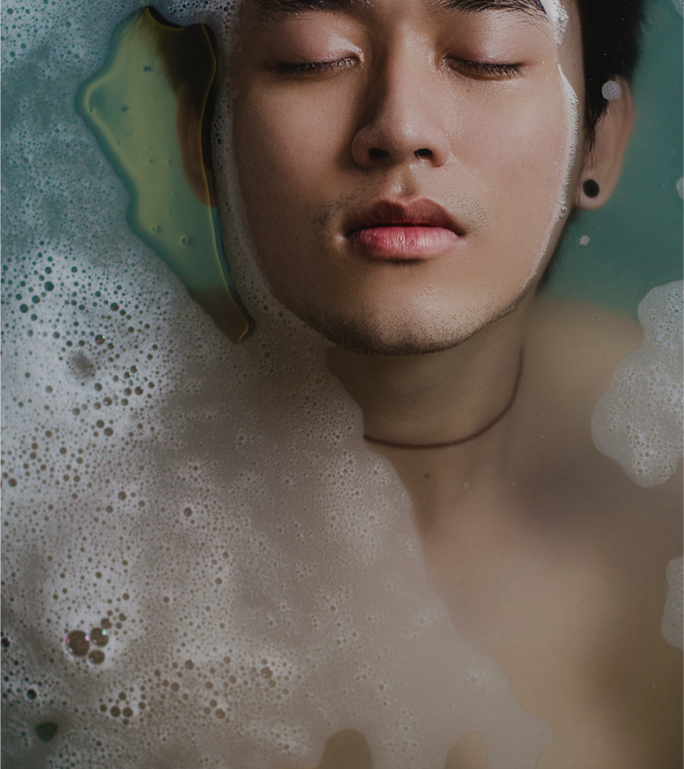
In the fall of 2018, the new Flacon magazine team, led by Alyona Doletskaya, decided on global changes in positioning and a partial transition to digital. Now Flacon is a real centre of the beauty industry in Russia, uniting bloggers, fashion adepts, content consumers and beauty brands and all of them speaks about beauty in all its manifestations. The changes have either touched the visual content of the magazine. The bold and unusual for our market shootings full of non-standard concepts, rich colours, lack of a gender framework, interesting presentation forms and not perfectly licked pictures can be found on the pages of today’s Flacon.
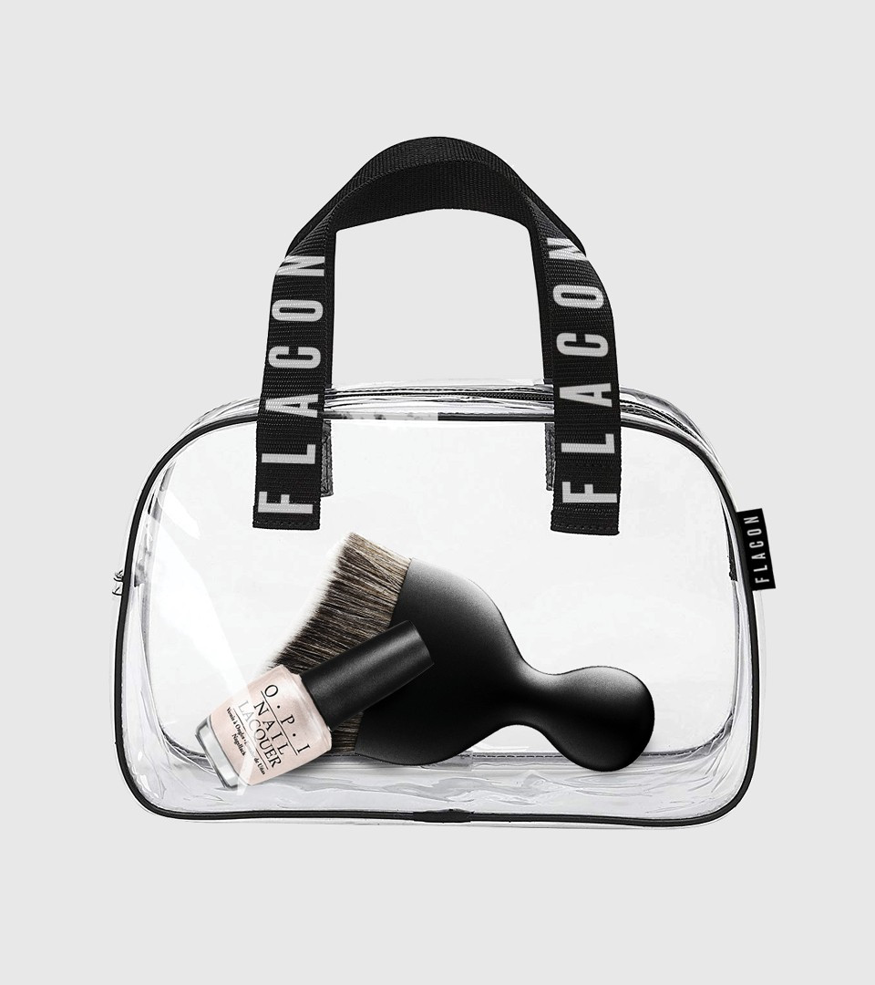
Our task was to develop the design concept of the magazine which would complement and promote the new content. Testing cosmetics is an inspiring process itself. When a makeup artist experiments with textures or looks for that perfect colour by waving a brush you can find so many visual techniques that are perfect for styling a beauty magazine. Testing provides variability and the ability to mix colours and create new combinations. This concept can manifest itself in the form of unusual compositions and mixture of typefaces.
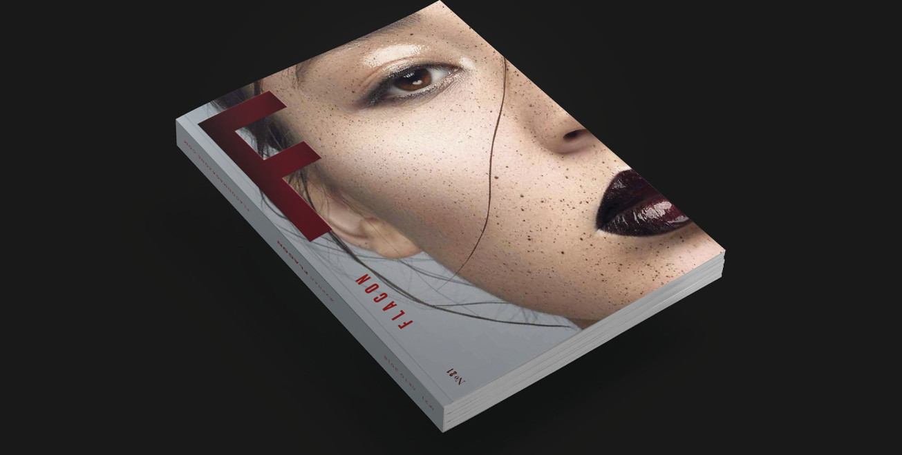
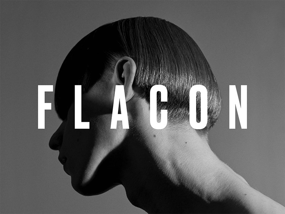
In the world of beauty, they «judge a book by its cover» so the key touch point was the development of a compositional system for the magazine’s jacket. The main attention was paid to the capital letter F, which could change its texture: to be filled with varnish or velvet while printing, be glossy or matte. After all, the quality, texture and tactile sensations are the things that first of all give heed to when testing cosmetics. Next to the letter was the decoding, the full name of the magazine, but we strive to ensure that later F became an independent recognizable element of the logo.
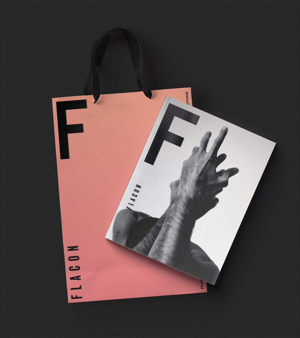
Sometimes you can just use patterns or one peculiar detail to make the cover brilliant. In digital we abandoned the pure colour and used a smooth gradient as if it was a makeup line on a hand. Thus, we made the hovers on the site brighter and highlighted some text blocks in the printed version.
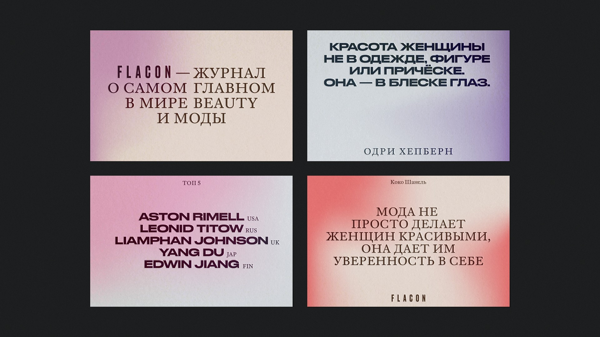
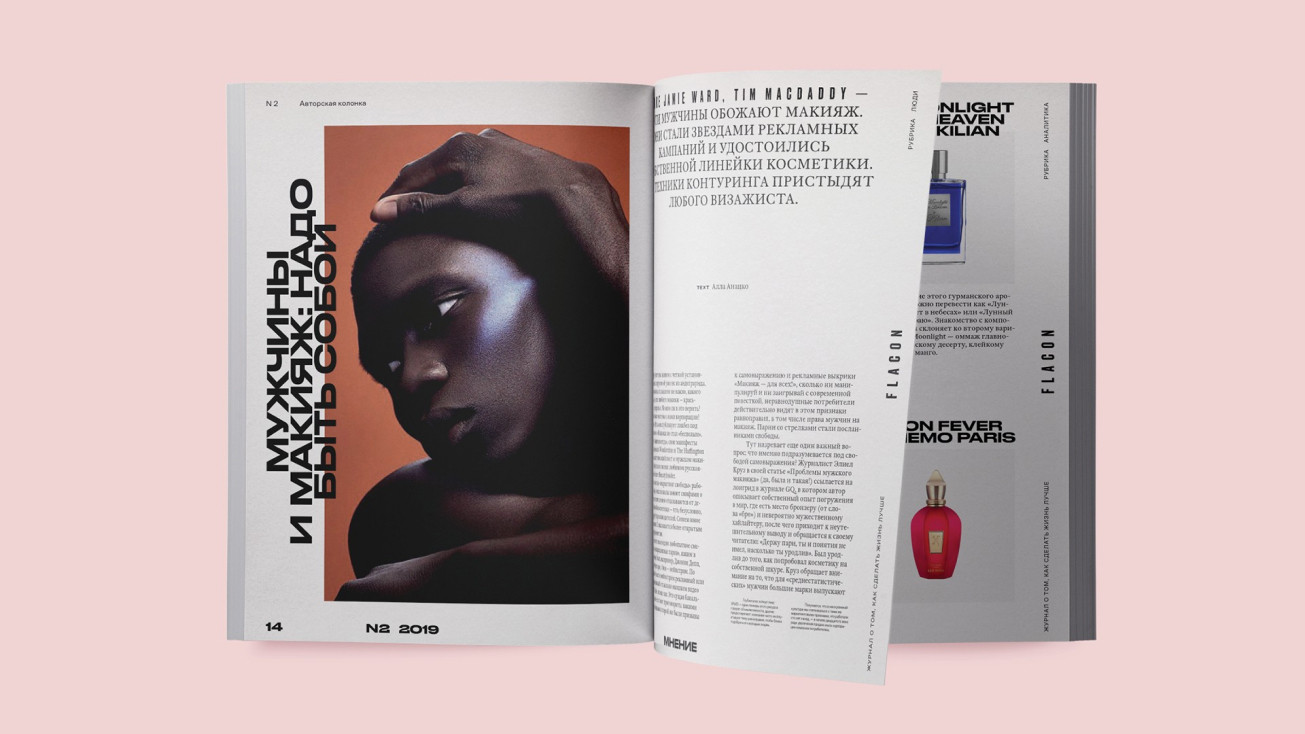
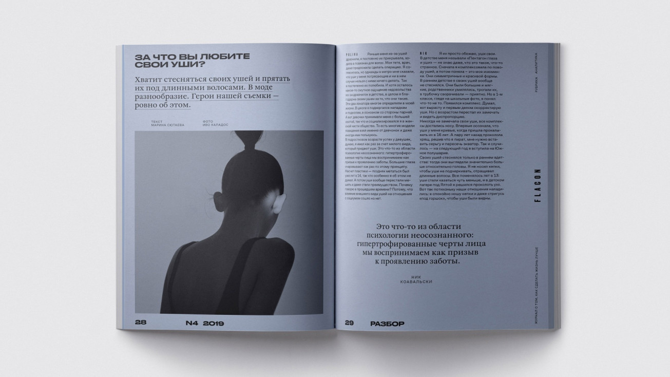
We have offered a bold font solution: to use Druk font in two traces (wide and super-narrow) for headings, and the transitional Antiqua William for text typing. The fonts give high flexibility in assembling interesting typographical compositions. So almost at the level of typography this contrasting combination has created a fresh and dynamic image.
As a result, the visual system of the magazine turned out to be daring, but clean and balancing the bright riot of the endless stream of content. The main style and all additional creative techniques we developed in a unique digital-platform of the magazine.