Gulliver. For children and their parents
Gulliver is a famous chain of stores with clothing, footwear and accessories for children. The chain's product range includes in-house clothing brands Gulliver and Button Blue, as well as Gulliver Toys and toys from third-party suppliers that meet Gulliver's high standards of quality and correspond to its values. The company turned to ONY to create a comprehensive design for a single e-commerce platform. We studied the segment of the category and the semiotics of children's culture, then developed a brand platform and identity which later helped us create the concept for a new online store: Gulliver Market.
A semiotic study conducted by Signal, our insights agency showed that in recent years, the role of the child in culture has changed: children are increasingly perceived as independent individuals, capable of thinking about their feelings and comfort. At the same time, most children's brands continue to use outmoded cultural and visual codes in their communication. We offered Gulliver the chance to become a strong brand in its category and become a platform for building respectful, harmonious and eco-friendly relationships within families.
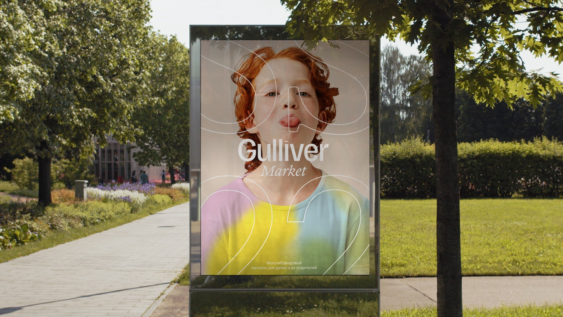
Gulliver's new positioning is as «an online store for children and their parents». Like the hero of the novel, who visited both Lilliput and the Land of Giants, the brand becomes an intermediary who understands the needs of two audiences simultaneously. The brand's image is emotionally mature, grown-up and understands what it wants, helping children develop and find themselves.
The main idea in this new identity is the image of a coloring book. Laconic and calm in its «zero» state, then immediately brighter as soon as it falls into the hands of a child, the coloring book reflects a new positioning through the synergy of an adult and a child's visual languages. For the corporate palette, we suggested using a neutral gray with the addition of pastel colors: this solution strongly distinguishes Gulliver from other stores in the children's goods category.
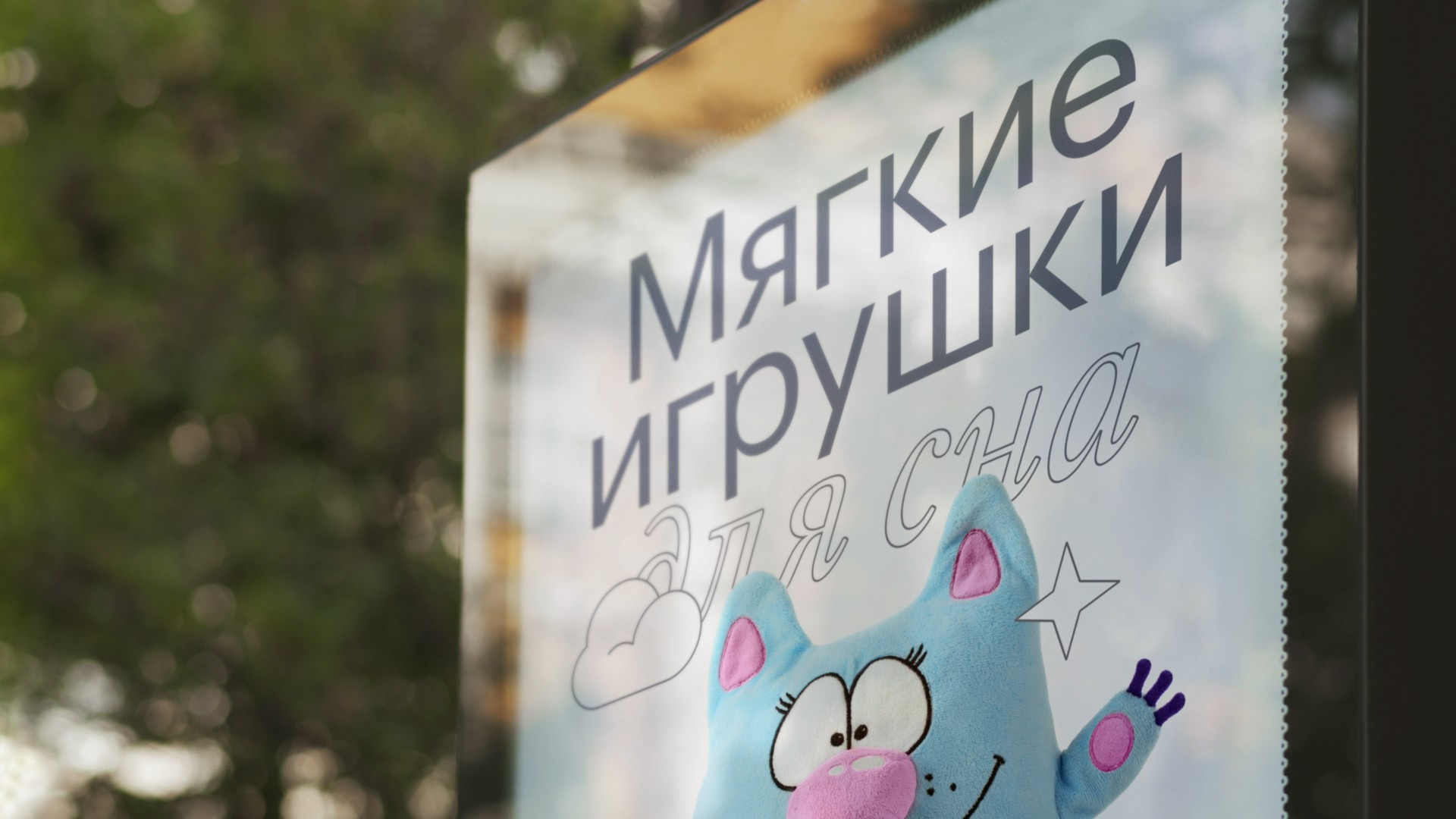
A significant role in this style is played by typography, with a mix of filled and contoured letters that support the color concept. A neutral Grotesque combined with a slanted Antiqua allowed us to find a balance between childlike spontaneity and calm, measured adult language. We updated Gulliver's logo, adding a more relaxed lettering while abandoning any whimsy and deliberate childishness: now there are no rounded and dancing strokes, but it preserves a feeling of play through small decorative details in the letters. To add emotionality, we drew a set of contour emoji that work both as self-sufficient messages or as separate objects in a layout. A set of more functional illustrations in the same style was also added.
As a result, we managed to find a new approach to the visual image of a children's brand. It sets itself apart from the competition in a significant way, helping to convey Gulliver's message about the importance of eco-friendly communication between adults and children, and also subtly develops children's tastes while staying clear and close to them in the process.
