Hyperlens The Camera Platform. The first branding of AR
Hyperlens is a mobile augmented reality platform. The minds who created it gave our team an ambitious challenge: to create the first-ever augmented reality branding in history. We accepted the ambitious challenge and gave them a full package: from strategy and positioning of their innovative product to a visual language, site and video that will help investors to understand the nature of the project and believe in its future.
With Hyperlens, reality becomes more vivid, convenient, and interesting. Using your smartphone, you can create and see a world that transforms our reality in incredibly new ways. Inside it, artists can create new works and set up galleries anywhere in the city, street musicians can receive donations right into their bank accounts, and information services can tell you about the history of the buildings around you. Inside it, an alternative system of wayfinding appears, and your friends from social media become visible in the space of the city.
The platform works with the majority of popular apps on the market, and any developer can integrate their product. Therefore, it’s important to create a neutral system of branding that doesn’t distract from the perception of the main content. In addition, we immediately decided not to compete with reality in developing our graphics: this is an impossible task for AR technologies today. Instead, we came up with the concept of Reality OS: a system with a blank, clean language that creates the greatest possible contrast with the detailed, complex world around us.
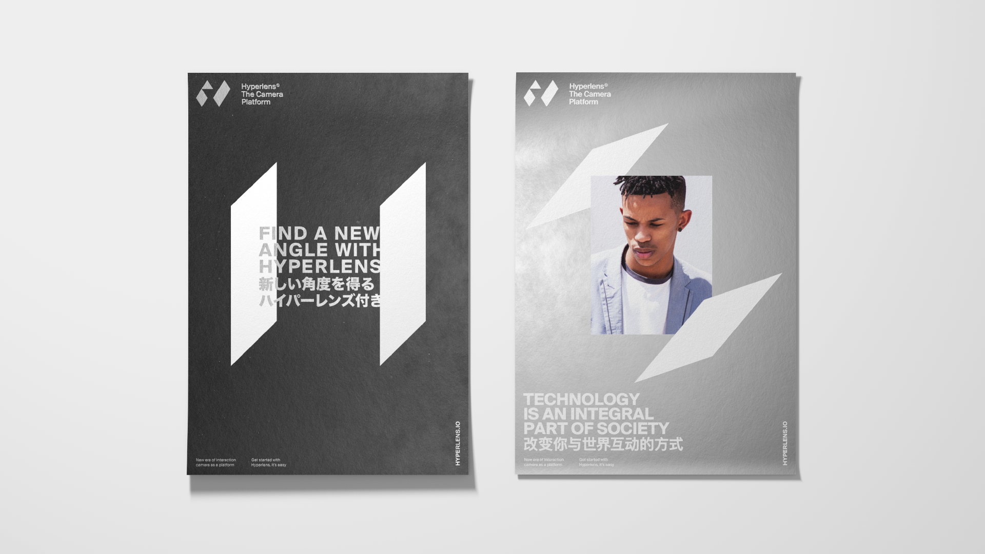
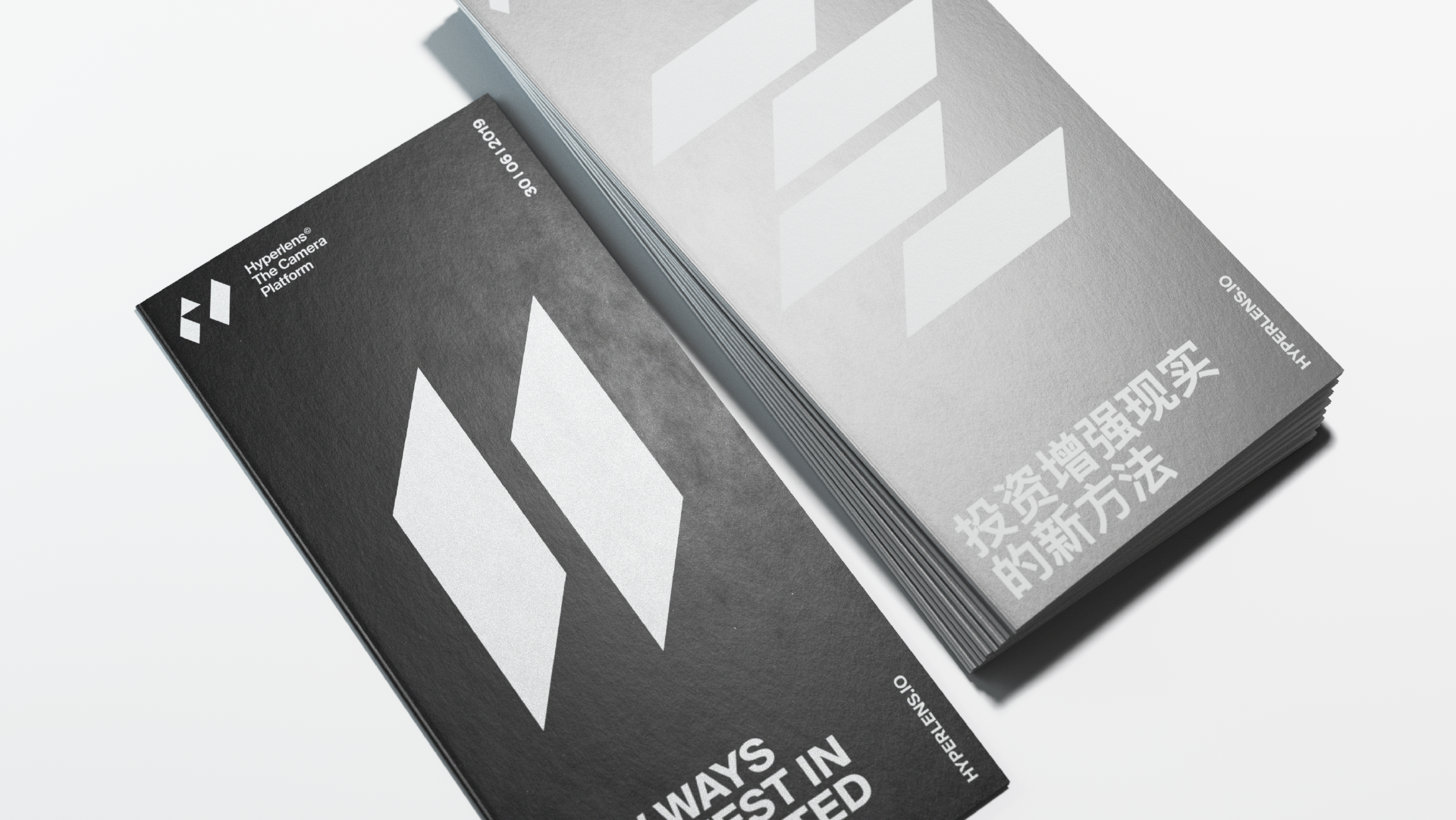
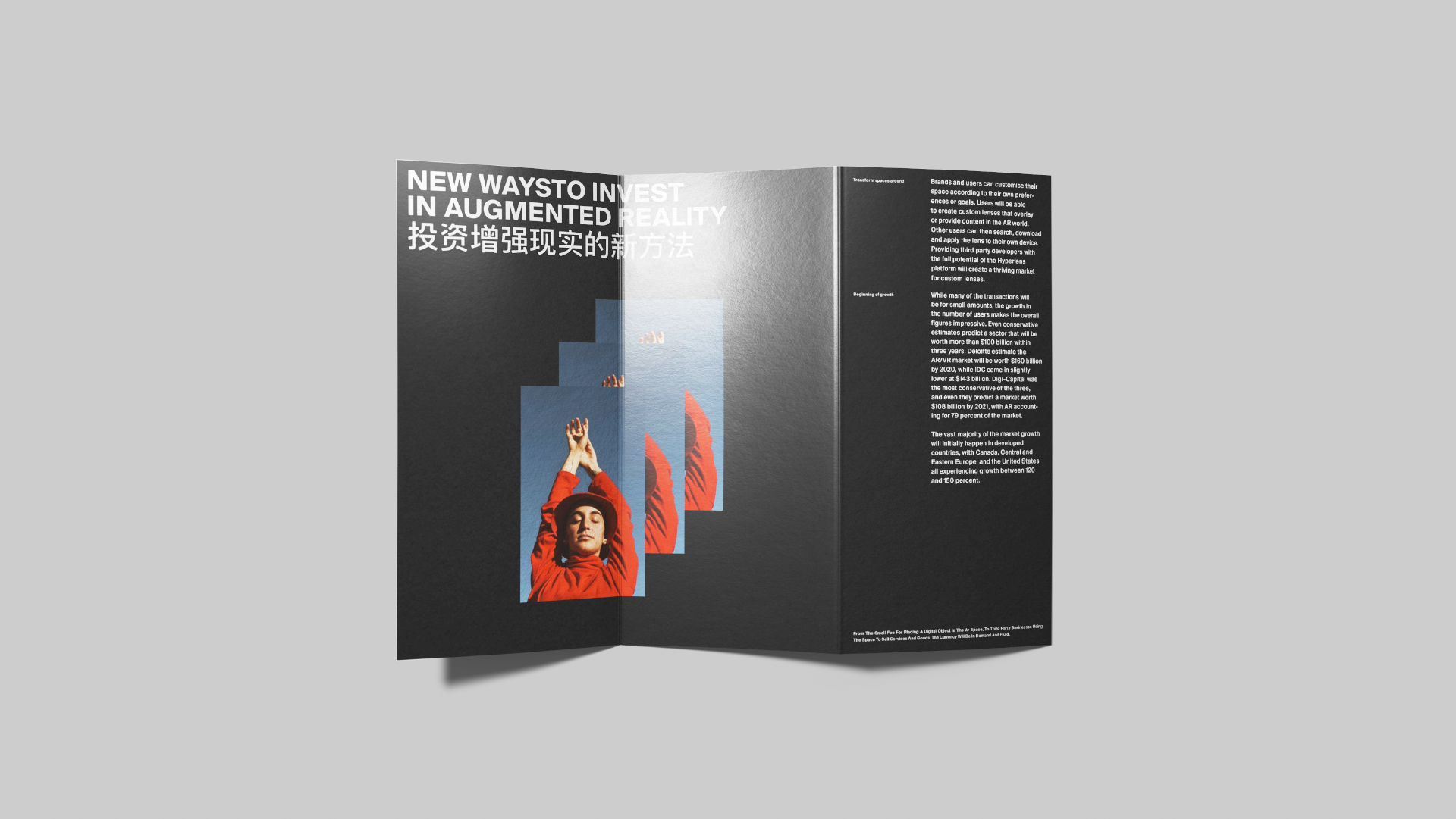
The main object around which the entire style revolves around is the extruded logo. It fits into the three-dimensional world. The capital letter «H» in the title is stretched out in space as two bright planes, and the horizontal line between them is a negative black space. In this way, form and its inverse echo each other in the dynamic between the real and imagined that Hyperlens creates.
The project’s visual language is built on the logo’s plates. They reference the depth of space while carefully interacting with text, images and graphical objects placed between them. The plate work as superimposed graphics, but appear consciously and appropriately without distracting from the essence of the content.
Even the font — Suisse Int'l, a functional and contextually flexible choice—seems simple and accidental. However, the choice was extremely conscious, and behind its seemingly default nature, the font turns out to suit our task perfectly: it is a modernization of Helvetica, perfectly adapted for use in interfaces. The first countries where the project will be launched are the United States and China, so we duplicated all of the Latin characters in Mandarin. An approach that came from the need to be bilingual gives it a trendy character and makes the style both more interesting and recognizable.
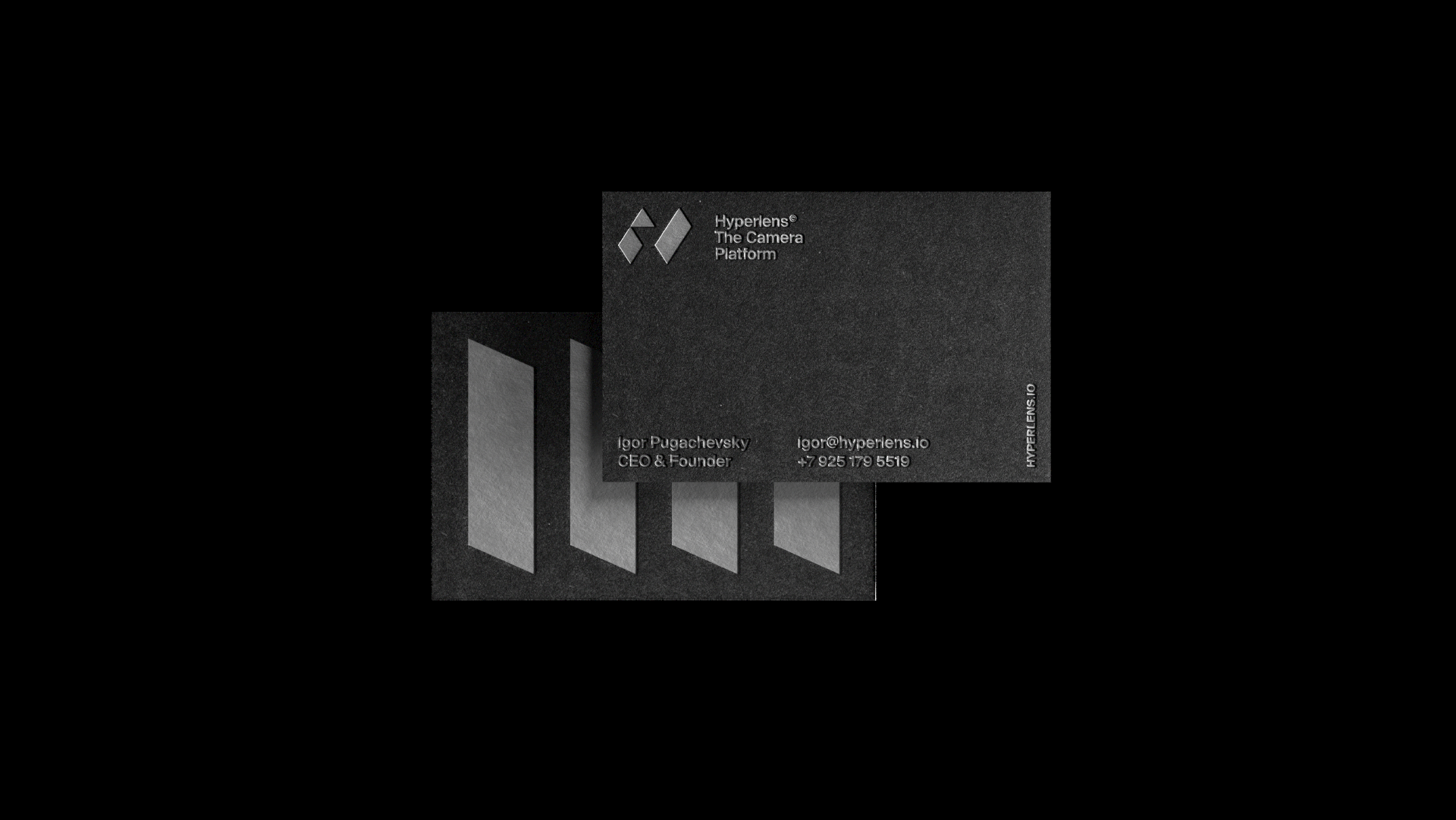
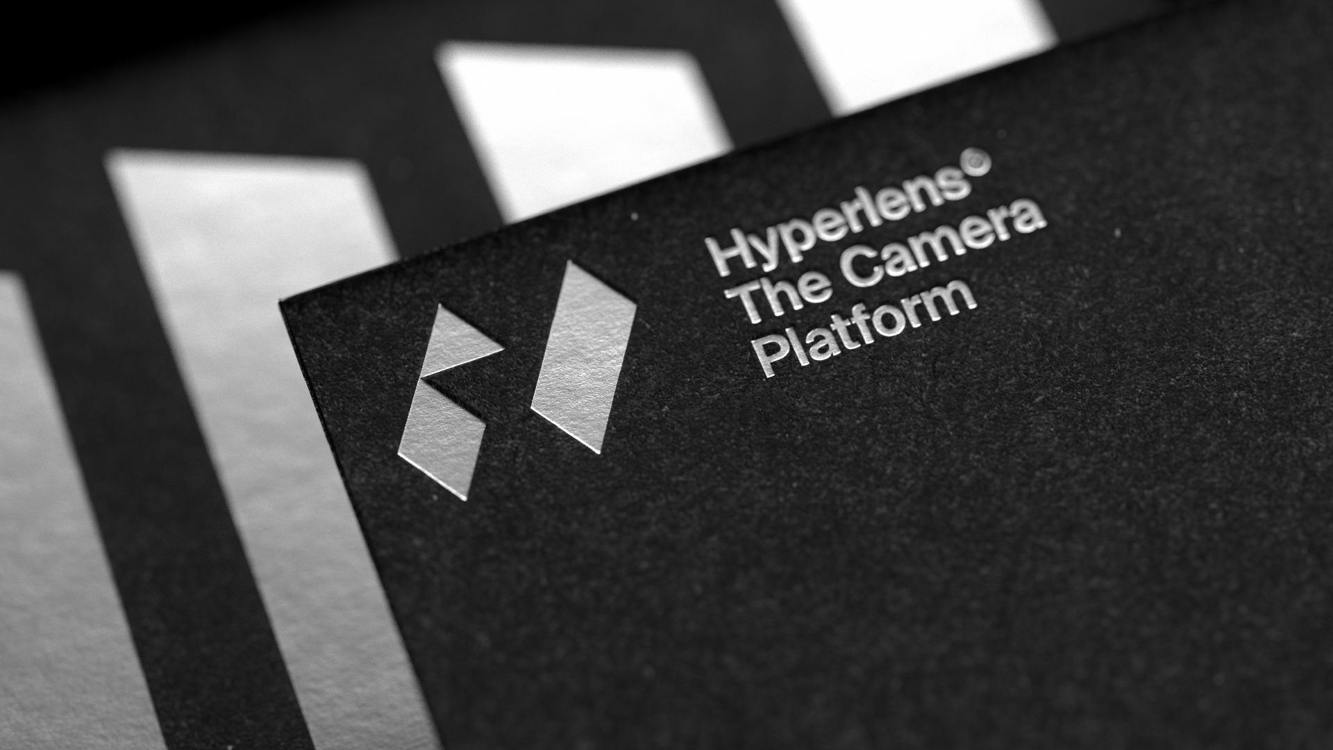
The style is consistent: it has many different expressive tools both online and offline. For example, the game it plays with space works perfectly in digital, where the loader and site element animation seem insignificant, but allow us to vary the user experience. On the other hand, embossed printed materials on nice paper also create an additional interactive experience.
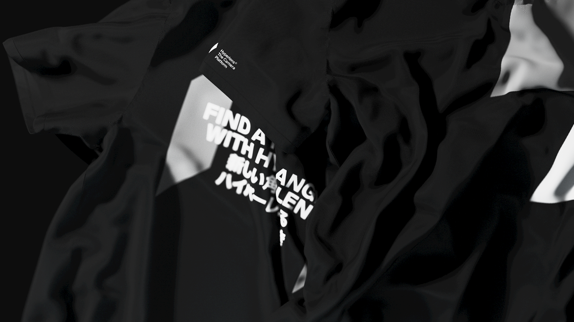

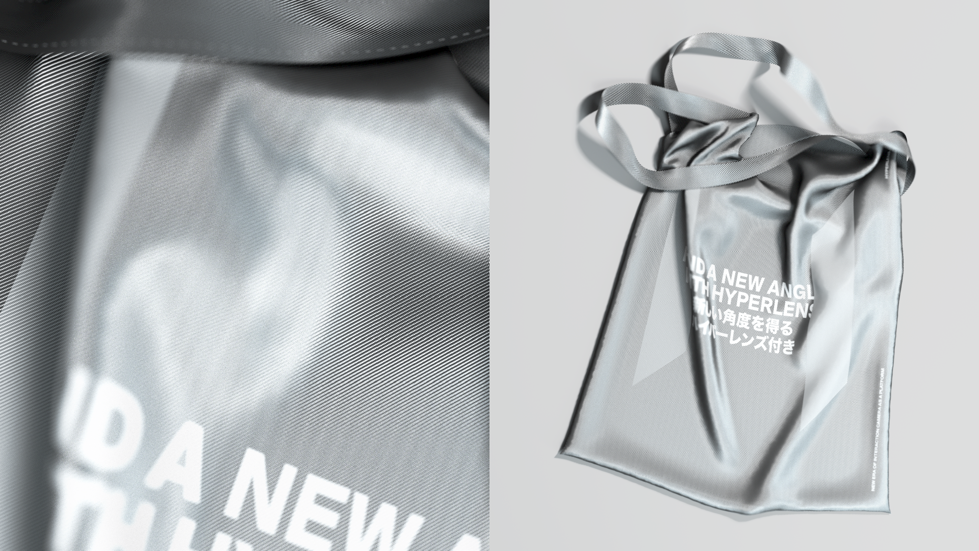
In the end, we constructed an external appearance for a fundamental system that governs a whole new reality: laconic, not imitating our physical world but creating its own, with a unique aesthetic and ruleset that allows every user to create and see more than they could in real life.