Cutting off the excess. OKKAM
OKKAM is the new name of the Japanese international communication group dentsu Russia. This company is one of the world leaders in media communications and marketing solutions, it specializes in building communications between consumers, products and brands. The company came to us for rebranding, and we developed a new naming and new corporate identity.
By the beginning of the project the ex-dentsu team, relying on the existing image, the current market context and the company's ambitions had already developed a new brand platform. The positioning was based on the idea of maximizing the benefits for the clients of the advertising group. An important place was given to the character of the brand: the team saw themselves as pirates of the advertising market, daring, serious-minded and if the goal requires it ready to go against the mainstream.
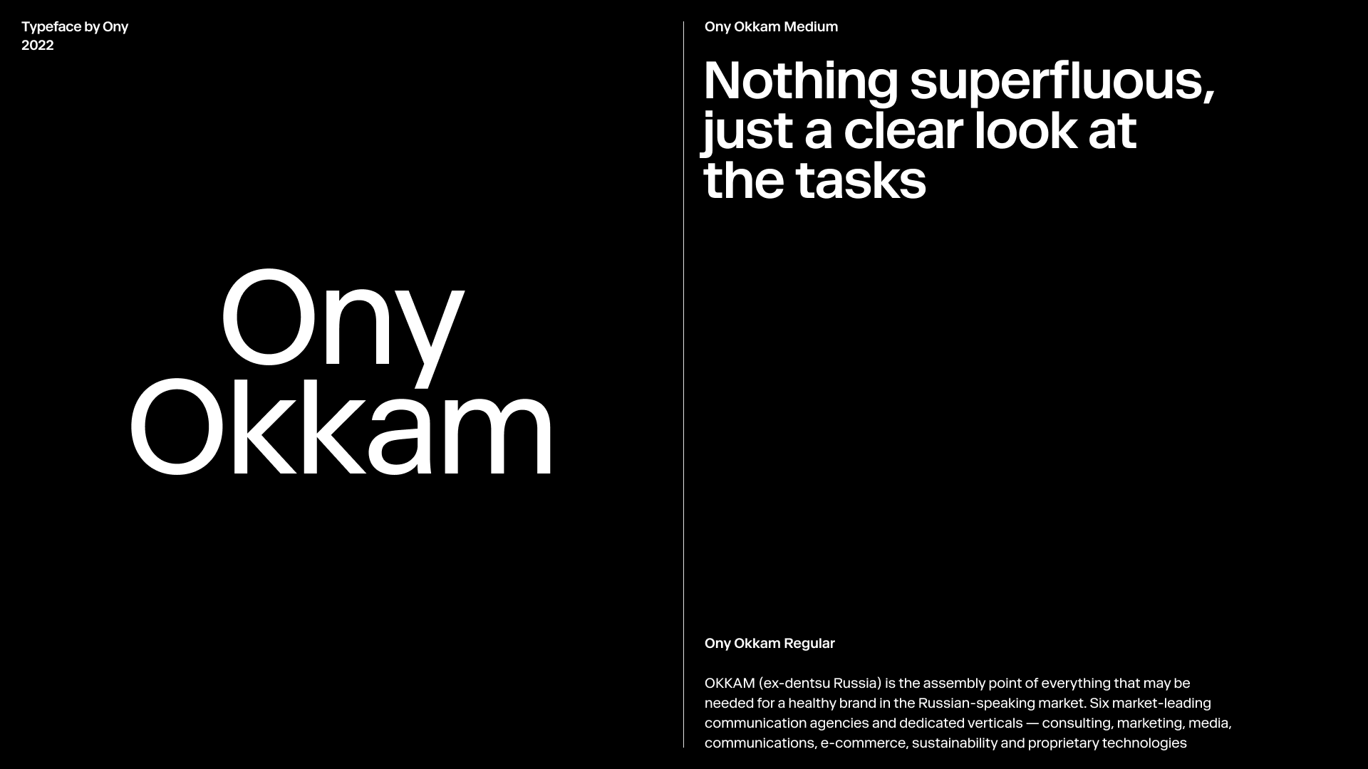
The new name is the surname of the English philosopher William of Ockham, the author of the famous methodological principle "Occam's razor". In philosophy, the term "razor" is understood as a tool that helps to cut off the unlikely and improbable explanations. The name embodies the principles of clarity and precision in work that are the main characteristics of the brand team - sharp mind and clear look.
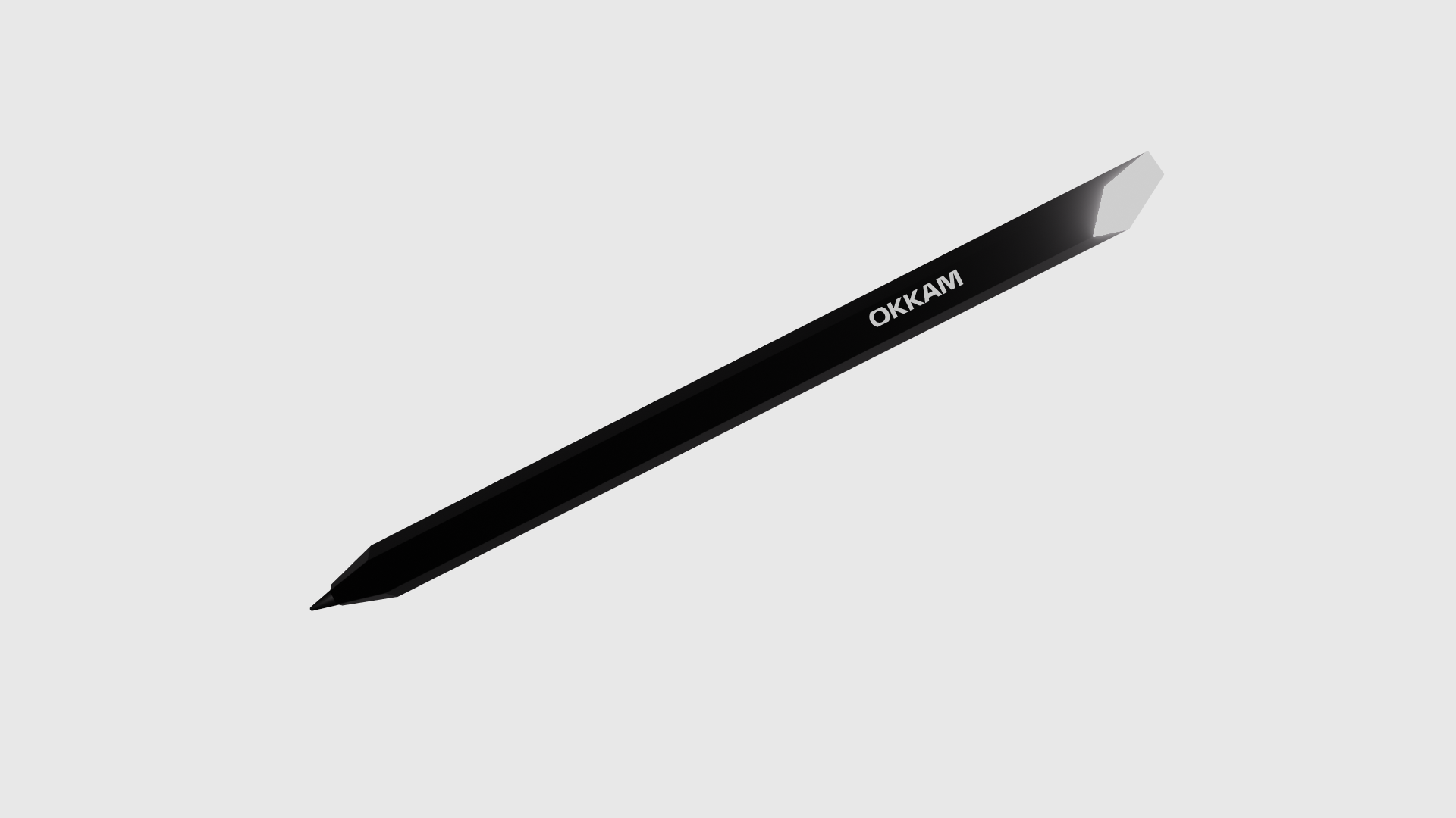
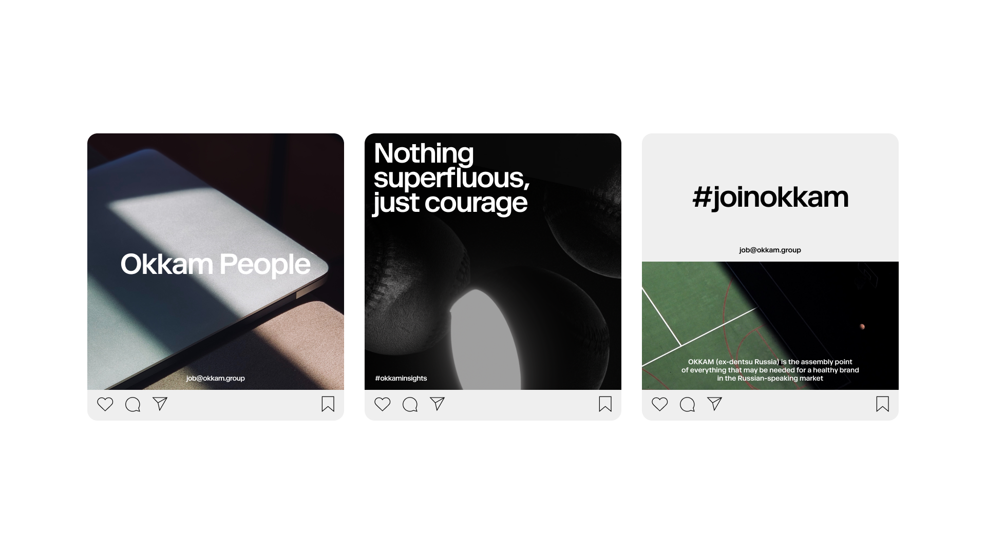
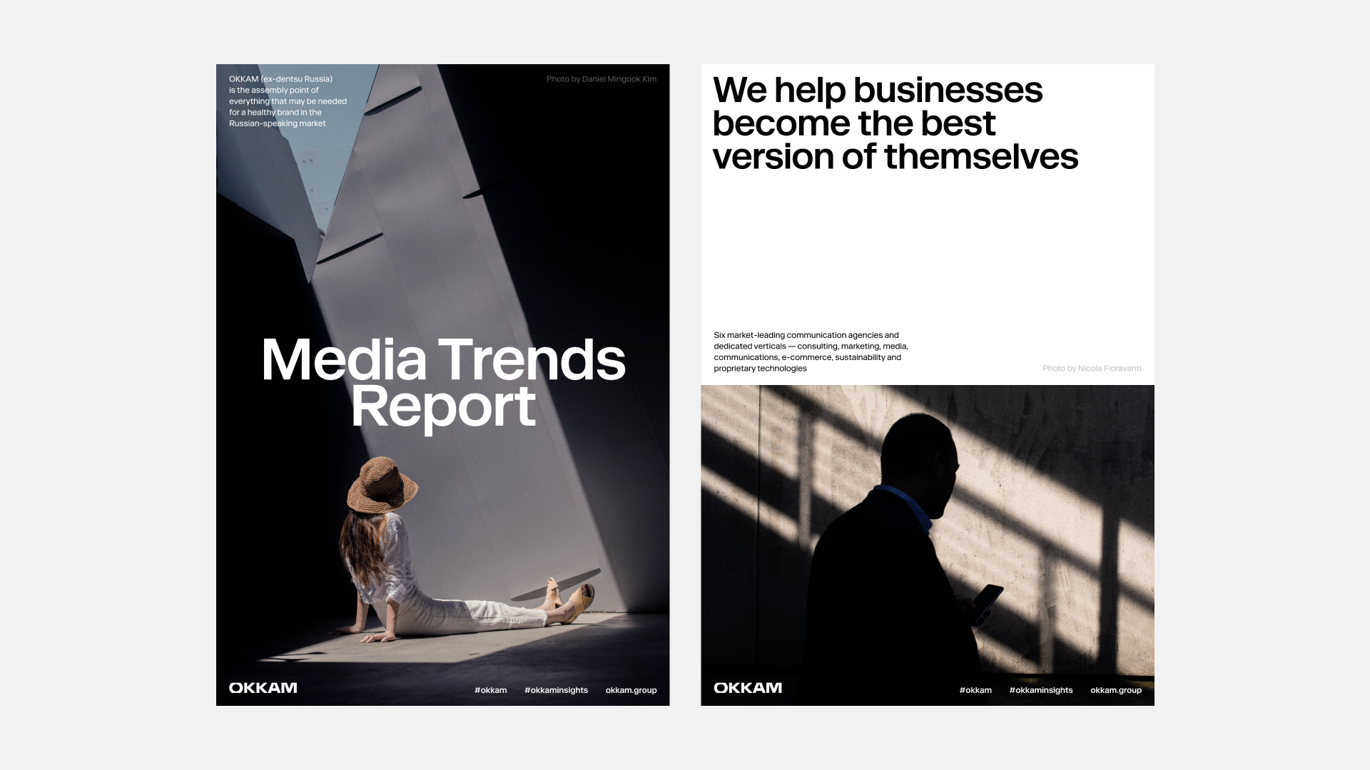
Positioning and the new name of the agency were directly reflected in the identity. Occam's razor passes over raw objects and in the place of the cut we see inner glow, a metaphor for "that very idea." The visual technique has great graphical and motion potential: “raw” objects can be of different type of complexity and the cut itself can be movable. The play with light continues in the photo style: here the geometric shapes of light emphasize parts of the composition and highlight important details.
Specially for the project we have developed a WebGL generator with the help of which, without additional efforts and investments in 3D and motion graphics, you can easily create objects and cut off shapes for them. It is enough to load the desired object, set the cut vector and adjust the glow strength. All these parameters can be configured directly in the browser and used in micro-interactives on the site.
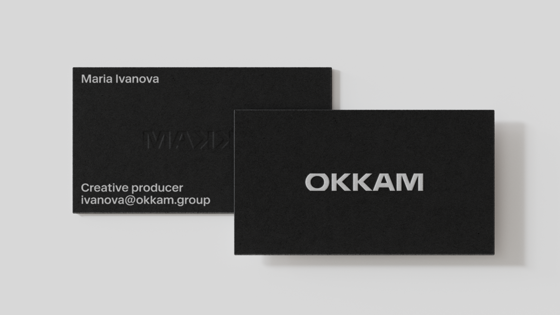
Occam's razor went through the logo of the company too: the letters are cut off at the top and at the bottom. The black and white palette and the hieroglyphic sign (two “K” letters inside each other) emphasize the rich history and Japanese roots of the company, adding some ninja character to the style.
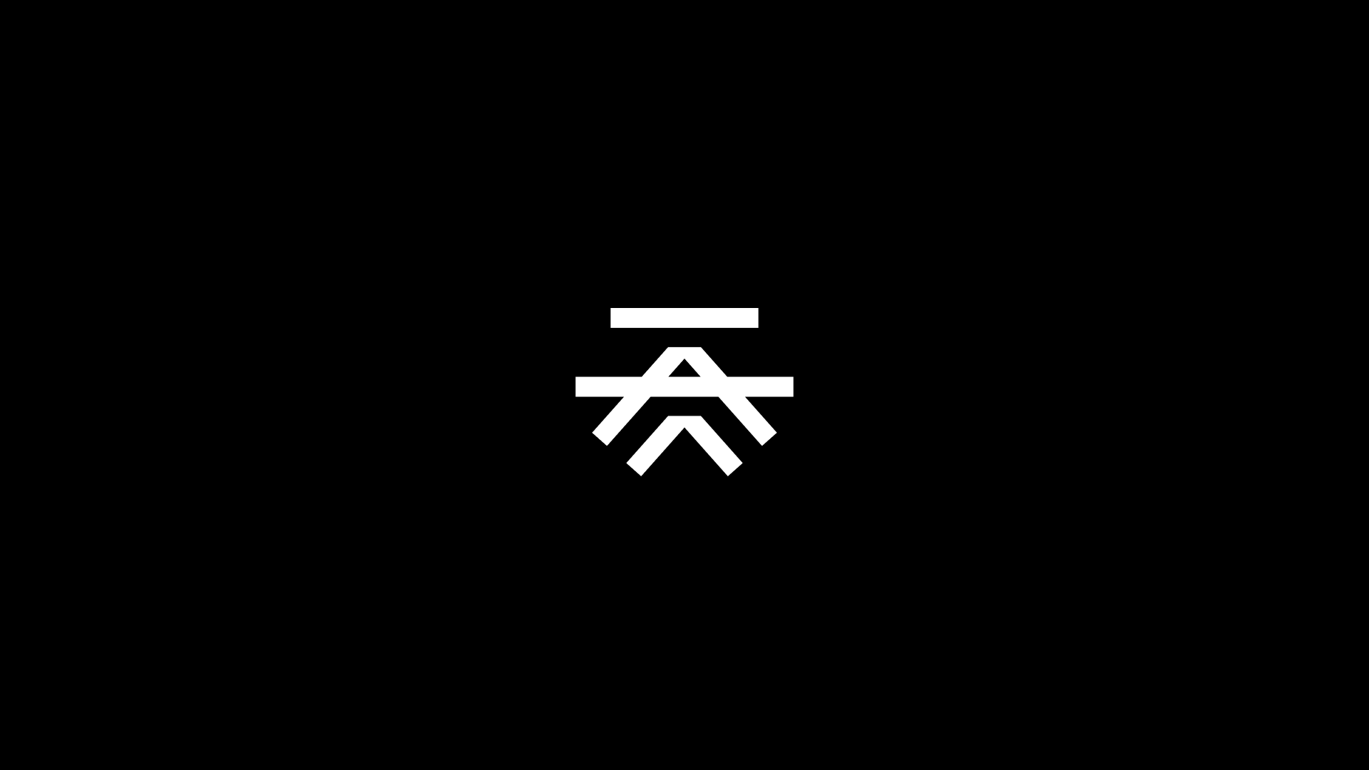
All the identity elements successfully reveal the desire of the team to be pirates in the advertising market. The signature cut can influence the form factor of items, the glow can be used inside items and the emblem works as a recognizable symbol, kind of Occam's Jolly Roger by which it is easy to recognize your like-minded people.