Pomosch. A new subculture
Pomoshch («Help») is a mobile app for targeted, transparent mutual aid founded by actor Nikita Kukushkin. Working similarly to apps like Uber, it connects volunteers and people who need their support. The goal is to make volunteer care for others a part of people's everyday way of life. We were inspired by the idea, stepped in as design partners for the project and in collaboration with a team led by Injila Samad Ali, we developed the project's visual system, including the corporate font, media, website design and communication materials for social networks.
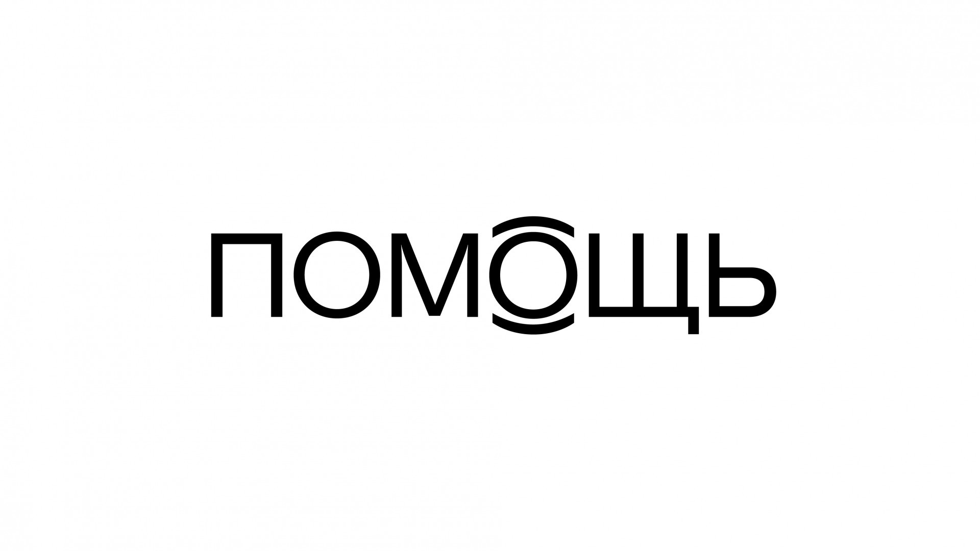
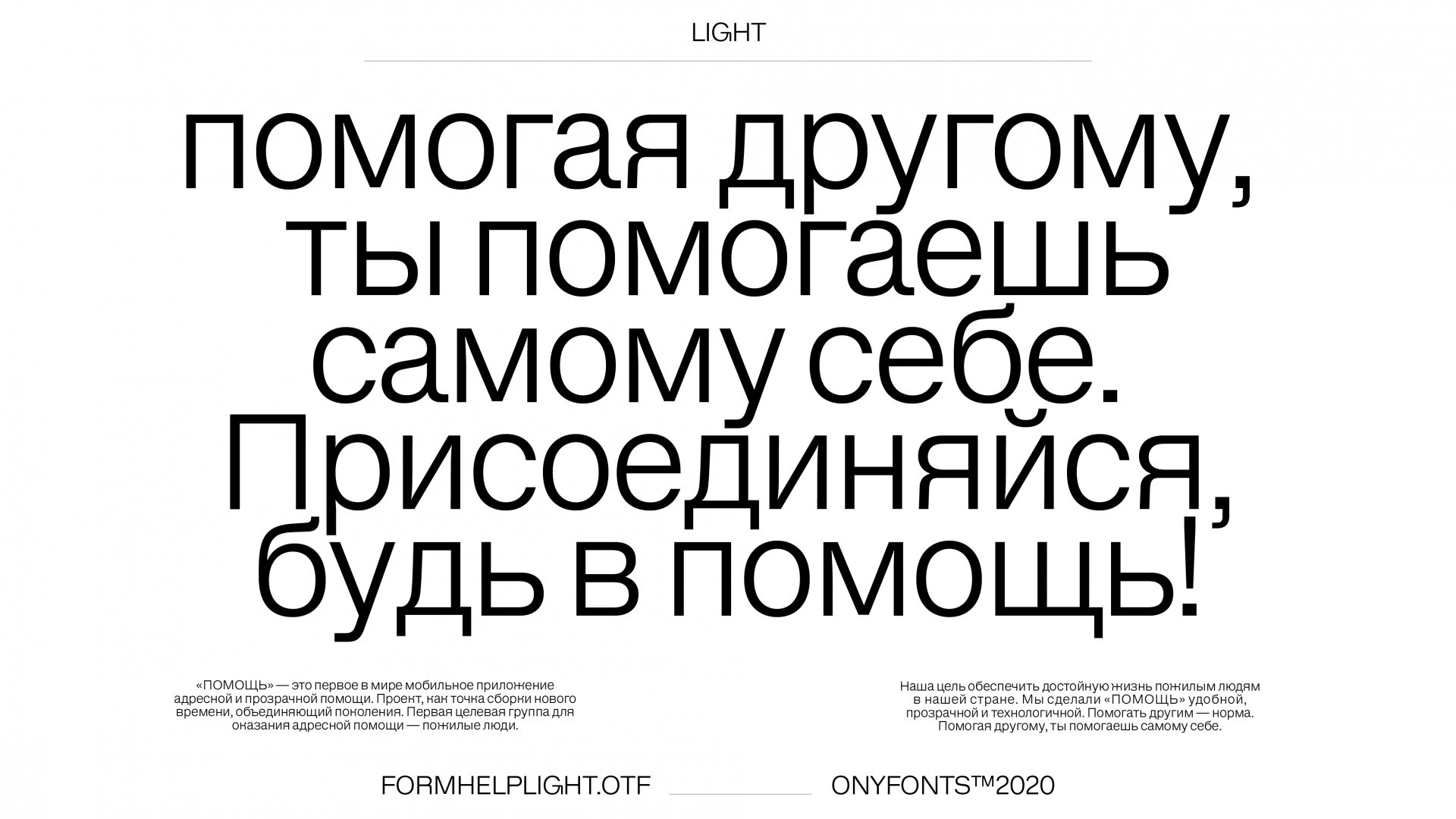
The project's identity is based on the concept of «non-branding». We developed a minimalistic and functional corporate identity, which tracks relevant visual codes that are comprehensible to a young audience. A font created especially for «Help» Form Help Light has become one of the main means of stylistic expression. The vulnerability of the some letters' design—for example, «K» and «W» — gives the font a sensitivity essential for a charity project. Discreet but artful, it helps the project speak a universal visual language, effectively convey messages and maintain its format. For the app, we also developed a digital version of the font and selected a complementary color scheme to make the interface look more lively.
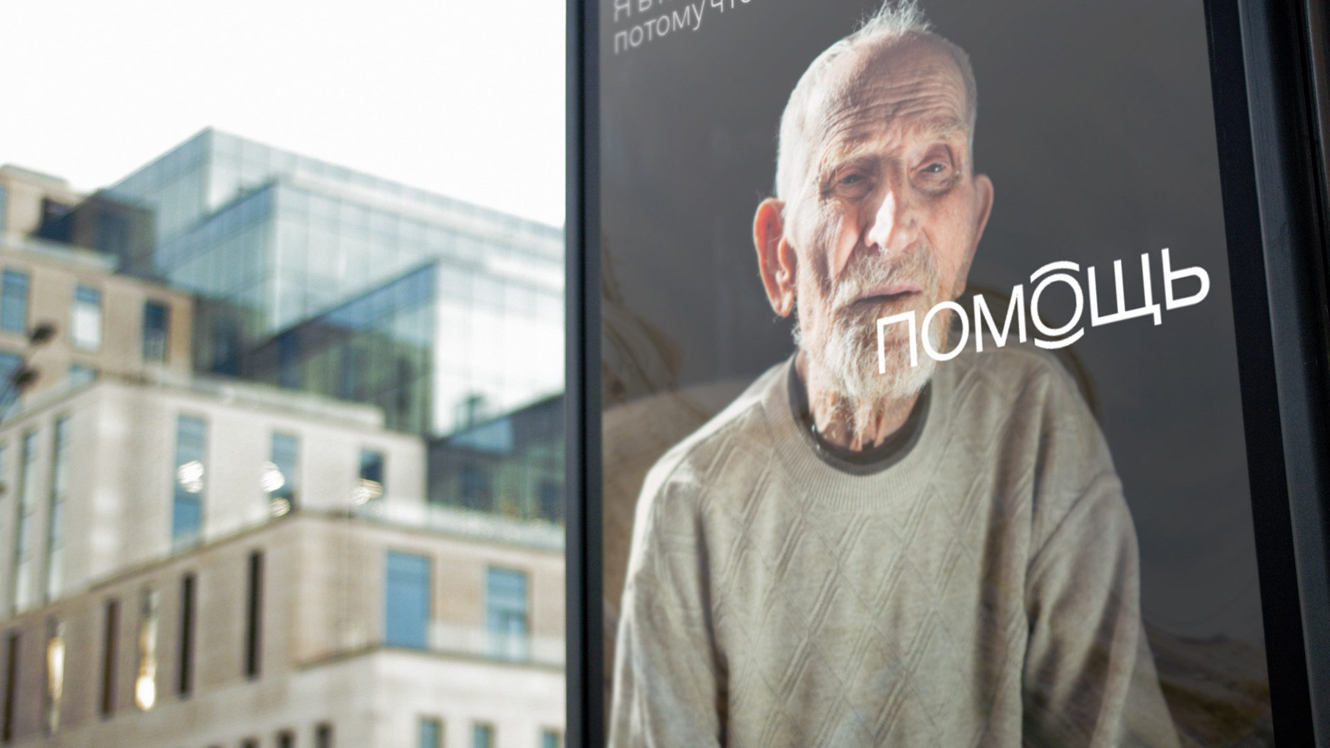
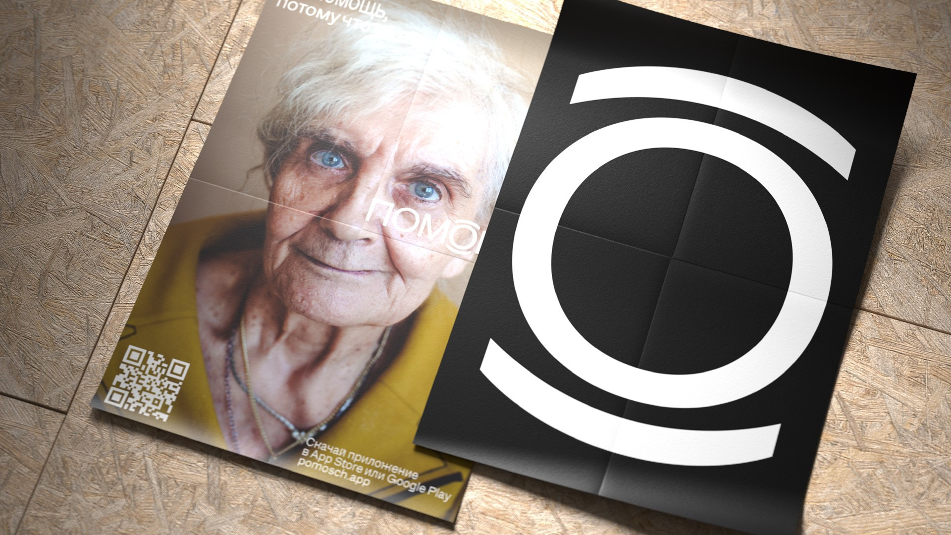
We added nuance to the logo designed by «Help's» art director, Injila Samad Ali. In it, an accented «O» is enclosed in brackets, simultaneously reminiscent of both a caring look and two palms that support and protect. In our new version, the sign became lighter and more balanced to work more harmoniously with the font.
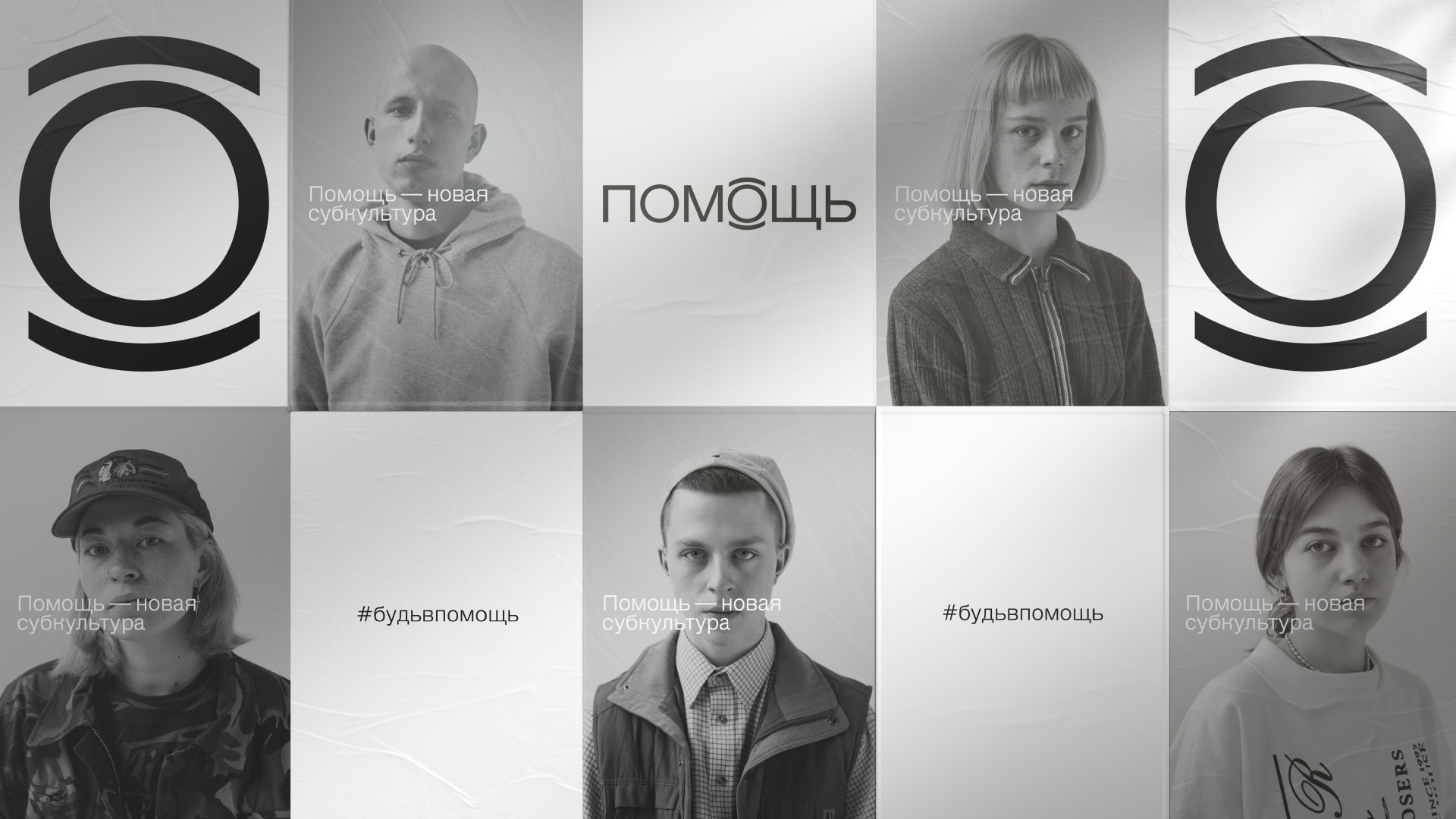
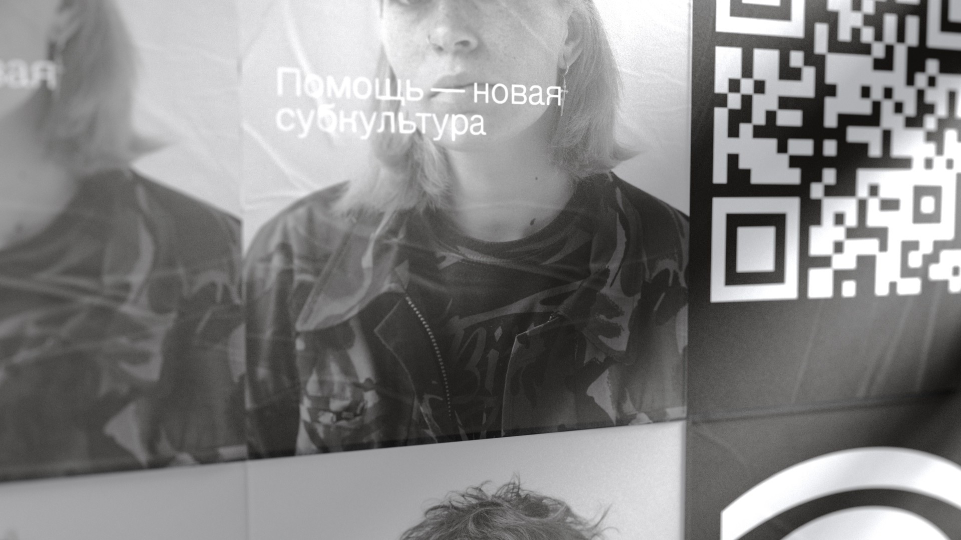
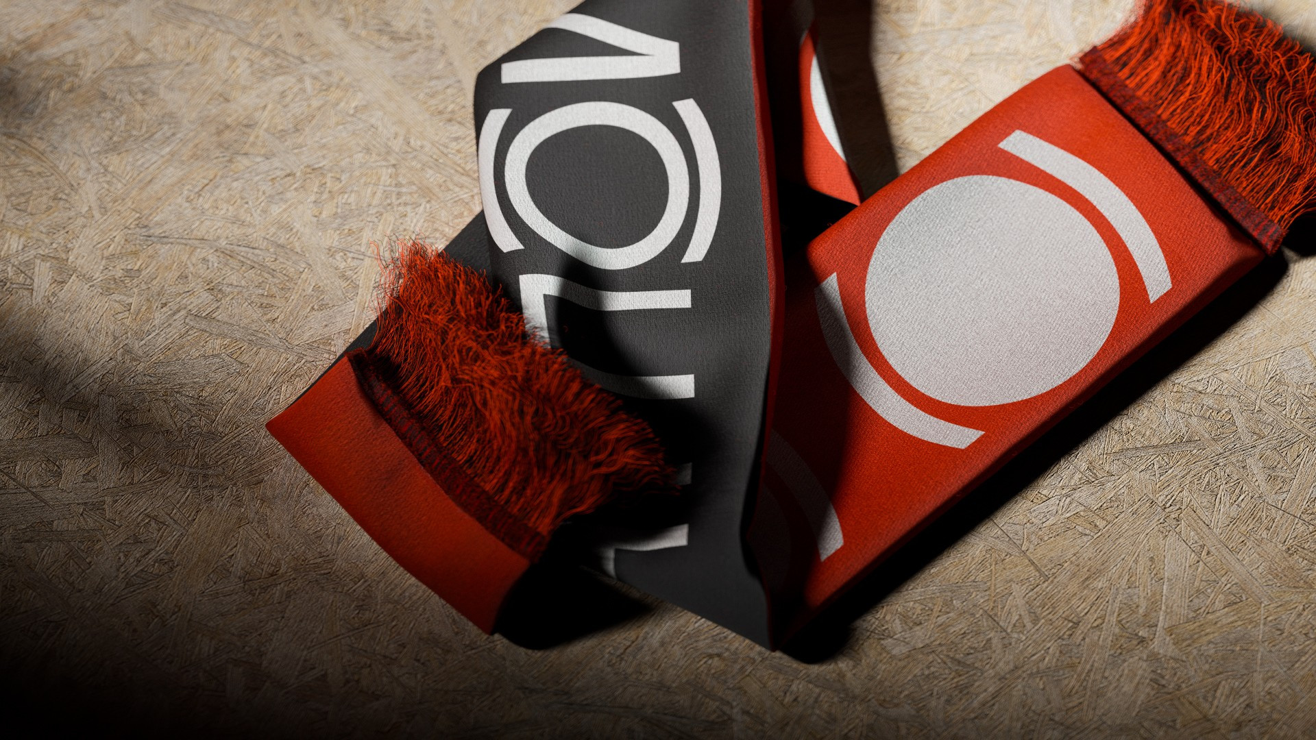
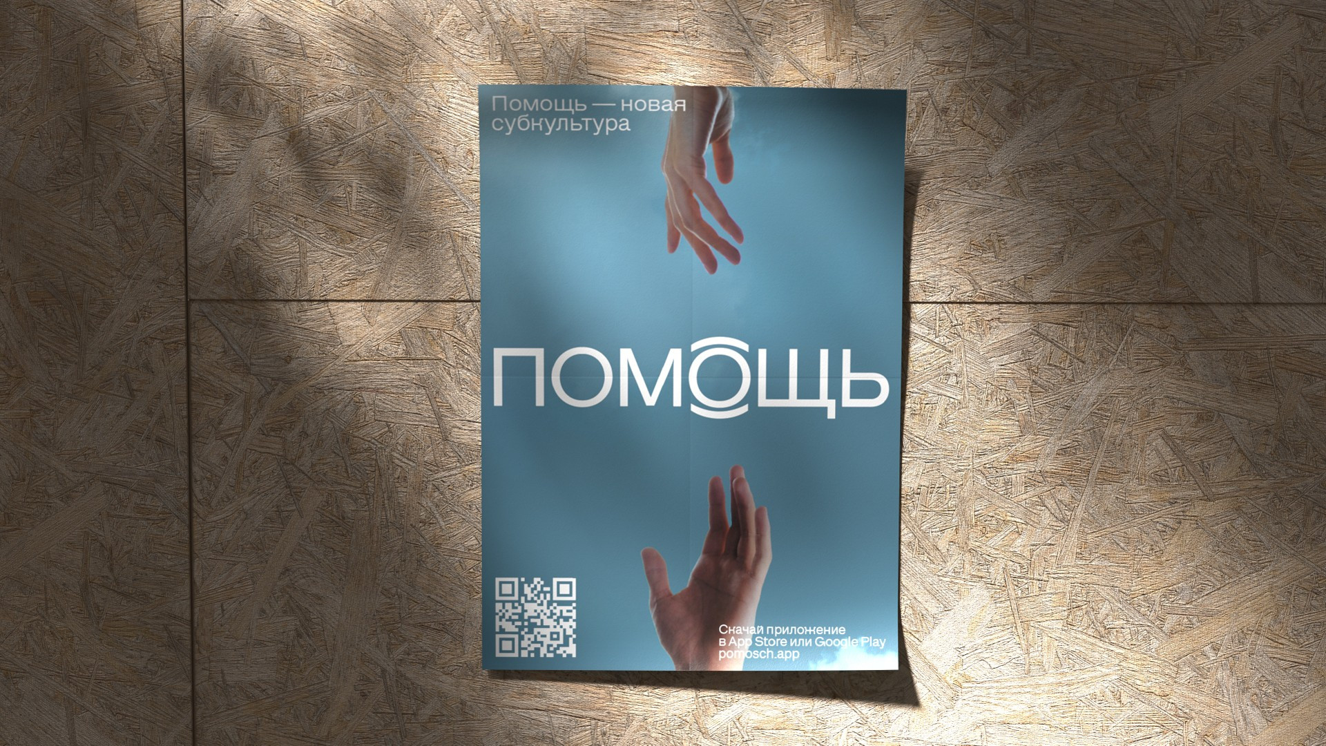
In printed graphics, we leave a lot of negative space in the layouts and arrange objects with a light overlap. This helps us both remain comprehensible to the conventional mass user while also attracting the attention of a younger and more advanced audience—the future primary audience for the application. Our concept for social media communication materials adds the color red. Like black and white, it is versatile in terms of cultural contexts, all while adding more life and energy to the layouts.
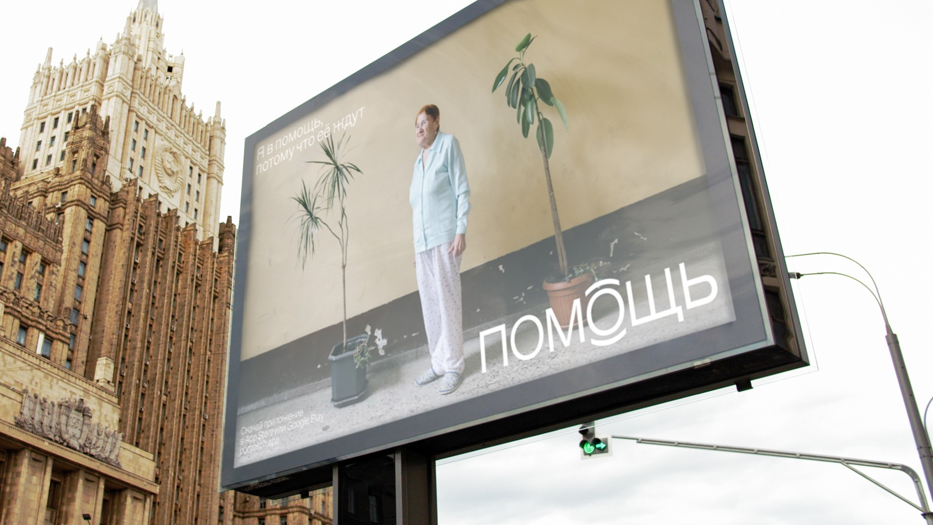
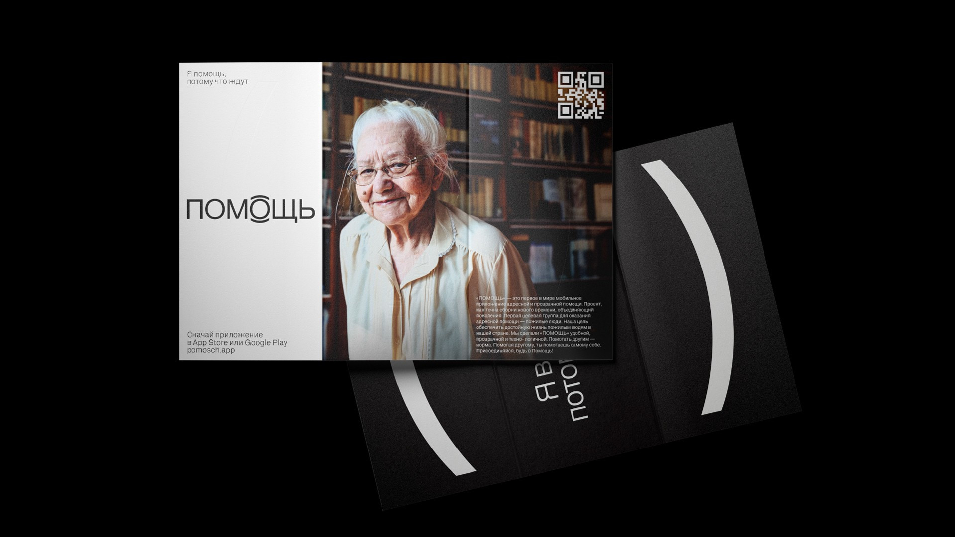
Photo style plays an important role in the branding of the project. Older people will be the first to receive help through the app, and we consciously wanted to avoid the image of old age as an unhappy and poor state, without laying it on thick with emotions or accenting feelings of pity. The goal of the project is to make help not a heroic act, but a natural behavior and the new norm for life. In talking about a new subculture—this is how the creators define their movement—we use light-hearted and positive images, showing people who are close to us and who are easy to help.
As a grand finale, we developed a set of merc—bags, hoodies, hats, keychains and buttons—using a QR code as the central element. This tactic turns any object into an advertising medium and helps brand ambassadors talk about «Help», attracting new people to the project in the process.