Superfluid. Fundamental and progressive
Superfluid Future Initiatives explores the future. The team's methodology begins with the research of the civilizational context and social sciences, because it is the human and society that are the agents of change followed by trends and technologies. The research is based on the theory of chaos and the approach is built with the help of "strange attractors" - the figures shaped by two or more trajectories which cannot be accurately predicted. Our task was to develop a visual language for the brand taking all this information into account.
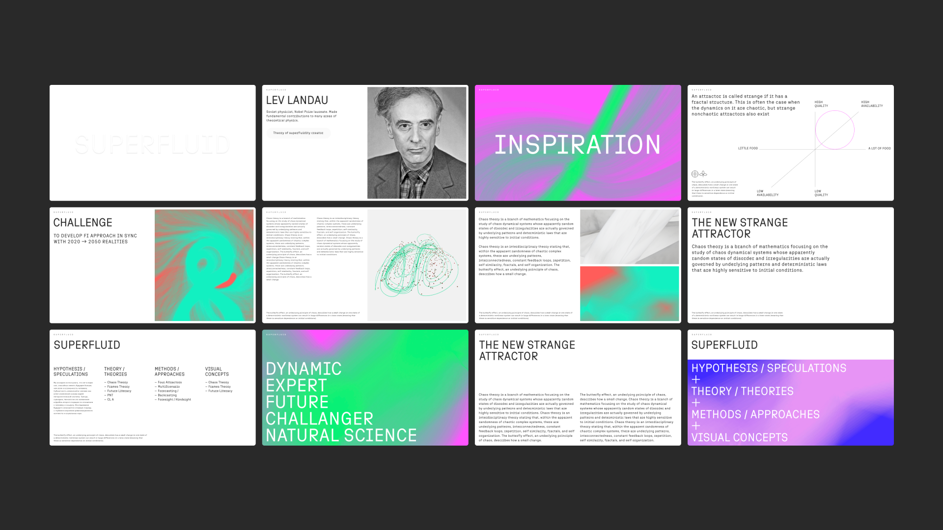
We wanted to combine the scientific, fundamental approach of the company and the progressiveness of its activities. The scientific approach implies calmness of the thinking process, balance, some kind of static, while the progressiveness, on the contrary, implies dynamics, a burst, a tonic effect. These means of expression became our main attributes. We imagined the future on the verge of science and art. It was embodied in two forms: in sculpture as the physical world and in a neon digital attractor, which was created with the use of generative graphics. Using the generator, we developed, one can create visual materials without additional efforts and investments in 3D design and motion graphics. It is enough to select an attractor model, enter parameters, and the system will generate an animated model itself. The Superfluid team now can use the mesmerizing moving attractors to create effective communications.
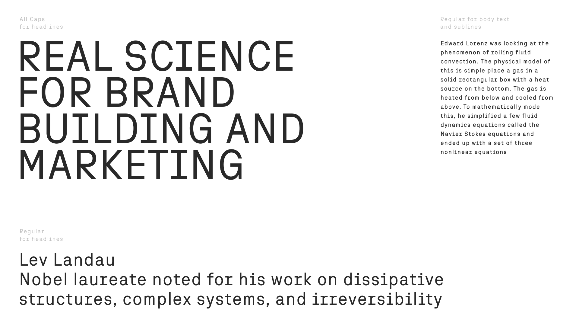
An important part of the corporate identity was formed with the help of ONY Semimono font developed by us. Its main characteristic feature is the desire for monospace, which endows the font with a particularly "scientific" touch. It contains artefacts of Soviet aesthetics, for example, the letters "у" and "ф", which help us to translate the continuity of scientific theories, since the research is based on the works of Lev Landau, Ilya Prigogine and other Soviet physicists and mathematicians. But besides this, there is a step towards non-conventionality and progressiveness in the font: for example, the plasticity of the letter “З” and the “quiff” of the letter “G”.
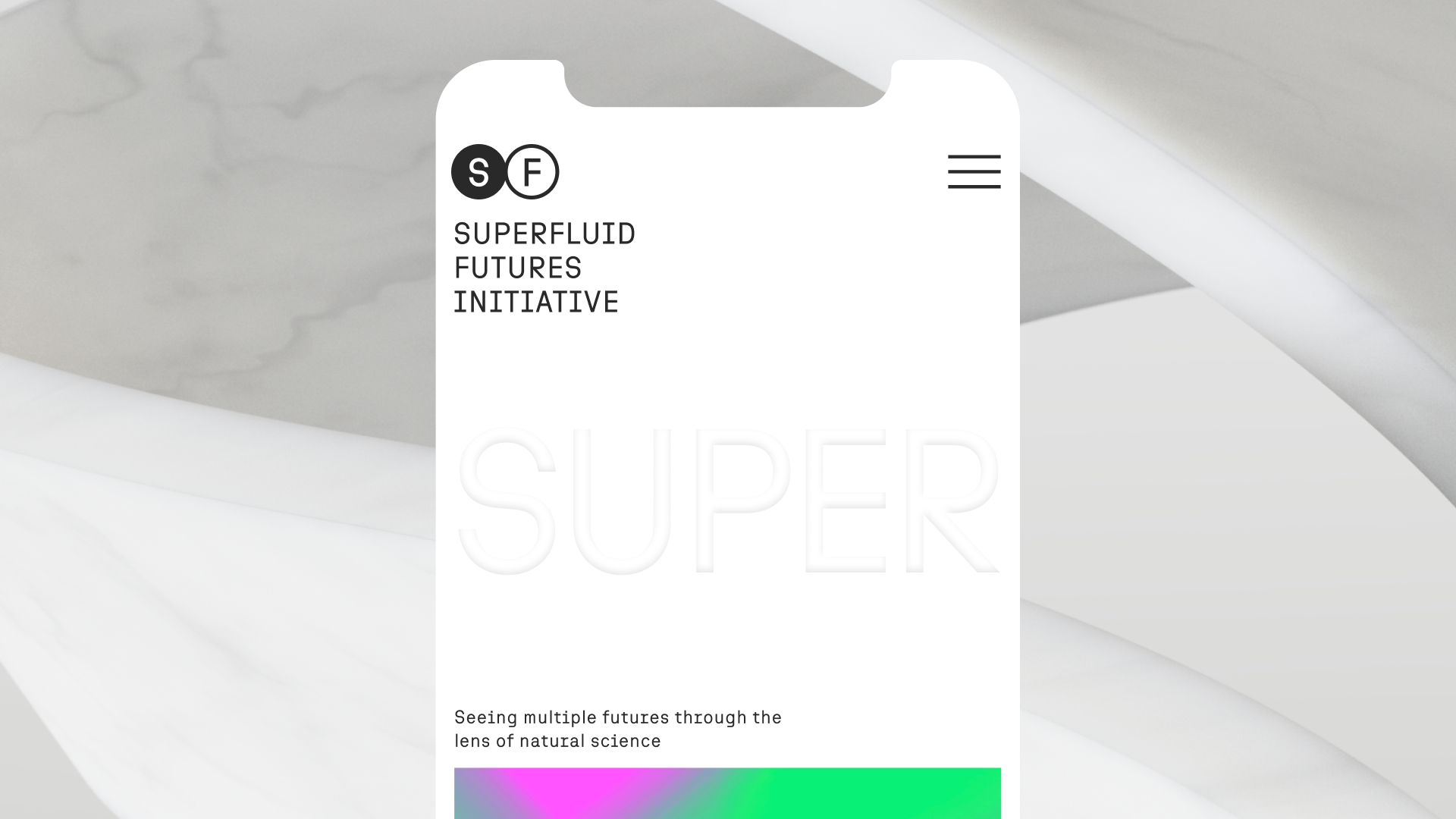
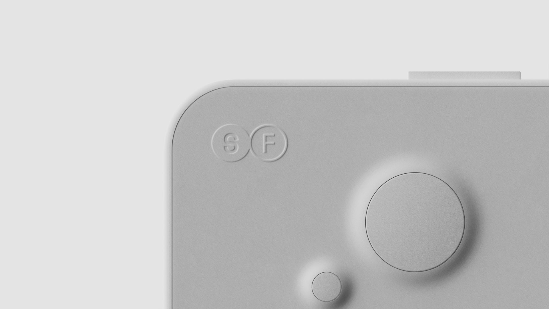
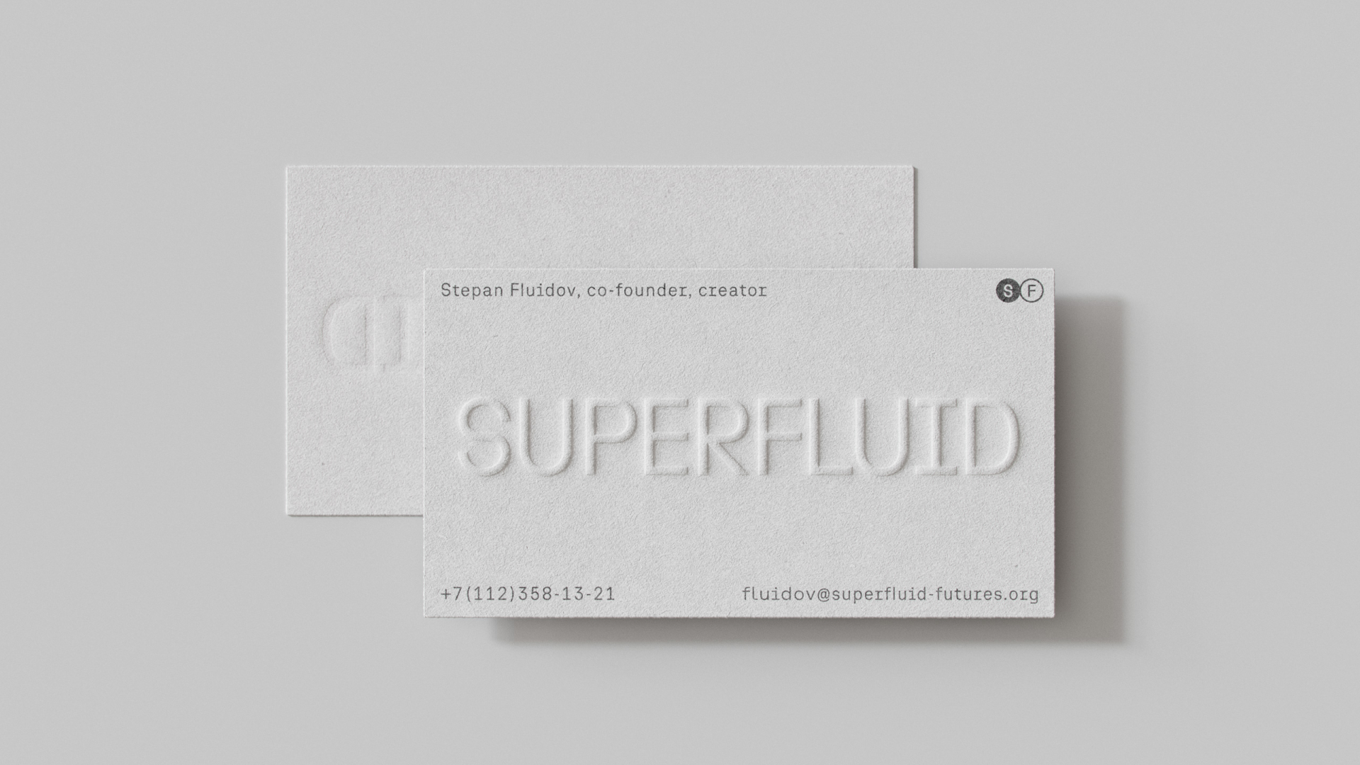
The sign is built on the unity of the opposites of the digital and physical worlds. This is a monogram and at the same time an illustration of strange attractors. Starting with it and further along its way, the user can feel tactile contact with Superfluid. For instance, on a website this effect is achieved by the move of the mouse: the headline lighting changes and by scrolling the animation appears. In real life the logo is transferred by embossing onto textiles or onto business cards. This is how the meaning-forming elements of the identity become touchable and we can literally touch the future.
