New Tretyakov Gallery. The new space for Russian art
Tretyakov Gallery hosts the most cherished and the most celebrated collection of artworks in Russia. It covers almost a millennium of Russian art and history. The gallery today is evolving: the change is meant to bring it closer to the public. It moves from the traditional format of classical art-museum to the the new modern space that is filled all kinds of activities. The new image of the gallery, that would span over museum's venues programs and activities, required the new universal sign. It could not be entirely novel, yet it had to bear the modern spirit and be comprehensible not only to Russian public, but also internationally.
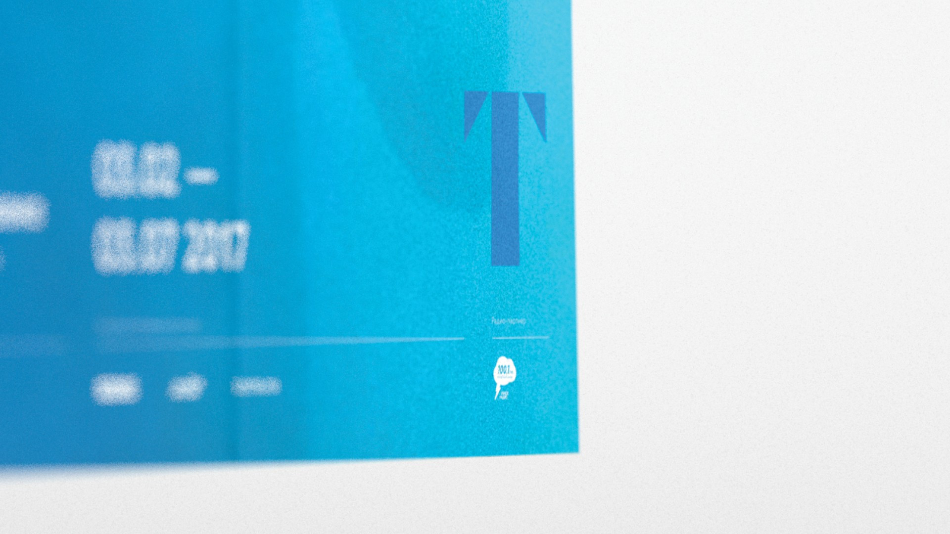
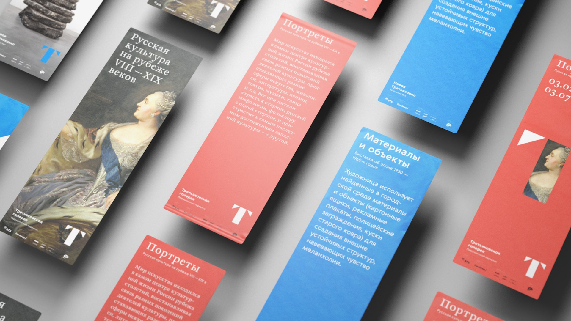
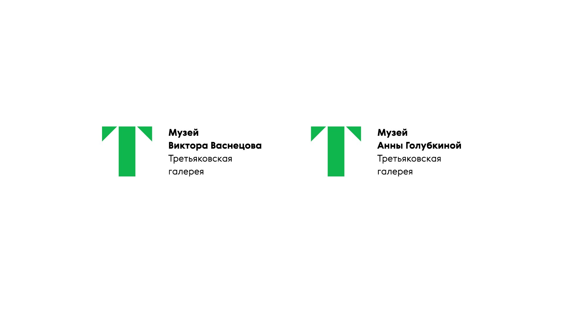
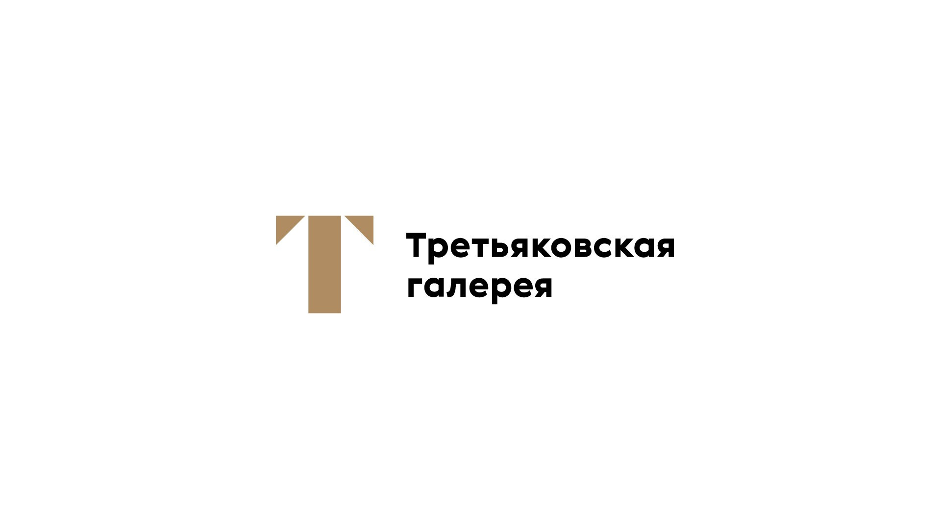
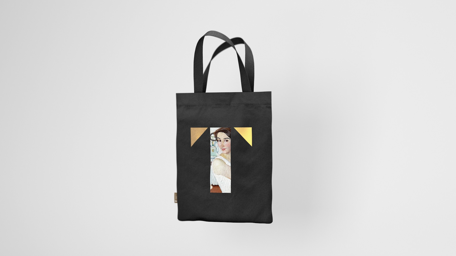
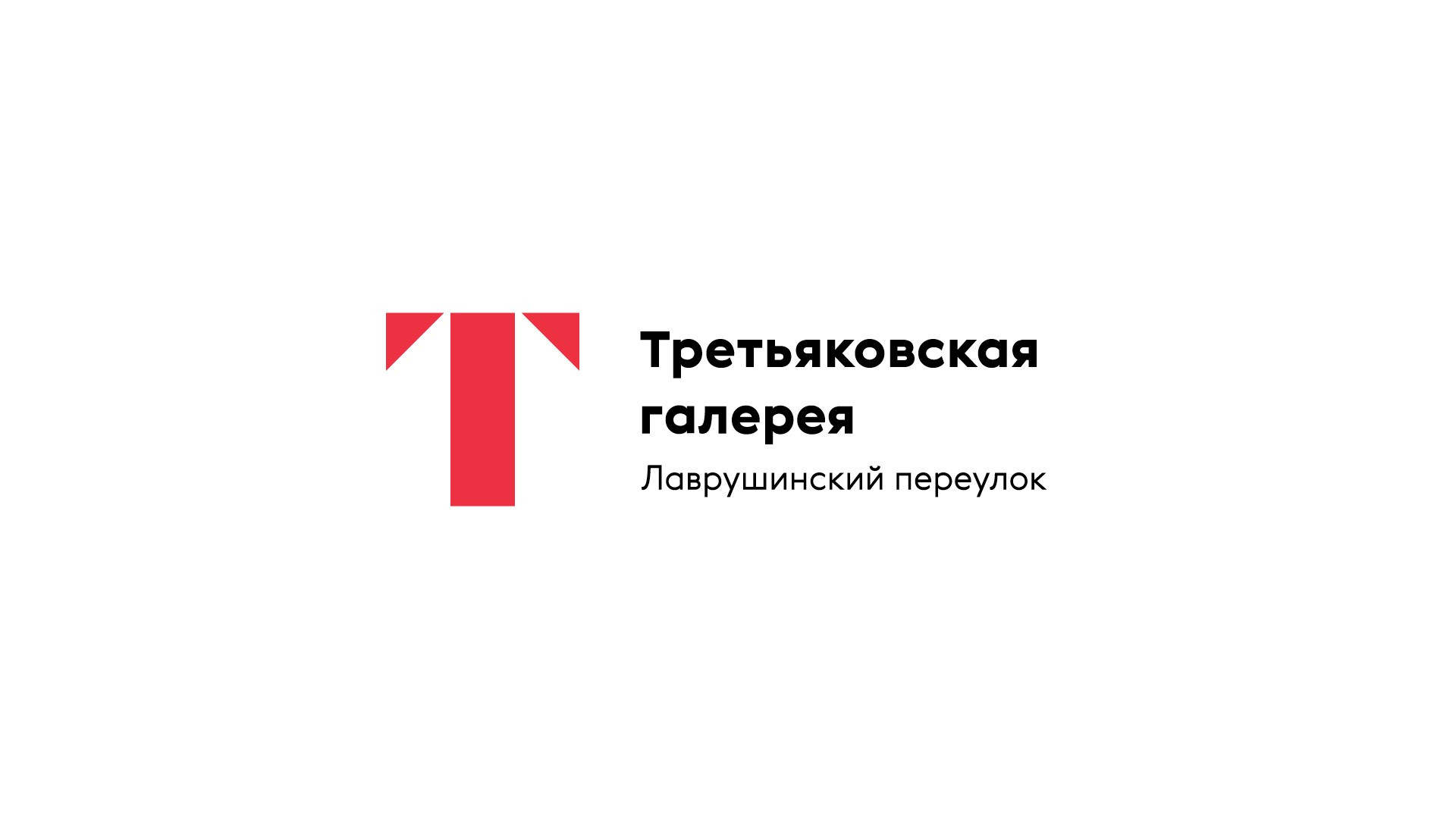
The solution came with a living letter «T». It blends into all kinds of images and objects and brings the focus onto the people. This new «T» merges the tradition of cyrillic alphabet with the aesthetics of Russian avant-garde. The latter naturally fits into modern digital space. Irt is easily recognizable in many different cultures and languages. This sign laid the foundation for the new flexible visual language of Tretyakovka — this is not just a letter, but a window into the world of Russian art. This window opens to reveal painting, sculpture, installation, and actual people. At the same time, the sign is not alien to the visual language of the gallery. The letter «T» has been often used in its visual identity. A good example here is the the old ГТГ logo (Russian acronym for State Tretyakov Gallery), that was stamped on the official papers of the museum and put upon the facade of the gallery building on Krymsky Val.
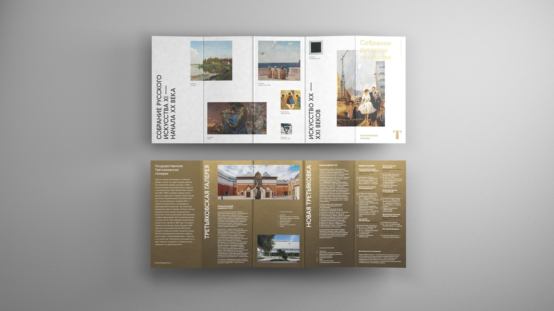
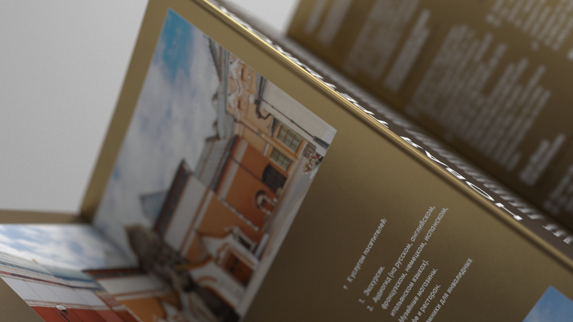
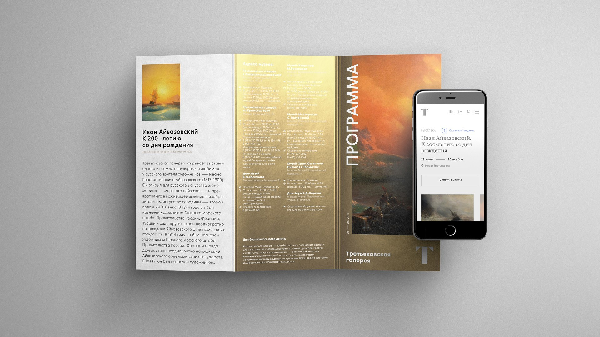
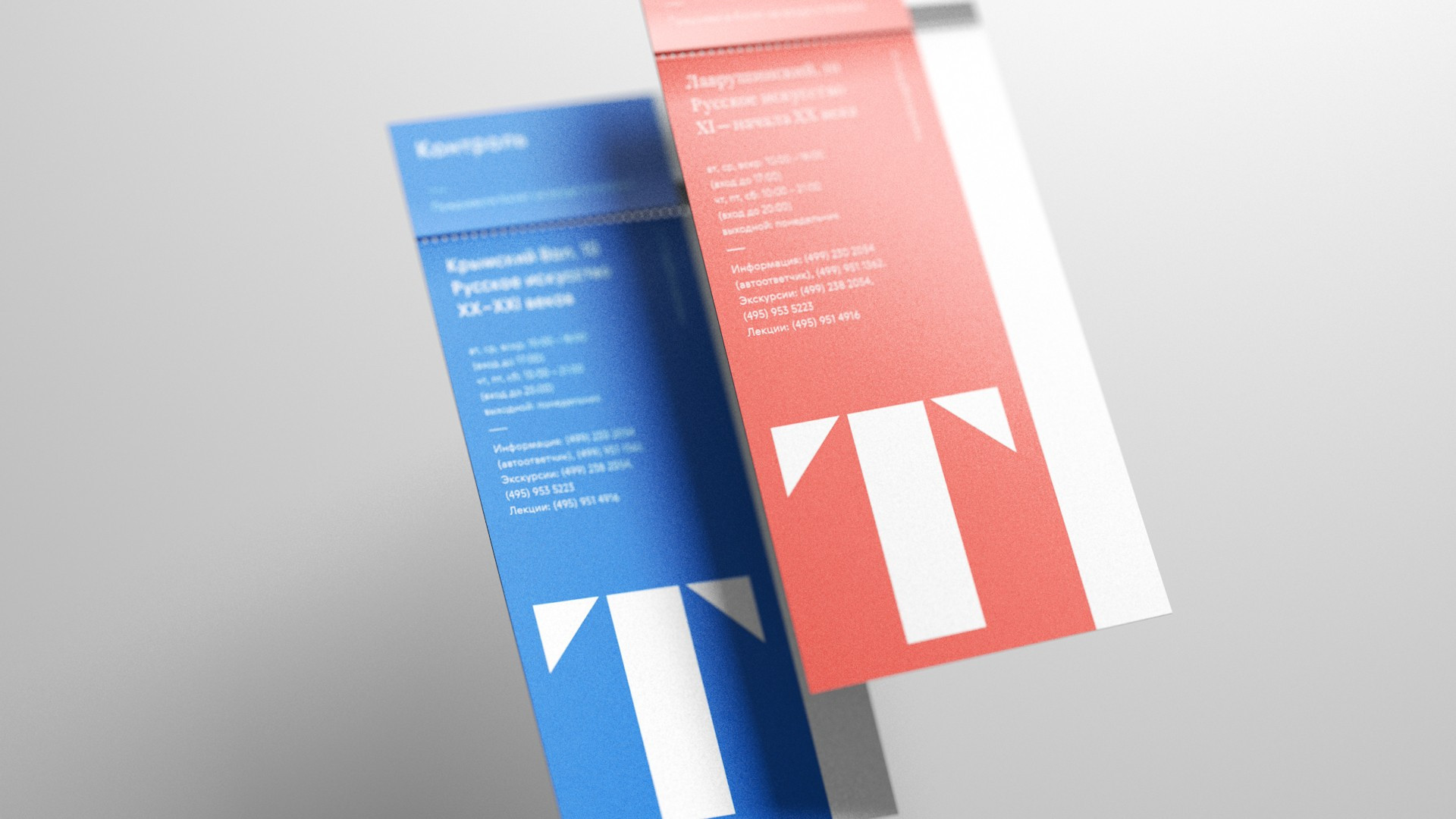
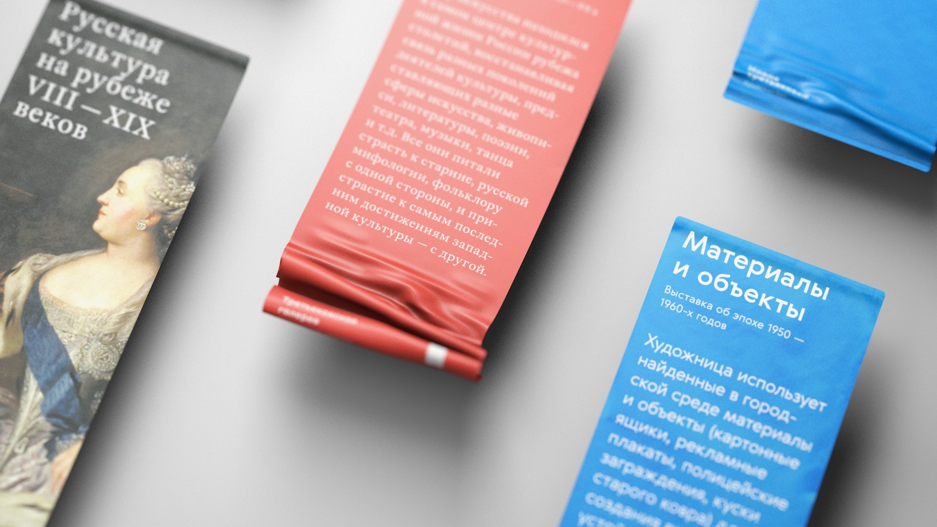
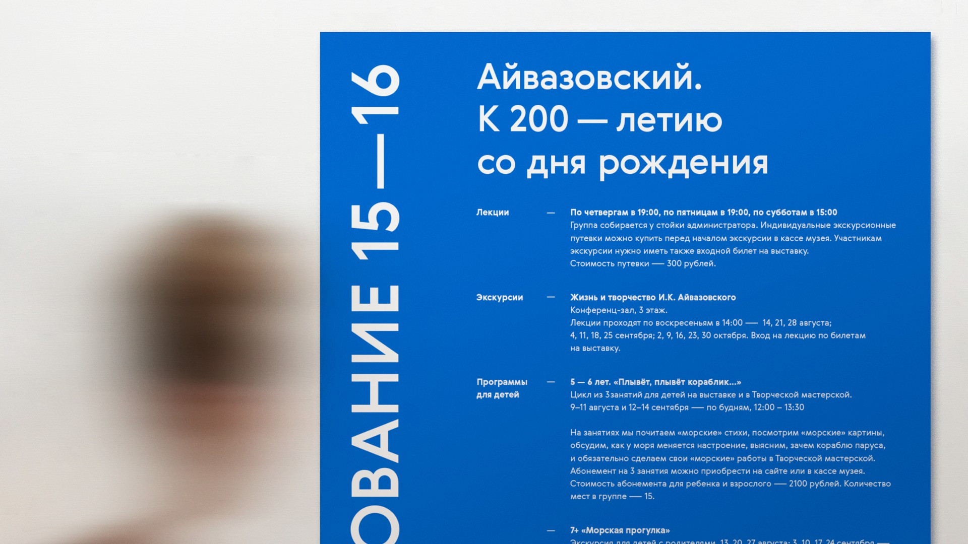
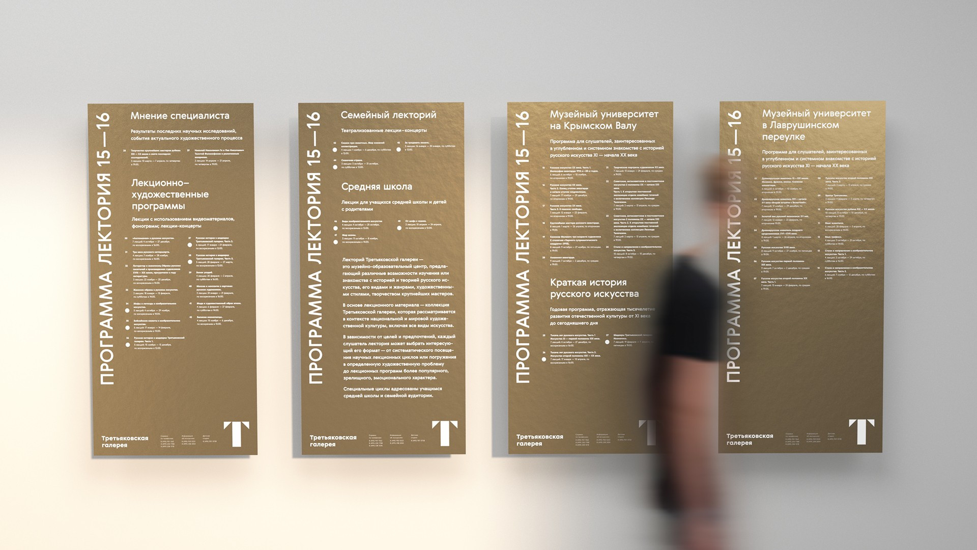
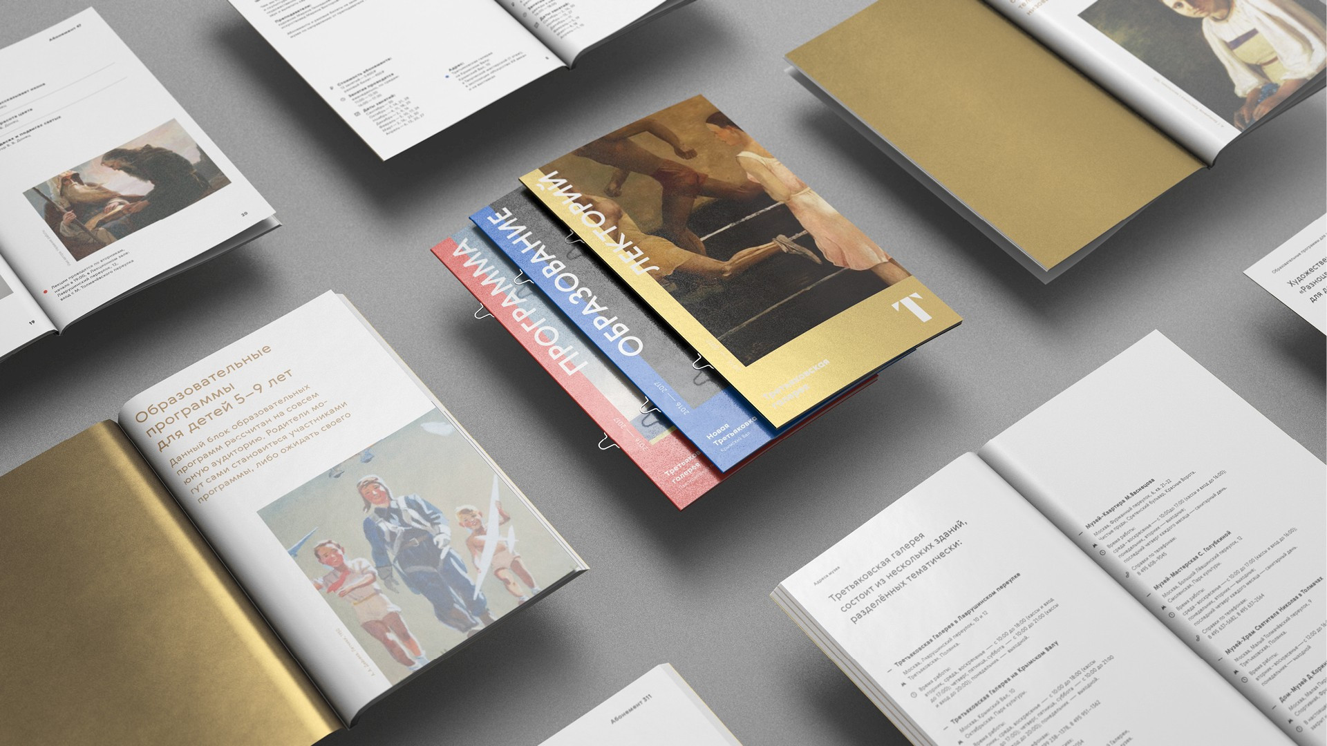
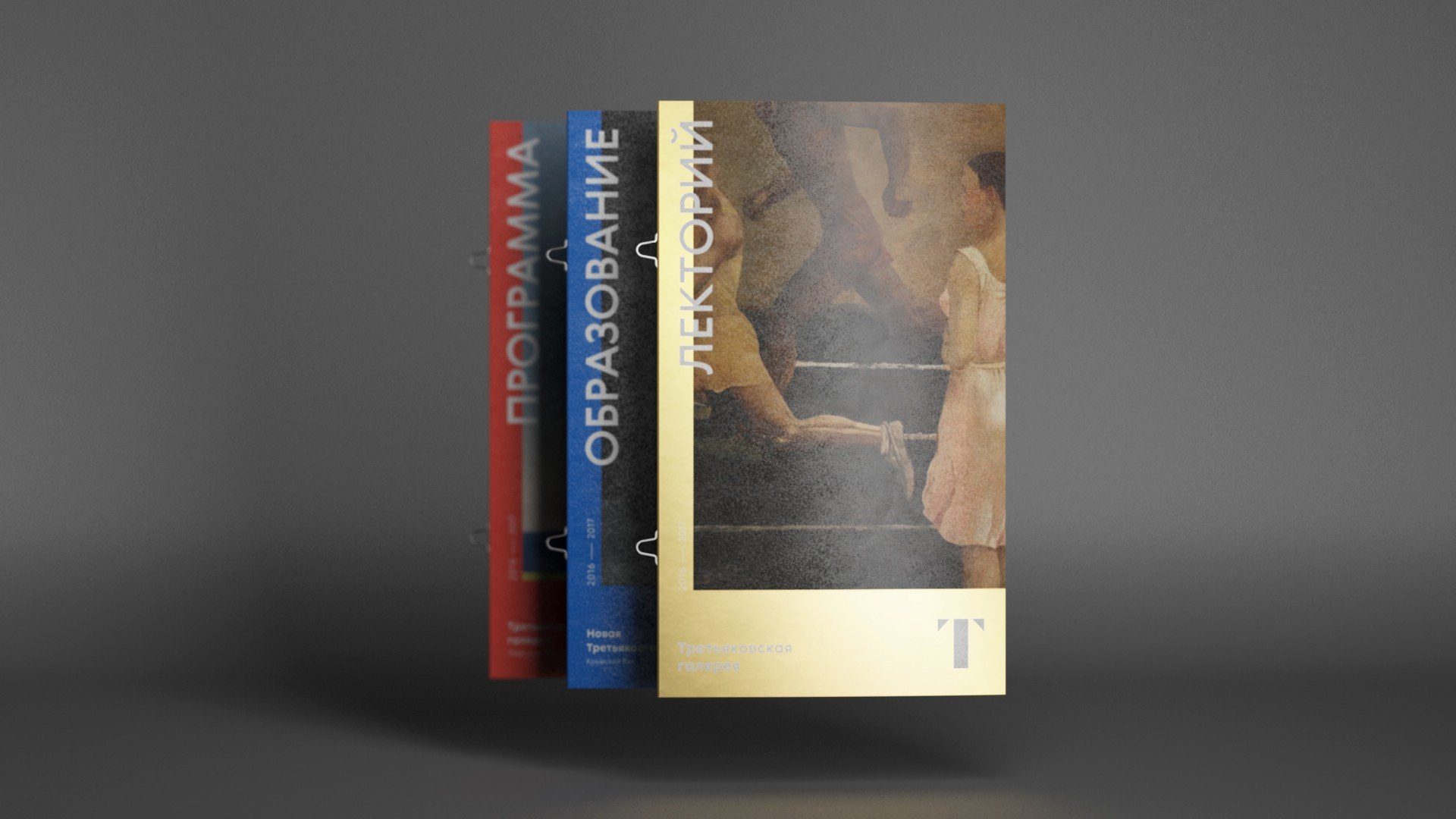
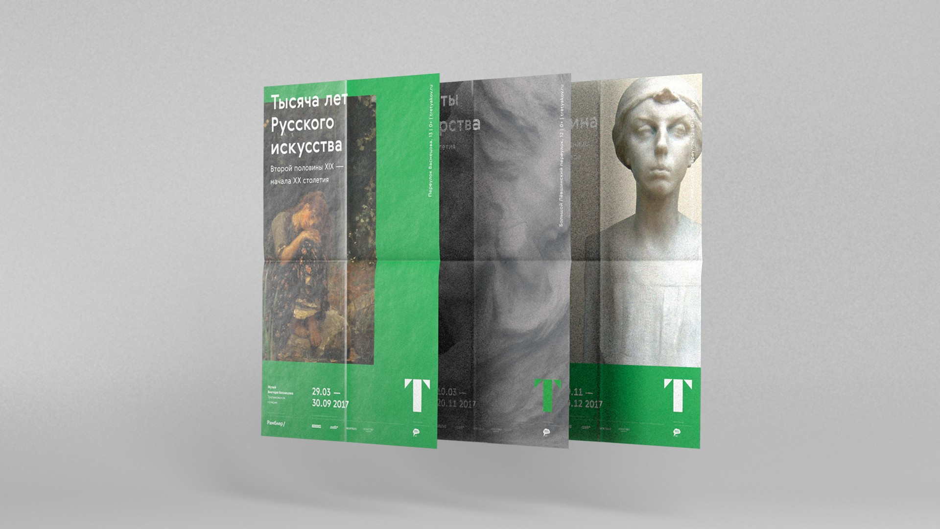
Tretyakov Gallery is large-scale museum complex. It occupies the entire block at Lavrushinsky Lane not to mention the grand building on Krymsky Val, the four Houses of Artist in different neighbourhoods of Moscow and the Museum of Tretyakov Brothers. But the gallery is not limited to its venues. It invests a lot of effort into education, filmmaking and theatre. All of these entities and activities required certain visual distinction. Therefore color coding with some new colors was integrated into the identity of the museum. Gold became the universal color of the gallery. The Lavrushinsky Lane got the the red color. Blue went to the Krymsky Val. And for the first time ever the color was assigned to the Museum of Viktor and Apollinary Vasnetsov, the Museum of Anna Golubkina and the Museum of Pavel Korin. They were united under the green.
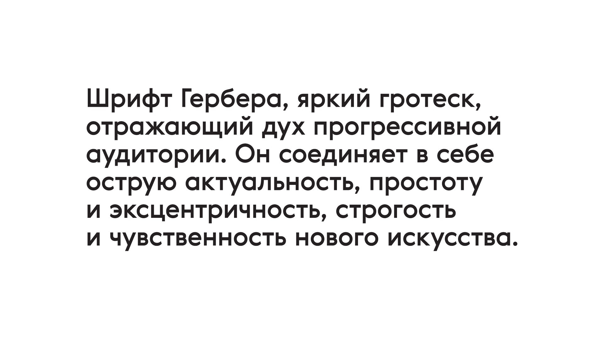
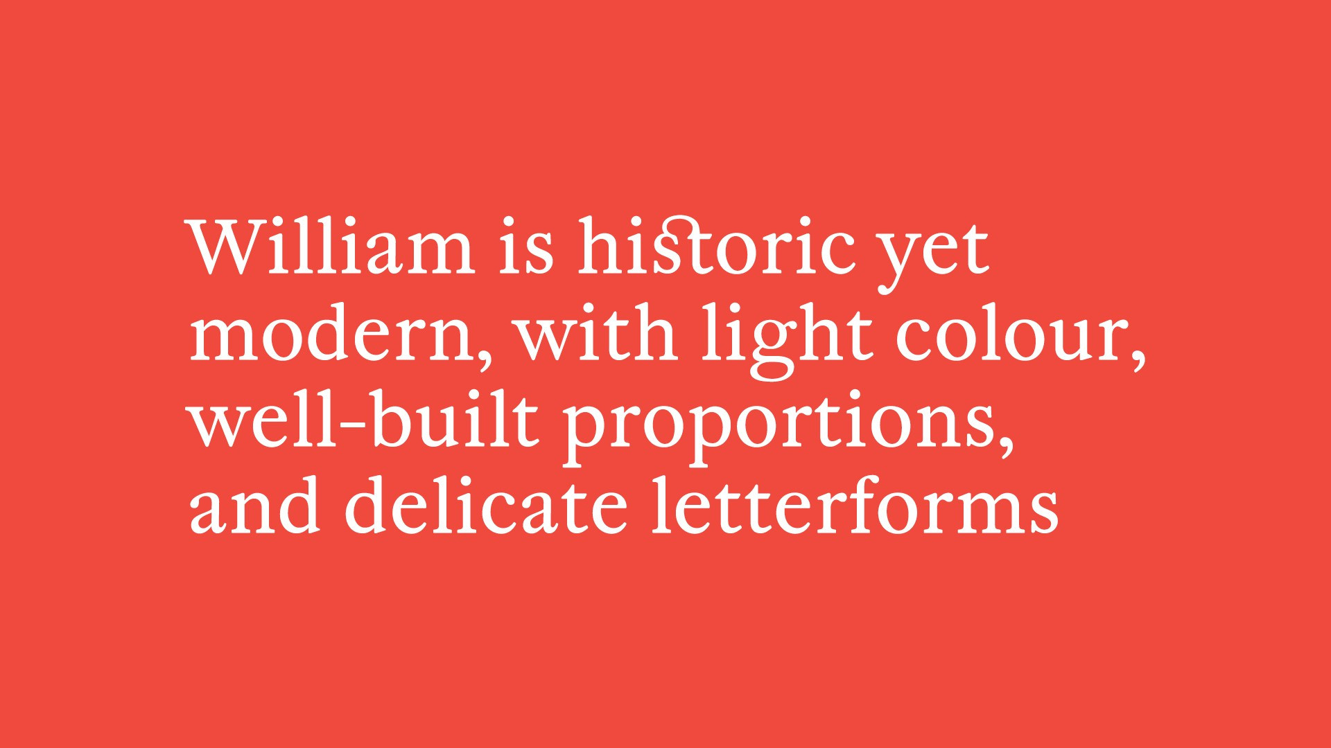
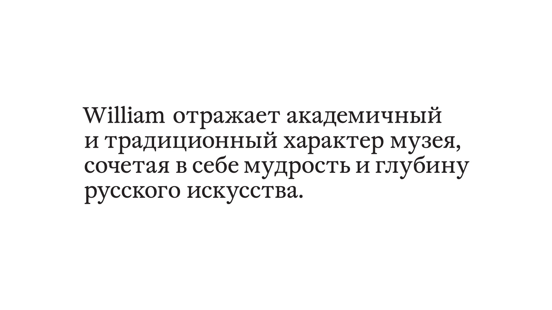
The typographic style of the gallery rests upon two carefully selected typefaces that exist in true harmony. The traditionalistic character of the Tretyakov Gallery at Lavrushinsky Lane is mirrored by the academic William, the typeface that feels as though it was intended to tell about the wisdom and depth of Russian art. The new and progressive spirit of Tretyakovka is expressed by Gerbera typeface.
The universal system of design was developed to create all kinds of visuals for the gallery. It is based upon a square module that determines the layouts of designs. Overall the system allows so much flexibility in positioning of graphic elements that designers can easily go for the baldest solutions.
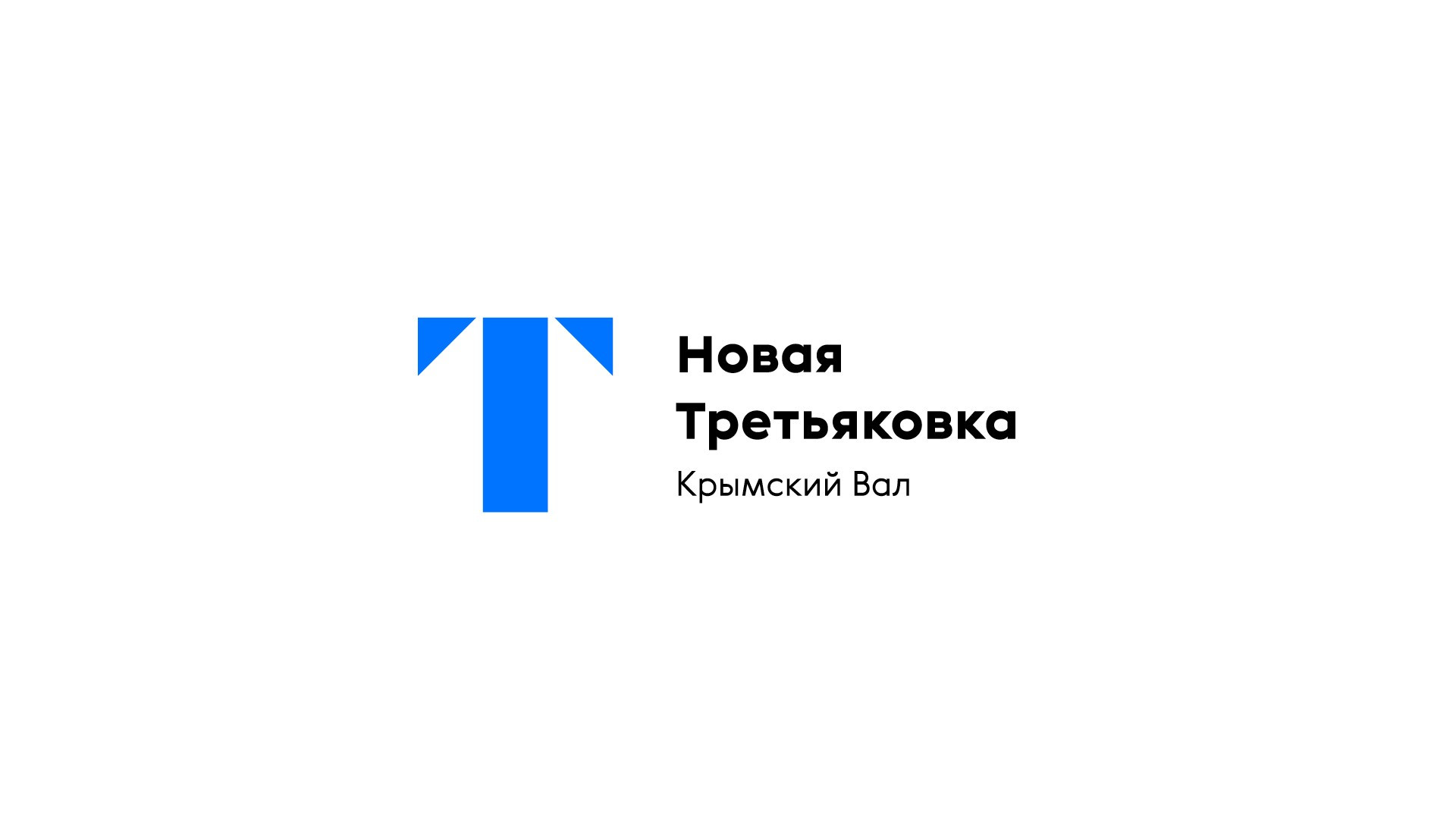
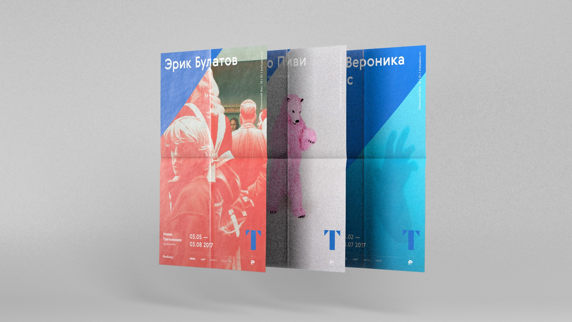
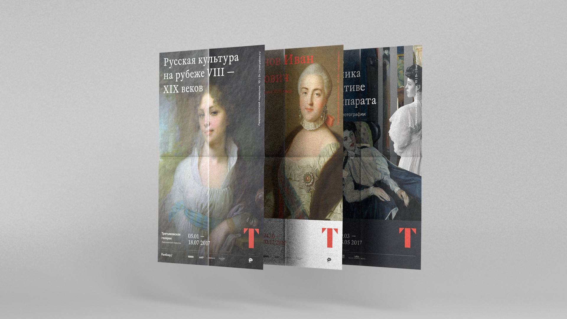
There is one element in the new visual identity of the Tretyakov Gallery that no other museum in he world has. The radially enlarged triangle of the letter «T» forms diagonal that evokes the sense of movement and symbolises the look into the future with the new vision of art. The diagonal is the natural extension of the modular system. The kinetic nature of the diagonal brings even more dynamics into the visuals of the gallery.