Torgi223. Easy about difficult
"Torgi223" is an electronic tendering platform. The platform is one of the leaders in terms of the number of services for customers under Russian Federal Law No. 223-FZ. They allow purchase and sale transactions between businesses. Such platforms also enable the possibility to organise tenders and post information about products and services. The product had to be comprehensively updated - so the company turned to us for a strategy, rebranding and a new promotional website.

The research conducted by our strategic consultancy agency Signal (part of ONY) has identified the main pain point. The digitalisation of tendering seemed designed to make procurement more efficient, yet, it merely transferred the monotonous paperwork from traditional offline formats to electronic ones. Digital products were far from perfect: forms on websites had to be filled in by hand every time, and communication between the players and the audience was becoming impersonal due to the complexity of the category and the lack of emotional connection.
"Torgi223'' is fundamentally different from the other players — the platform prioritises customer service and utilises a genuine product approach in service creation. The users are provided with the support of experts in procurement procedures, who advise clients quickly, clearly and comprehensively. The e-platform is constantly evolving, and new flexible solutions are continuously being tested and implemented. A human-friendly approach, a rejection of bureaucratic templates and the best of the digital world — are the very features that have been incorporated into the brand platform and then reflected in the positioning. "Torgi223" is a flexible service that contributes to the growth of the businesses of their clients.

The principles of humanity, flexibility and the ability to explain the complex with simplicity were the starting point for the new corporate identity concept. At the core of the eventual identity are illustrations depicting little men and a bold colour palette, in contrast to the other players across the category. The human nature of the illustrations derives from their texture – they are drawn as if in wax crayon.

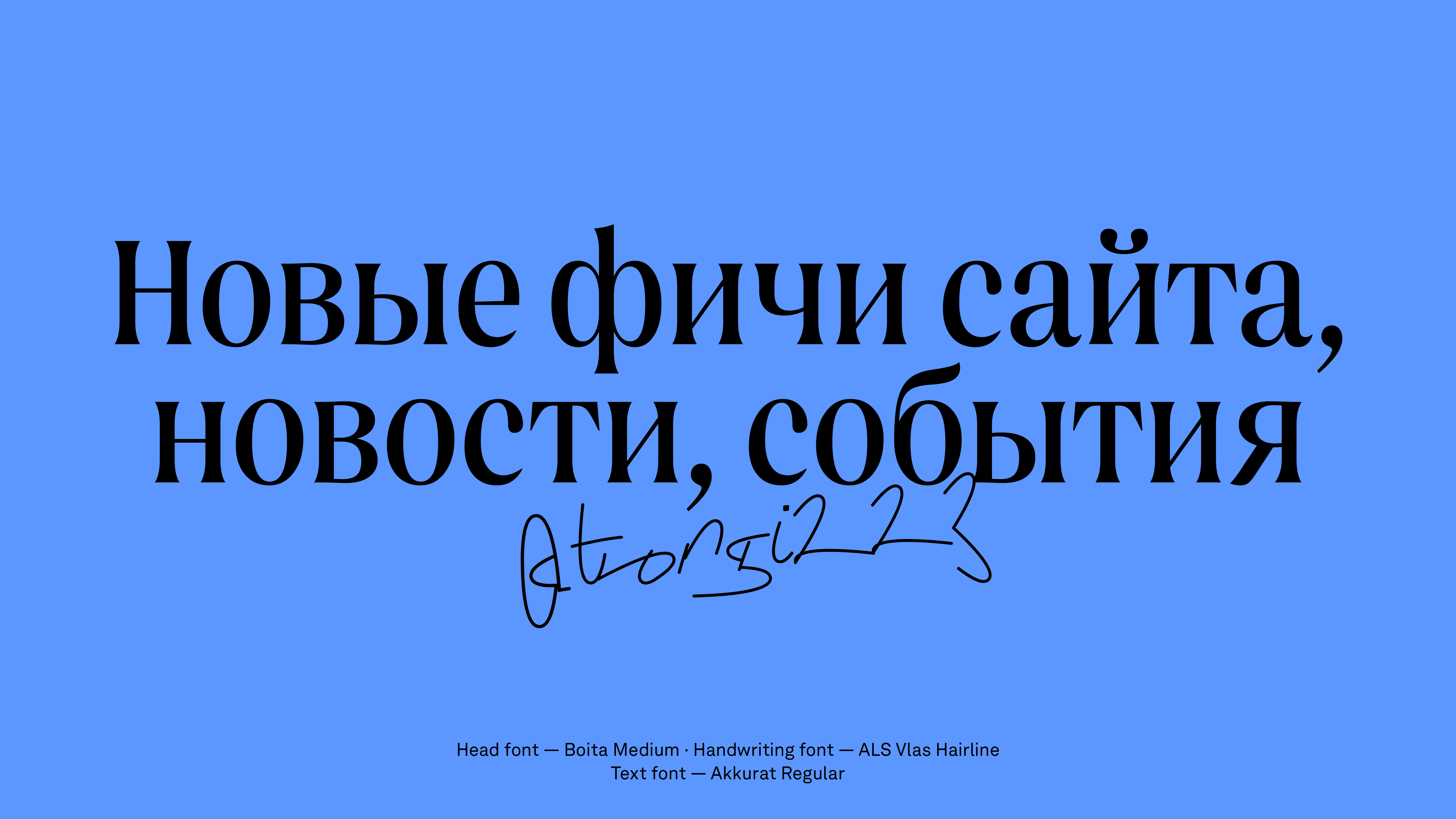
We have chosen a Boita font that supports the idea of friendliness while maintaining the right degree of formality since bidding and procurement are meant to be serious. Additional graphics in the form of dashes and lettering referring to handwritten notes help to introduce character and instrumentation while allowing the style to be more flexible. This is how the energetic and non-repulsive sign in the form of a capital 'T' lettering has been created. In the signature palette, we have incorporated juicy yellow and paired it with a sandy touch.
Thanks to the unusual placement of the illustrations, their scale and their interaction with the typographical elements – additional meanings have been created on the platform's promotional web page. We have placed these little men, who live and interact with important information, in their own world (the one we have created for them).Besides, as part of the concept, these little fellows have also found home inside the interiors of the company's head office.

The "Torgi223" is a promotional website for the platform itself, so it was important for us to make a clear and attractive page for both customers and suppliers. According to law 223-FZ, a customer is obliged to hold a tender only on one of the many platforms, so the level of competition in the category is high. The main objective of the developed promotional website is to attract as many customers as possible to the "Torgi223" platform and thereby give more opportunities to suppliers.
Another crucial objective we had to achieve was to minimise the distance with the client by showing them how to interact on the "Torgi223" platform. Placing orders and working on e-commerce platforms always means a lot of information, dozens of spreadsheets and complicated procedures. But on the "Torgi223" platform, consultants and a cutting-edge product help to make this journey smoother. It was vital for us to think through the UX of the promo page so that a potential client gets the impression from the first moment that it is easy to work on the platform itself. We tested our solutions in several in-depth interviews.
The "Register" section is the most popular on the website, as you can find an up-to-date list of tenders and all the information about their conditions. We have moved all the important documents from the register to the pre-purchase card in the new version of the website (before an extra action from the user was required to see all the documentation). The supplier now spends less time evaluating and selecting a suitable tender and can download all the documentation without opening the procurement page.
To make the search for procurements of interest in the register easier, we have adjusted the search visually: we have put the main parameters in the short version and the detailed ones in the extended version. From in-depth interviews, we have learned about a frequent pain for suppliers – if one participates in a large number of tenders at once, it can be challenging to keep track of bid submission deadlines (where every minute counts) and sum up the dates. We have added the ability to save dates and timing to Google's work calendar so that users can keep track of their deadlines and be sure they have time to place their bids.
In addition to tendering, "Torgi223" helps to automate the client's work by offering various services such as electronic document management, obtaining an electronic signature, checking counterparties or issuing a bank guarantee. We have put all the additional services on separate landing pages, making the presentation of information more consistent. For example, if a client needs electronic document management, it is crucial to provide this service quickly and make them forget about the paperwork forever. For this reason, the page first describes all the advantages and possibilities of the service, followed by a call to action.
The willingness to help and a human-friendly approach to customers are also reflected in the "Knowledge Base" section, where we have brought together all the most useful information about the platform. This is not just a FAQ but a detailed overview of questions that may arise during the interaction of suppliers or customers with the platform.

It appears that "Torgi223" has taken a big step towards a change in e-tendering by choosing an unexpected and bold style. Currently, we are working further with the client and improving the product itself – the internal platform where the bidding takes place.