Waves. Get started with blockchain
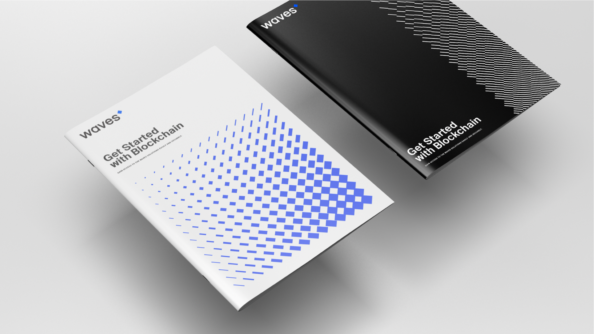
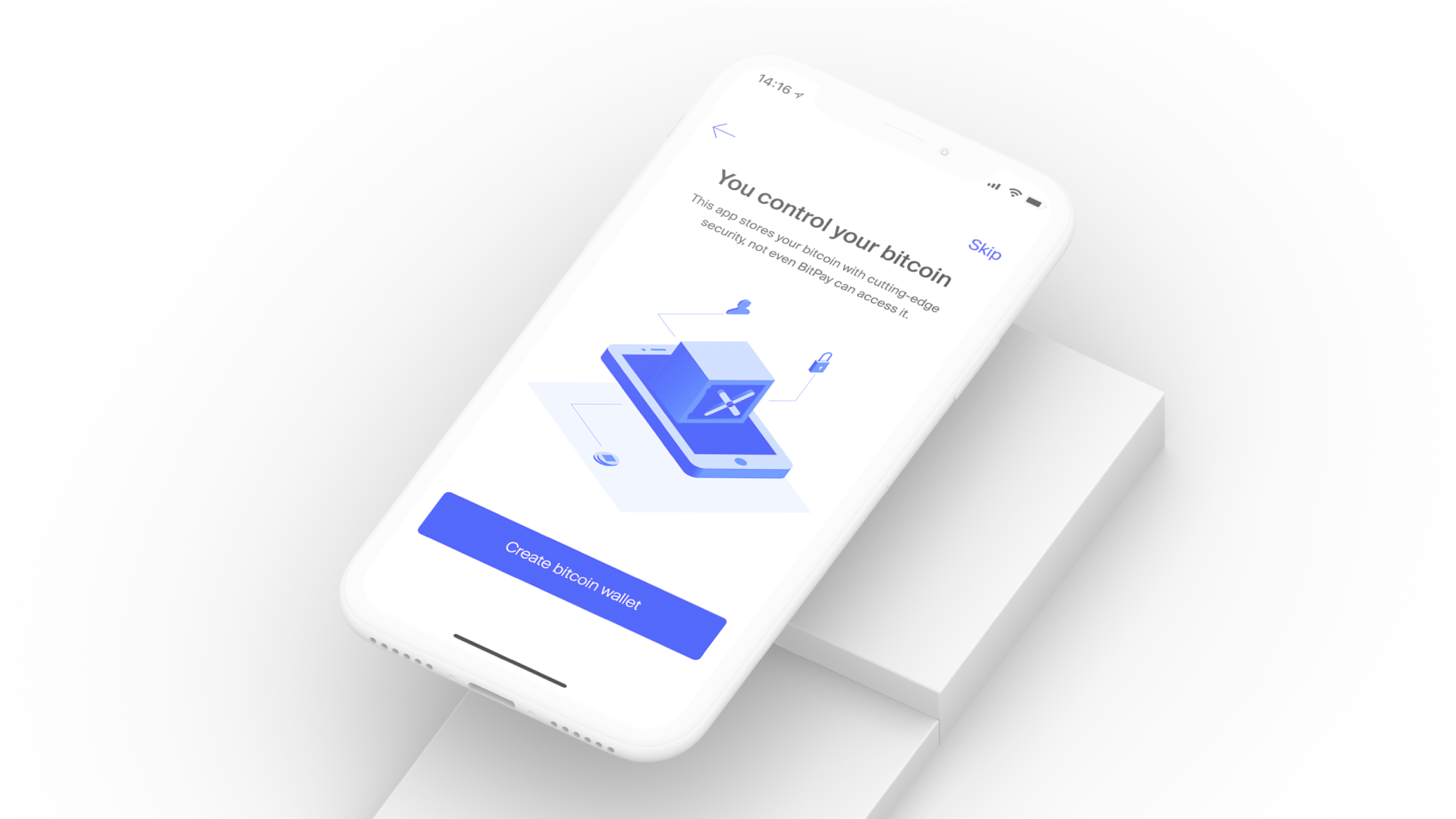
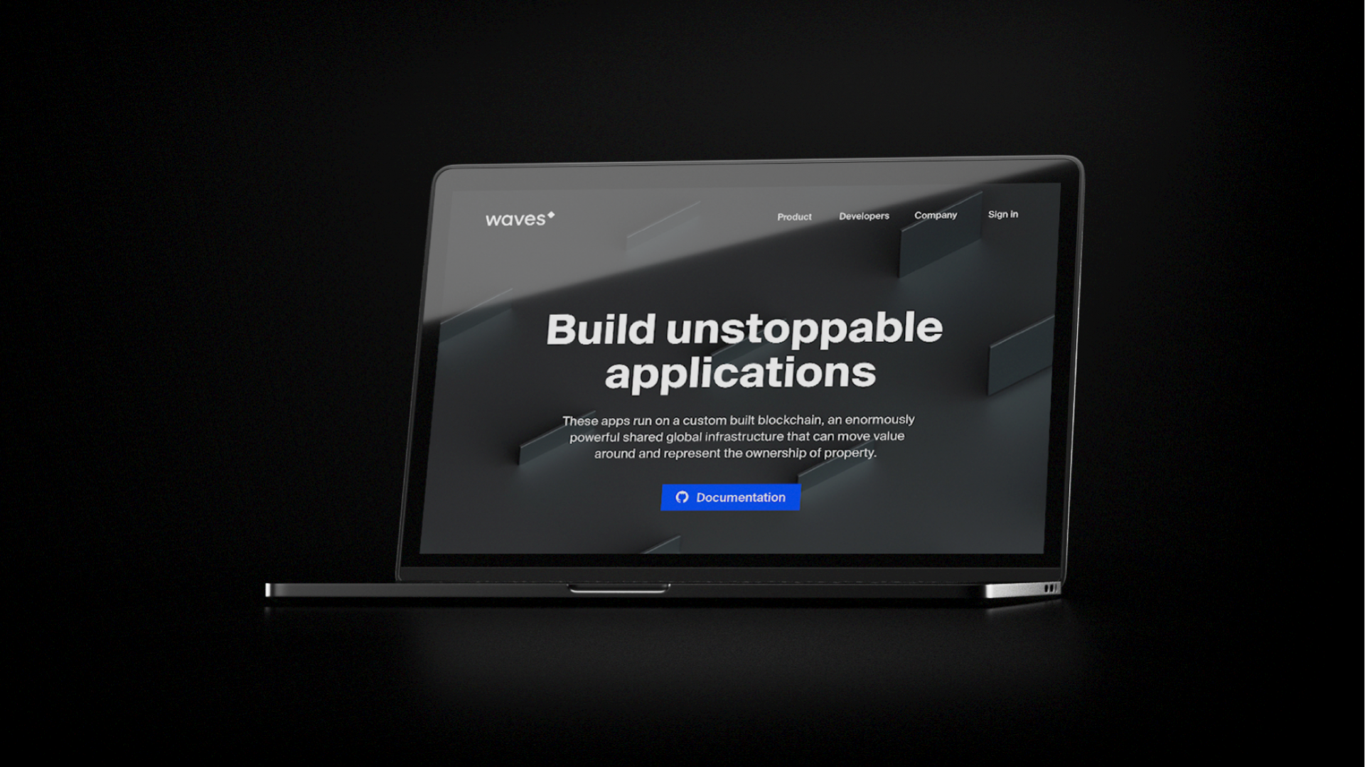
Waves is a unique company. This is a blockchain ecosystem that gives users a wide spectrum of services: wallets, an exchange (DEX), merchant, and token release. We were able to unite 5 of the business’ different target audiences with the help of an identity that integrated codes and meanings from each of those groups.
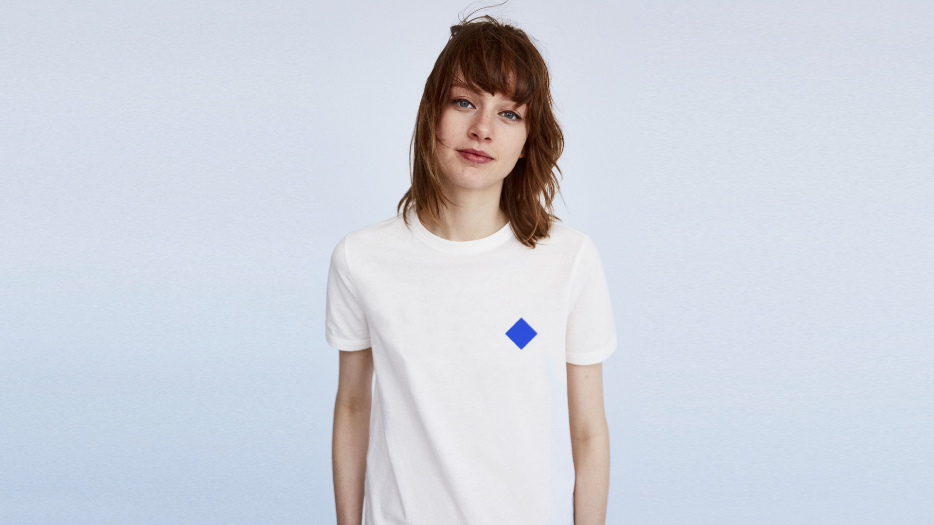
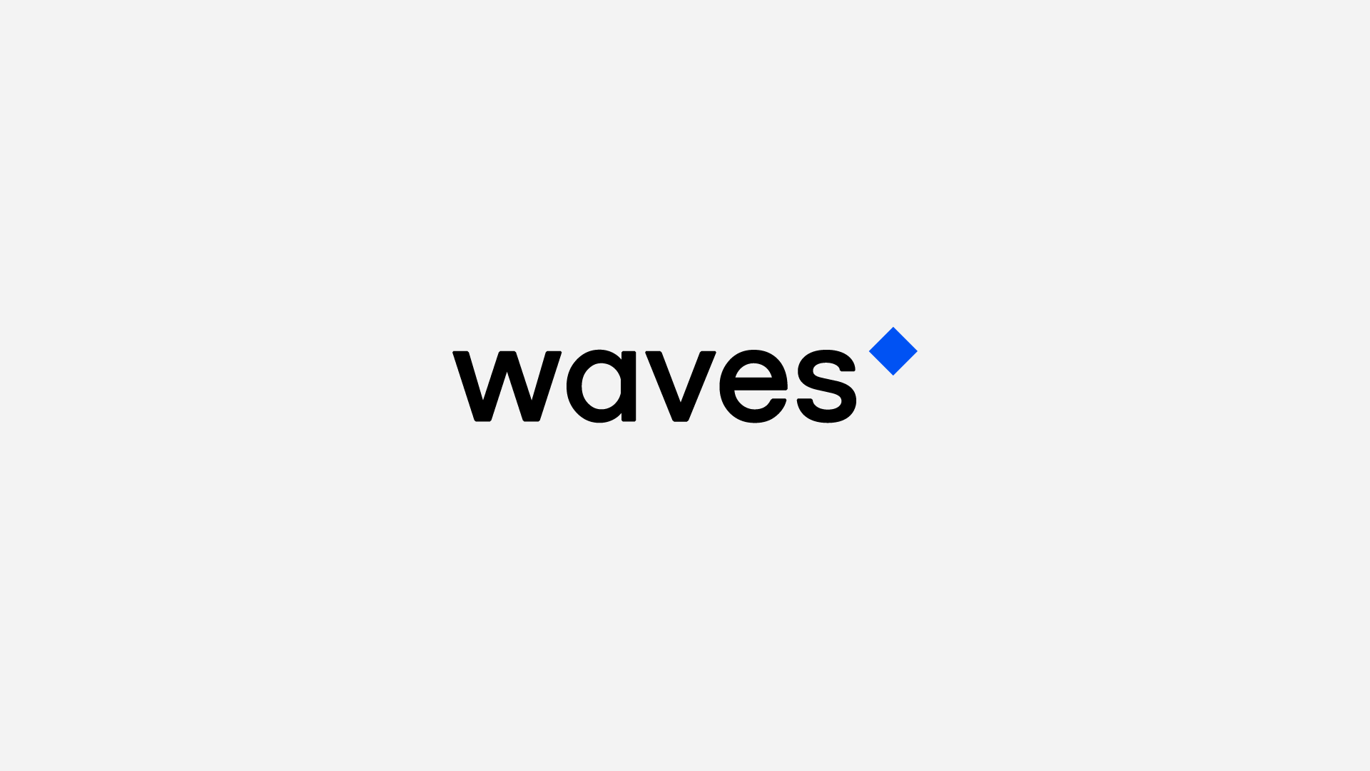
In developing a new logo for Waves, we tried to make something as simple as possible, creating a symbol for cryptocurrency that reflected the scale of the fundamental differences between old and new systems. Our new logo was a kind of antithesis to circles and coins, and a counterpoint to traditional notions and visualizations of money. It isn’t limited by the laws of physics, and exists in an unstable state that we’re not used to seeing. This fundamentally new “digital” entity is the symbol of “new money”.
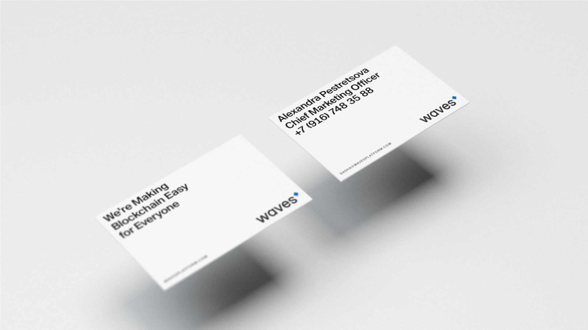
In our visual language, we reflected important attributes for the industry: innovation, high technology and even some elements of a cyberpunk aesthetic. All the while, of course, we put an accent on lifestyle elements: after all, cryptocurrencies are slowly become a part of all of our lives. We thought that it was important to make the brand pleasant and psychologically comfortable for the widest possible target audience. Waves is a global product which will soon be integrated into every part of our lives, becoming the “lifeblood” of the new economy.
