A kingdom comes alive. World Schools Team Chess Championship
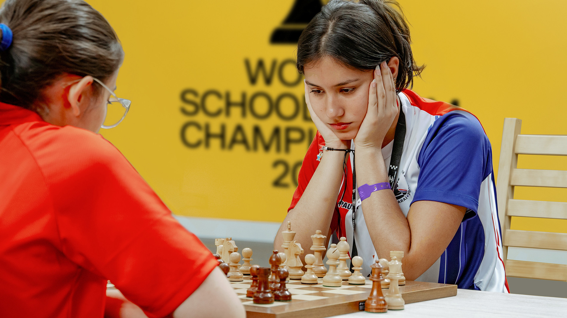
The first World Schools Team Chess Championship in history took place in Kazakhstan in the summer of 2023. FIDE, the Kazakhstan Chess Federation and Freedom Bank participated in its organisation. The tournament was the first amateur team championship in history, in which teenagers from 50 countries participated. Our task was to create an identity and logo that would remain relevant and fit the visual design of the event in the next few years.
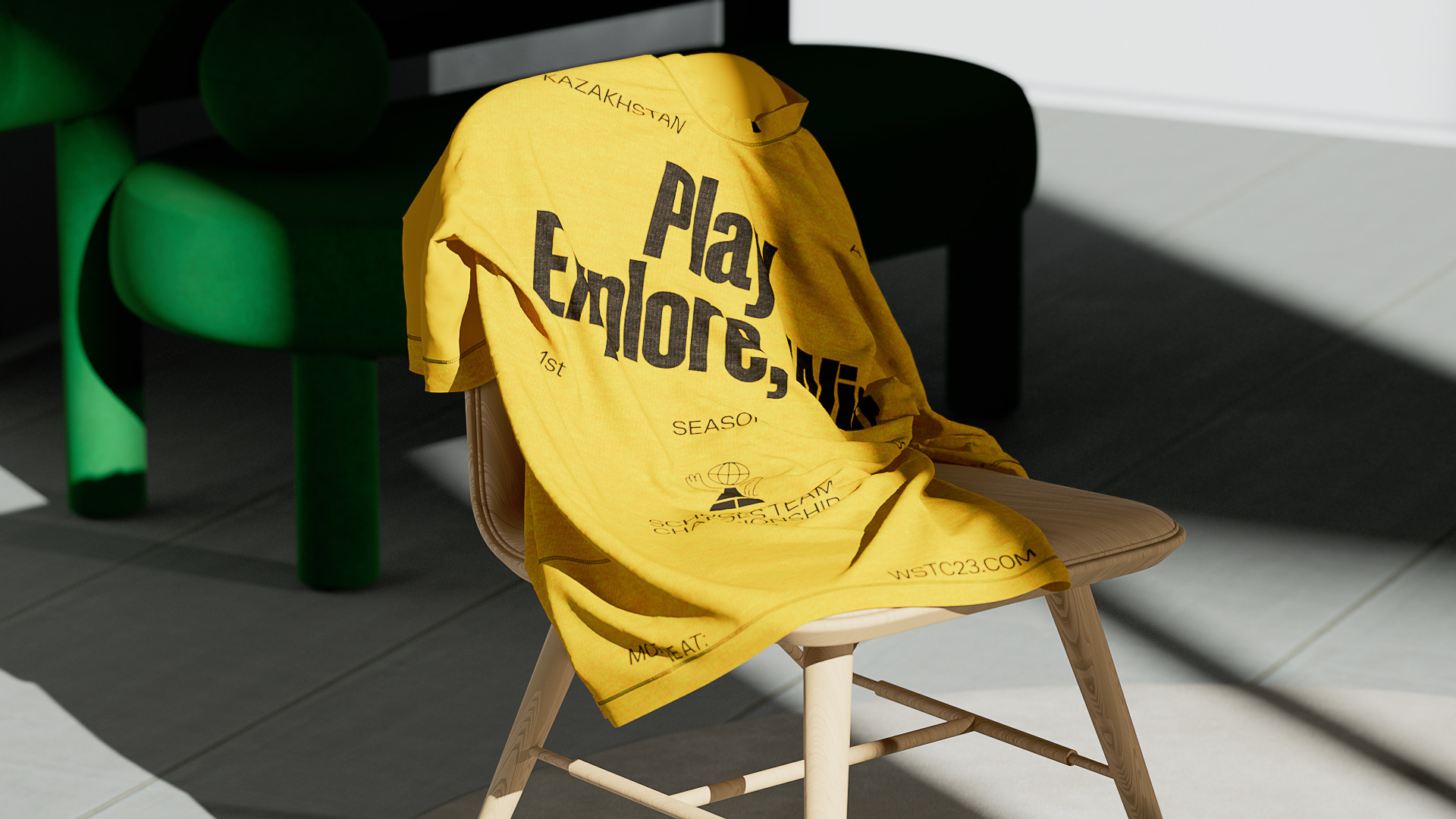
At the core of the championship identity lies the idea that chess is a marvellous kingdom. The characters, with their unique traits and personalities – chess pieces – live in this world. A charming mascot – Pawn – stands out, representing an attendant for young players in this fascinating world. This very simple chess piece is a symbol of the championship. It reflects perfectly well the amateur level of the tournament and the opportunity to participate, even if you've only recently started playing chess. In the logo, the pawn appears as a lively character with arms, legs, head and human-like behaviour.
Other pieces also come to life in this world. They play, rest and chat with each other. The characters are sketched in a vibrant illustrative style, and a simple stop-motion animation adds a childish cartoonishness to them. Alongside this, our aim was to emphasise the deep intellectual meaning of the chess game, balancing the childlike mood with the artistic execution. We took inspiration from Picasso's early sketches to create the characters. Their personalities and emotions are ambiguous: some are smiling cheerfully, some are brooding, and others are smirking judgmentally.

All elements of the identity refer to the visual language of the modernist period. The typography reflects it as well. The contrasting combination of grotesques – the bold, elongated ONY Track and the Helvetica-like ONY One – recalls the traditions of the Swiss typography school. The implementation of international design techniques supports the multicultural nature of the chess championship, where children from all over the world participate.
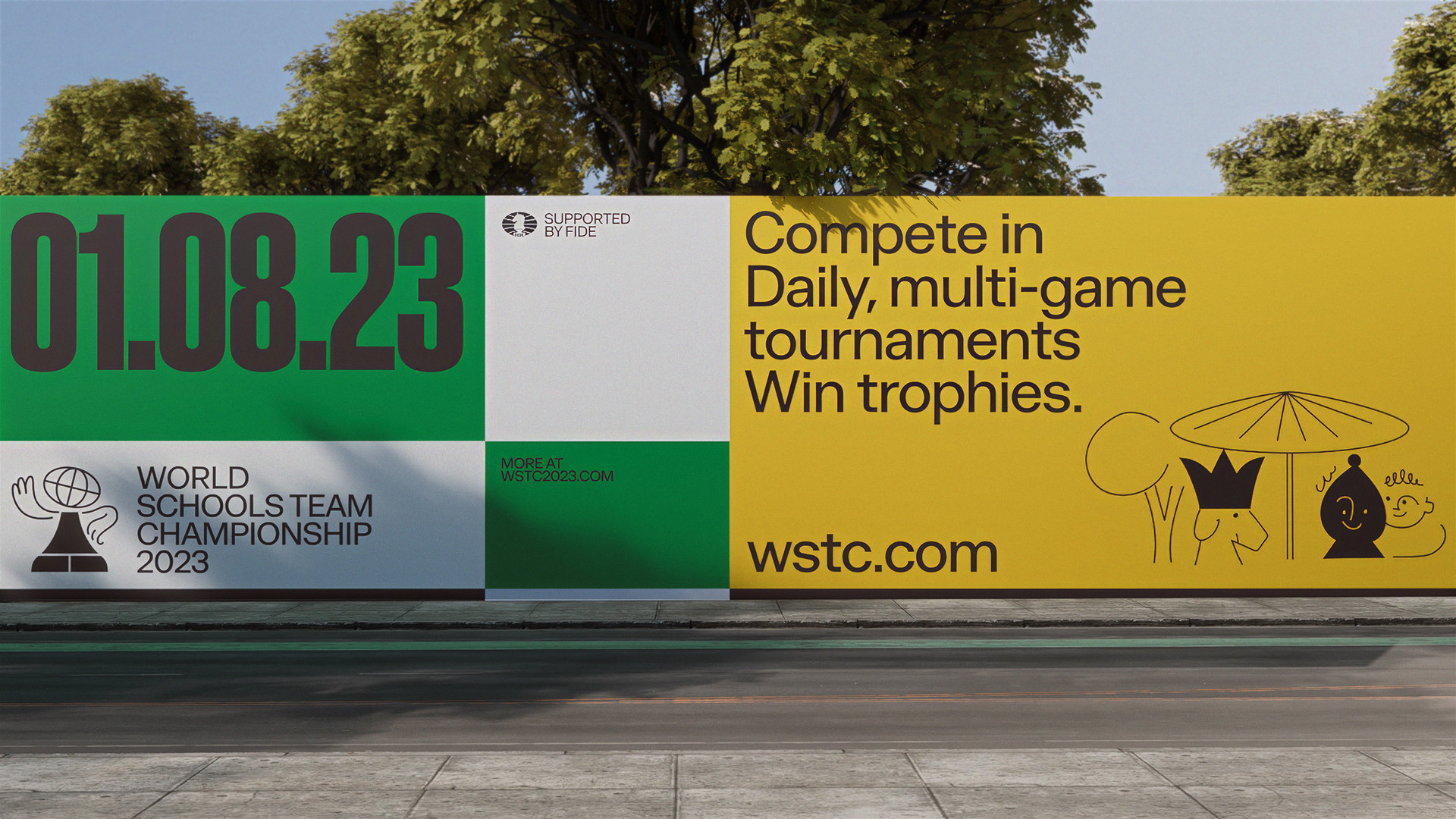
The visual concept follows the logic of a chessboard: the space is subdivided into segments. The system of blocks alludes to the structure of the chessboard, which occurs at different scales: from the tiniest details to the overall image. The chessboard itself appears in layouts but is distorted, giving a sense of depth and perspective, allowing the imagination to delve into the game board.
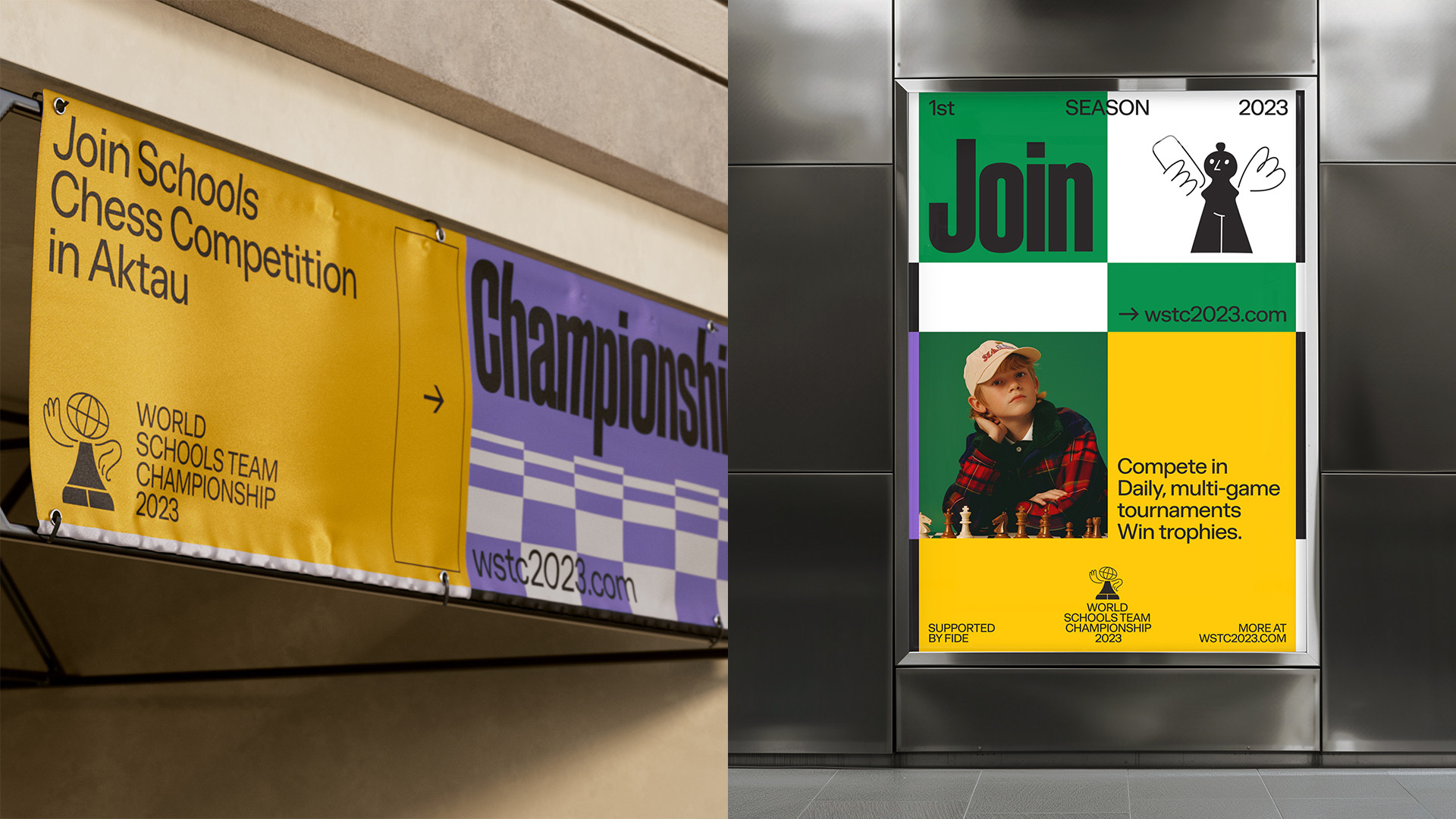
The identity follows a poster-and-magazine aesthetic, evoking nostalgia for the Olympic Games and championships of the 20th century. Brightly coloured split blocks with bold typography resemble a tournament tableau displaying the score. The colour palette consists of purple, yellow, green, white and black – this combination supports the retro sentiment.