Zolla. Step towards dreams
Zolla is one of the biggest fast fashion retailers in Russia. They sell bright, trendy, and affordable clothing that can be used to create any look. The brand is opening dozens of new stores every year, and the majority of them are outside major cities, in locations with populations of less than a million people. Our task consisted of two major compoenents: first studying, then creating a system for all of the brand's visual communication.

In working on the brand’s strategy, the experts at Signal began to study the typical resident of a small- to medium-sized city: what are their values, habits, desires, and hidden motivations for selection? For those who have yet to leave to take over the city, the key values in life are family and loved ones. This is undoubtedly a clear, important insight. But there is another interesting common thread: the urge to stand out and look good. Our studies showed that this is motivated by a kind of escapism, and creating fresh, new looks is a way to step outside the grey and monotonous daily grind. In other ways: people don’t run away, but craft their own unique realities, bringing the dream of the best life as close as possible. This is at the foundation of the brand's communication strategy: close and attainable dreams, for which Zolla offers the new looks that people need.
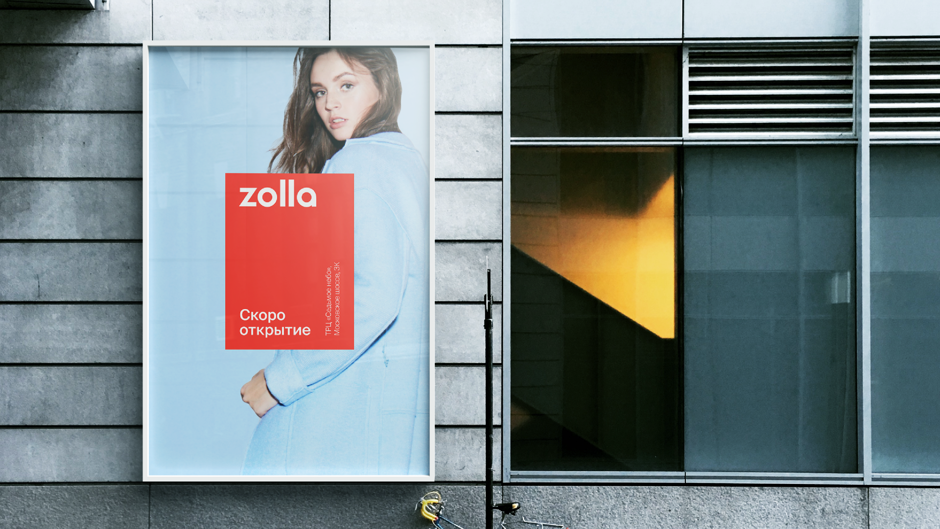
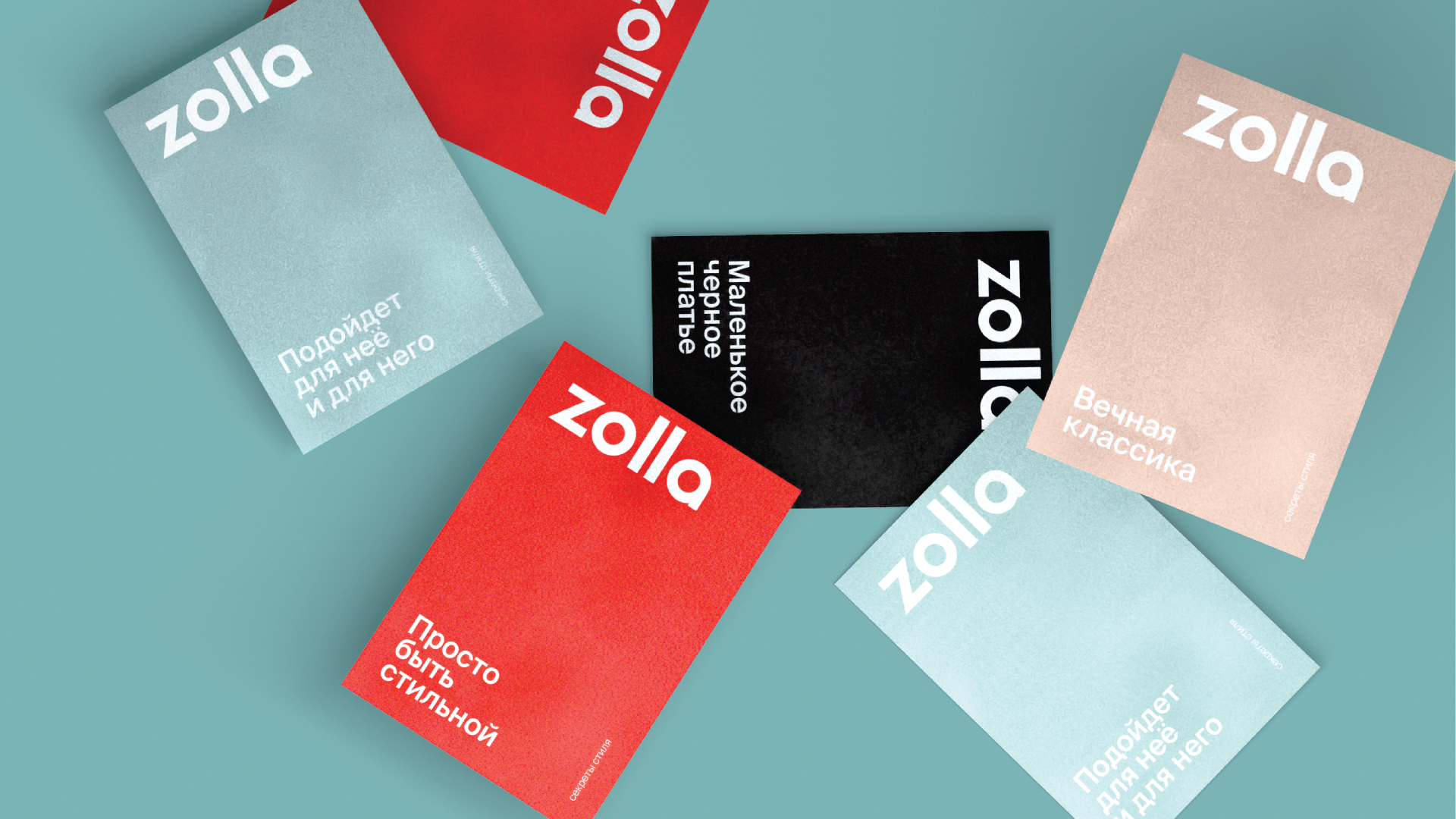
Our task was to update Zolla’s logo and branding while creating a convenient, understandable system for its use that would unite all of the brand’s visual communications. First of all, we perfected the lettering, freshening and cleaning it up. We made the line widths in each letter more uniform, trimmed the strokes of each letter to a more reasonable height, and evened out the white space in the logo – overall, making the character of the logo less mechanical.
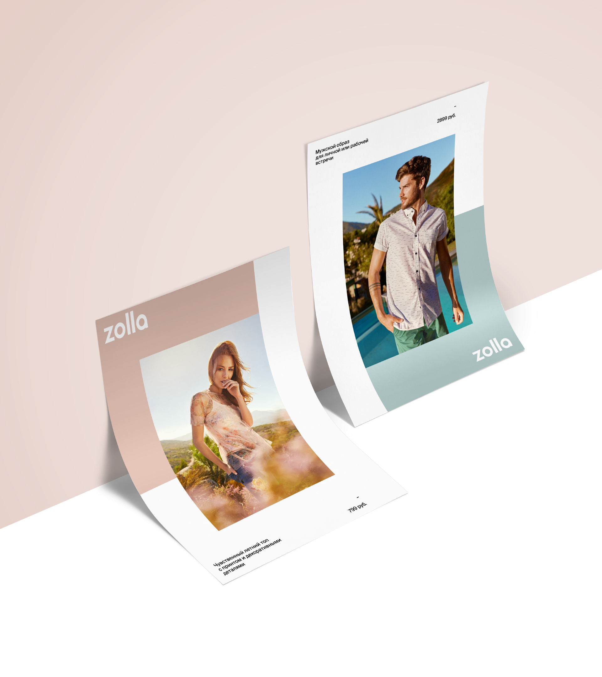
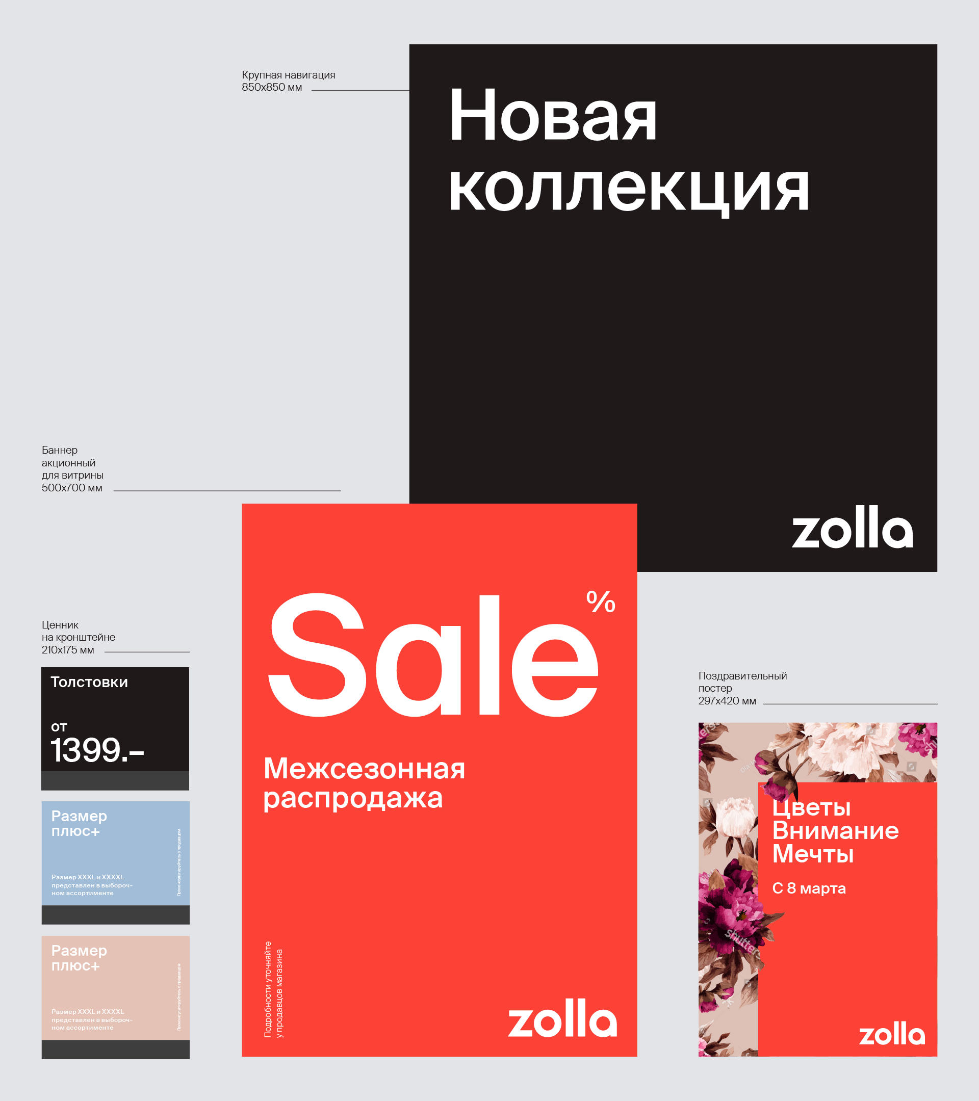
The logo was formerly used in a hard square, which seriously limited the opportunities for its use. We threw out this frame and created a new one: flexible and dynamic. It effectively became the base for the brand’s visual language. Now the frame can become a container for photography. It can turn into an information bar. It can become the border for a sign. It can take on different forms: stretched out horizontally, square, rectangular – any way at all, and the color remains unchanged.
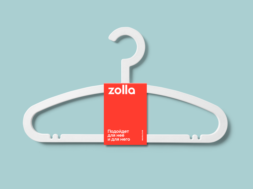

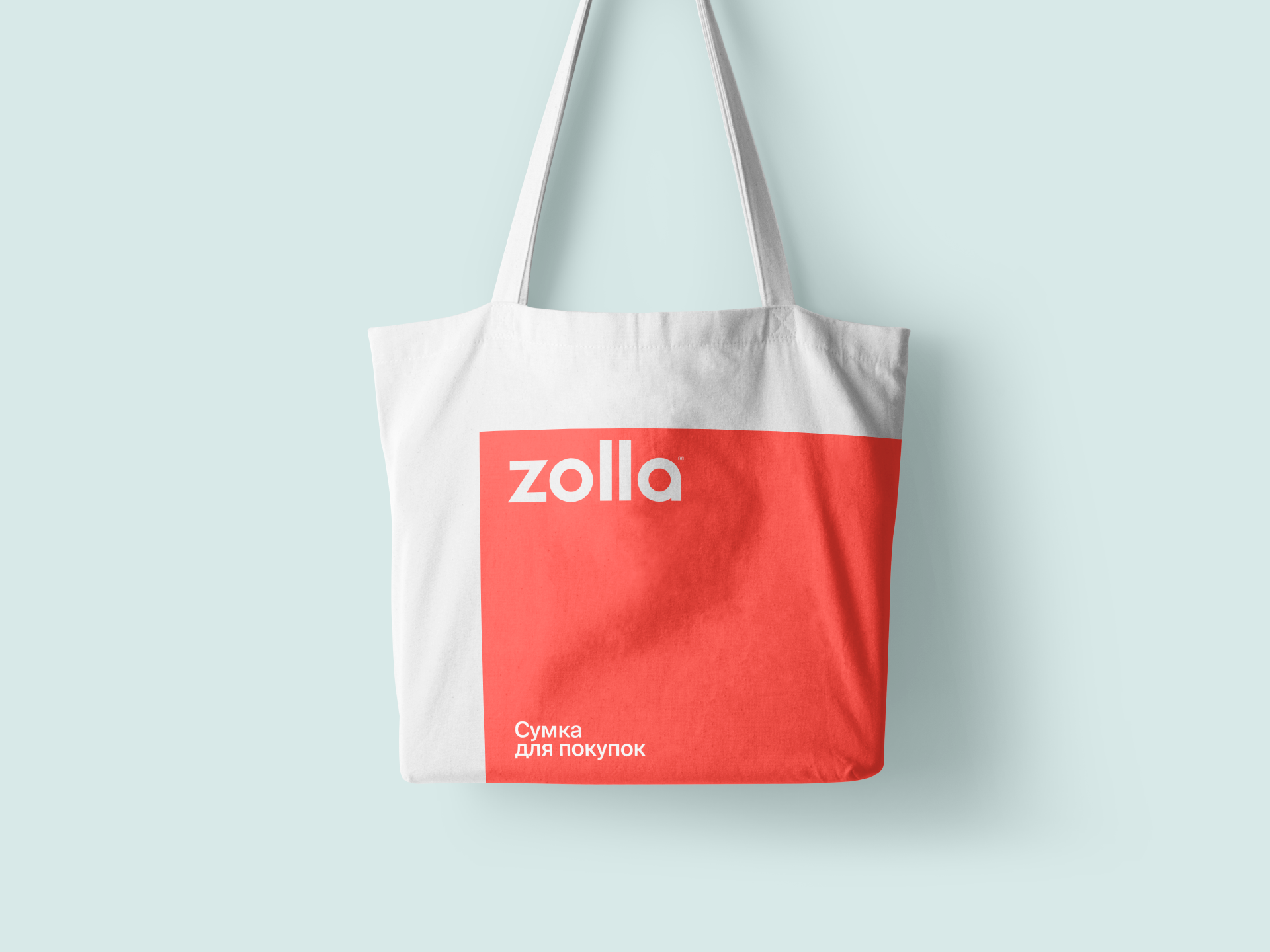
Zolla’s signature color has always been red. Red is a complex, bold color, and it’s hard to work around it. We decided to leave it as our primary, but selected an ideal Pantone color, simultaneously clean and warm. In addition, we developed a palette of five lighter shades with which it could be harmoniously combined.
The style for photos and promo videos was built on the strategy developed by the experts at Signal. The main idea was that dreams should be achievable. Whether a picnic with family and friends, a trip outside the city, a romantic dinner, or a long-awaited holiday by the sea, happiness is both close at hand and realistic, and Zolla is there to help you look good for it. We also developed a wayfinding system and color scheme for categories of goods, turning stores into style advisor that help shoppers get their bearings among Zolla’s wide variety of clothing and select the ideal combinations of items.
In this way, we developed and systematized all of Zolla’s visual communications. Now the brand can be maximally recognizable and communicate the most information with a minimum of effort, and all of the elements work toward a common goal: selling Zolla’s bright, trendy, and attention-grabbing clothing.