Acronis. Mission possible
Acronis’ international team produces computer programs for information storage. Acronis came to us for a new font. At the time, the company had been using their own corporate font for almost five years, but criticism had accumulated over time: the design team wanted to have more styles and weights in their arsenal, expand the font’s symbol collection and generally reimagine their signature grotesque to make it work better in a digital format while holding up better to changing design trends.
The company’s logo served as our departure point, and we tried to extract a physical idea from it. In examining the dynamics and propositions of the letters in the logo, we saw the fusion of two contrasting ideas and decided to develop them in the new font. All creative methods can be divided into the rational and the intuitive. In the same way, grotesques (sans-serif fonts) can be divided into two categories: drafting and hand-lettered.
The most notable examples of these categories are two of the most important fonts of the 20th century, Futura and Helvetica. They are different not only in their plasticity, but in their ideology as well. Futura is a font full of radical and maximalist ideas that served as the foundation for all subsequent geometric grotesques, and which is itself based on Roman monumental proportions. Helvetica, by contrast, is focused on the comfort of democratic society and technological advancement. The task of combining two visions that contrasted so sharply into a single font struck us as both ambitious and very interesting.
We started to look for which specific characteristics of these two fonts could be taken and combined in order to assemble a single harmonic vision. The long kerns of Futura and the relatively large capitals from Helvetica, as well as Helvetica’s tendency towards fixed-width letters—not by narrowing round letters (important for a geometric grotesque), but by widening the others. We dialed down Futura’s playfulness, shook the dust off of Helvetica and created a vision that answered the challenges of the 21st century.
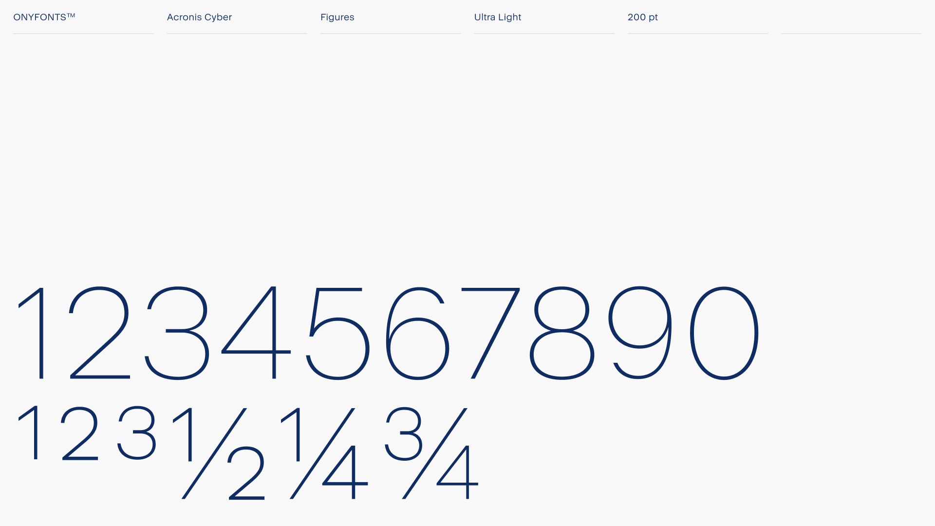
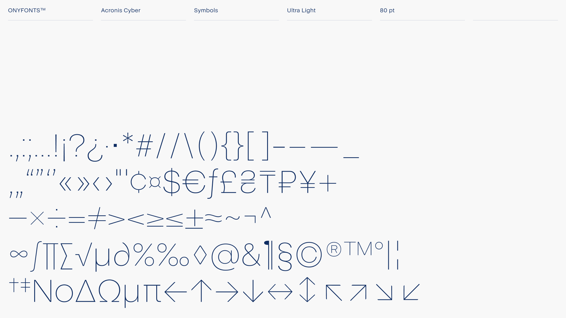
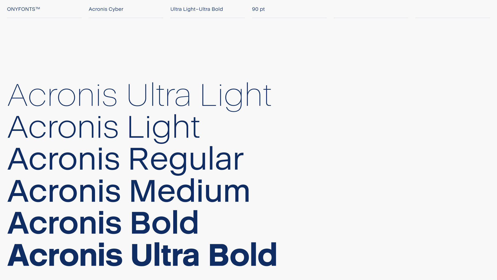
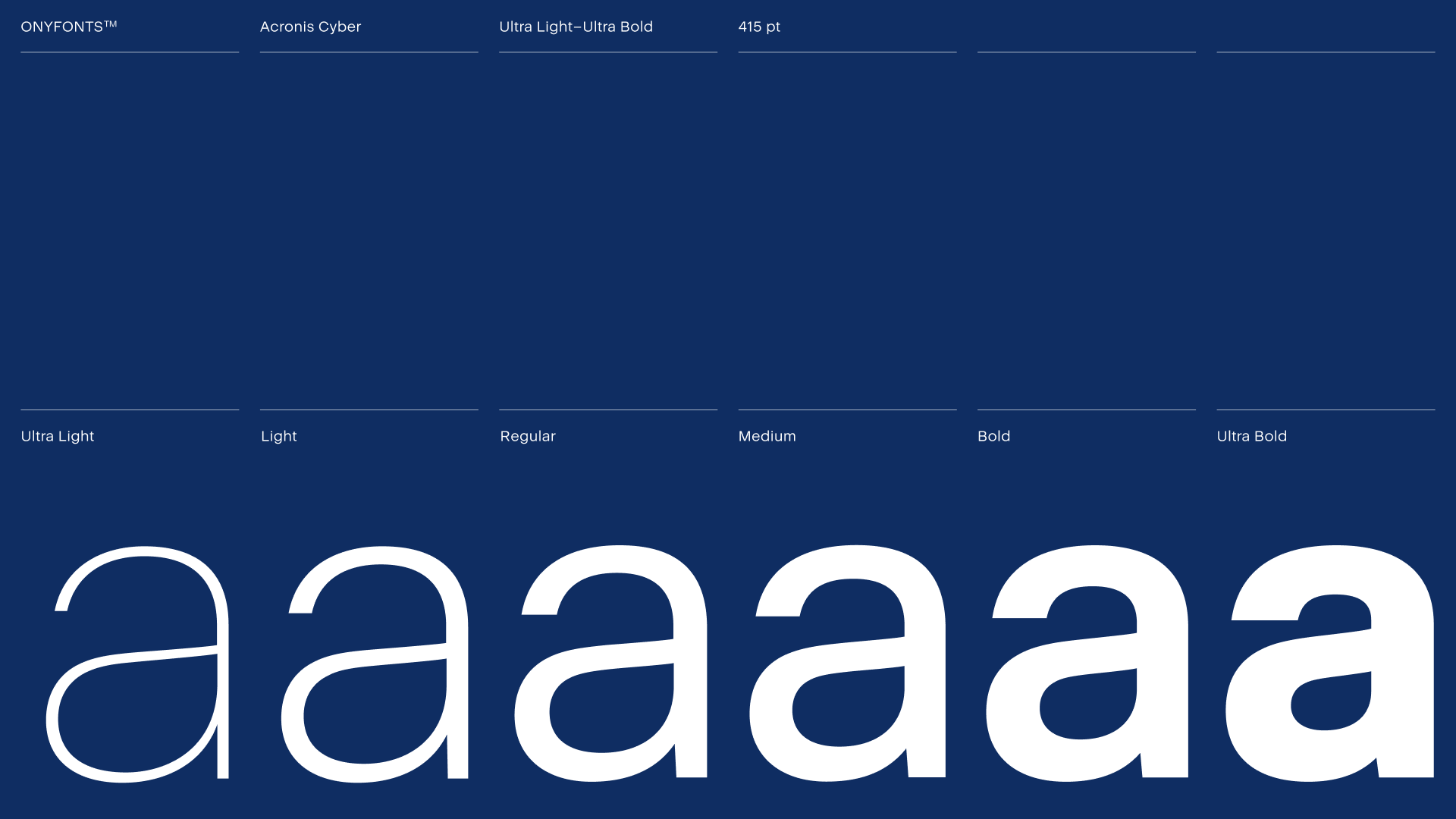
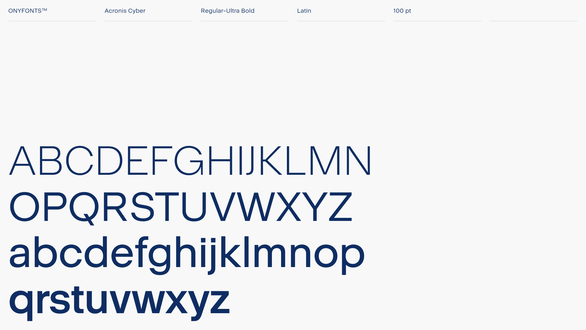
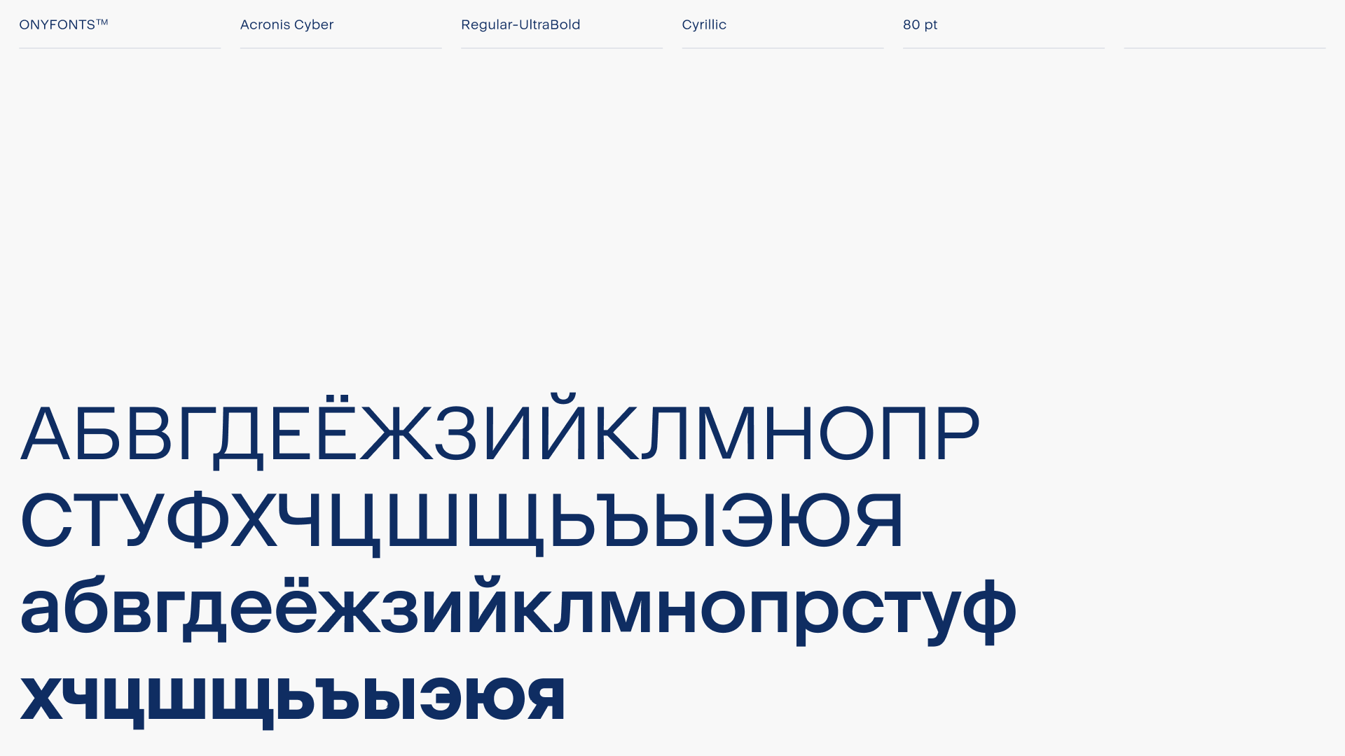
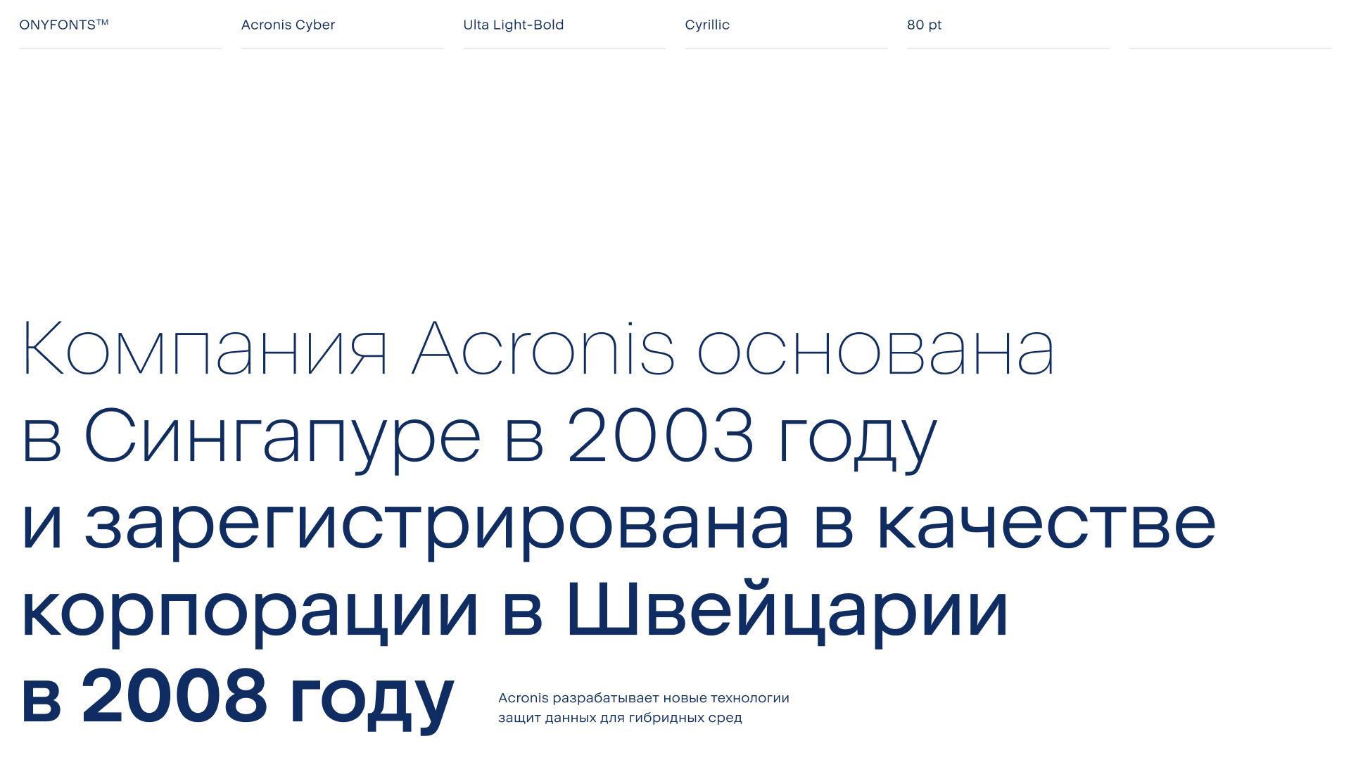
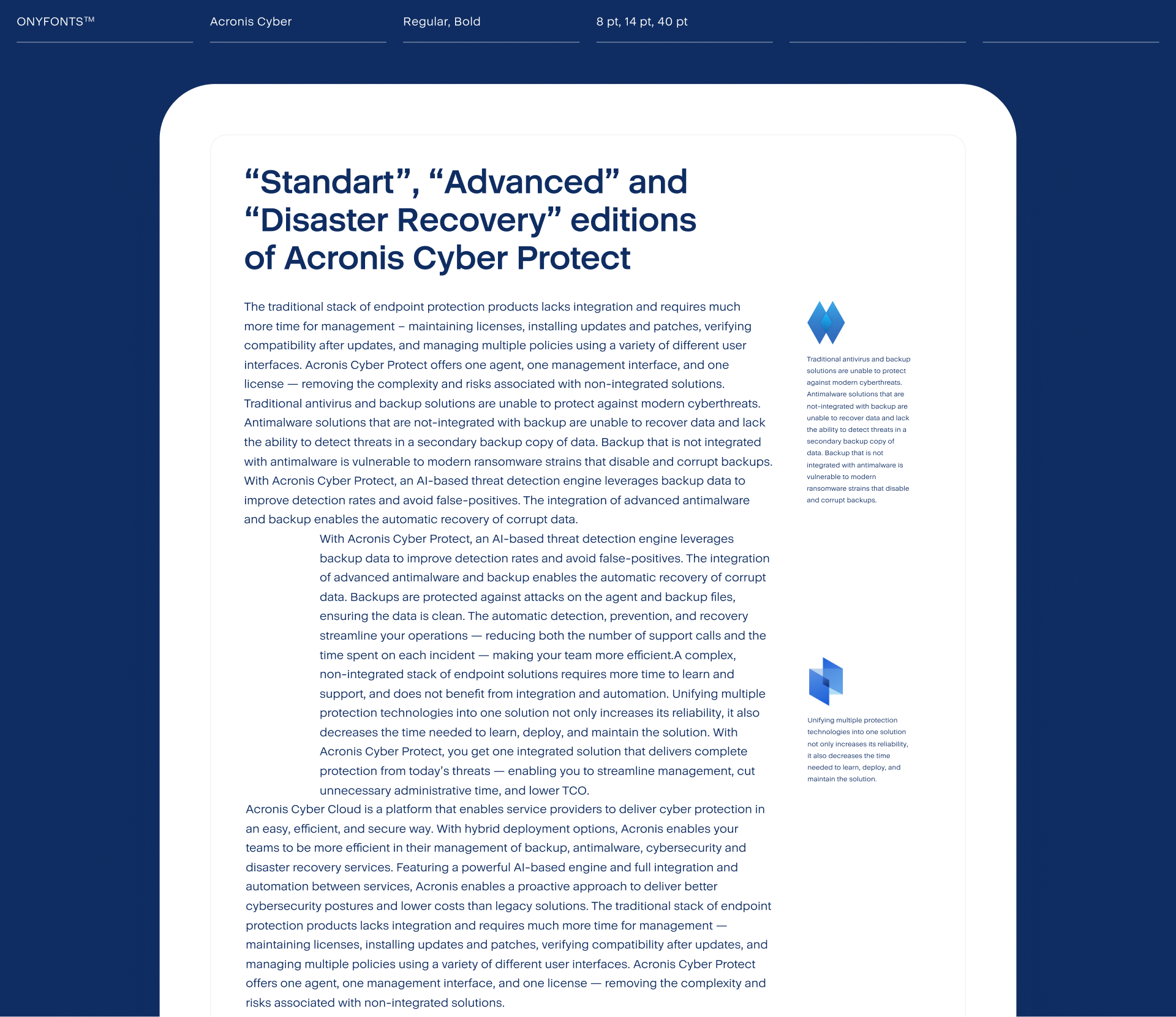
Even though the new font was born from a mixture of two radical ideas, it turned out relatively neutral. This allows us to use it both in text blocks and, with the addition of some minimal nuances, in an interface as well. The seven weights that we developed allow designers to flexibly solve any typographical challenges they face and work with the company’s internal hierarchy of material delivery.
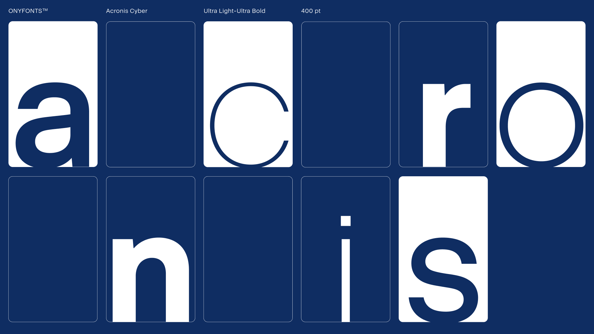
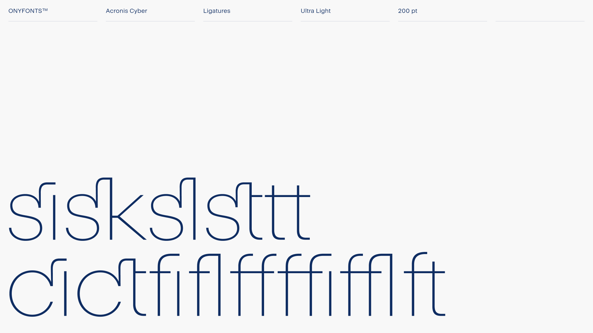
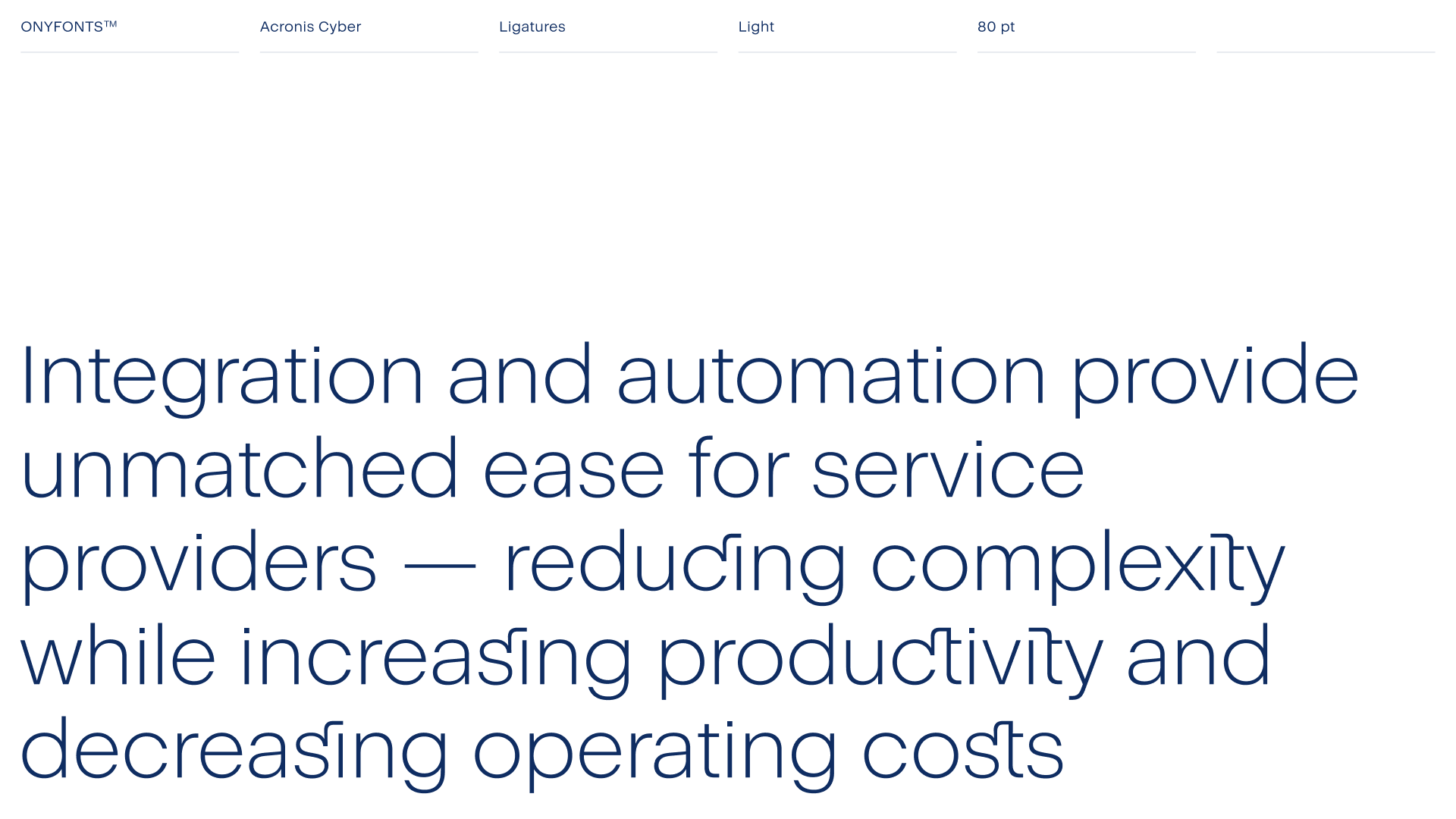
For accidentals, we put together a selection of characteristic ligatures to make any heading more decorative and recognizable. Here we have classical ligatures like «fi», as well as unexpected pairs like, «cy», «ct» and «sk» — all individually developed to meet the company’s needs for combinations that get more frequent use (such as the word «Cyber»).
We put a year of painstaking work into solving this extraordinarily interesting challenge. The font is now on its way to extensive field testing, and we are heading towards new ambitious goals.