Everchanging and everlasting me. Ekonika
In 2022, the footwear and accessories chain EKONIKA celebrated its thirtieth anniversary. The company turned to us for a comprehensive brand renewal project to attract a new segment of urban fashionistas at yet another round of development. It has always been important for EKONIKA to stay true to its values and heritage, so Signal (part of ONY) has started work with a series of studies to address the question: How can a brand with a history stay fashionable and attract new audiences?
The strategy work consisted of a case study, semiotic category analysis and qualitative research of the target audience. As a result, we have developed a unique fashion formula for EKONIKA, taking into account the peculiarities of each segment – from lovers of classics to trendsetters. We have found that regardless of their lifestyle, age or interest in fashion, women see their style as a way to tell their personality without words. To do this, they consciously develop the ability to see trends but remain selective and faithful to their dress sense. This principle is embodied in the EKONIKA positioning concept and the slogan "Everchanging and everlasting me". For more details and findings of the research, see Signal (part of ONY) case study.
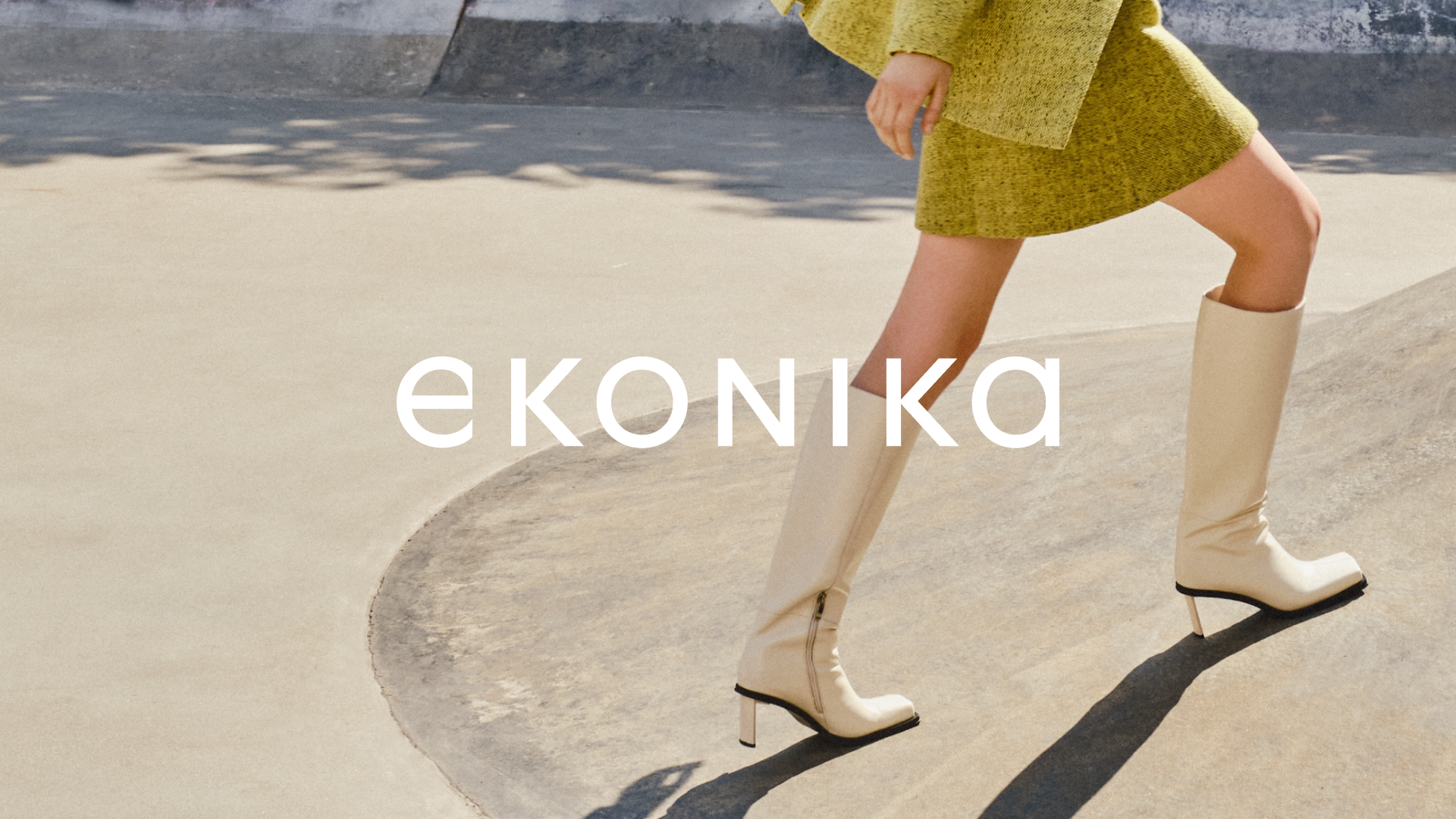
The metaphor of the brand, which has helped to grasp the visual concept, is the river – a vivid manifestation of changeability and persistence in nature. A river always follows its direction but can change its course alongside the landscape and surroundings. This image has helped us to convey corporate values and accurately describe the character of the brand's heroine, the woman who chooses EKONIKA.
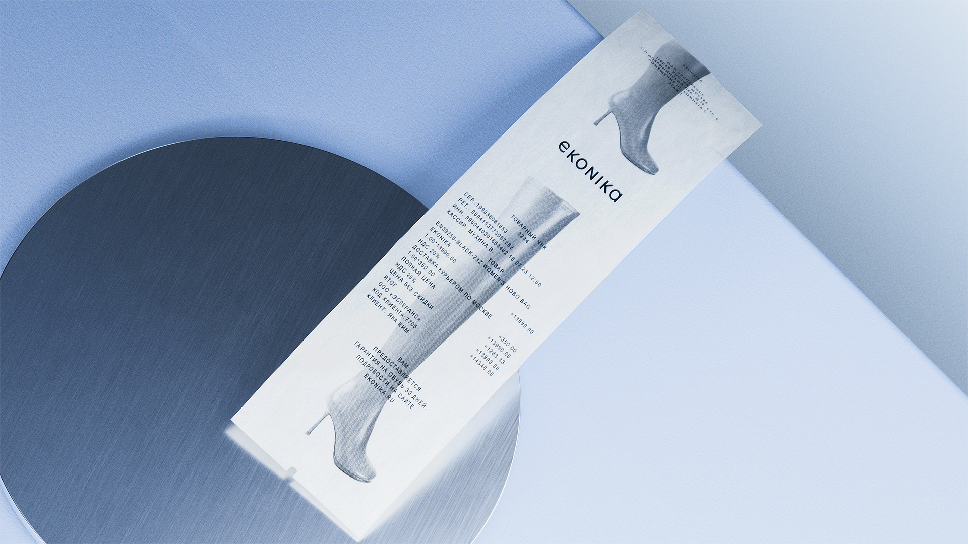
The renewed EKONIKA logo is now in Latin script. It is a lettering with an embedded emblem – the letter "e" with a signature cut. The display typeface cut alludes to the unusual but memorable design of the first version of the logo in Cyrillic, emphasising the concept of change and internal persistence.
According to the laws of fashion branding, typography becomes the central part of the visual language of the new identity. Ekonika Sans, a modern interpretation of the geometric grotesque classics, has become the company's typeface. Rationally structured signs are embodied in classical Roman proportions. To strengthen the visual expression of the idea of duality, we have worked on the behaviour of typography. The principal expressive technique is the conservative central axis, which we "loosen" and refresh with the help of indentions, making the typography look more modern and lively.
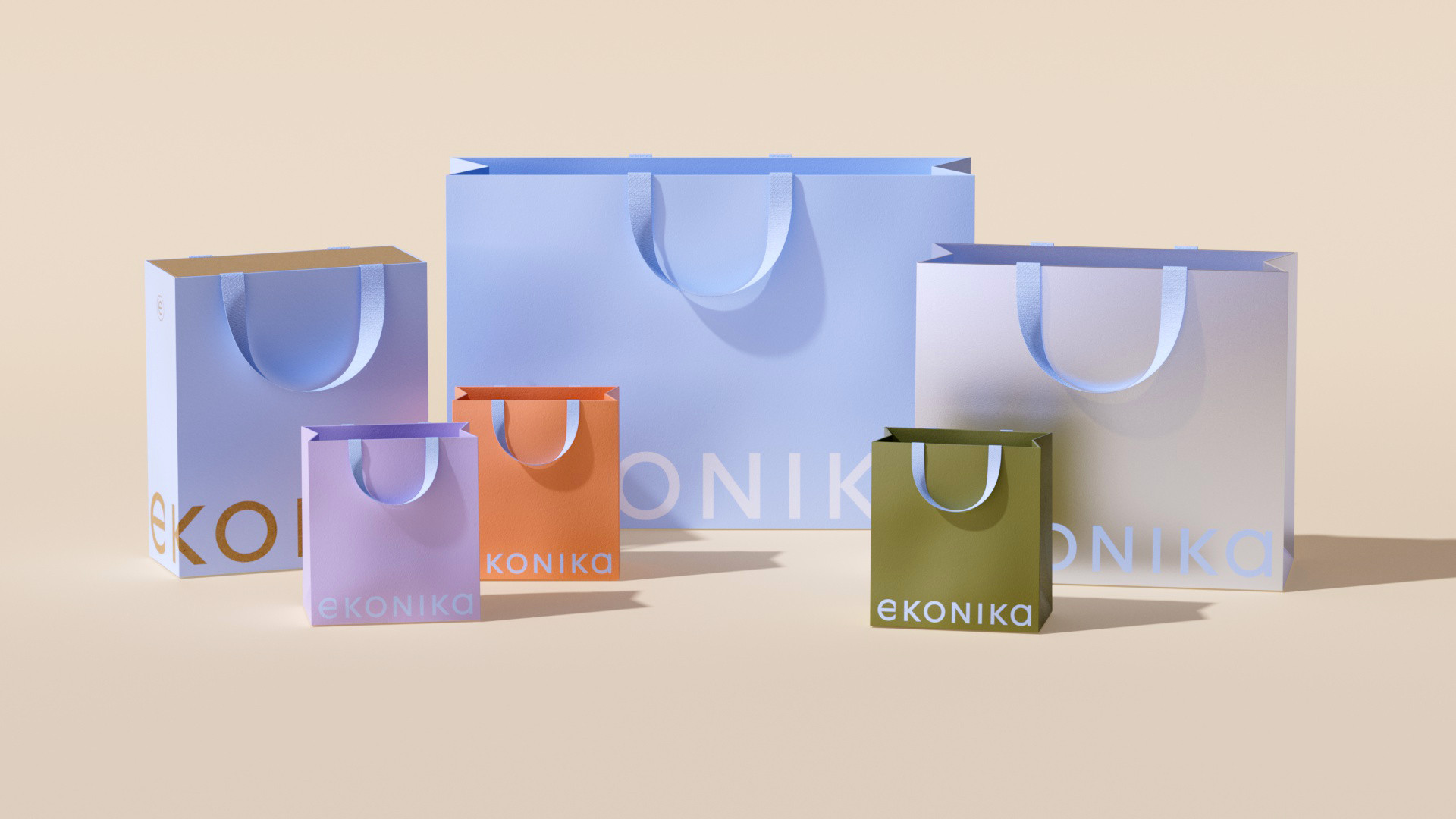
The light blue has become the corporate colour following the water metaphor. It is complemented in the brand's palette by metallic, neutral beige and muted black. The extended colour set includes eight additional shades. The chosen colours refer either to physical and tactile materials (fabrics, velvet, leather) or reflective surfaces (water, glass, mirror, etc.) as if helping the heroine of the brand to visualise herself.
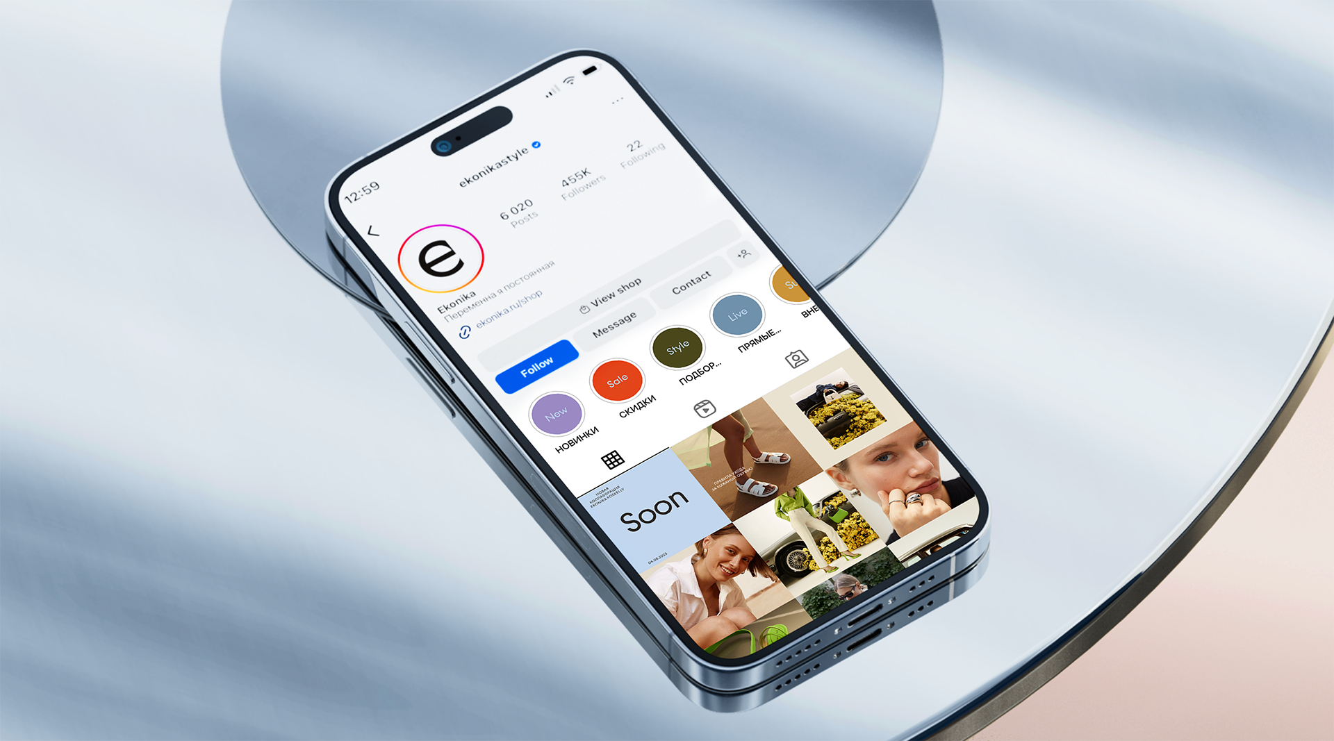
We have developed detailed guidelines for online and offline communication formats, social media management, layout of email newsletters and photo shoots. We have also designed layouts for packages, boxes and a series of private brand SKUs for shoe care products. Besides, we have thought through the appearance of employees and the store sign. Furthermore, we have created gift vouchers and card holders, as well as developed a look and feel of the website and provided recommendations on its functionality.
The new brand identity and communication, as before, emphasises hospitality and a human format of interaction with the audience. At the same time, the new positioning highlights creativity and freedom. EKONIKA is a space that does not dictate any rules and invites women to open up and be inspired to create their own fashionable image.