The power of a place. GALITSKIY & GALITSKIY
GALITSKIY & GALITSKIY is a joint winery project of Sergey Galitskiy and Sergey Galitsky Jr. The talented and dedicated team creates premium terroir wines in the Krasnaya Gorka nature reserve. Our goal was to create an image-building website that would introduce the audience to GALITSKIY & GALITSKY terroir wines as well as reflect the winery’s values, its positioning and approach.
In order to impress and captivate site visitors, we had to convey the inspiration and passion that the project’s authors are driven by. In the website’s concept, we emphasized the uniqueness of the terroir in Krasnaya Gorka and described the wine of this place through nature: the soil, the forest, the sea, the climate, the flora and the fauna. To make the storytelling more mesmerizing, we used smooth transitions and the Single Page Application technology. It allowed us to make page-to-page transitions inconspicuous, thus engaging the site visitor into the winery’s atmosphere.
The client’s goal was to highlight the uniqueness of the terroir, and that is why the history of the reserve and all facts about the its nature are located on the main page. We used audio, photo and video content recorded on the reserve’s territory to convey its atmosphere. Thanks to the GALITSKIY & GALITSKIY team, we received a huge collection of sea and clouds’ timelapse videos, rain and wind sounds. Sometimes we had to send the team back to retake the shots, so that in the video the sun shined from the right side. Due to such commitment the website turned out to be so captivating.
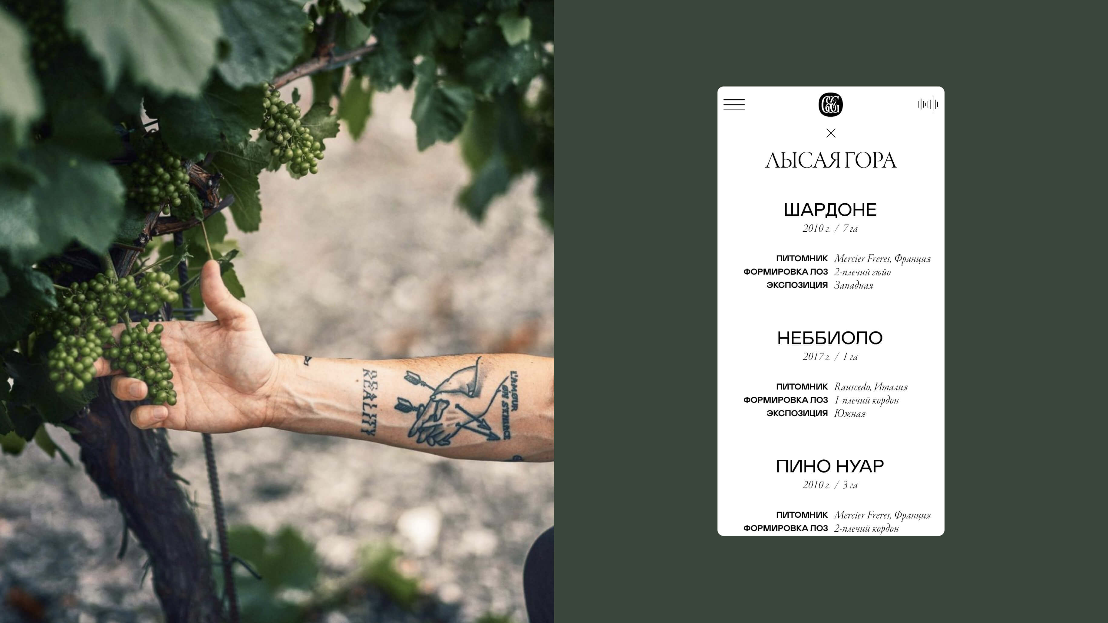
The typography plays a crucial role in the website’s design. The label of GALITSKIY & GALITSKIY wines is rather minimalistic – a rectangular white textured paper with a name, place and date of the grape harvest. We wanted to continue this exquisite story, adding the metaphor that expensive aged wines have quite a bouquet of flavors. The variety of wine notes was reflected in typography through two fonts which are completely dissimilar to each other – Mabry Pro and Garamond.
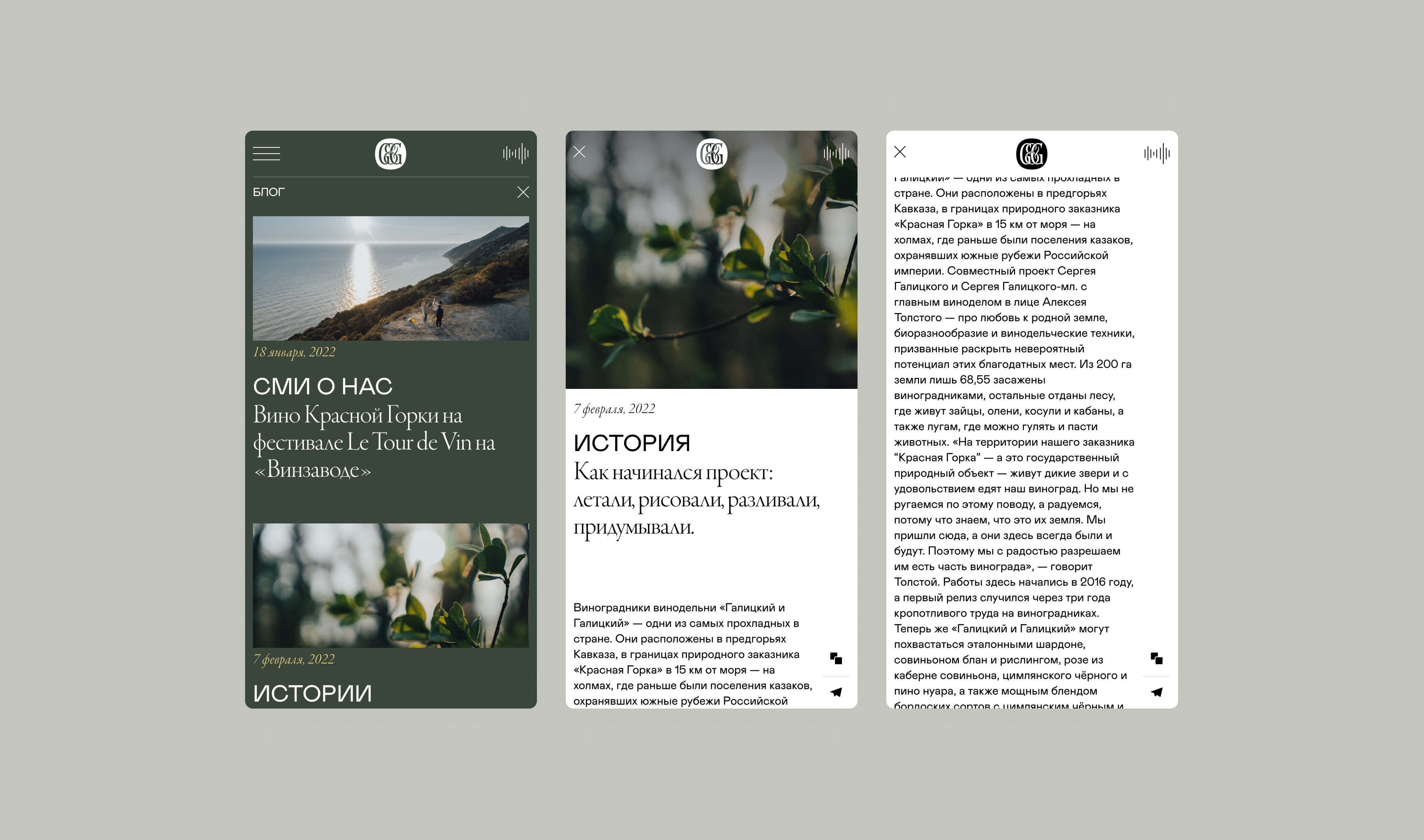
We wanted to make the site menu laconic in order to keep up with the elegant style. That is why only two sections remained on the main page – “About us” and “Wines”. Thanks to the Single Page Application technology, the three subsections of the “About us” page open on the same page – it doesn’t require refreshing or loading additional pages.

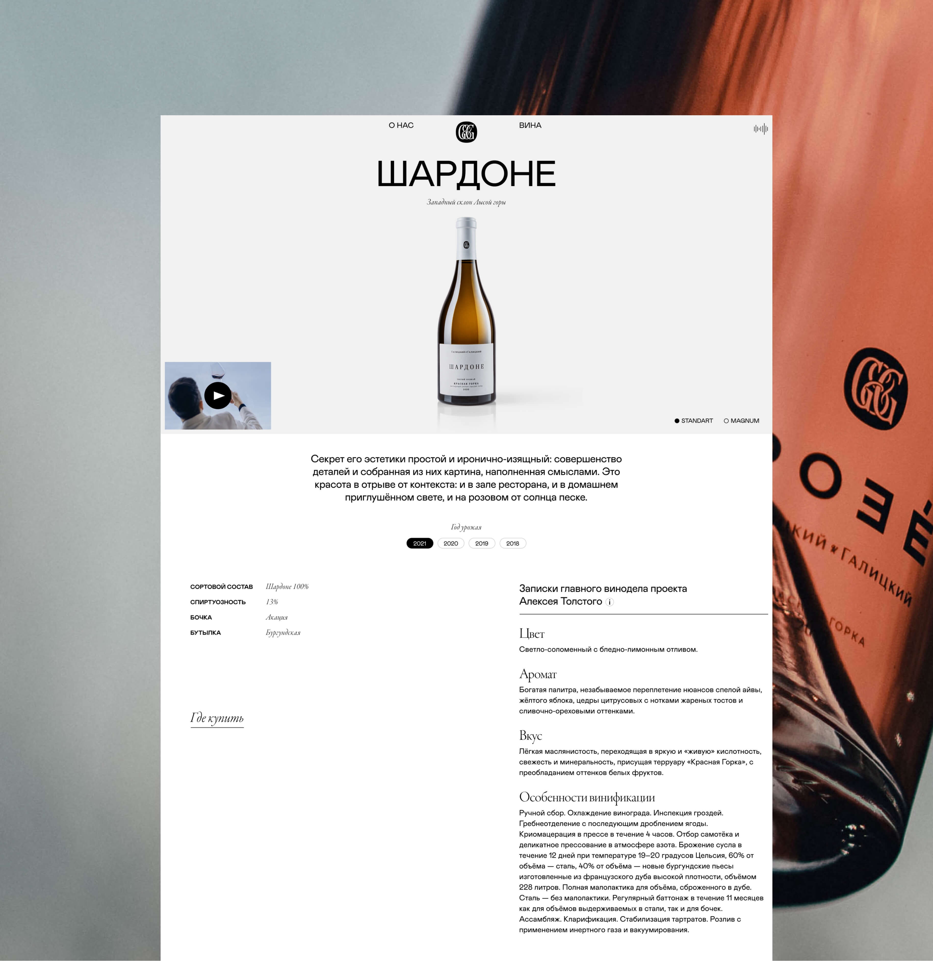
The “Wines” page describes all sorts of GALITSKIY & GALITSKIY wines and places where you can purchase them. We share the creators’ love for concise beauty and quality typography, so there is nothing superfluous on the page. We captured the main parameters, such as the year of harvest, the varietal composition, the alcohol component, bottle type, and also added a few notes from the project’s chief winemaker Alexey Tolstoy, in which you can read about the fragrance, the color and flavor of the wine as well as peculiarities of vinification.
In order to intensify the immersion into the winery’s atmosphere, the color palette is adjusted depending on the current weather and season in Krasnaya Gorka. The logo, headings, tags, buttons and fonts turn yellow on sunny days, and on rainy days they turn blue. Music is played on the website throughout the day: with crickets at night and chirping larks in the morning. The information about the state of nature is available in the footer, which is shared by all pages of the website. We made the GALITSKIY & GALITSKY website atmospheric, inspiring and capable of immersing the site viewer into the beauty of nature and the taste of wine. The result was a real co-creation of the client and us.
