Innotech Group. Business transformation
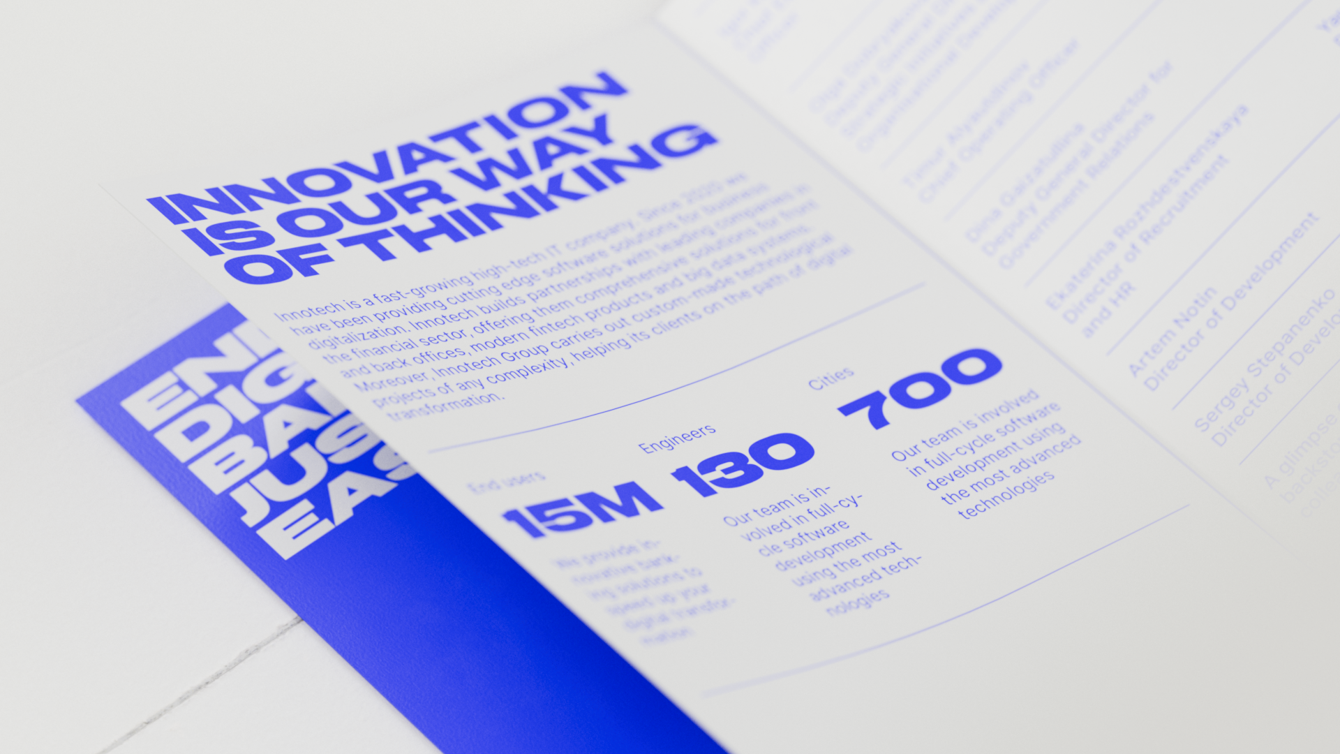
Innotech Group is a modern, fast-growing IT company that develops innovative solutions for digital business transformation. The team began operations in 2020 and, in just two years, has grown to become a big high-tech company with more than 10,000 employees. Such successful growth has required the brand to adjust its own image - retaining the spirit of an energetic, young company and establishing itself as a secure business partner. Innotech turned to us for the restyling and development of its corporate website.
The team has expressed a desire to base the company's image on such concepts as speed, innovation, flexibility and efficiency. They are communicated, for example, through the logo. Thus we have left its original idea untouched. Two dots and a dash are a reference to the telegraph and Morse code, symbols of technological progress, in which Innotech itself actively participates. We have conducted a detailed design audit to identify the strengths and weaknesses of the existing brand identity and to plan further the direction for its restyling. The conclusions were as follows: the brand lacked clear rules for its motion behaviour to better fit into the digital environment; detailed typography and 3D illustrations were lacking for creating a modern identity; to reduce the amount of art direction, a system of guidelines had to be developed that would solve the problem of generating branded graphics and give the company's designers more templates.
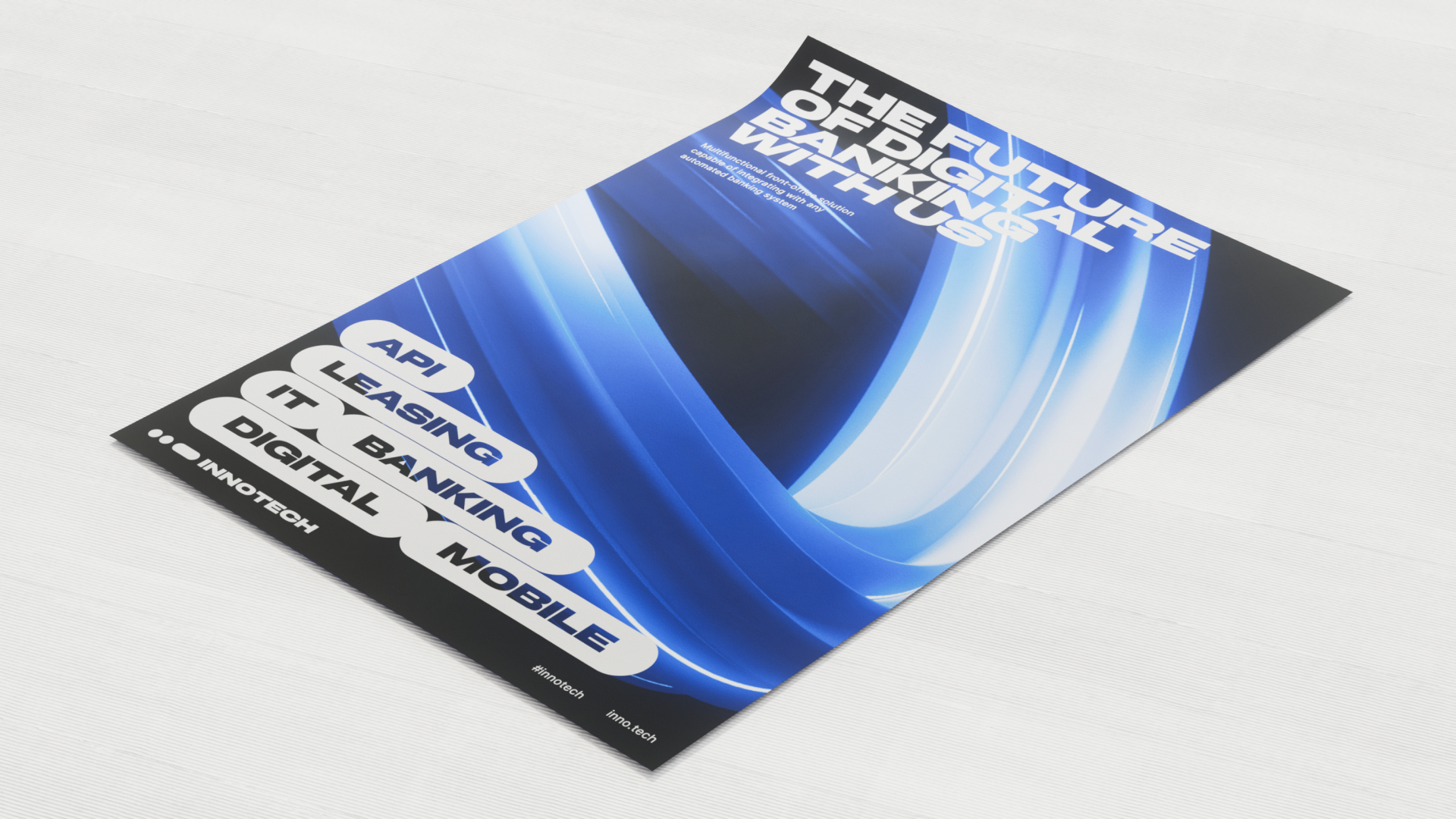
The brand's typography required refinement: the bold font in the layouts was rather basic. Such an accent font called for a tight assembly, tense margins and small line spacing, though the font itself had to be freshened up. As a replacement, we have chosen Cofo Kak Black, which is more concentrated and balanced, and have rebuilt the layouts to find the best possible ratio between font sizes, margins and spacing.
Another significant part of the corporate DNA was the colour palette. It had already been set up but order in its application was lacking. We have adjusted and narrowed the colour set. While blue remains at the core of the style, black and white have been completely eliminated, as well as some other additional colours. Instead, deep blue, grey, light blue and accent light lettuce have been added. Thanks to this solution, the palette is more consistent and systematic now. Furthermore, it conveys the brand's new, serious business tone.
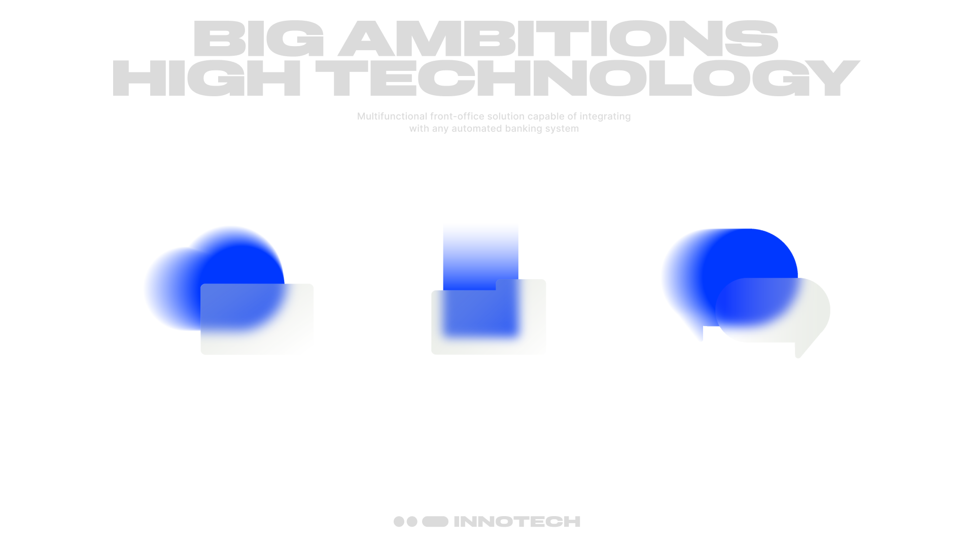
To express better visually the company's philosophy, which is based on the idea of speed, the designers also used 3D graphics as a supplementary tool. Now a luminous flow of energy rushes through the templates, giving them vibrant imagery – a sense of the energy pulse. The basic graphics have been reinterpreted as a set of object illustrations – designed for the company's external communications. These illustrations also support the idea of movement, at the same time helping to shape the materiality of the brand, and making the identity more coherent.
The corporate website of Innotech had to communicate a brand image that combines the seriousness of a high-tech company with the energy of a startup. Thin lines, left-edge layout, pedantic arrangement of all design elements, standardised colours – all these solutions convey a sense of rigour and orderliness. At the same time, the design incorporates strong headlines with large typography, active brand graphic elements in the background, and unusual compositional solutions which contrast with the rigid layout. Some elements look intentionally more interactional – for example, we have used pop-up boxes that move the site's core content around and give an immersive user experience. This has helped to emphasise the energetic and innovative nature of the brand.
The company's website is the key channel for communication with clients, partners and the industry itself. The company presents its products and communicates its strategy and plans for further development via the website. These tasks are successfully handled by the home page and the "About the Company'' section. The website is also meant to be a sales tool, attracting new clients and partners. For this purpose, a system of lead-generating forms has been developed – where users can leave their contacts at any convenient moment.
Innotech actively shares information about the company's activities in news and press releases. Therefore, we have paid attention to their systematisation and have created the "Resources" section with several content groups: "News" and "Industry Recognition", which include information about awards, media mentions and analytical reports. This section also contains a block dedicated to providing information about the company's participation in exhibitions, forums and conferences – "Events". We have succeeded in developing a flexible modular structure, which corresponds to the different demands and needs of these groups. A block constructor for materials has been added to the admin panel so that the Innotech team can make the pages look more versatile.
The result of our joint work with the Innotech team is an updated identity and well-thought-out design system. It communicates all the company's meanings and values and emphasises its new positioning. Innotech now has a corporate website that successfully addresses both business and user needs.
