Intuition
Intuition Engineering provides technology consulting to companies based on AI solutions. They specialize in investigation of the customers’ shopping behavior both offline and online or for example to prevent breakdowns in production.
The main part of the team are practicing scientists, graduates of IPM M.Keldysh RAS (Federal Research Center Institute Applied Mathematics named after M.V.Keldysh of the Russian Academy of Sciences), the Faculty of Mechanics and Mathematics of Lomonosov Moscow State University and MIPT (Moscow Institute of Physics and Technology). Their advantage over many competitors is that instead of using ready-made solutions, they independently develop high-tech products for each individual client.
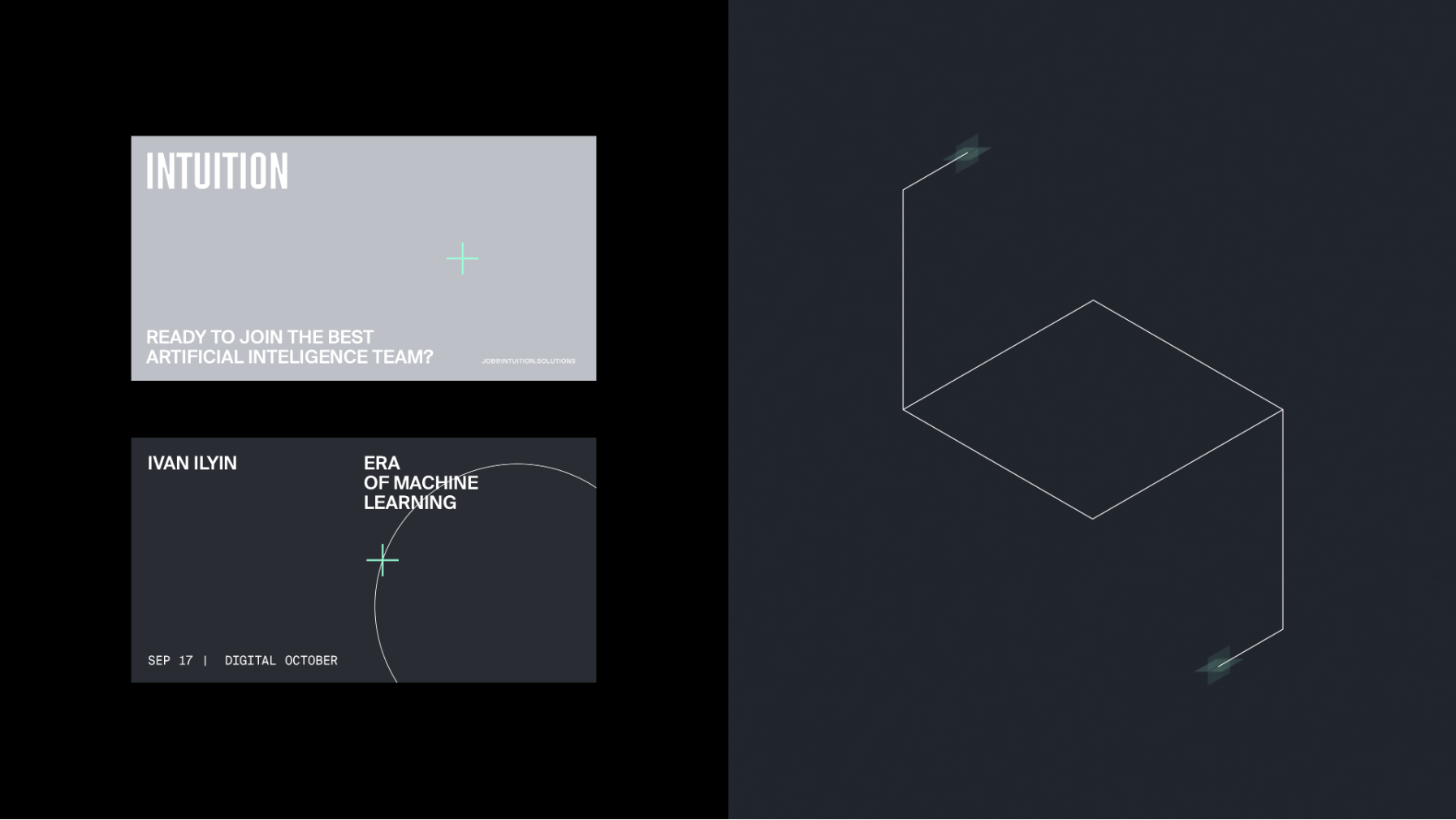
The integrating of AI technologies makes the work of companies easier and big data of necessary computations are left behind. Here in ONY we tried to show how a complex technological product can be simple and understandable for the client. We came to a solution to make a restrained, minimalistic design: a calm, academic gray color, subtle semantic graphics and a modernist strict approach to layout.
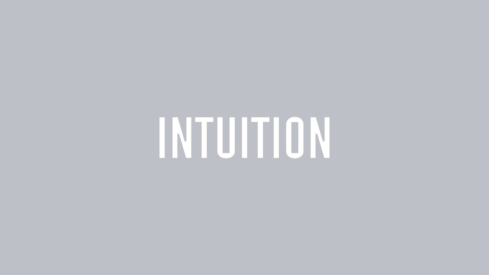
We used AI approach to found precise naming. The naming machine by Intuition analyzed what words evoke the associations we need and suggested its own version of «Intuition». The last task was to give it a more technological character. For that we chose a spelling that resembled a code. These were narrow and contiguous letters with a sense of monospace typing. There was one more special feature as the blown-up and trimmed «paint traps» inside of some signs that added brutality and rigidity to the logo.
The Intuition graphic language reflects the processes in mind of artificial intelligence. It represents how the data appear, move and evolute from simple structures to complicated ones. Animations provide an opportunity to observe working of the neural network, how it analyses information and makes decisions.
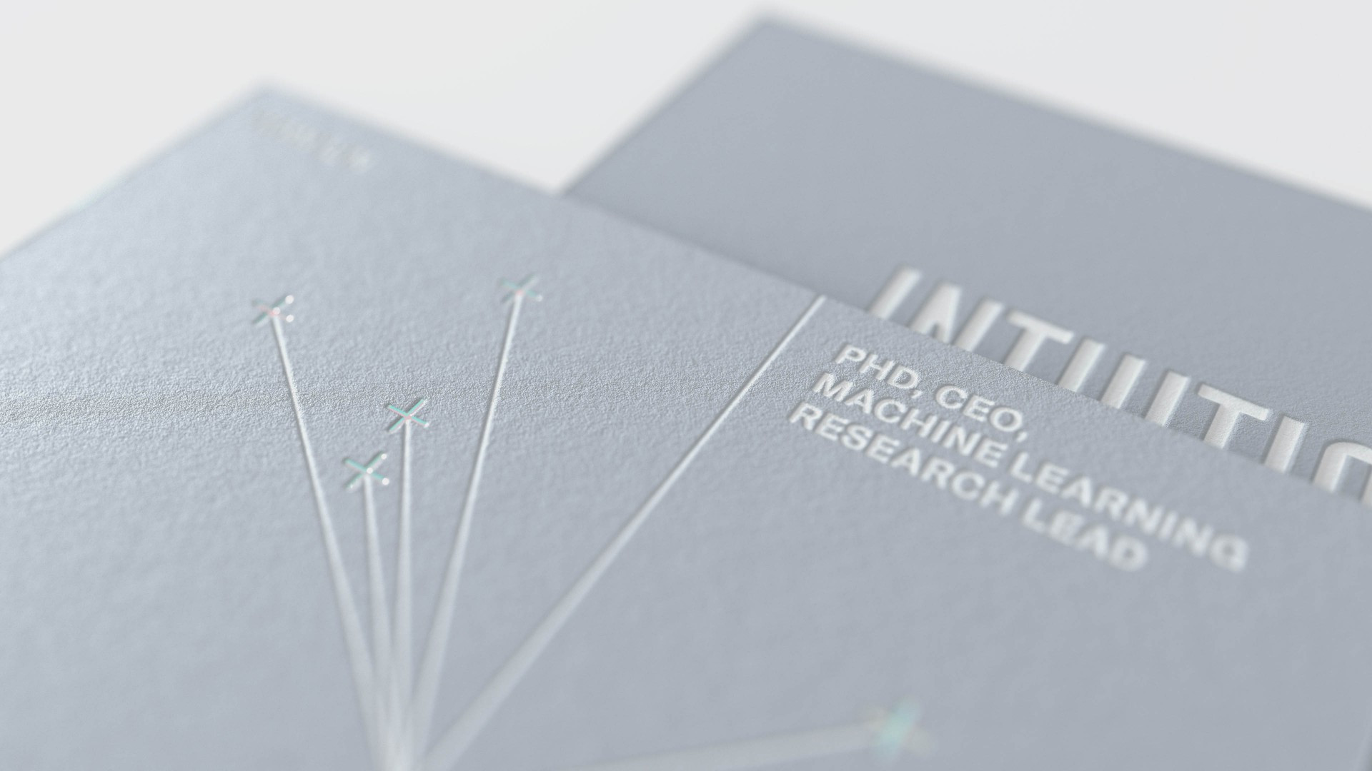
The tracking markers and thin lines are the foundation of graphics. On the one side it helps to avoid embellishment and emphasizes the academic nature of the company's development, and on the other side it gives more space for alternative interpretation. And this approach makes it easy to generate new images for illustrations.
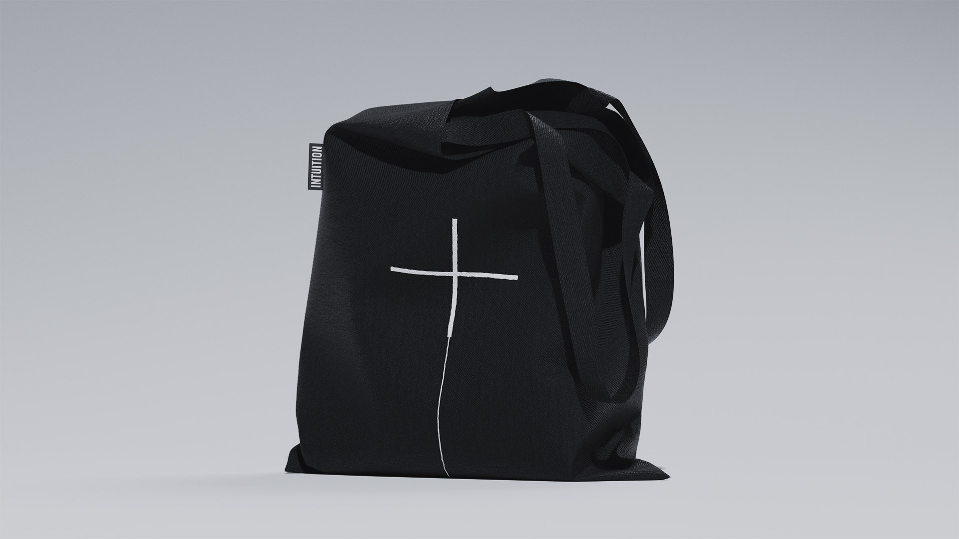
The neon «plus» sign which is an icon for displaying incoming information turns into an independent element of brand identification even without the use of a logo. This is the main sign of a new world created by the mind of artificial intelligence.
Intuition branding stands out from the competition as there no complicated and bulky graphics solutions. The absence of Russian identity helps in implementing the plan for the company to enter the international market.
