Soyuzmultfilm. The childhood of several generations
Without a doubt, rebranding Russia's most important animation studio was a responsible task. On one hand, we needed to update their visual style for a new millenium. On the other, it was important to preserve the image that entire generations know and love, along with the brand’s history and character. Furthermore, it was of fundamental importance for the studio to start speaking the same language as today’s children, who don’t see the world the way people did in the days of «Winnie the Pooh».
ONY’s Signal laboratory delved into research: we analysed the cartoons being released worldwide, studied the children’s behaviour on the Internet and compiled a semiotics of their culture. Our findings helped us formulate theses for a new brand platform, which we called the «Dialogue of Generations». This positioning turned into an idea of visualising the world the way children see it — which must be remembered by adults, who once were children, too.
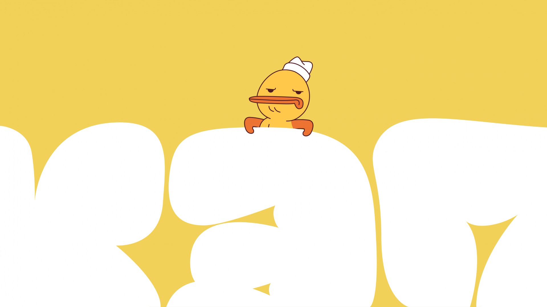
The design system is built on soft, «airy» split blocks: separate letters and abstract forms reminiscent of Soyuzmultfilm characters. They can rotate, compress and expand, but most importantly, they can both form patterns and exist as abstract shapes, either going beyond a given format or limiting it. They can seamlessly blend into digital space. As a result, the viewer enters into a dialogue with the brand in the process of deciphering its visual language.
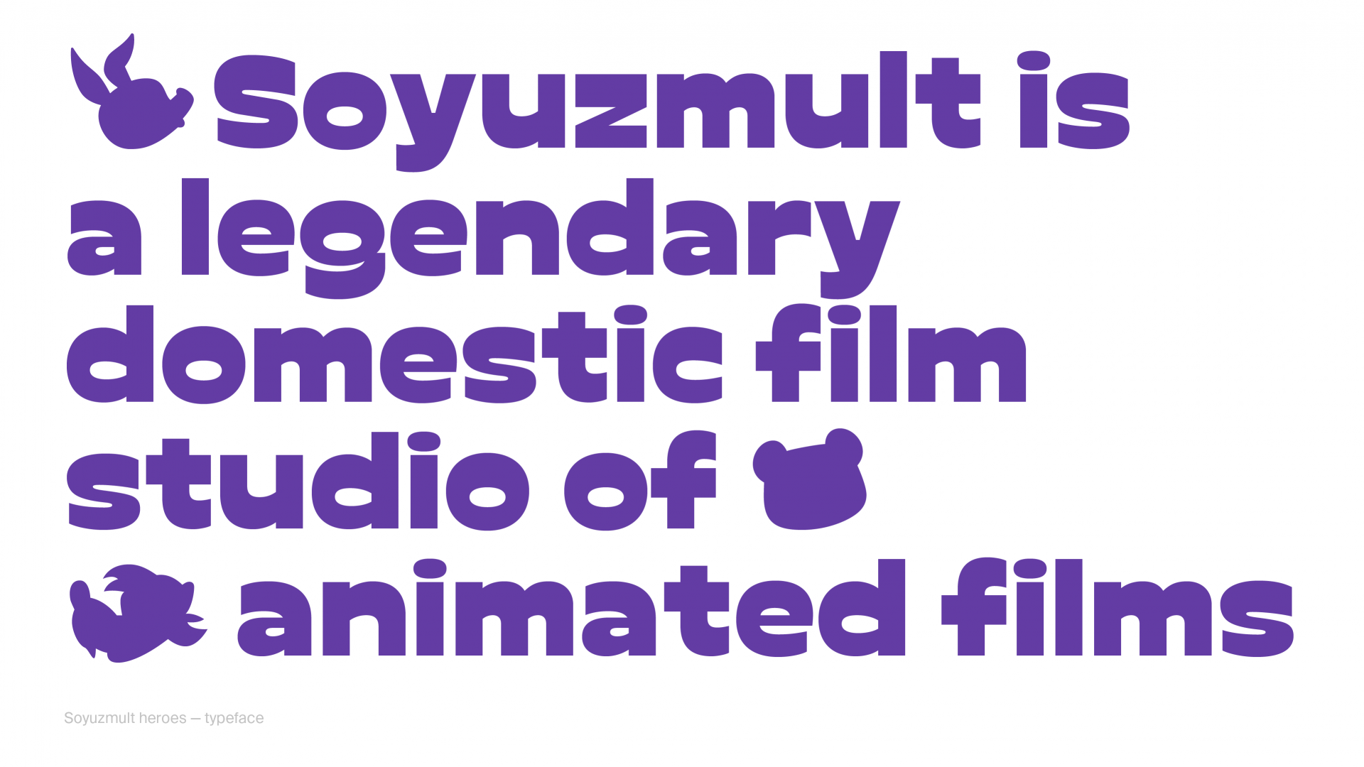
The company’s typeface, Soyuzmult has the same flexible character. Its letters are similar to classic cartoon titles, but are simultaneously more elastic and balanced, while also looking a little less plump and naive. The letter offset opens downward, giving a necessary element of childishness without seeming frivolous or distorting its shape. In addition, we created a special code that turns each subsequent character in the opposite direction from the neighbouring side. These digital codes will be useful both for subsequent generations and to animate the world in which the brand exists. We used the iconic font in the logo, but its letters are even more lively: they revolve more quickly, bouncing and interacting with each other.
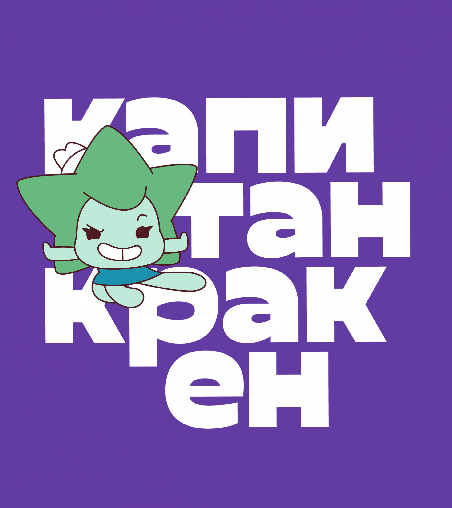

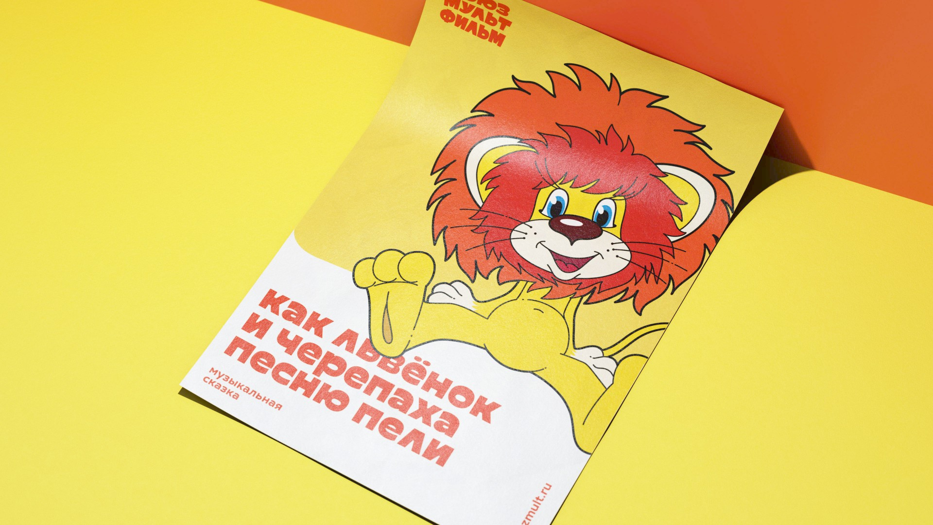
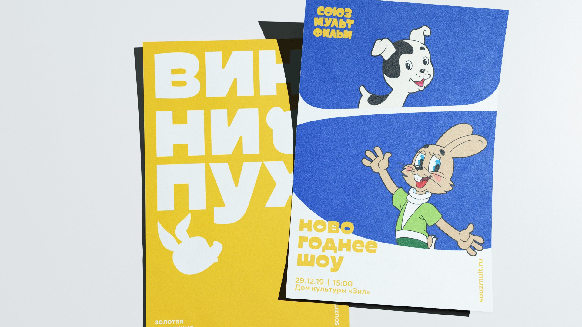
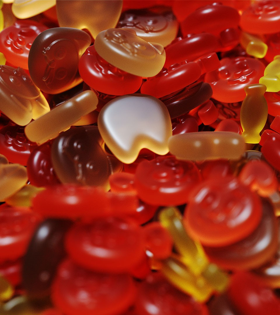
Next we had to find a single style for the characters to unite Soyuzmultfilm’s Golden Collection with the studio’s new cartoons. This meant making 3D, plasticine and puppet characters coexist in one place. We paid a lot of attention in the compilation of corporate palettes. Of course, the worlds of animation are always bright and multi-coloured, but there still needs to be a system within the identity that brings all of these colours together. Using all these rules, the studio animators can draw characters for a variety of communication forms.
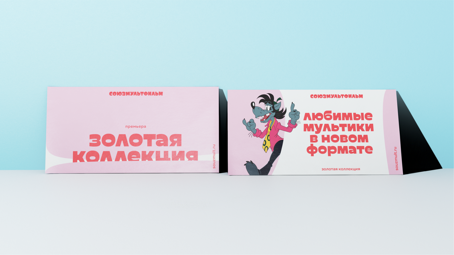
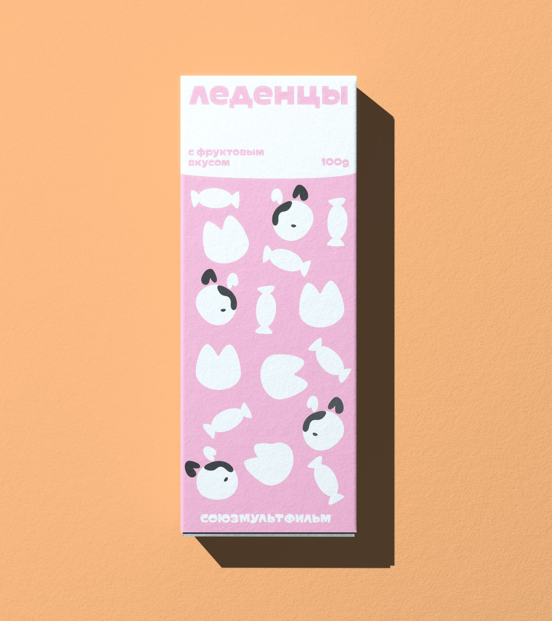
We needed to maximize the toolset and capabilities of the visual language. This is how we arrived at a simple graphic vocabulary, where the characters are split into a set of recognizable symbols and key objects from the world of the studio’s cartoons. When they are transformed into simplified components, they become graphics and patterns with a wide variety of applications, from advertising branding to packaging design.
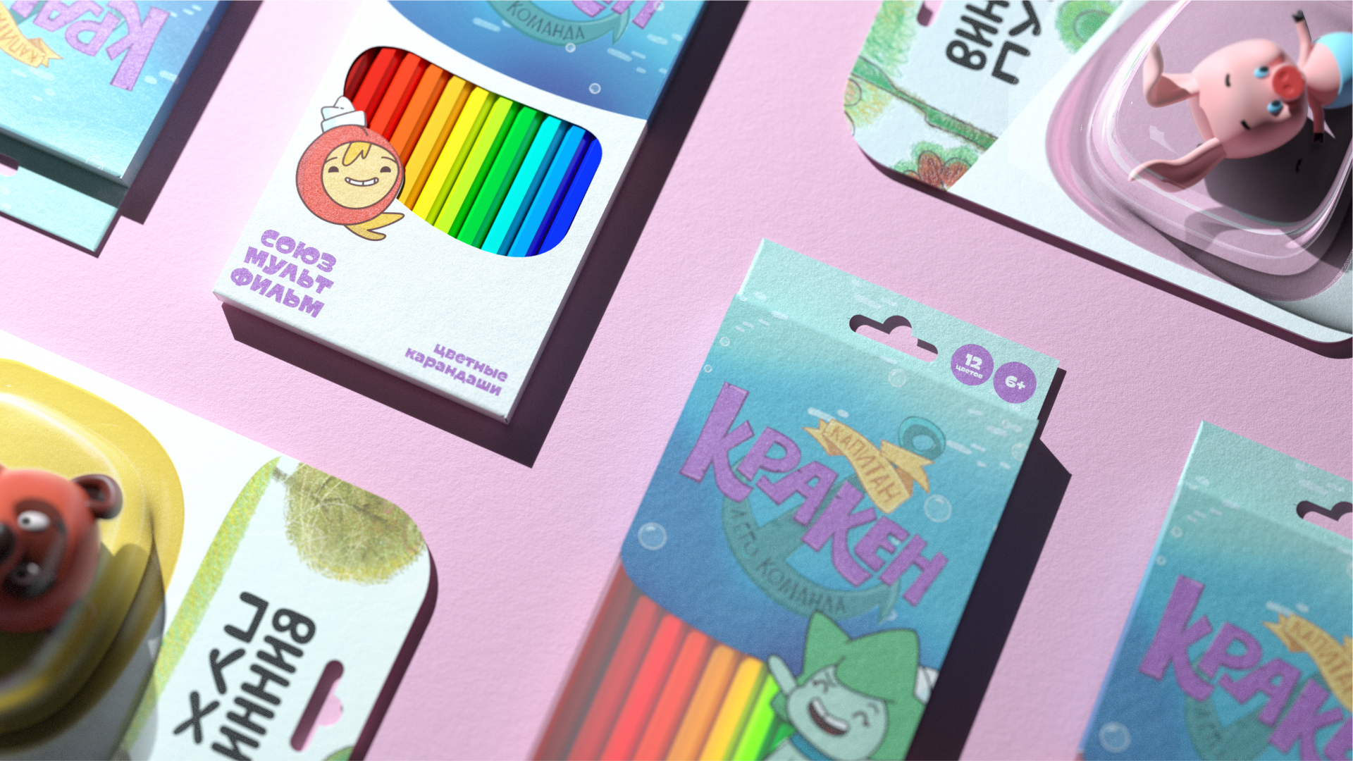
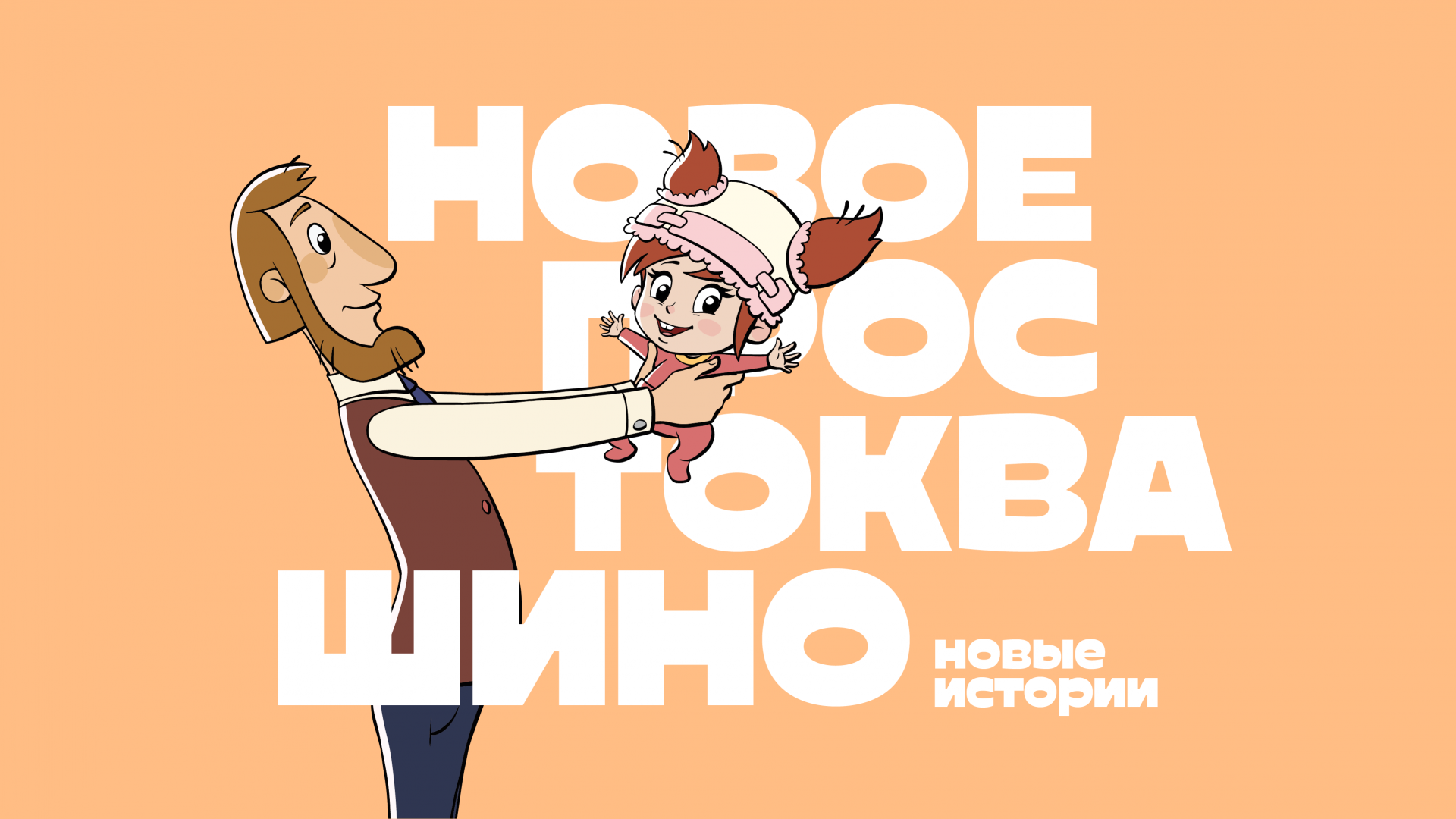
This approach permits tremendous variability of usage. A variety of techniques allows the studio to speak the same language as all generations of viewers, make limited-edition collaborations and maintain their relevance in different channels, ranging from TV to YouTube. In addition, we have had the unique chance to work with an animation studio whose professional artists can develop the techniques and tools we proposed for years to come.