New-age literature. Stroki by MTS
Stroki is a new reading platform by MTS. The app brings together books, podcasts, magazines and online textbooks. Besides, there is also an in-house publisher, which publishes original content and exclusive new products that are only available to subscribers. Stroki (rus. Строки – Lines) is an online multifunctional library space where one wants to come over again and again for great content in a convenient format. Together with MTS, we have created a design system that would serve as a platform for the app's further development. The design system would also help the platform to stand out among competitors and show that time spent within can be fun and rewarding.
We have adopted the metaphor of storylines as the basis of our visual style. In 1995, writer Kurt Vonnegut suggested the concept of universal charts for describing the ups and downs in the lives of characters in different archetypal plots. We have taken this idea as a starting point though adding volume to the charts, unfolding the line in space and creating a perspective.
We have incorporated several images into the service's logo: the first letter of its name – "C" – reminds us of a stack of books, and the book on the top of it is slightly open and represents the movement of the eye across the lines of text.
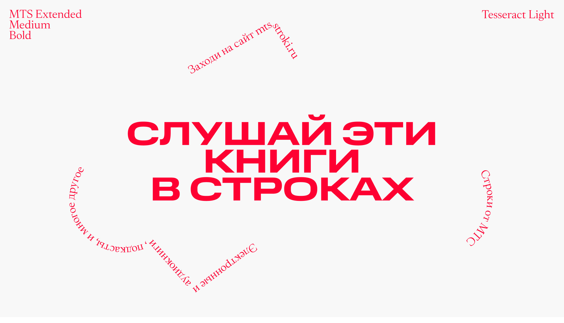
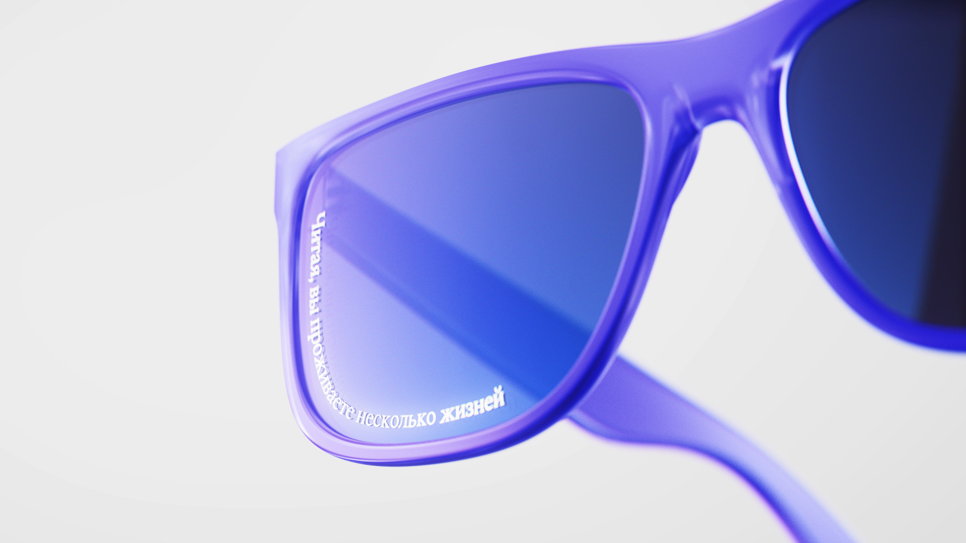
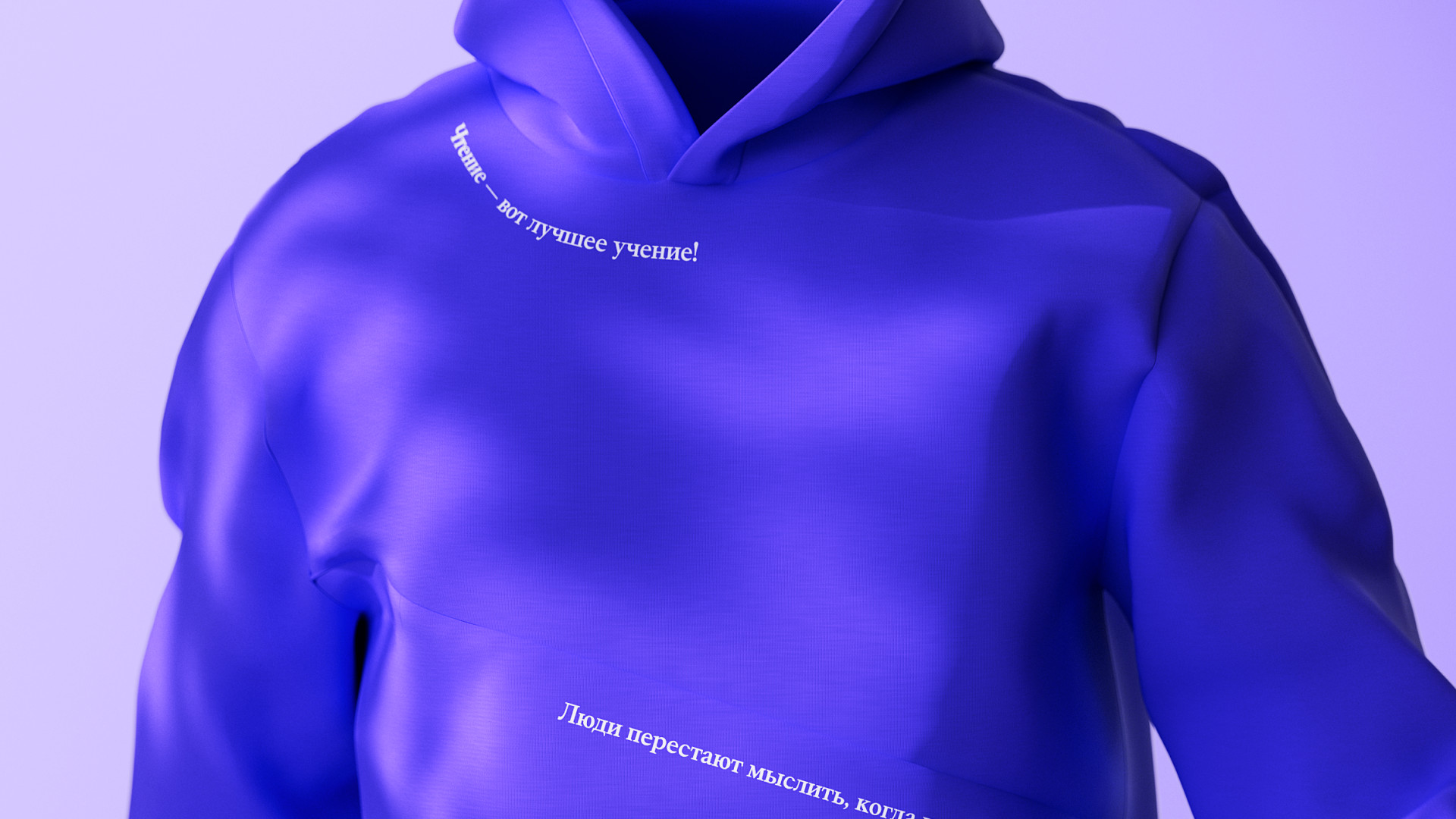
The foundation of the brand identity has also been formed thanks to the font pairing: the bold digital MTS Sans Extended, and the thin classic antiqua typeface – Tesseract. Tesseract is associated with book typography, which helps to create a link between the digital environment of the app and the world of printed books. Antiqua draws more attention to the lines within layouts, so the text can become an Easter Egg, referring to a plot of the book or complementing the semantic content of a layout.
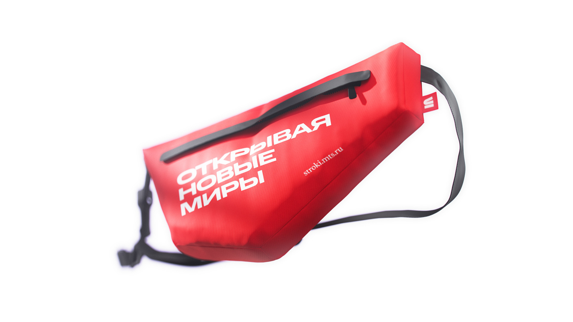
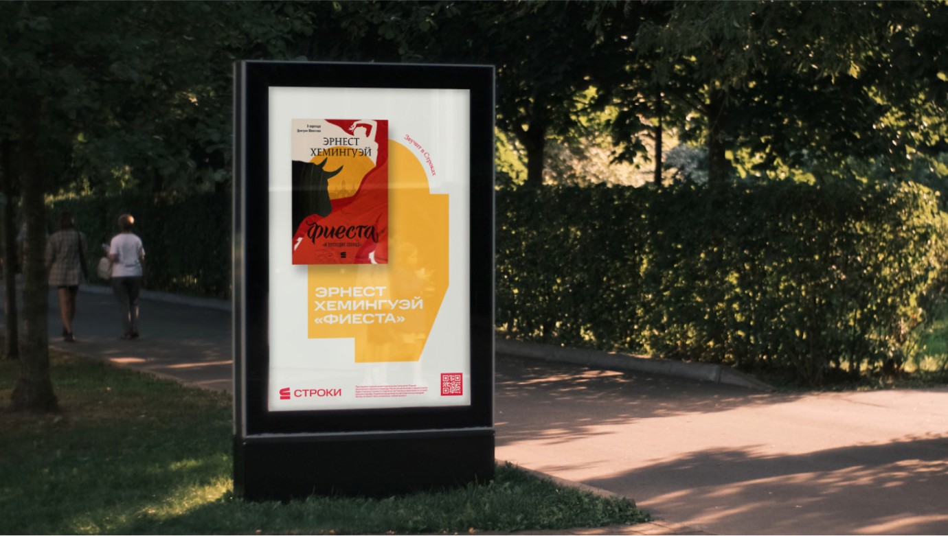
The MTS brand colour, red, remains the primary one, but we have complemented it with a palette of calm pastel shades.They do not argue with the bright book covers that would appear in most brand communications, nor do they create unnecessary volume in the branded geometric shapes on the substrates. The same colours appear in the app, which helps to actively use the visual style in the interface without overloading it.
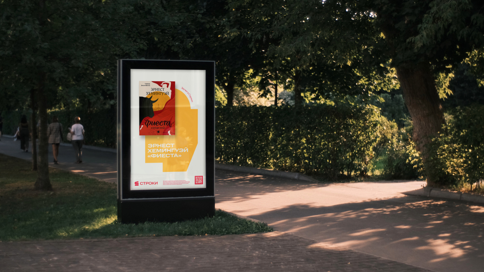
Branded graphics can be used as substrates, frames for images, or as standalone illustrations. Their outline can be used as a support for text, creating an additional visual and semantic layer. This technique also gives room for motion and light animation in the layout.
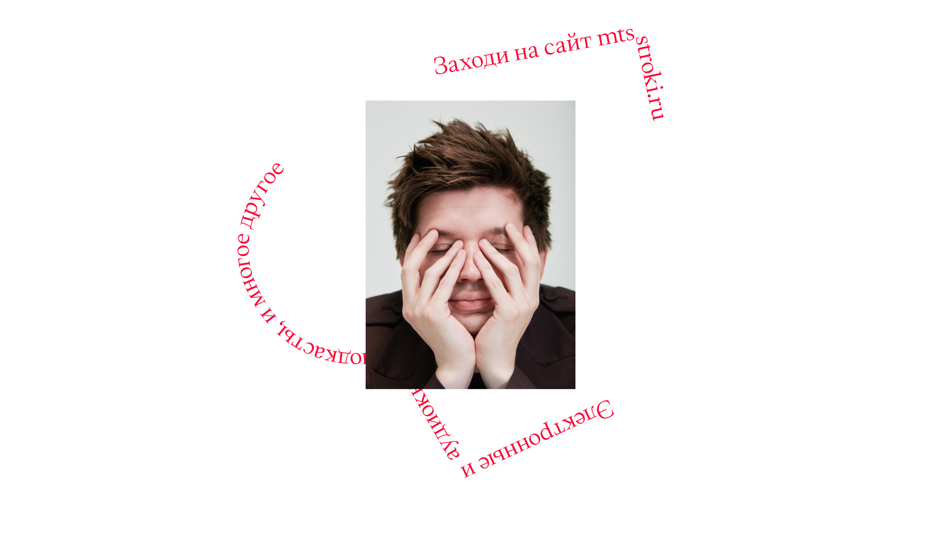
The basic principle in illustration creation is to use metaphors that suggest looking at simple objects from a different perspective. This technique, as well as the running lines of a text, makes the storyline of the layouts more captivating and profound. The silhouettes of the illustrations are matched with geometric shapes, while their colours support the overall visual style palette.
As a result we have a fluid style that harmoniously combines the attributes of traditional printmaking with digital light shapes and vibrant colours. Besides, the curved lines of the text and the overall composition of elements complement the storylines in all layouts – print and digital. All this gives plenty of room for book cover design and reflects the nature of the brand as a space of impressions.