Playrix. Fathers of dragon

More than 30 million users around the world play Playrix games and its founders have been recently called dollar billionaires by Bloomberg. In 2017 we had an objective to update the corporate identity and seriously work on the logo which already seemed infantile and was not associated with serious developments and technologies. It did not correspond to the size of the company as by the time Playrix has long grown into a large-scale business and entered the TOP-10 of the world chart.

We decided to stylize the dragon, the symbol of the company, under the hero of a non-existent game that would be great to play in. So the infantile heavy set green dragon from an old version of the Playrix logo has been upgraded to a real mascot. The hero turned out to be graphic and two-dimensional, but a very charming one with a charisma and lively facial expressions that display many emotions (as in the sticker packs serias). There was made made a special letter design under the character where all font elements of the graphics repeat its elements. Thus the text and the hero merge into one structure but at the same time perfectly exist separately from each other. What a perfect match!
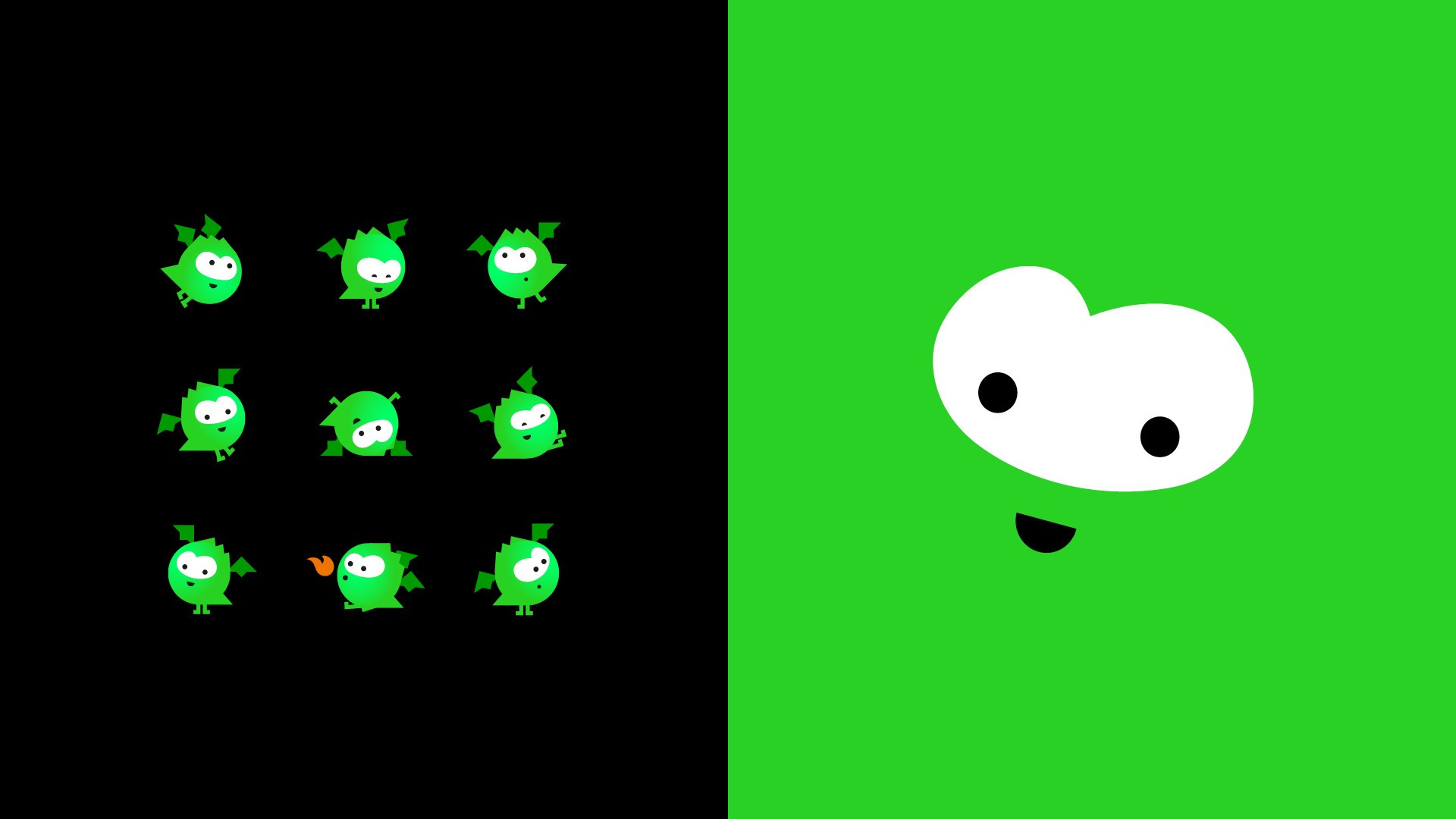
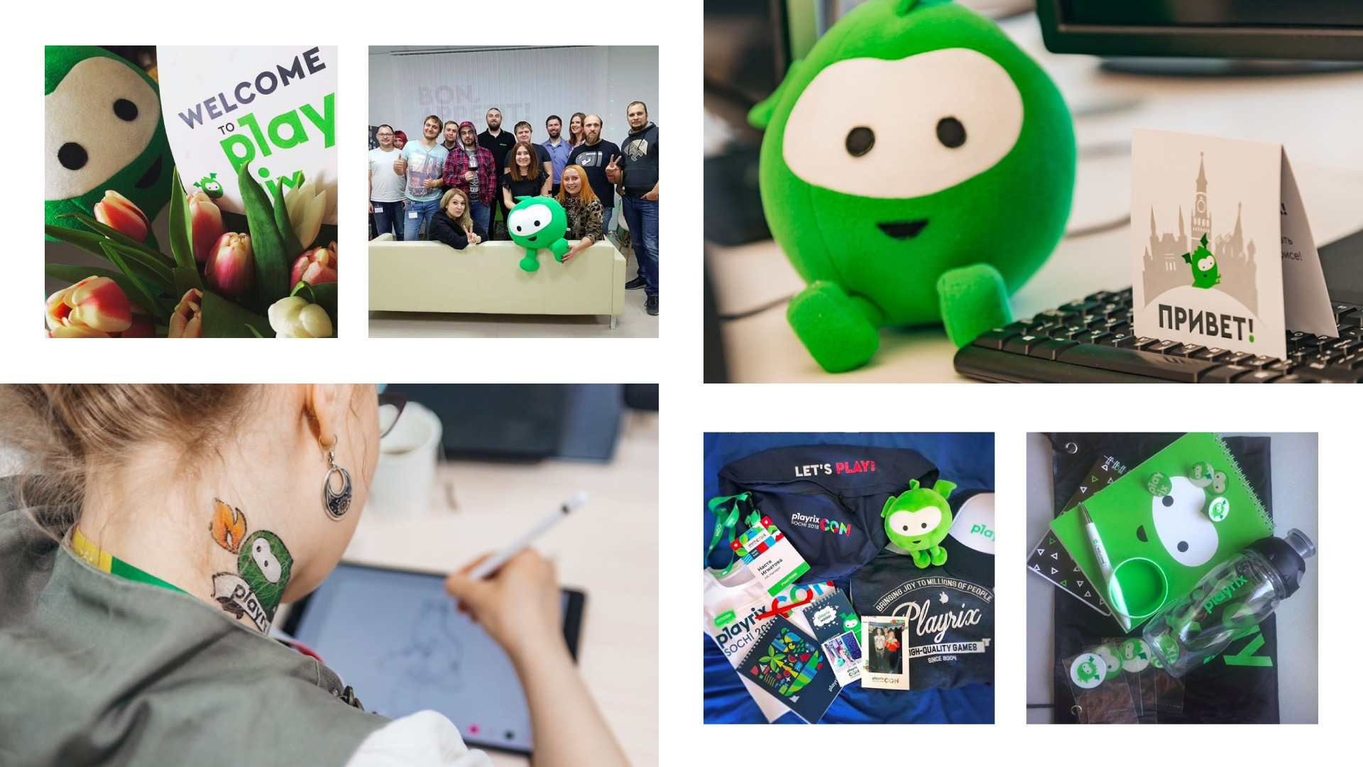
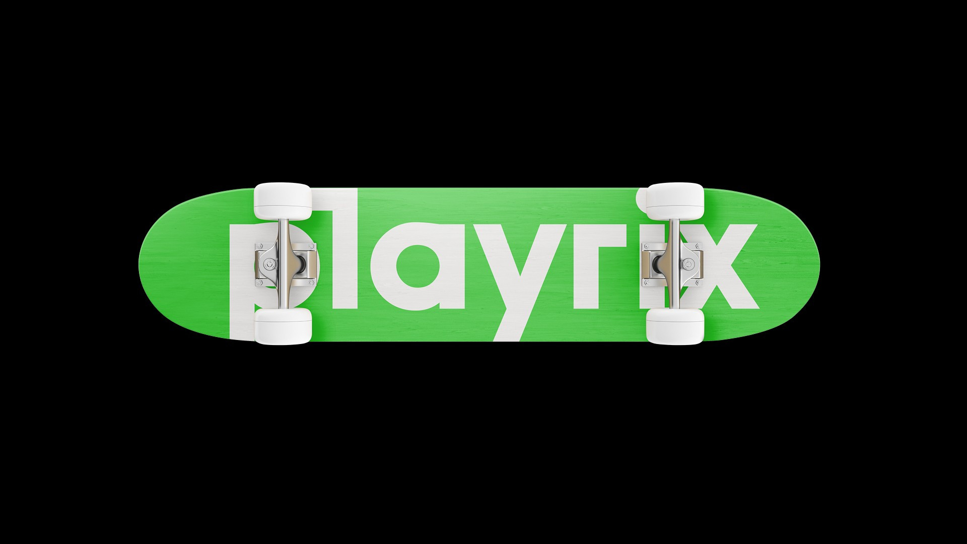
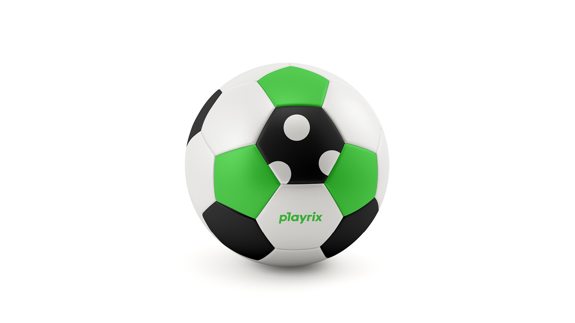
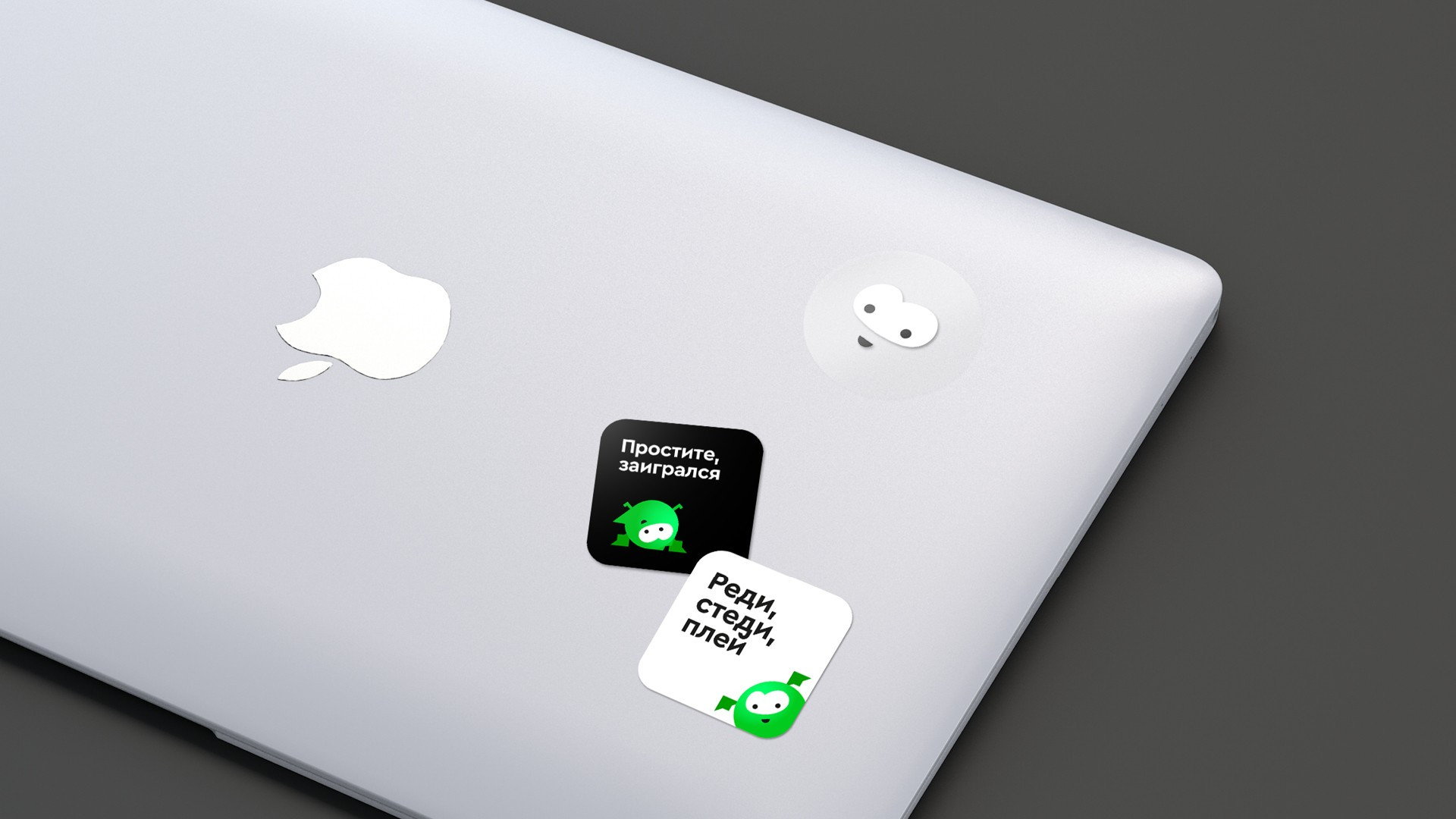
The new dragon, nicknamed Rix, has become a full and recognizable part of the logo and the design in totality. Any object with Rix comes to life and becomes more fun. Sometimes it's just enough to use his eyes, smile and color.
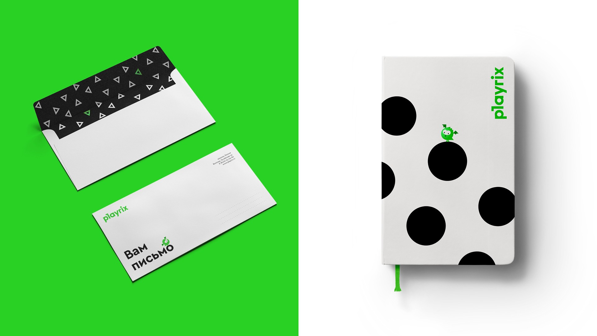
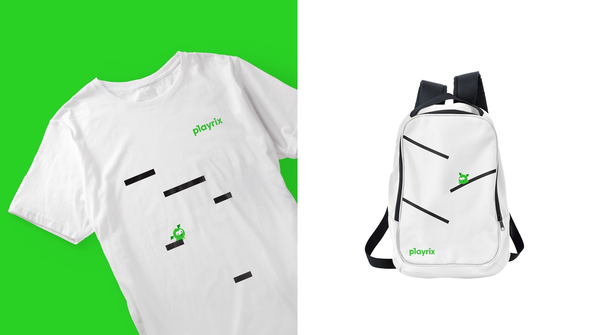
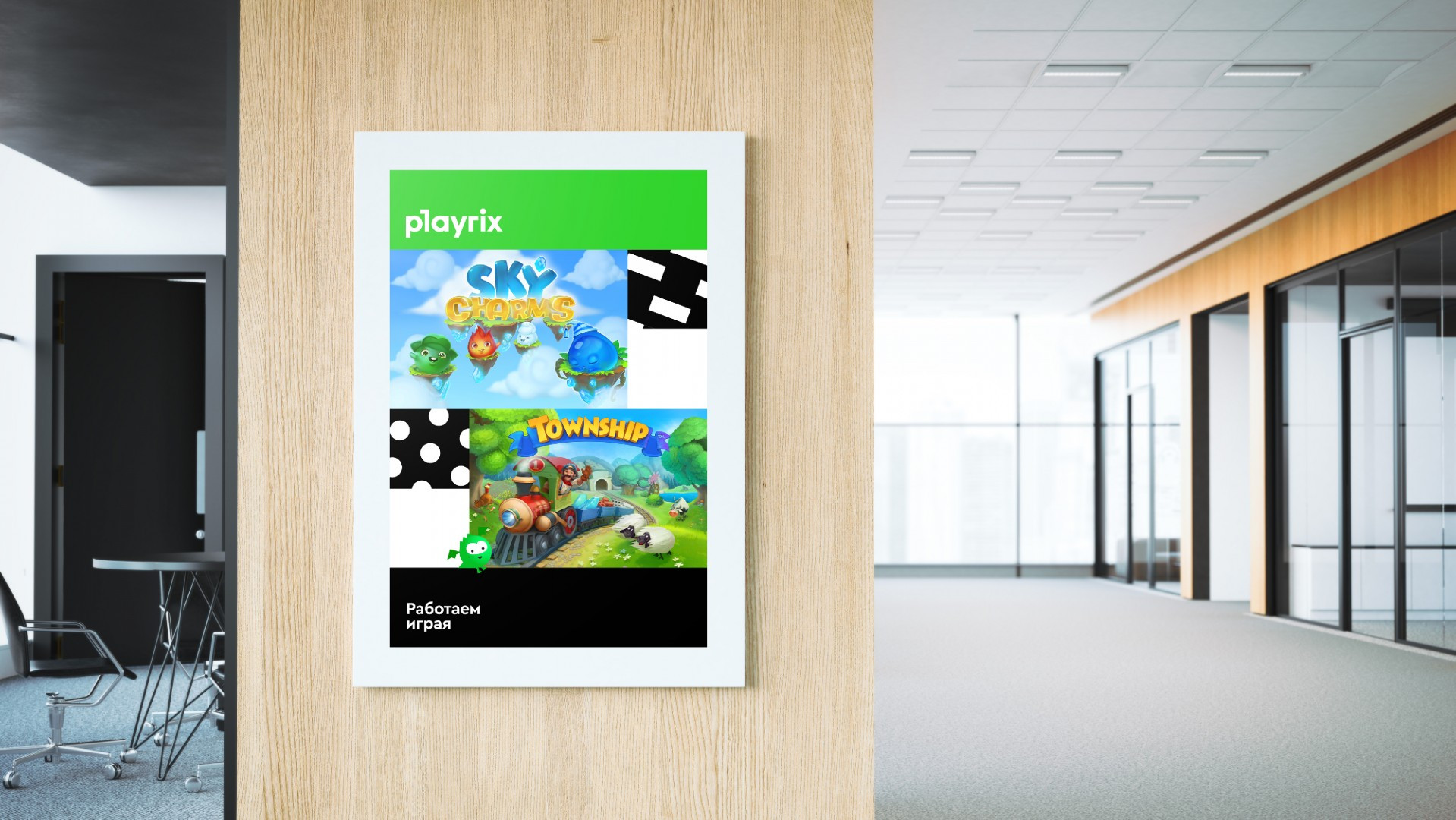
Since most of the Playrix products have rich texture visual style we came up with a simple shape and color design system where its simplicity only emphasizes the bright world of these games. In order not to dominate and not to fade we used color split blocks. In the design we also added graphic elements associated with something playful and uplifting: circles, scattered dashes, triangles. So we arrived at recognizable playrix-frame.
Three years have passed and the character lives quite a real life. It has become a toy and an absolute symbol of the company. Playrix use the dragon literally everywhere: in promotional materials, in Instagram of the company, as a mascot and a souvenir to new employees. It is very pleasant to watch the project through time and understand that it was beyond its control.