Festive feeling. Restore
Restore has had the status of Apple Premium Reseller in Russia for eighteen years. However, in addition to working with the company, the brand has developed many of its own initiatives over the years. An entire ecosystem of services has been established to improve customer service and support the creative community. Last year, restore became a multi-brand retailer: the range of products extended with new brands and categories. Hence, new segments of the audience had to be addressed. The brand has turned to us for a new identity, positioning and internal architecture that would organise the proposition of all products and services and reflect the ideas of the creative community.
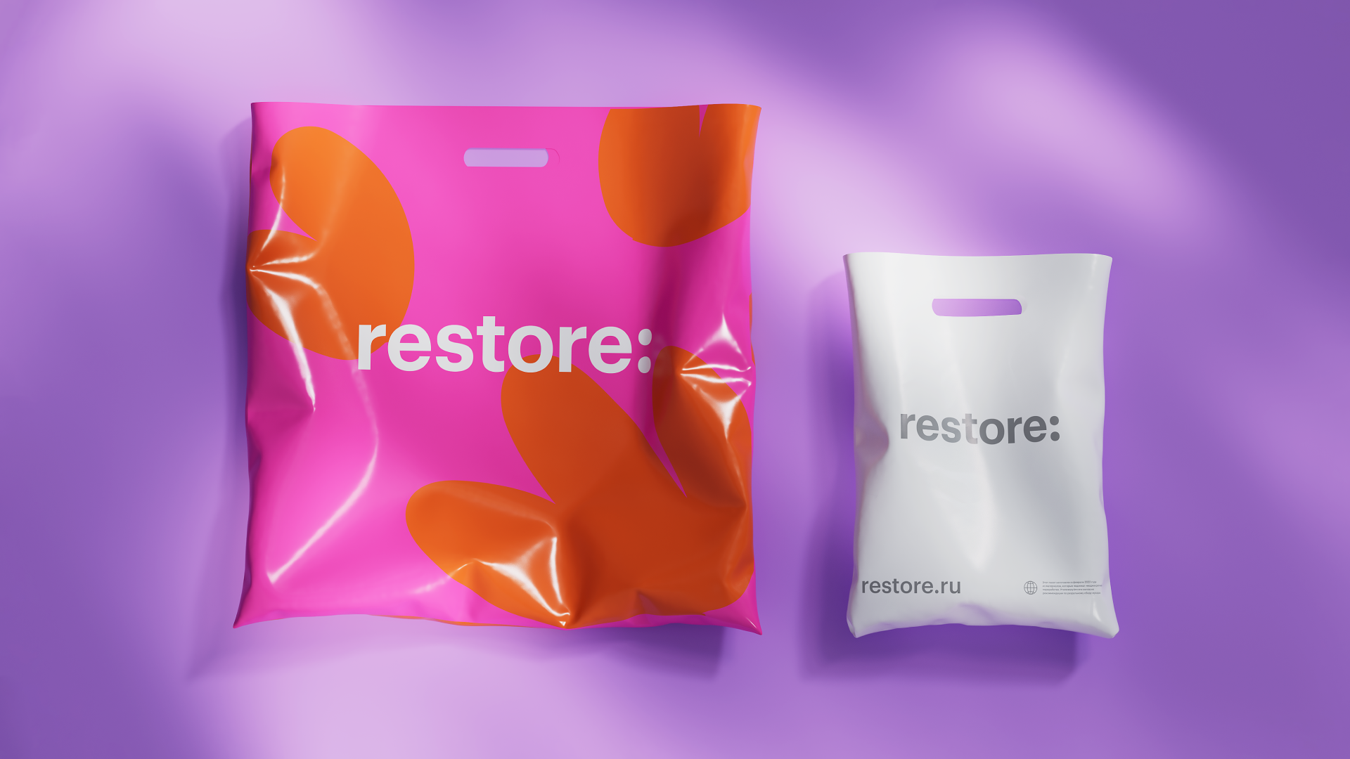
We have kept four key areas to optimise the internal architecture: the shop, technical support, offers for business and the community area. We have radically simplified the old two-colour logo with a colon in the middle, making the brand identity more concise. Meanwhile, the relocation of the colon has highlighted the evolution of the brand. The new communication promises more offers, insights and surprises.
The restore:u sub-brand brings together all initiatives of creativity, training and community support. The image of restore:u is the most vivid manifestation of the character of the renewed brand. The new identity reflects the ideas of bold creative experiments and enthusiasm that arise in a community of like-minded people. To reveal the communication potential of the new concept, Signal (part of ONY) has conducted a quantitative study among buyers of premium appliances. We have discovered that modern technologies are often perceived as small miracles, whereas the buying process of a desirable device evokes special joy and excitement. That is why such appliances are mostly bought as a gift – for loved ones or oneself. So we have defined the essence of the new multi-brand restore as technical miracles that give people new opportunities and inspiration.
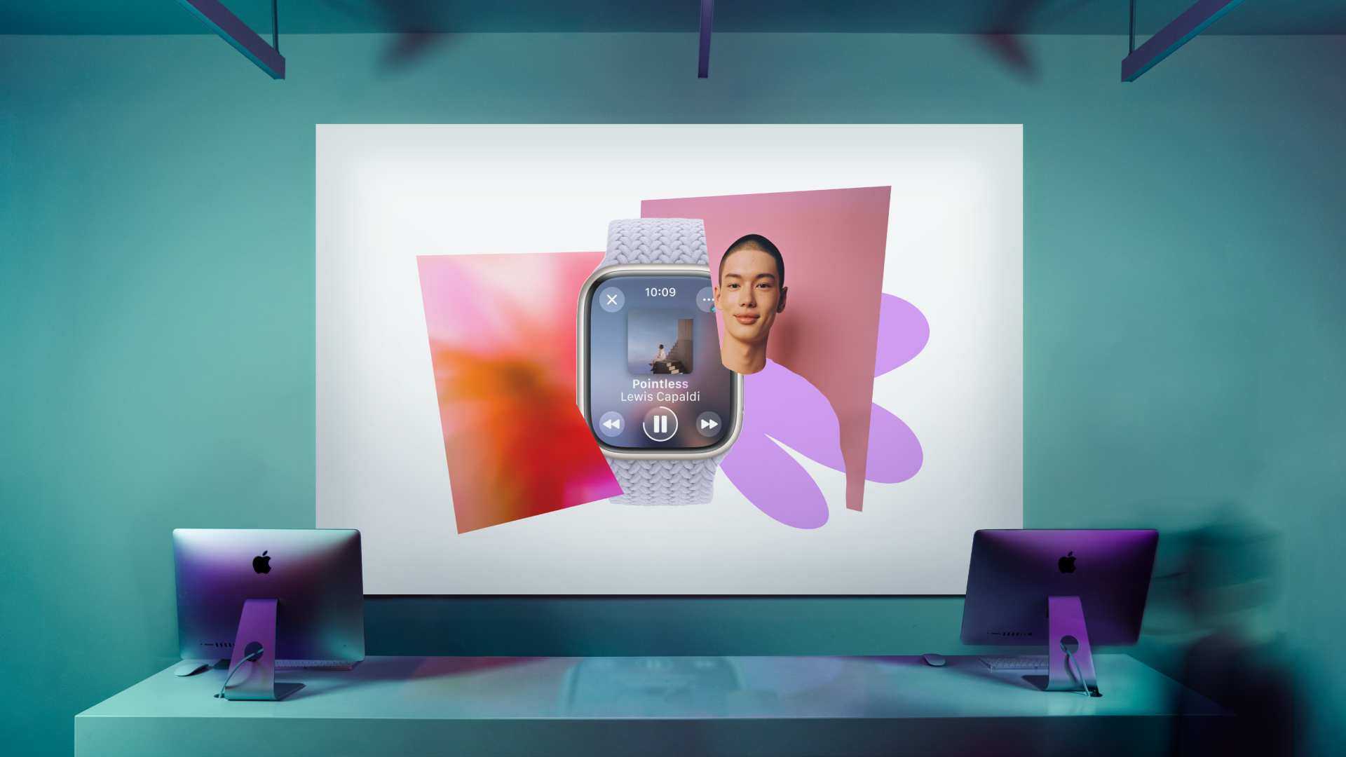
The identity is based on collages with portrait photography in the centre. On the portraits are bright representatives of a new segment of the brand's target audience: self-confident young people open to showing their emotions. Then there are subject photos, which follow the same principle as portraits, except that the leading part here is playing the product rather than the person. The third type of image is abstract sensual photos. These pictures are mainly used for the emotional component of the collage and can be more or less subject-specific. Underneath the apparent disorder lies a careful work with colour and composition with its own laws and rules. We have created a detailed guide to it.
All photos in this case study (except for product photos) are AI-generated. We have picked the prompts, so getting expressive portrait photos is a matter of minutes: soft lighting, textured space, models with bright charismatic appearances and film-like photography. The sensual abstract set is also AI-generated. It has been a long, painstaking process to find the right prompts and references, but still less labour-intensive and more budget-friendly than doing the shoot.
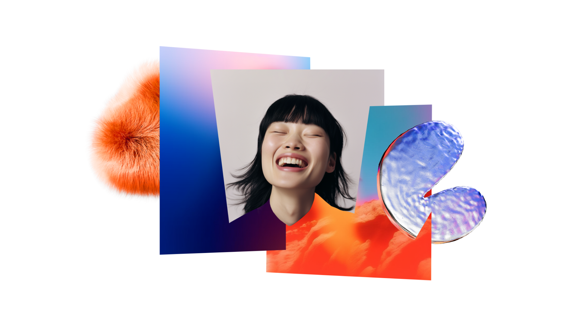
Our 3D graphics are tangible, three-dimensional blobs of holiday spirit. They are the result of a search for materials that carry different emotional charges. We have come up with several universes, each with its own logic and creatures. Geometric rigid shapes, joyful soft inflatable forms, fluid figures made of smoked glass and fluffy bubbles – all of them contrast with each other. Every single one of them is selected in a way to be combined with different products and photographs in the future.
All the tools are flexible for collaborations, indeed any brand identity can manifest itself in collages. The incorporation of different colours, formats and textures brings us into a metaverse. Its elements seep into real life and turn, for instance, into elements of furniture or décor. Now there are more excuses to go to the shop – after all, it is a place where you can find inspiration and create what you like.
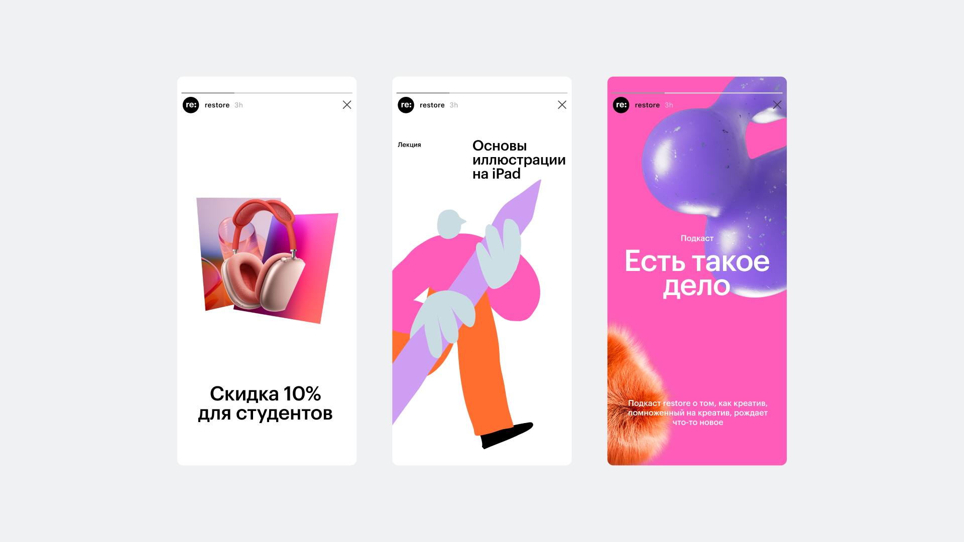
The degree of emotionality of layouts can vary. Thanks to the flexibility of the style and a wide range of tools, we can solve problems for both community-oriented and more uncompromising product layouts by simply adjusting the amount of expressive means.
We reinforce the feeling of festivity and anticipation of the surprise with the illustrations with a naive spirit that takes you back to childhood. In the layout, we play with proportions of illustrations, which are cropped on a large scale: to create a feeling of being overwhelmed with emotions.
People come to the new restore for long-awaited, premium devices, as they trust the brand and its selective approach to brands and models. New communications help us to say: there is a lot of space for creativity, where everyone can find themselves. After all, the most interesting things are born in the interaction of different and contrasting things.