Tinkoff. New ecosystem
Tinkoff is one of the largest finance and lifestyle ecosystems in the country, with dozens of innovative products. The company has gone far beyond offering financial products, adding new features and launching new services every year. But the quicker the company grows, the more important it is to clearly understand where each of the business’ focuses lies in the company hierarchy. ONY’s global task was to organize the whole system: first in terms of structure, then in terms of brand identity.
We analyzed all of Tinkoff’s features, services, and offerings and collected them into a streamlined architecture. Then we developed a design system as part of the visual style and branding, which all of the company’s existing and future products will fit into. We made the important strategic decision of strengthening Tinkoff as an overarching brand that dominates all of the company’s different services. What’s more, the client agreed to our suggestion of using the Cyrillic spelling for the brand and products in every case where it suits the overall meaning. We think that this is an honest and bold decision.
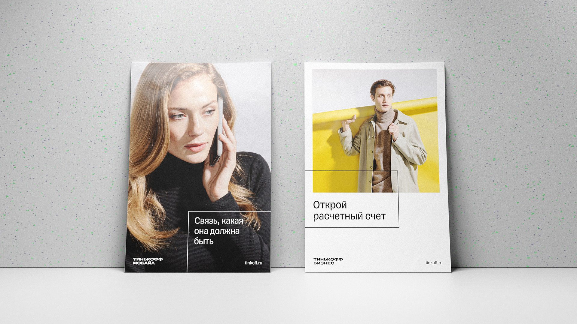
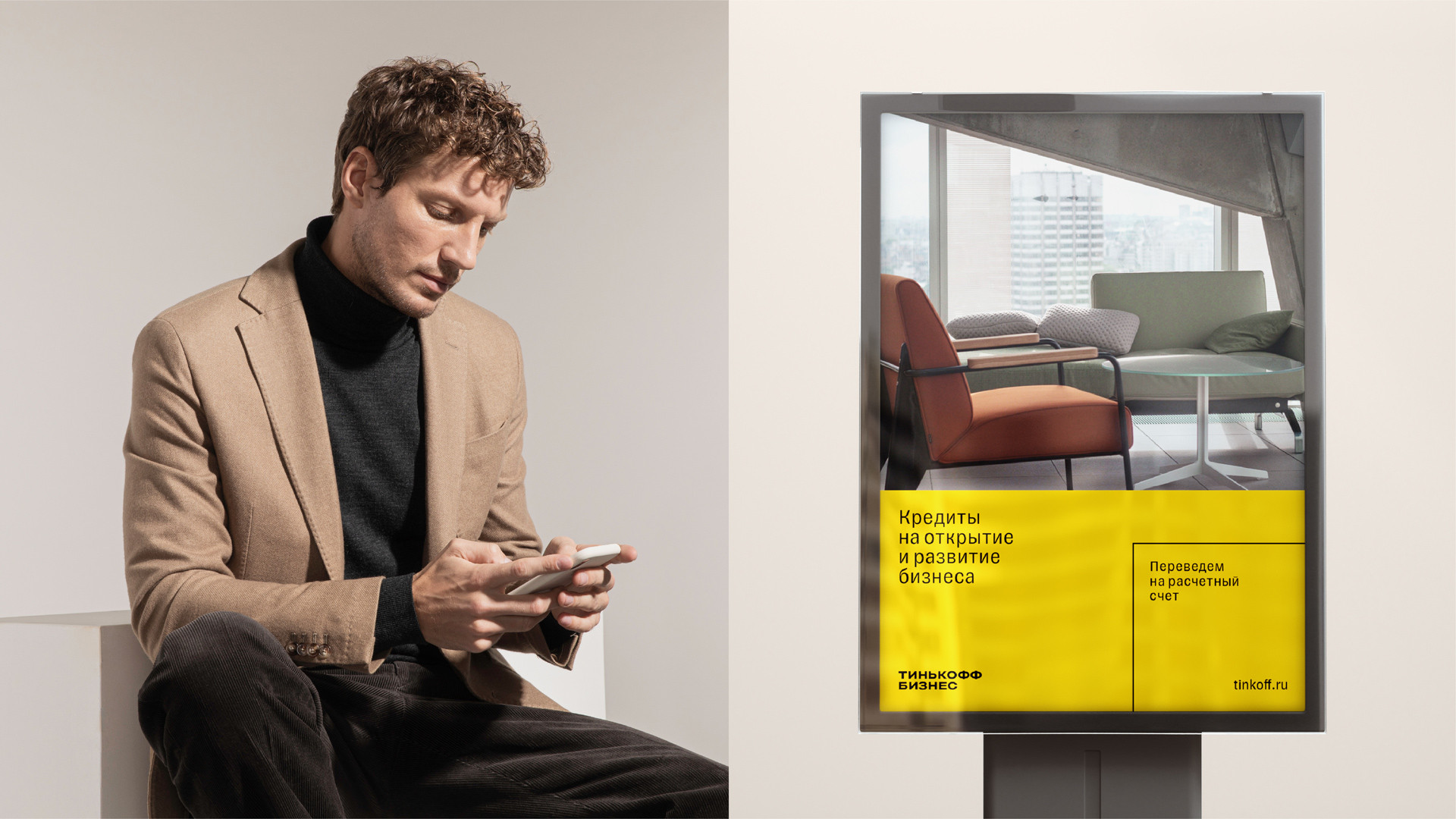
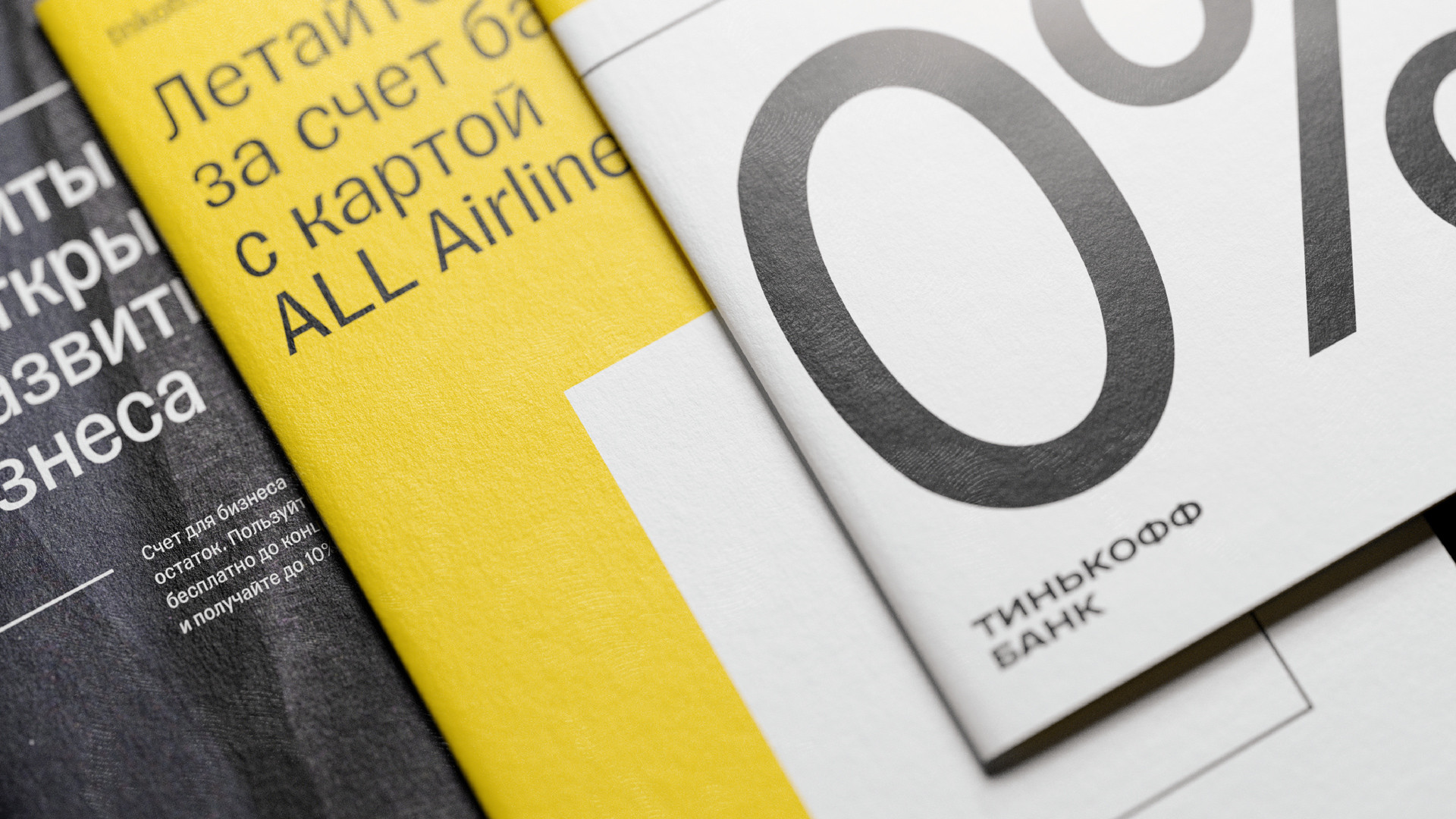
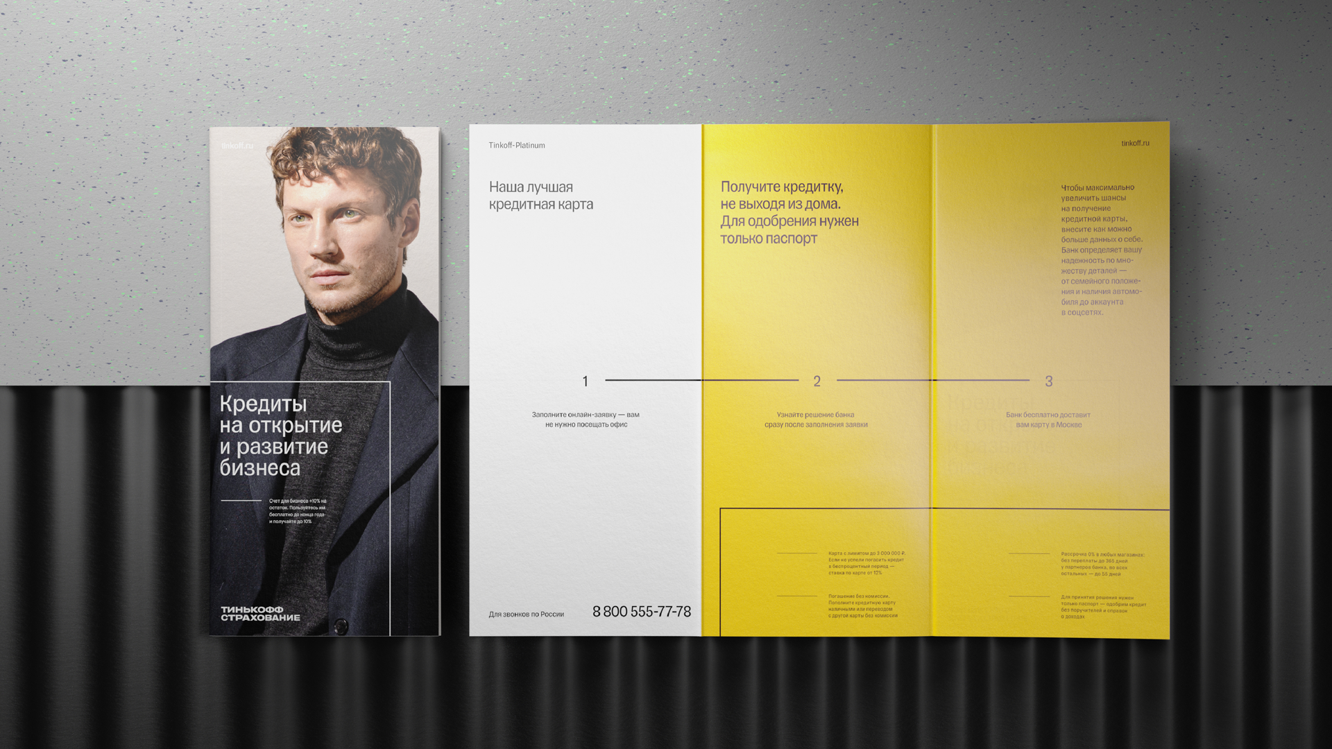
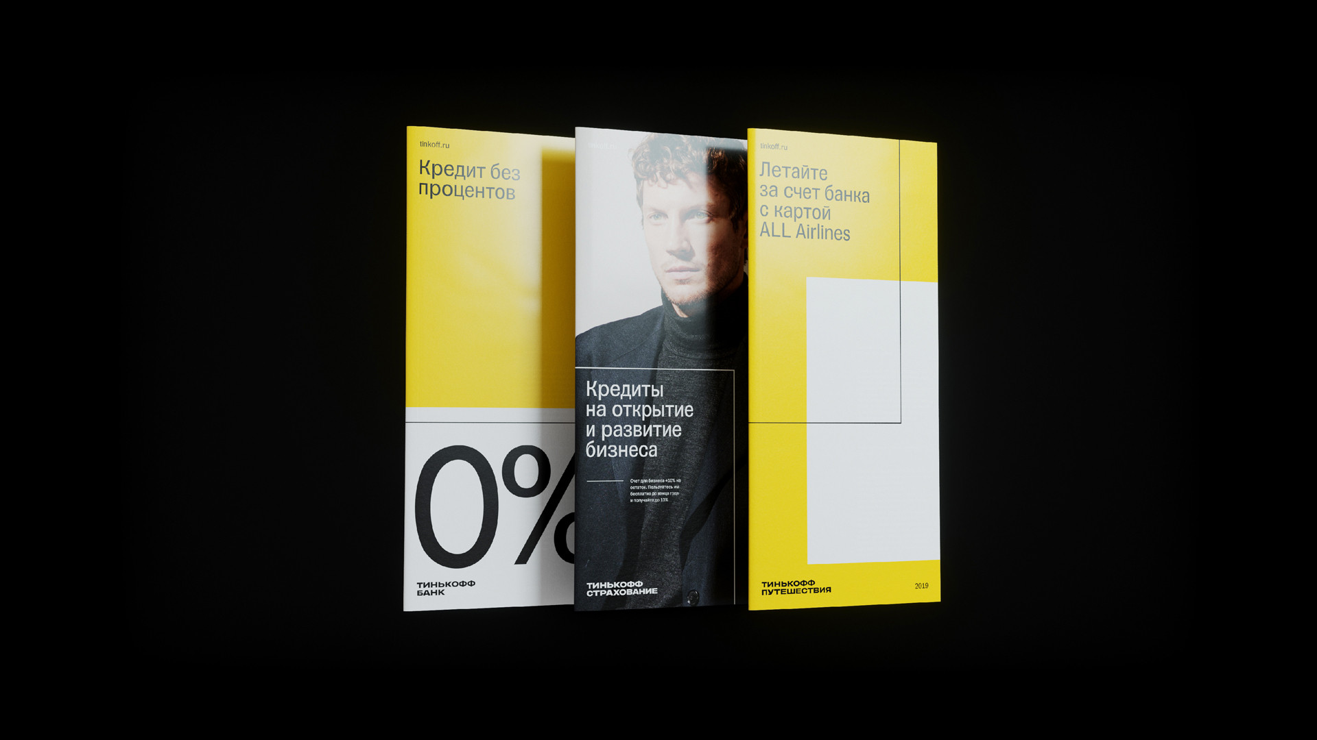
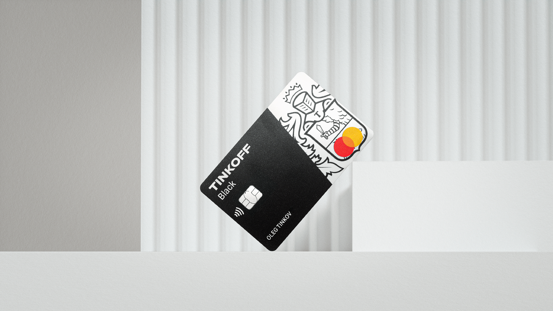
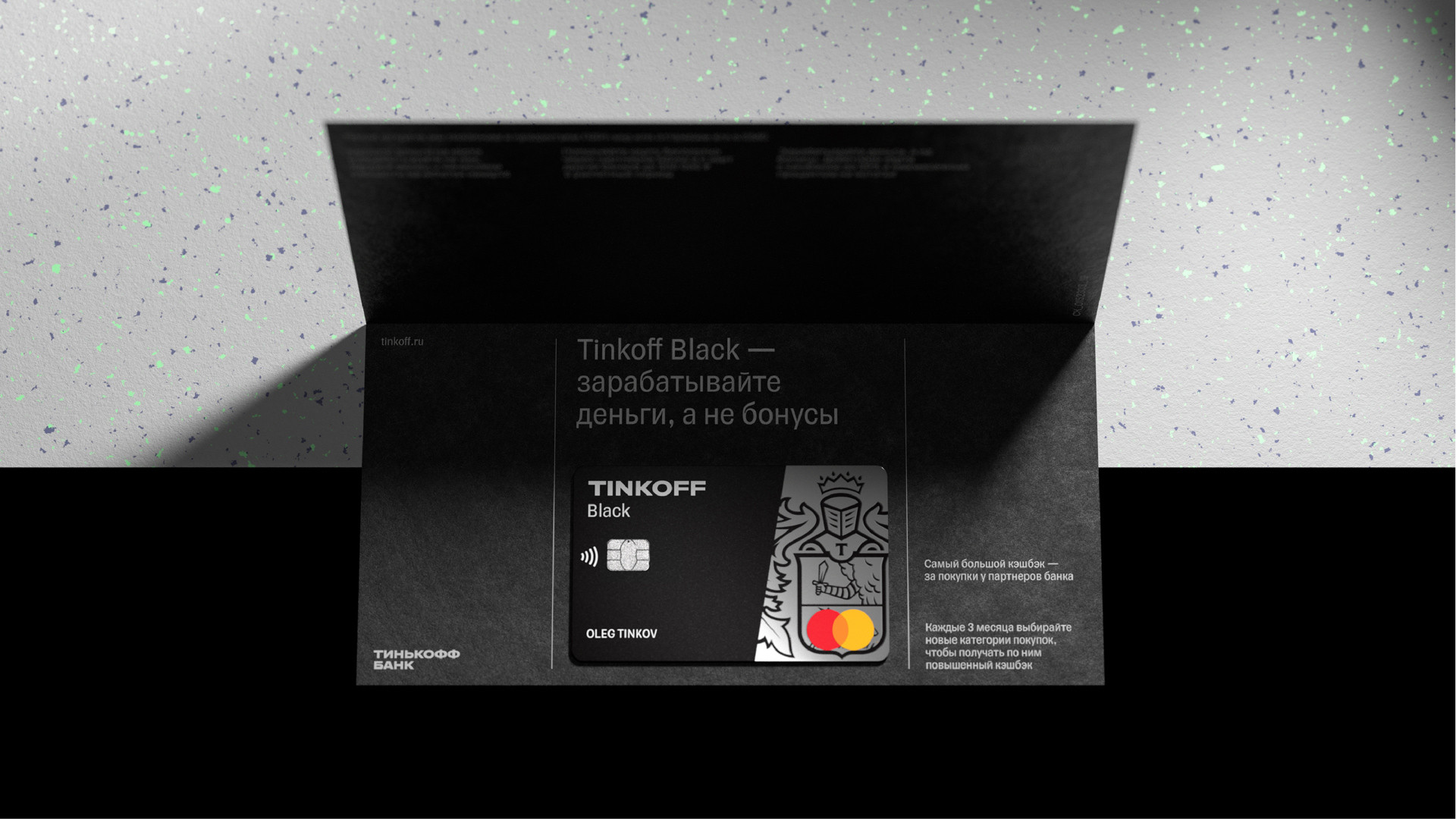
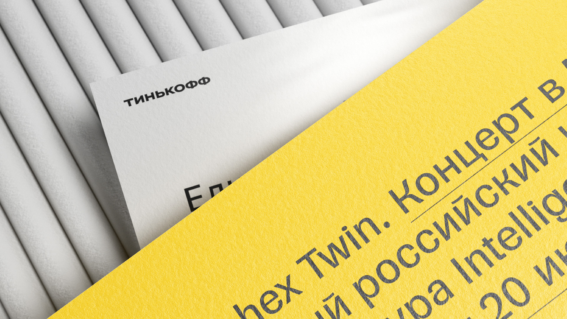
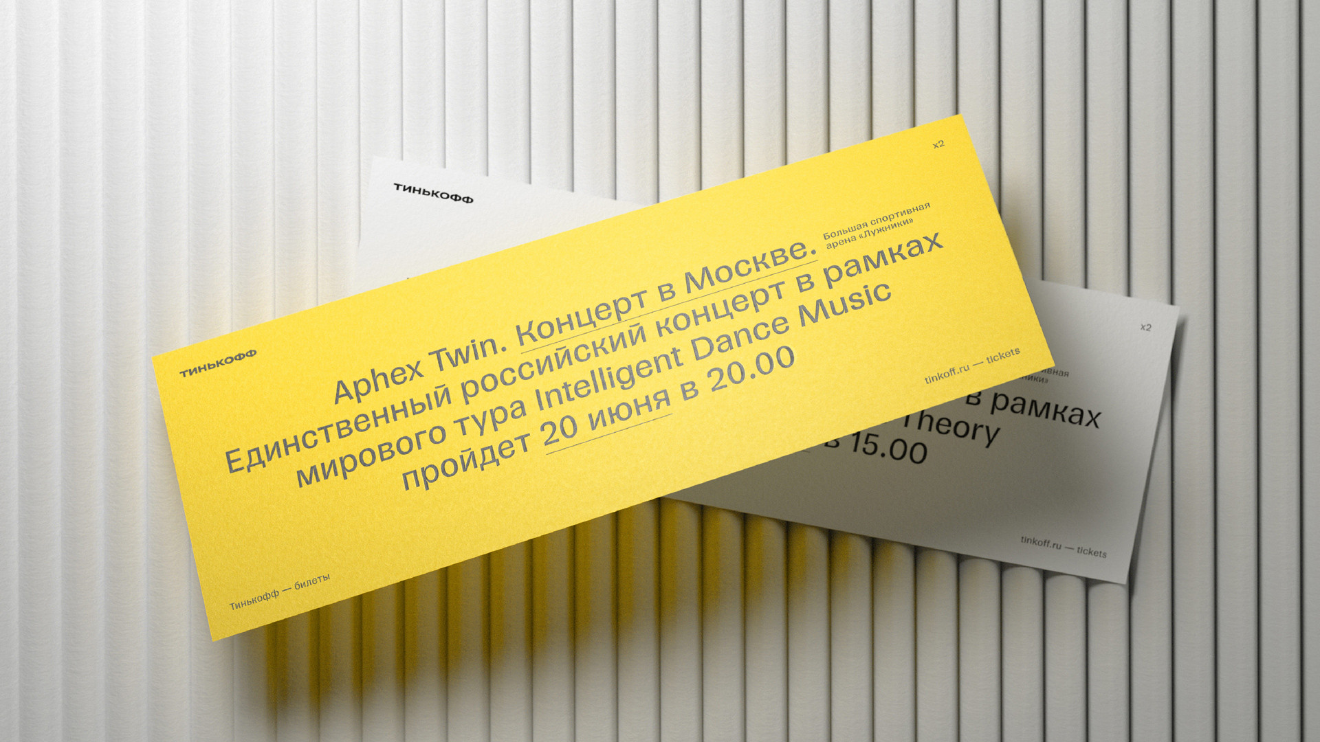
In our search for a concept for this new style, we worked with several constants: the company’s signature yellow color scheme and the crest, Tinkoff’s main symbol. Right away, we broke the crest down into its graphical components: two base colors and a black outline. We used these elements to create a layered visual system, similar to windows on a computer screen. This resulted in a unified environment filled with different objects, reflecting the numerous products that the company has to offer. The frame worked as an additional accent element in advertisements, allowing us to separate important layout elements or differentiate blocks of information.
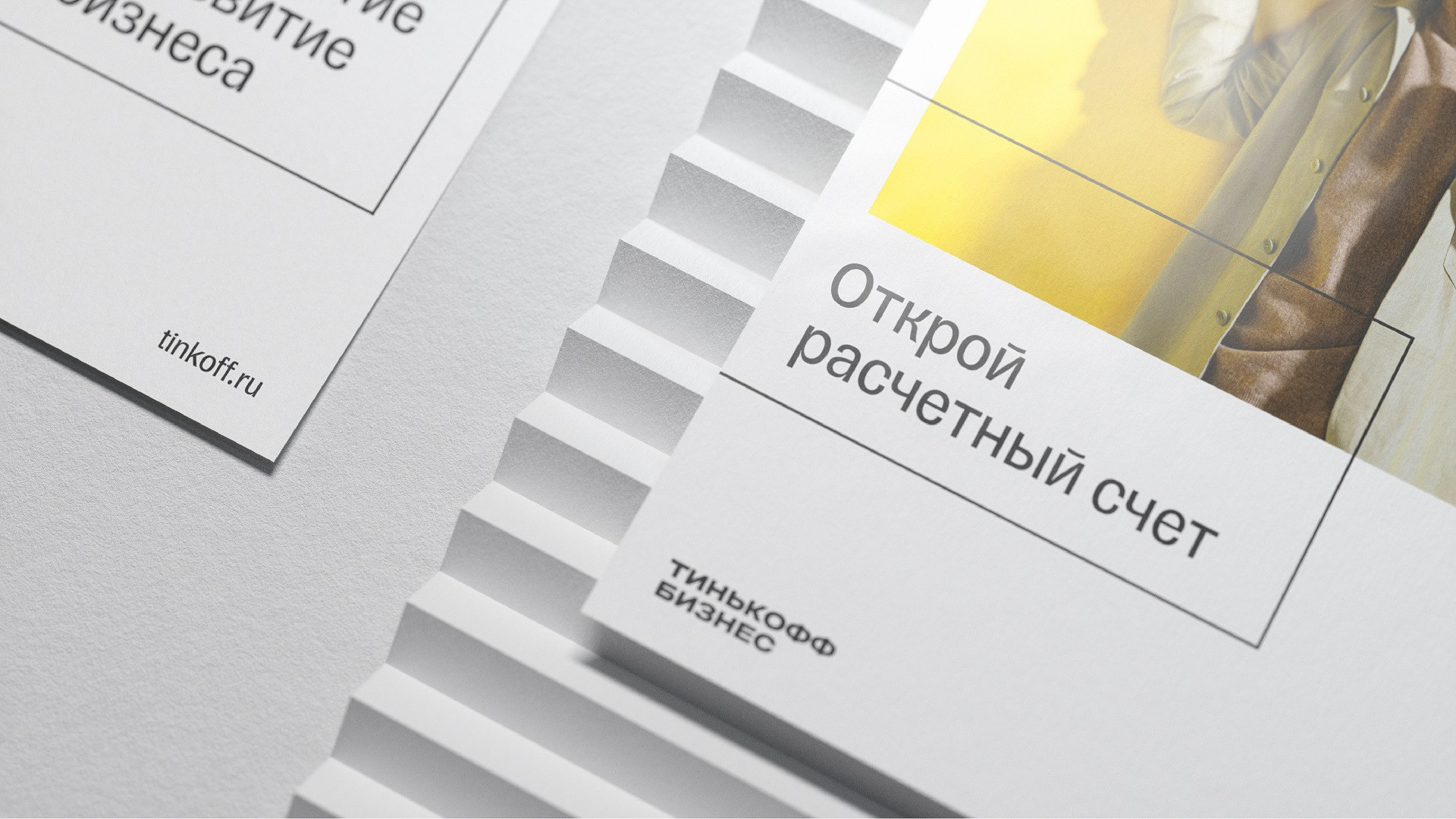
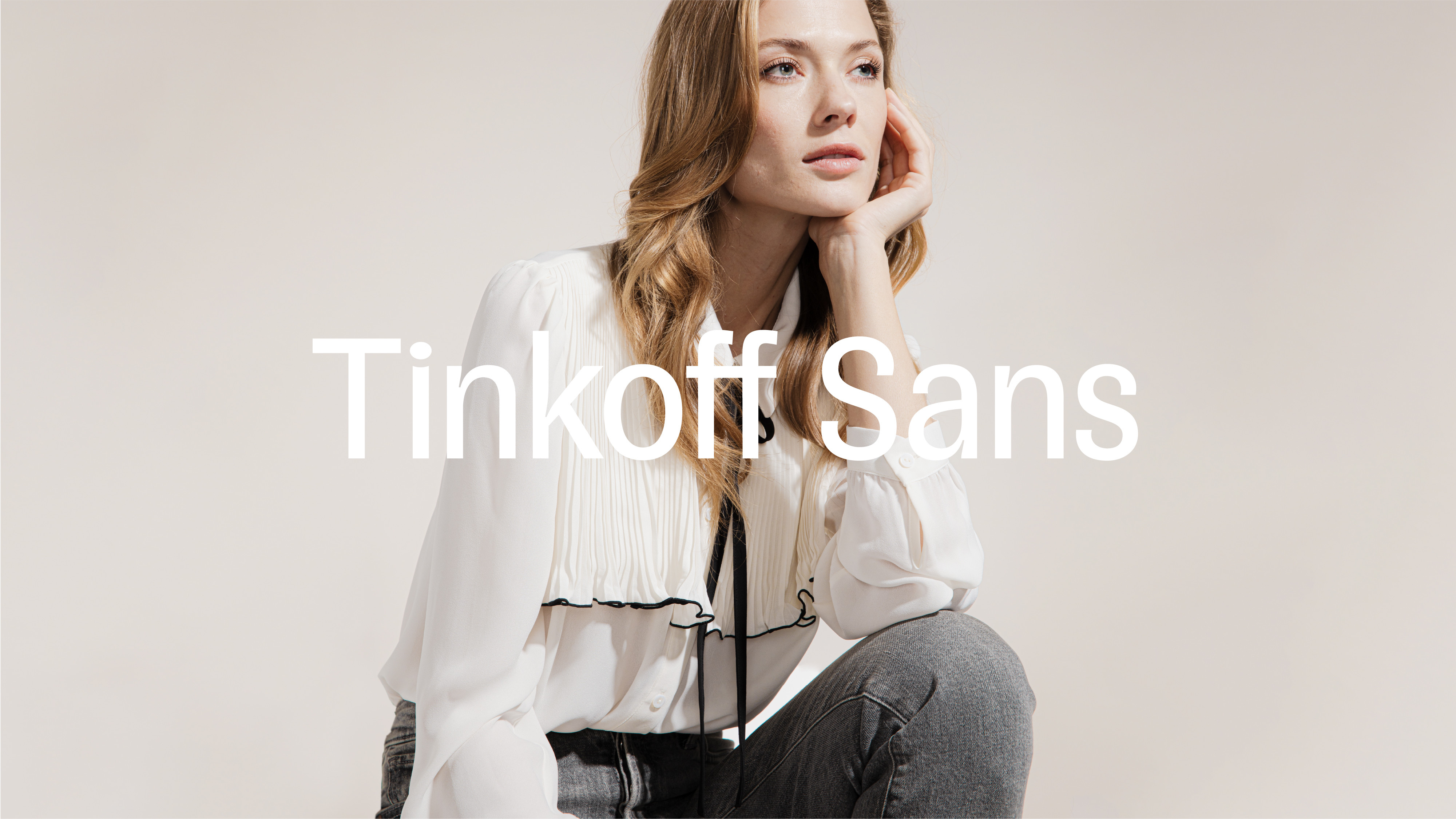
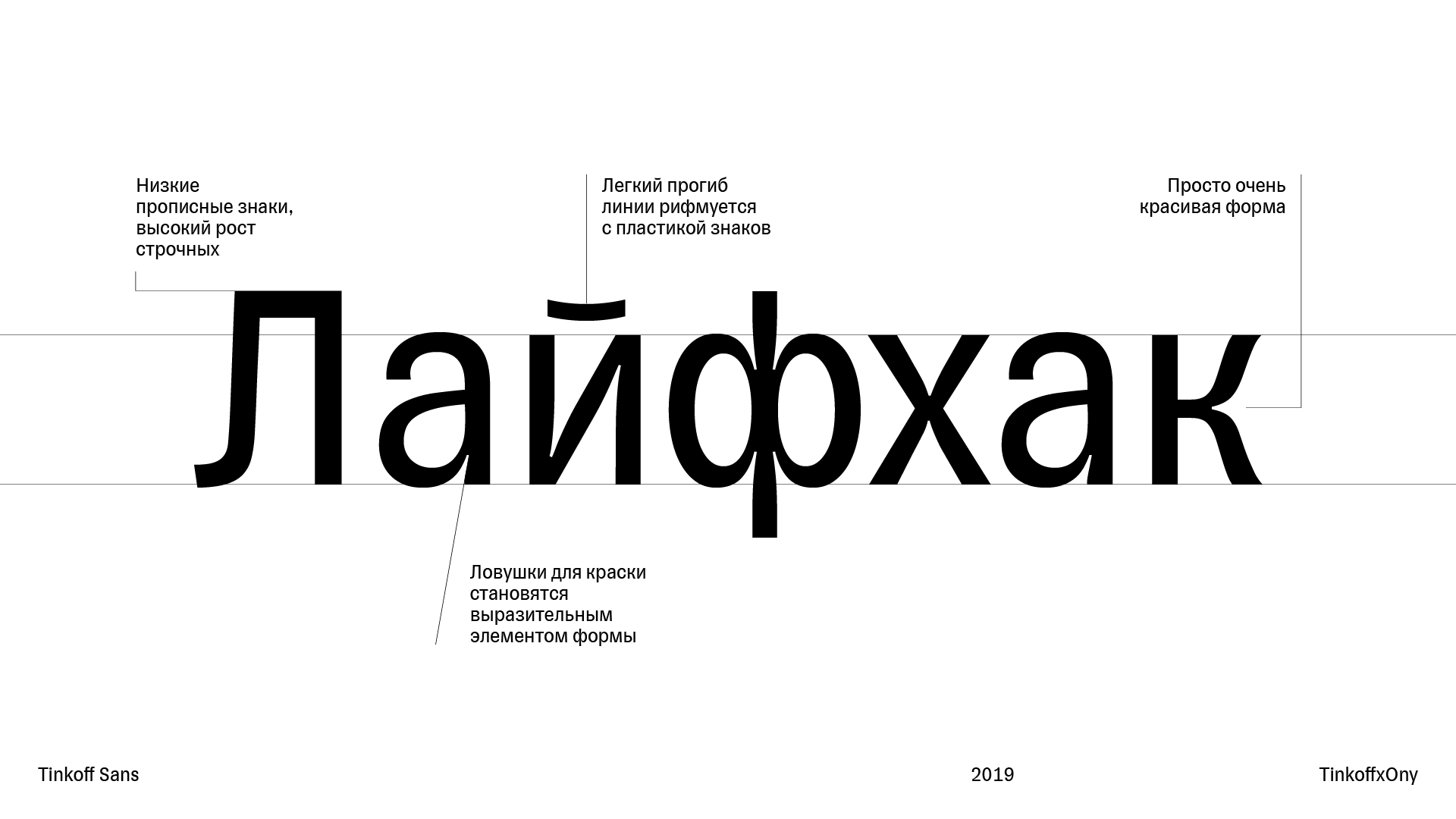
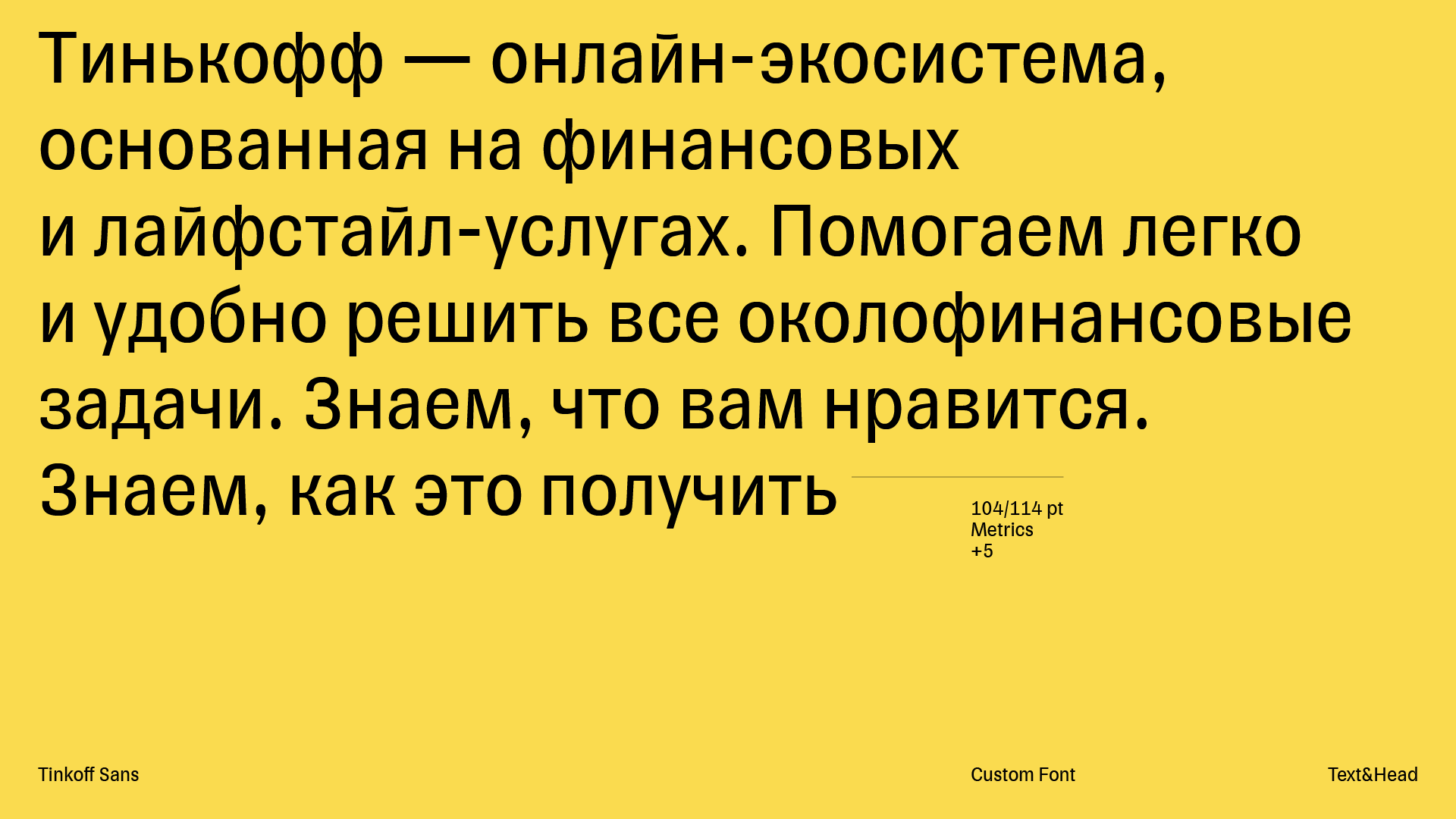
In working on the style, we developed two new fonts. They help the company distinguish itself from its competitors and begin speaking its own unique language. The first one is used for the name of the company and all of its services. It’s wide, substantial, and underlines the confident character of Tinkoff and its products. In the second font, used for body text, we went in a completely different direction and suggested a grotesque font, unheard of in the banking sector. It has unusual narrowed proportions, convenient for use with Cyrillic text, while its dynamism reflects boldness and bravery.
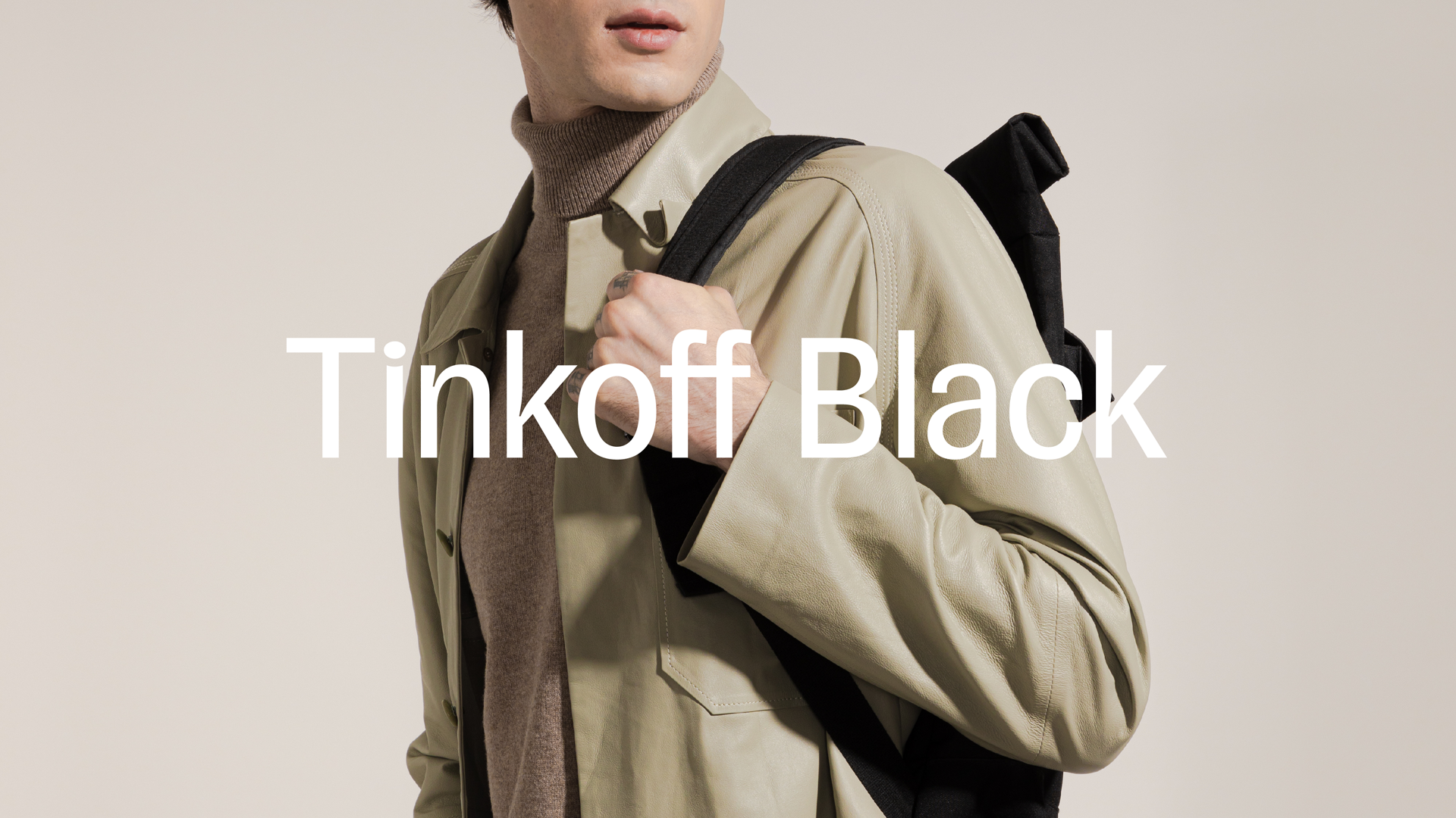
For Tinkoff’s advertisements, we also developed concept for their photographic style. What could be worse than a stock image of “successful success?” We know: if your own production department puts out the exact same thing. The brand’s new photo style is simple: people shouldn’t look at the camera, frozen in a tense pose with an artificially wide smile. They should be relaxed and behave naturally. A warm color palette breaks down the traditional stereotype that “money is hard,” while clean, natural backgrounds are easy to use in digital. In order for the branding team to have their own references, we did a photo session where we showed how real objects interact with signature color blocks and frames.
Now the company has a selection of tools to control the unity and hierarchy of their existing products and for the rapid launch of new ones, with clear communication for users. We are continuing our work on the project and developing the style so that any services, from cellular service to spaceflight, can look contemporary and straightforward, supporting Tinkoff’s overall product positioning are tools to simplify life with just a few clicks.
The textual information in all of this case’s materials are for reference purposes only. For up-to-date information about all services, products and offers, visit tinkoff.ru
