Yandex.Uslugi. When you’re in good hands
Yandex Services is a tool for solving everyday problems. Just like all of Yandex’s other products, it’s simple and reliable: with a single tap, trustworthy professionals will help you complete any task, right on time and just how you need it. The market is already full of aggregators that collect professionals in one place, but Yandex.Services’ strategy is different. It focuses on support and taking responsibility for work. Its new identity had to reflect this, inspiring trust and distinguishing it from the rest of the company’s services.
The first challenge in this project was the search for an image that could serve as the basis for our concept and embody the service’s new positioning. It’s not hard to come up with a logo, of course. For instance, a builder’s visual attributes are a hardhat, hammer and other familiar tools. But we were looking for a universal metaphor that would encompass all the services and professionals on offer, and landed on a handshake. In any form of labor, even of an intellectual variety, we work with our hands, shake on a deal, hold tools and interact with the world. As a product, Yandex.Services effectively become the digital hands for its clients.
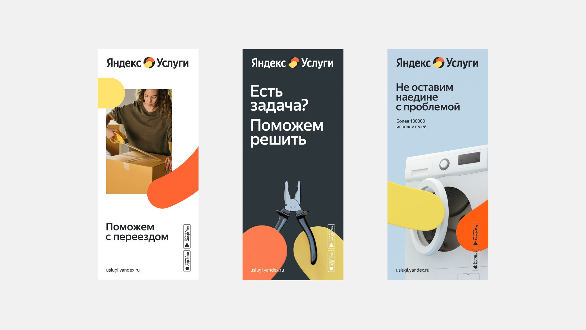
The next step was to create a visual system that could easily scale to various media, from digital to offline, and our «high-fives», as we called them, were the core of the entire style. Even if the logo isn’t visible in a given medium, these elements bring us back to the brand. In order to add variety to the layouts, we developed several tricks, like “zooming in/out” on an image using our hands. We can «support» this with photography or start using an object this way. All of this creates a sense of warmth and care: after all, when something breaks, we instantly feel like children in need of a strong, responsible adult.
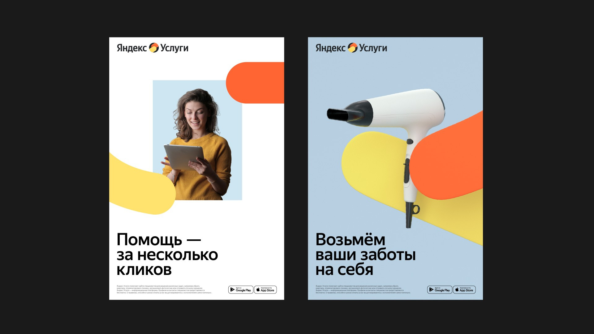
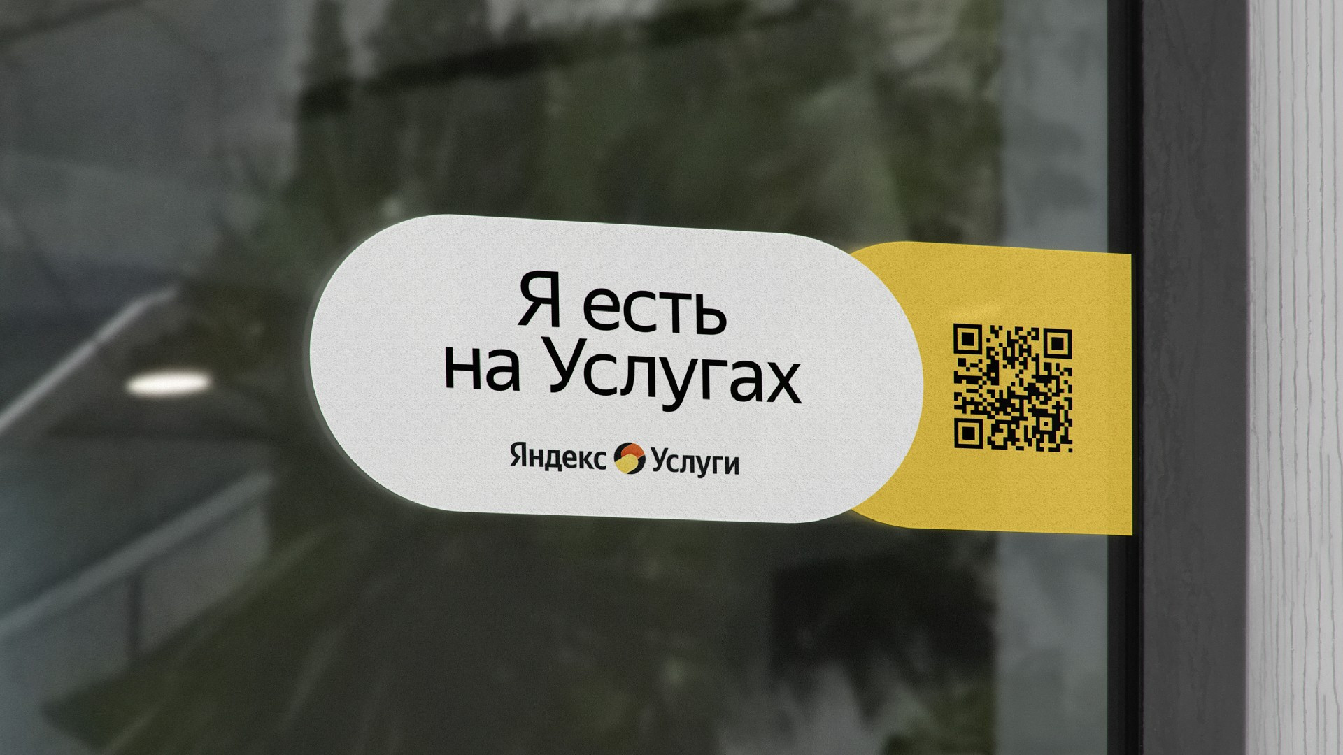
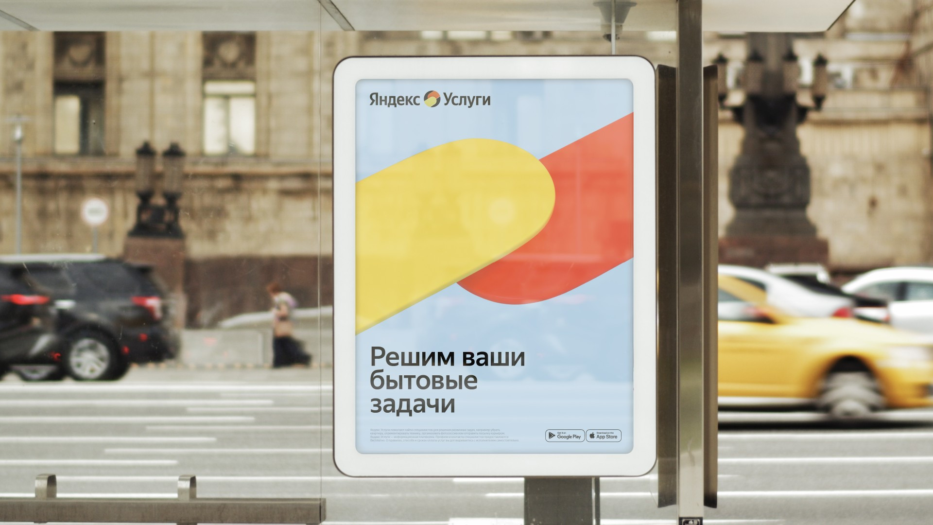
The Yandex.Services icon had to fit organically into Yandex’s array of other products. Therefore, the color scheme matches the company’s palette while still standing out. Alongside the Yandex yellow, we added an active, bright orange, with black added for contrast to make both the logo and the service icon more noticeable and memorable.
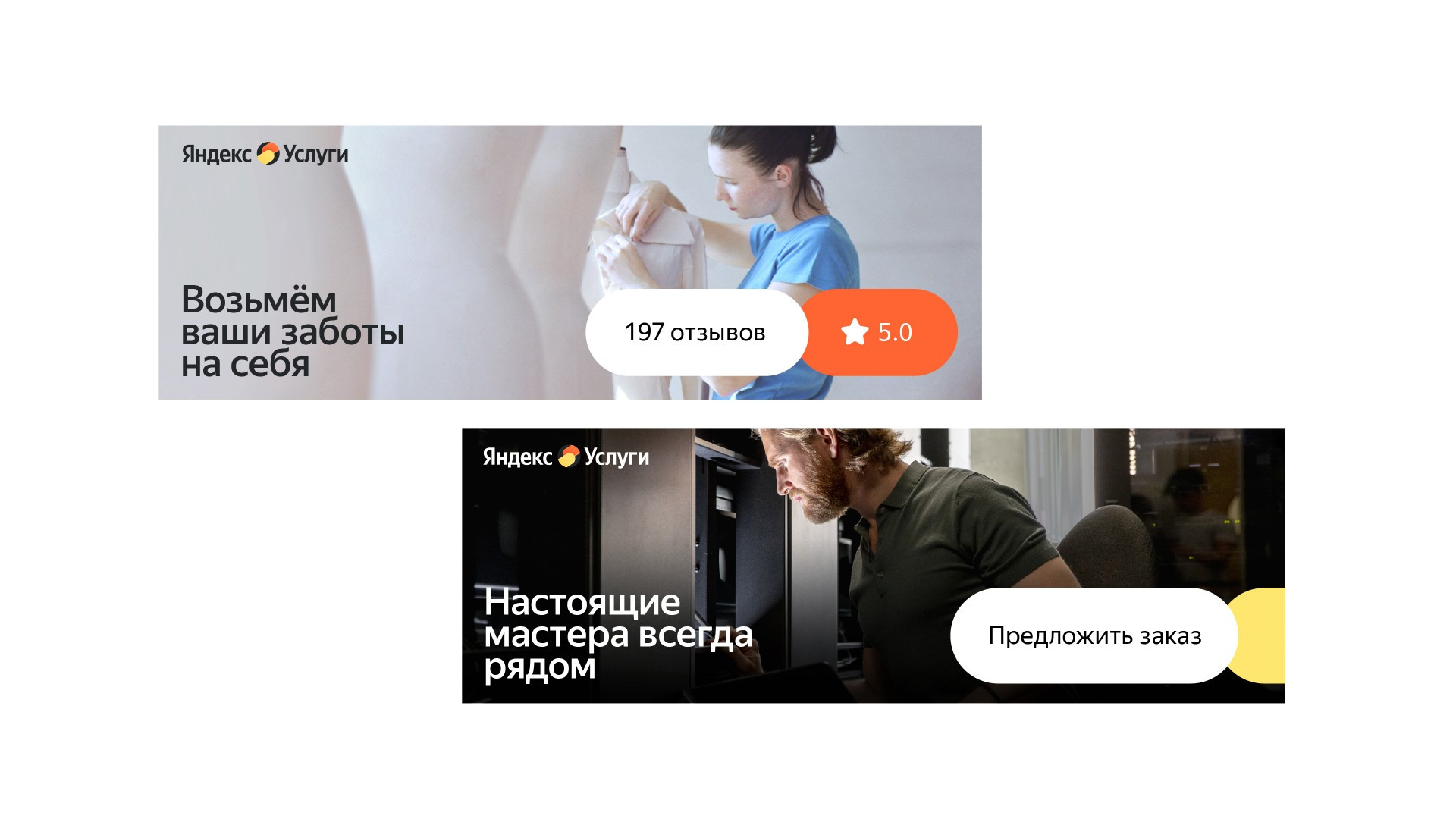
We devoted special attention to photo style. People don’t want to see stock photos as their potential contractors, but real people—after all, they’re the ones that they’re going to let into their homes and let into their homes! We prepared a set of advice for the Yandex.Services team with unique angles and scenes in the city and people’s apartments, full of genuine emotions and real faces of contractors that immediately draw a client in.
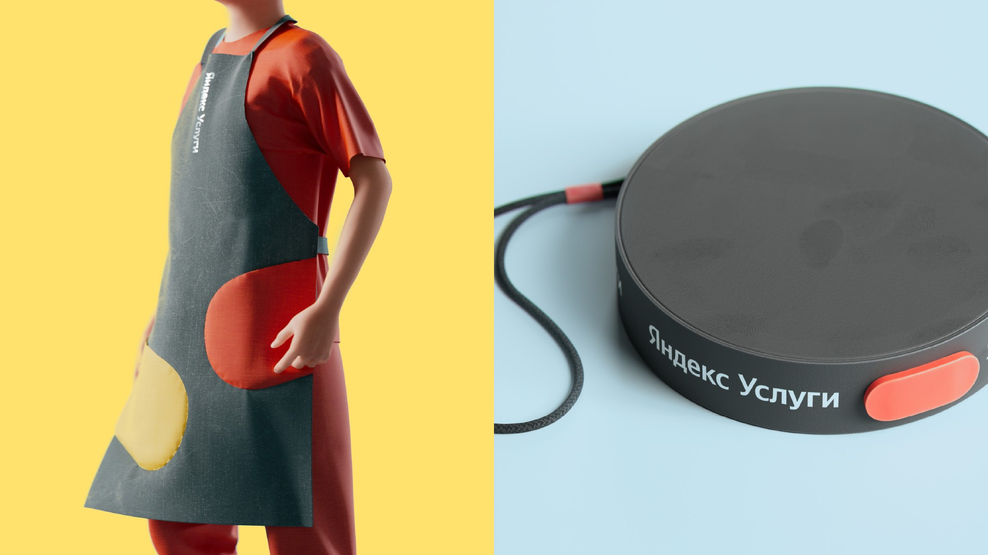
Yandex.Services is a digital product, so all of the branding elements can naturally integrate as interface elements. For example, animated hands can become buttons or blocks that grab a user’s attention. It was also important for the brand that the design apply well to contractors’ uniforms, be they an apron, T-shirt or hat. These «high-fives» хwork perfectly on any kind of merch
While working on the project, we interacted closely with the client’s team, conducting workshops and open creative sessions. As a result, we were able to create a flexible design system with broad and easy-to-use set of tools.